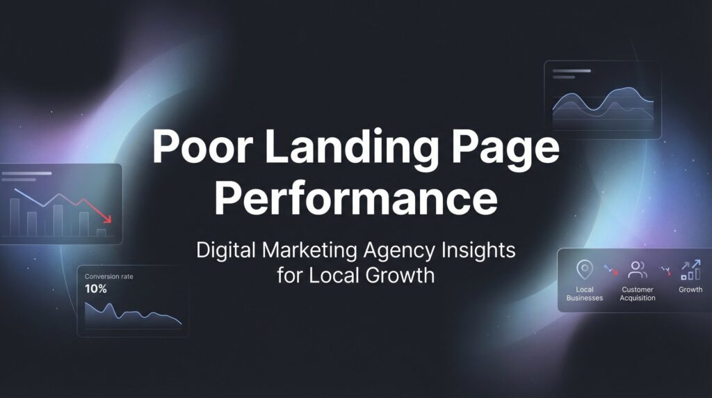
Your ads are running, traffic is flowing, but conversions aren’t happening. Poor landing page performance is silently draining your ad budget and sending qualified prospects straight to your competitors. The frustrating part? Most business owners don’t realize their landing page is the problem—they blame the ads, the targeting, or the market itself.
But here’s the truth: even the best-targeted PPC campaign will fail if your landing page doesn’t convert.
This guide walks you through exactly how to diagnose and fix poor landing page performance, step by step. You’ll learn to identify what’s broken, prioritize the fixes that matter most, and implement changes that turn your underperforming pages into conversion machines. Whether you’re seeing high bounce rates, low form submissions, or visitors who scroll but never act, these six steps will help you pinpoint the problems and fix them systematically.
Let’s stop the bleeding and start converting.
Step 1: Run a Performance Audit to Find Your Conversion Killers
You can’t fix what you can’t measure. Before changing a single word on your landing page, you need to understand exactly where visitors are dropping off and why.
Start with Google Analytics. Navigate to your landing page’s specific URL and examine three critical metrics: bounce rate, average time on page, and exit rate. A bounce rate above 70% signals immediate problems—visitors are landing and leaving without any interaction. Time on page reveals engagement: if people spend less than 10 seconds before bouncing, they’re not finding what they expected.
Next, run your page through Google PageSpeed Insights. This free tool measures both mobile and desktop load times while identifying specific performance bottlenecks. Load speed directly impacts conversions—mobile pages that take longer than three seconds to load experience significantly higher bounce rates according to Google’s published research.
Think of load time as your first impression. A slow page tells visitors you don’t value their time.
If you have access to heatmap tools like Hotjar or Microsoft Clarity, install them immediately. These tools show you where visitors actually click, how far they scroll, and where their attention goes. Session recordings reveal the truth: you’ll see visitors rage-clicking broken buttons, getting stuck on confusing forms, or scrolling past your call-to-action without noticing it.
The most important part of this audit? Document everything. Screenshot your current metrics. Record your baseline conversion rate, bounce rate, and average time on page. Write down your PageSpeed score. You need these numbers to prove whether your fixes actually work. Understanding your landing page conversion rate benchmarks helps you set realistic improvement targets.
Create a simple spreadsheet with these columns: Metric, Current Value, Date Recorded, Target Value. This becomes your scorecard. When you implement changes in the following steps, you’ll compare against these baselines to measure real improvement versus guesswork.
Success indicator: You’ve completed this step when you can answer these questions without guessing: What’s my current conversion rate? What’s my bounce rate? How long does my page take to load on mobile? Where do most visitors exit?
Step 2: Align Your Message Match Between Ads and Landing Page
Here’s where most campaigns fall apart: your ad promises one thing, your landing page delivers something different. This disconnect kills trust instantly.
Open your highest-spending ad in one browser tab and your landing page in another. Read your ad headline out loud. Now read your landing page headline. Do they mirror each other? If someone clicks an ad that says “Get Your Free Marketing Audit” and lands on a page that says “Welcome to Our Agency,” you’ve broken the promise.
Message match means your visitor should experience seamless continuity. The language, the offer, the specific benefit mentioned in the ad—all of it must appear immediately on your landing page, preferably above the fold.
Check your ad copy word-for-word. If your ad mentions “24-hour response time,” that exact phrase should appear prominently on your landing page. If you’re advertising a specific service like “Local SEO for Dentists,” your landing page headline better say “Local SEO for Dentists,” not generic “SEO Services.” This is fundamental to understanding what makes a PPC landing page effective.
Verify that keywords triggering your ads appear in your page content. If someone searches “emergency plumber Chicago” and clicks your ad, they should see “emergency plumber” and “Chicago” multiple times on the page. This creates psychological reassurance—they’re in the right place.
The offer promised in your ad must be visible immediately. If your ad says “Download Our Free Guide,” the download form or button needs to appear above the fold. Making visitors hunt for what you promised creates friction and doubt.
Here’s a quick test: Show your ad and landing page to someone unfamiliar with your business. Ask them if these two things match. If they hesitate or say “kind of,” you have message match problems.
Fix this by rewriting your landing page headline to mirror your best-performing ad headline exactly. Use the same words, the same phrasing, the same promise. If you’re running multiple ad variations, create separate landing pages for each distinct message—this is called ad scent, and it’s non-negotiable for strong conversion rates.
Success indicator: A visitor clicking your ad should feel instant recognition, not confusion. They should think “Yes, this is exactly what I was looking for” within two seconds of landing on your page.
Step 3: Eliminate Friction Points in Your Page Layout
Every element on your landing page either moves visitors toward conversion or gives them an excuse to leave. Your job is to remove the exits.
Start with your navigation menu. If your landing page has a full website navigation bar with links to About, Services, Blog, and Contact, you’re actively encouraging visitors to leave. Remove it. A dedicated landing page should have one goal and zero escape routes. Think of it like a sales conversation—you wouldn’t stop mid-pitch to hand someone a brochure about your company history.
Examine your form fields with ruthless scrutiny. Every field you add reduces completion rates. If you’re asking for first name, last name, email, phone number, company name, website, budget, timeline, and “how did you hear about us,” you’re asking too much. Strip it down to the absolute essentials for your first contact: name, email, phone number. You can gather additional details later in the relationship.
Count your current form fields. Now cut that number in half. If you absolutely need certain information, consider making some fields optional or using a multi-step form that reveals fields progressively rather than overwhelming visitors with a wall of inputs. Following proven best practices for landing pages can dramatically reduce form abandonment.
Your call-to-action button deserves special attention. It should be impossible to miss. Use a contrasting color that stands out from your page design—if your page is blue and white, make your CTA button orange or red. The text should be action-oriented and specific: “Get My Free Audit” beats “Submit,” and “Start Saving Money” beats “Click Here.”
Button size matters. Your CTA should be large enough to tap easily on mobile devices—at least 48 pixels tall. Make it look clickable with subtle shadows or borders.
Place your primary CTA above the fold so visitors see it immediately without scrolling. Then repeat it strategically throughout the page: after you’ve explained key benefits, after testimonials, and definitely at the bottom. Long-form pages should have the CTA visible every 1-2 screen heights.
Remove external links from your body copy. If you mention a case study or reference, don’t link to it—that’s an exit. If you must provide additional resources, save them for after conversion or include them in your follow-up email.
Success indicator: Trace the path from landing on your page to completing your desired action. Every step should be obvious. If you find yourself thinking “visitors might click here” or “they could get distracted by this,” you’ve found friction to eliminate.
Step 4: Strengthen Your Value Proposition and Trust Signals
Your value proposition answers one question: why should someone choose you instead of doing nothing or picking a competitor? Most landing pages answer this question poorly or not at all.
Rewrite your headline to focus on the specific outcome your prospect wants. “Marketing Services for Local Businesses” is a description, not a value proposition. “Get 20+ Qualified Leads Per Month Without Wasting Money on Ads That Don’t Work” speaks directly to the result they’re after. The difference is specificity and outcome-focus.
Generic headlines blend into the background. Specific ones grab attention because they address the exact problem keeping your prospect awake at night. Instead of “Professional Web Design,” try “Get a Website That Actually Generates Leads, Not Just Compliments.” Learning how to create high converting landing pages starts with mastering this headline-first approach.
Add concrete proof immediately after your headline. Testimonials work when they include names, photos, and specific results. “This was great, highly recommend!” from “John S.” is worthless. “Clicks Geek helped us go from 3 leads per month to 47 in 90 days” from “Michael Rodriguez, Rodriguez Plumbing, Chicago” builds credibility.
If you have review counts, display them prominently: “Trusted by 200+ Local Businesses” or “Rated 4.9/5 Stars from 156 Reviews.” Numbers provide social proof—they show you’ve delivered results repeatedly, not just once.
Certifications and partnerships matter for credibility. If you’re a Google Premier Partner, that badge should be visible. Industry certifications, awards, or media mentions all reduce perceived risk. These trust signals answer the unspoken question: “Can I trust this company?”
Replace vague claims with specificity. “Save time” becomes “Save 3 hours per week on manual reporting.” “Increase revenue” becomes “Average client sees 34% revenue increase in first quarter.” Specific numbers feel real; vague promises feel like marketing fluff.
Address the top objection directly on the page. If prospects worry about cost, include “No long-term contracts—cancel anytime.” If they’re concerned about results, offer a guarantee: “If we don’t generate at least 10 qualified leads in 60 days, we’ll refund your investment.” Acknowledging and resolving objections preemptively removes barriers to conversion.
Include a brief explanation of your process or what happens next. “Here’s how it works: Schedule a call → We audit your current marketing → You get a custom plan → We implement and optimize” removes uncertainty. People hesitate when they don’t know what they’re signing up for.
Success indicator: Someone unfamiliar with your company should be able to read your landing page and explain exactly what you do, why you’re different, and what result they’ll get. If they can’t, your value proposition needs work.
Step 5: Optimize for Mobile Users (Where Most Traffic Lives)
Most of your traffic comes from mobile devices. If your landing page isn’t optimized for phones, you’re losing conversions before the battle even starts.
Test your page on actual mobile devices, not just browser preview tools. Chrome’s device toolbar gives you a rough idea, but real phones reveal the truth. Text that looks readable on your desktop might be microscopic on an iPhone. Buttons that seem obvious might be impossible to tap accurately with a thumb.
Grab your phone right now and visit your landing page. Can you read the headline without zooming? Is the CTA button large enough to tap without accidentally hitting something else? Do you have to scroll horizontally to see content? These issues kill mobile conversions.
Ensure tap targets—buttons, form fields, links—are at least 48 pixels tall with adequate spacing between them. When elements are too close together, visitors accidentally tap the wrong thing, get frustrated, and leave. Your CTA button should be large and centered with clear space around it. Understanding how to optimize landing pages for conversions means prioritizing mobile experience above all else.
Make phone numbers click-to-call. On mobile, every extra step creates friction. If someone has to copy your number, switch to their phone app, and paste it in, you’ve lost them. Use the tel: link format so tapping the number initiates a call immediately: 555-123-4567.
Optimize forms for thumb-friendly input. Use appropriate input types: type=”tel” for phone numbers brings up the numeric keypad, type=”email” adds the @ symbol to the keyboard. These small details reduce typing effort and errors.
Verify images and text are readable without zooming. Your hero image should make sense at mobile sizes—complex graphics with tiny text become illegible. Simplify or create mobile-specific versions of busy images.
Check your page load speed specifically on mobile. Use Google PageSpeed Insights’ mobile test. Mobile networks are slower than wifi, and mobile users are more impatient. If your page takes more than three seconds to load on mobile, you’re hemorrhaging traffic.
Compress images aggressively. That beautiful high-resolution hero image might be 3MB—way too large for mobile. Use tools like TinyPNG or ImageOptim to reduce file sizes without noticeable quality loss. Aim for hero images under 200KB.
Success indicator: You should be able to land on your page, read the headline, understand the offer, and complete the conversion action entirely on your phone without frustration, zooming, or horizontal scrolling. If you can’t, your mobile visitors definitely can’t.
Step 6: Implement A/B Testing to Validate Your Fixes
Opinions don’t matter. Data does. A/B testing is how you prove which changes actually improve conversions versus which ones just seem like they should work.
Start by testing one element at a time. Change your headline, or your CTA button color, or your form length—but never all three simultaneously. If you change multiple elements and conversions improve, you won’t know which change caused the improvement. That knowledge is valuable for future optimization.
Prioritize high-impact elements first. Headlines and CTA buttons typically influence conversion rates more than footer text or minor copy tweaks. Test your headline against 2-3 variations that emphasize different benefits or use different emotional appeals. Test your CTA button text: “Get Started” versus “Get My Free Audit” versus “Show Me How.”
Form length is another high-impact test. Create a version with your current fields and a version with half as many. The reduced-field version will likely get more submissions, but you need to verify the leads are still qualified. Sometimes fewer fields means more junk leads. Mastering A/B testing for landing pages separates guesswork from data-driven optimization.
Run tests until you reach statistical significance. This typically requires at least 100 conversions per variant. Testing with 10 conversions on version A and 12 on version B proves nothing—that difference could be random chance. Most A/B testing tools calculate significance automatically, but the general rule is: the more conversions in your test, the more confident you can be in the results.
Document every test result in a spreadsheet. Record what you tested, which version won, by what margin, and what you learned. Over time, this becomes institutional knowledge about what works for your specific audience. You might discover your audience responds better to outcome-focused headlines than curiosity-driven ones, or that shorter forms outperform longer ones consistently.
Don’t stop testing after one win. Conversion rate optimization is continuous. After you find a winning headline, test that winner against a new challenger. After you optimize your CTA button, test different placements. Each incremental improvement compounds. If you lack the bandwidth for ongoing testing, consider working with landing page optimization services that specialize in continuous improvement.
Use proper testing tools like Google Optimize, Optimizely, or VWO. Don’t just swap elements manually and compare weeks—too many variables change week to week (seasonality, traffic sources, ad performance). Proper A/B testing shows both versions to random visitors simultaneously to ensure fair comparison.
Success indicator: You have a testing calendar with your next three tests planned, a spreadsheet tracking all past test results, and the discipline to let tests run to completion rather than calling winners prematurely based on early data.
Putting It All Together
Fixing poor landing page performance isn’t about overhauling everything at once—it’s about systematic diagnosis and targeted improvements. Start with your audit to establish baseline metrics. Then work through message match, friction reduction, value proposition, mobile optimization, and testing. Each step builds on the last.
Quick-start checklist: Run PageSpeed Insights today. Compare your ad headline to your landing page headline. Count your form fields. Check your page on your phone. Make one improvement this week and measure the result.
Your landing page is either your best salesperson or your biggest liability. These six steps ensure it’s the former.
The difference between a landing page that converts at 2% and one that converts at 8% is the difference between struggling to justify your ad spend and having more qualified leads than you can handle. That four-point improvement doesn’t require genius—it requires systematic attention to the fundamentals covered in this guide.
Start with the audit. You might discover your page loads in eight seconds on mobile, immediately explaining your bounce rate. Or you’ll find your ad promises a free consultation but your landing page headline talks about your company history—instant message mismatch. These discoveries point you directly to the highest-impact fixes.
Tired of spending money on marketing that doesn’t produce real revenue? We build lead systems that turn traffic into qualified leads and measurable sales growth. If you want to see what this would look like for your business, we’ll walk you through how it works and break down what’s realistic in your market.
Your landing page problems are fixable. The question is whether you’ll fix them before your competitors do.