You’re paying for clicks. Your ads are performing. Traffic is flowing to your landing page. But the leads? They’re trickling in, or worse, they’re nonexistent. Here’s the hard truth most business owners learn the expensive way: your landing page is either a conversion machine or a money pit. There’s no in-between.
Landing page optimization isn’t about making things look pretty. It’s about engineering every element on the page, from headline to form to layout to trust signals, to do one job: turn a visitor into a lead or customer.
For local businesses running PPC campaigns, even a small improvement in conversion rate can mean dozens of additional leads per month without spending a single extra dollar on ads. The traffic you’re already paying for becomes dramatically more profitable.
These nine landing page optimization best practices are the same principles that separate high-performing campaigns from ones that bleed budget. Whether you’re building your first landing page or overhauling one that’s underperforming, this is the exact playbook to start converting more of the traffic you’re already paying for.
1. Match Your Headline to the Ad That Brought Them There
The Challenge It Solves
When someone clicks your ad and lands on a page that feels disconnected from what they just read, their brain immediately signals: “This isn’t what I was looking for.” That moment of confusion costs you the conversion. It’s called a message mismatch, and it’s one of the most common and most preventable reasons landing pages fail.
The Strategy Explained
Message match means the language, offer, and tone of your landing page headline should directly mirror the ad that drove the click. If your ad says “Free Roof Inspection for Homeowners in Denver,” your headline should say something nearly identical, not “Welcome to ABC Roofing Services.”
Think of it like a handshake. The ad makes a promise. The landing page keeps it. When those two things align, visitors feel they’re in the right place, and that confidence carries them toward the form or call button. Unbounce has published extensively on message match as a foundational CRO principle, and it consistently ranks as one of the highest-leverage improvements you can make.
Implementation Steps
1. Pull up your active ads and note the exact headline and offer language used in each one.
2. Compare each ad to the landing page it points to. Is the headline an immediate, obvious continuation of the ad’s promise?
3. Rewrite landing page headlines to mirror ad copy as closely as possible, including the specific benefit, location, or audience mentioned in the ad.
4. If you’re running multiple ad groups targeting different audiences or services, consider building separate landing pages for each rather than sending everyone to the same generic page.
Pro Tips
Use dynamic text replacement if your platform supports it. This automatically swaps headline text based on the search term or ad that triggered the click, creating near-perfect message match at scale. Even without that feature, segmenting campaigns by offer and matching each to a dedicated page is one of the fastest ways to lift conversion rates across the board.
2. Strip Away Every Distraction That Doesn’t Serve the Goal
The Challenge It Solves
Navigation menus, sidebar links, footer pages, and social media icons all seem harmless. But on a landing page, every additional link is an exit ramp. You paid to get someone there. Every click that doesn’t lead to your form or call button is a dollar wasted. Distraction is the silent killer of conversion rates.
The Strategy Explained
A high-converting landing page has exactly one goal and one path to achieve it. That means removing your site’s main navigation, eliminating any links that lead off the page, and cutting anything that doesn’t directly support the decision to convert.
This is fundamentally different from a standard website page. Your website is designed to be explored. Your landing page is designed to convert. Treating them the same way is a structural mistake. Understanding what makes an effective landing page starts with recognizing that distinction. Think of your landing page as a hallway with one door at the end. Your job is to remove every other door.
Implementation Steps
1. Remove the site navigation header entirely from your landing page template.
2. Audit every link on the page and ask: does this link help the visitor convert, or does it give them a reason to leave? Delete anything that falls into the second category.
3. Remove social media icons, footer links, and any “related content” sections.
4. Keep your logo, but make it non-clickable or link it only to the same landing page, not back to your homepage.
Pro Tips
The only acceptable links on a landing page are anchor links that scroll the visitor to your form or CTA, a click-to-call phone number, and potentially a privacy policy link near your form (which builds trust). Everything else should go. This single structural change often produces measurable improvement before you change a word of copy.
3. Craft a Value Proposition That Speaks to Pain, Not Features
The Challenge It Solves
Most landing pages describe what the business does. High-converting landing pages describe what the visitor gets. The difference sounds subtle, but it’s the gap between a page that resonates and one that gets ignored. Visitors don’t care about your process. They care about their problem and whether you can solve it.
The Strategy Explained
Your value proposition needs to answer one question within the first five seconds of someone landing on your page: “What’s in it for me?” Lead with the outcome, not the offering. Lead with the relief, not the resume.
Instead of “We provide comprehensive HVAC services,” try “Stay cool this summer without overpaying for repairs.” One describes a service. The other speaks directly to a real concern. The language you use in your value proposition should feel like it came from a conversation with your best customer, because ideally, it did. Investing in professional ad copy optimization can help you refine this language across both your ads and landing pages. Mine your reviews, testimonials, and sales calls for the exact phrases your customers use to describe their problems.
Implementation Steps
1. Write down the top three pain points your customers have before they hire you. Use their words, not industry jargon.
2. Rewrite your headline and subheadline to address those pain points directly, leading with the outcome they want.
3. Replace feature-focused bullet points with benefit-focused ones. “24/7 availability” becomes “Help when you need it, not when it’s convenient for us.”
4. Read your copy out loud and ask: does this sound like something a real person would say, or does it sound like a brochure?
Pro Tips
A powerful formula for landing page copy is: “We help [specific audience] achieve [desired outcome] without [common frustration].” It forces you to be specific, outcome-focused, and empathetic all at once. Run this through your headline and see how much sharper it gets.
4. Reduce Form Fields to the Absolute Minimum
The Challenge It Solves
Every field you add to a form is a micro-commitment you’re asking a visitor to make. The more fields, the more friction. The more friction, the more drop-off. Many businesses unknowingly tank their own conversion rates by asking for information they don’t actually need at the top of the funnel.
The Strategy Explained
CRO practitioners and platforms like Unbounce, HubSpot, and ConversionXL consistently point to form length as a key variable in conversion performance. The principle is straightforward: ask only for what you need to make the next step happen. For most local service businesses, that’s a name and phone number. Maybe an email. That’s it.
You can always collect more information during the follow-up call or intake process. Your landing page form isn’t the place to qualify every detail. Applying proven conversion rate optimization tactics like reducing form friction can dramatically increase your lead volume. Its only job is to get the hand raised. Keep it short, keep it simple, and get out of your own way.
Implementation Steps
1. List every field currently on your form and ask: do I actually need this information before I can follow up with this lead?
2. Eliminate any field that isn’t essential to initiating contact. Common culprits include company name, address, budget range, and “how did you hear about us.”
3. If you have a multi-step form, front-load it with the easiest questions first. Commitment increases as people progress through steps.
4. Label your submit button with action language that reinforces the benefit, not just “Submit.” More on this in the CTA section.
Pro Tips
If you genuinely need more information to qualify leads, consider a two-step form. The first step captures name and contact info. The second step, shown only after they’ve committed, asks the qualifying questions. This approach reduces abandonment on the initial ask while still giving you the data you need.
5. Load Your Page in Under Three Seconds—No Exceptions
The Challenge It Solves
You can have the perfect headline, the most compelling offer, and a beautifully designed form, but if your page takes five seconds to load, most of your traffic will never see any of it. Page speed is not a technical nicety. It’s a conversion fundamental, and it disproportionately affects mobile users, which is where most of your local traffic is coming from.
The Strategy Explained
Google’s own research and Web.dev documentation confirm that as page load time increases, the probability of a visitor bouncing increases significantly. A page loading in under two seconds retains far more visitors than one loading in four or five seconds. For paid traffic, where every visitor costs money, this is a direct ROI issue.
Page speed problems typically come from a handful of sources: uncompressed images, bloated code, slow hosting, and too many third-party scripts loading on the page. Choosing the right platform matters too—our landing page builders comparison evaluates which tools deliver the fastest load times out of the box. Fixing these isn’t glamorous work, but it’s often the highest-leverage technical improvement you can make to a landing page.
Implementation Steps
1. Run your landing page through Google PageSpeed Insights and note every flagged issue, particularly on mobile.
2. Compress all images before uploading. Tools like TinyPNG or Squoosh can dramatically reduce file sizes without visible quality loss.
3. Evaluate your hosting. Shared hosting plans are often too slow for paid traffic landing pages. A faster hosting environment or a CDN can make a noticeable difference.
4. Remove or defer any third-party scripts that aren’t essential to the page’s conversion function. Chat widgets, analytics tags, and social plugins all add load time.
Pro Tips
Aim for a PageSpeed score above 80 on mobile, not just desktop. Mobile scores are almost always lower and matter more for local PPC traffic. If your page is built on a platform like WordPress, caching plugins and lightweight themes can help significantly. If you’re using a dedicated landing page builder, choose one known for fast load times.
6. Stack Trust Signals Where They Matter Most
The Challenge It Solves
Visitors who don’t know you have no reason to trust you yet. And without trust, even the most compelling offer falls flat. The moment of decision, right before someone fills out your form or picks up the phone, is exactly when doubt creeps in. Trust signals exist to neutralize that doubt at the exact moment it’s most powerful.
The Strategy Explained
Trust signals include customer reviews, star ratings, before-and-after results, certifications, guarantees, media mentions, and any third-party validation that confirms you’re legitimate and capable. The CXL Institute and other CRO authorities consistently recommend placing social proof near conversion points rather than burying it in a footer or “about” section.
Proximity matters. A five-star review placed directly above your form carries far more weight than the same review on a testimonials page no one visits. Think about the moment someone is about to click “Get My Free Quote.” These landing page conversion tips can help you position trust elements for maximum impact. What would make them feel most confident in that exact moment?
Implementation Steps
1. Identify your strongest trust assets: Google reviews, specific customer testimonials, industry certifications, guarantees, or recognizable client logos.
2. Place at least one high-quality testimonial directly adjacent to your form or CTA, ideally with a real name, photo, and specific result described.
3. Display star ratings or review counts prominently near the top of the page, not just the bottom.
4. If you have certifications or partnerships, such as Google Premier Partner status, place those badges where they reinforce credibility without distracting from the CTA.
Pro Tips
Specificity in testimonials dramatically increases their persuasive power. “Great service, highly recommend!” is weak. “They got us 14 new roofing leads in the first month” is compelling. When collecting testimonials, ask customers to describe their specific situation before they hired you and the specific outcome they experienced after. That structure produces social proof that actually converts.
7. Design for Mobile First, Desktop Second
The Challenge It Solves
Most local searches happen on phones. When someone searches “plumber near me” or “best dentist in [city],” they’re typically doing it from a mobile device, often while they’re already in a situation where they need help. If your landing page is a pinch-and-zoom nightmare on mobile, you’re losing the majority of your traffic before they even read your headline.
The Strategy Explained
Google’s shift to mobile-first indexing underscores the priority the industry places on mobile experience. For local businesses running PPC, mobile optimization isn’t optional. It’s the primary use case. Designing mobile-first means your layout, font sizes, button dimensions, and form fields are all optimized for a thumb on a small screen before you ever think about how it looks on a desktop monitor.
This also means including click-to-call functionality prominently. A local service seeker on their phone should be able to tap one button and call you directly. Understanding how to navigate landing page design pricing can help you budget for a mobile-first build that doesn’t cut corners. That single feature can be the highest-converting element on your entire page.
Implementation Steps
1. Open your landing page on your actual phone and try to complete the form. Note every point of friction: text too small to read, buttons too close together, fields hard to tap.
2. Ensure your CTA button is large enough to tap comfortably without zooming, typically at least 44px tall.
3. Add a click-to-call button near the top of the mobile page, ideally above the fold, so phone-ready visitors can convert immediately.
4. Simplify your mobile layout: one column, large text, generous spacing, and a form that doesn’t require excessive scrolling.
Pro Tips
Test your page on multiple devices, not just your own phone. What looks fine on an iPhone 15 might break on an older Android. Use Google’s Mobile-Friendly Test tool for a quick diagnostic, but always follow up with real device testing. Real thumbs reveal problems that automated tools miss.
8. Use a Single, Unmistakable Call-to-Action
The Challenge It Solves
When visitors have too many options, they often choose none. It’s a well-documented phenomenon in decision psychology. Landing pages that ask visitors to “call us, fill out the form, download the guide, or chat with an agent” create decision paralysis. The result is visitors who leave without doing anything, not because they weren’t interested, but because they weren’t sure what to do next.
The Strategy Explained
Your landing page should have one primary CTA. One action you want the visitor to take. Every design element, every line of copy, and every visual cue on the page should point toward that single action.
The CTA button itself matters more than most people realize. “Submit” is one of the weakest possible button labels because it tells the visitor nothing about what they’re getting. Benefit-driven button text like “Get My Free Estimate,” “Claim Your Free Inspection,” or “See How It Works” converts better because it reinforces the value of clicking rather than the mechanics of the form. Applying broader conversion funnel optimization principles ensures your CTA aligns with every stage of the buyer’s journey.
Implementation Steps
1. Decide on one primary conversion action for the page: form submission or phone call. Build everything around that single action.
2. Rewrite your CTA button text to describe what the visitor receives, not what they’re doing. Start with a verb: “Get,” “Claim,” “Start,” “See.”
3. Make your CTA button visually dominant. It should be the highest-contrast element on the page, easy to spot within two seconds of landing.
4. Repeat your CTA at multiple points on the page: above the fold, after your value proposition, and again at the bottom. Visitors who scroll to the bottom are highly interested.
Pro Tips
If you want to offer both a form and a phone number, make one the clear primary CTA and the other a secondary option visually. The phone number can appear in the header as a text link while the form button gets the full visual treatment. This preserves choice without creating paralysis.
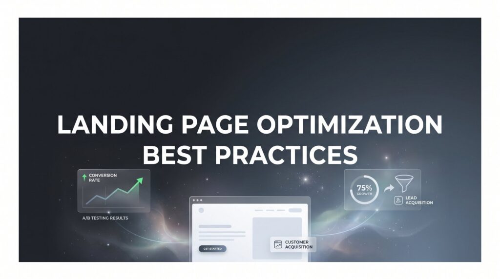
9. Test Relentlessly—Then Test Again
The Challenge It Solves
Every optimization decision made without data is a guess. Some guesses are educated. Some are lucky. But none of them compound over time the way disciplined testing does. The businesses that consistently outperform their competitors on conversion rates aren’t necessarily smarter. They’re just more systematic about learning what works.
The Strategy Explained
A/B testing, also called split testing, is the practice of running two versions of a page element simultaneously to see which one performs better. It’s the gold standard for landing page optimization, endorsed by virtually every CRO authority in the industry, from ConversionXL to Unbounce to Google itself.
The discipline is in the methodology. Test one element at a time. Run tests long enough to reach statistical significance. Document your results. Apply what you learn. Then test the next thing. Pairing this testing discipline with proven marketing ROI optimization strategies ensures every experiment moves the needle on your bottom line. This process, repeated consistently over months, produces compounding improvements that no single redesign can match.
Implementation Steps
1. Start with high-impact elements: headline, CTA button text, hero image, and form length. These typically produce the most meaningful results when tested.
2. Change only one element per test. If you change the headline and the button color at the same time, you won’t know which change drove the result.
3. Run each test until you have enough traffic and conversions to draw a statistically meaningful conclusion. Ending a test too early based on early results is one of the most common testing mistakes.
4. Keep a testing log that records what you tested, the hypothesis, the result, and what you’ll test next. This turns individual experiments into institutional knowledge.
Pro Tips
If your traffic volume is low, prioritize tests on the elements most likely to move the needle: the headline and CTA. Low-traffic pages need more time to reach significance, so be patient and resist the urge to call a winner too early. Platforms like Google Optimize alternatives, VWO, or built-in testing tools in landing page builders can simplify the technical setup considerably.
Bringing It All Together: Your Landing Page Optimization Roadmap
Nine strategies is a lot to absorb. The good news is you don’t need to implement all of them simultaneously. In fact, trying to do everything at once is a reliable way to do nothing well. Here’s the order that makes the most sense.
Start with page speed and mobile experience. These are foundational. A slow, broken mobile experience undermines every other optimization you make. Fix these first, and every subsequent improvement will land on a better foundation.
Next, tighten your message match and strip distractions. These structural changes directly affect whether visitors stay on the page long enough to evaluate your offer. They’re high-leverage and relatively fast to implement.
Then sharpen your copy, simplify your form, and optimize your CTA. This is where the real conversion work happens. The words on your page and the friction in your form are what ultimately determine whether a visitor becomes a lead.
Finally, layer in trust signals and build your testing cadence. Trust signals are the finishing touch that converts interested visitors into confident ones. And ongoing A/B testing is what turns a good landing page into a great one over time.
The critical mindset shift here is this: landing page optimization is not a one-time project. It’s an ongoing discipline. Every improvement compounds. A lift in conversion rate this month means more leads next month without a single additional dollar in ad spend. Over time, that compounds into a dramatically lower cost per acquisition and a much higher return on every campaign you run.
For local businesses investing in PPC, the landing page is the single biggest lever available for improving ROI without increasing budget. Most businesses focus almost entirely on the ad side and leave enormous value sitting on the table in their landing page experience.
Tired of spending money on marketing that doesn’t produce real revenue? At Clicks Geek, we build lead systems that turn traffic into qualified leads and measurable sales growth. If you want to see what this would look like for your business, we’ll walk you through how it works and break down what’s realistic in your market.