You’re spending money on ads, investing in SEO, and driving real traffic to your website. But the leads aren’t coming in. The phone isn’t ringing. Forms sit empty. You’ve checked your ad campaigns, questioned your targeting, maybe even blamed the market. Here’s the uncomfortable truth most local business owners don’t want to hear: your website might be actively repelling the customers you’re paying to attract.
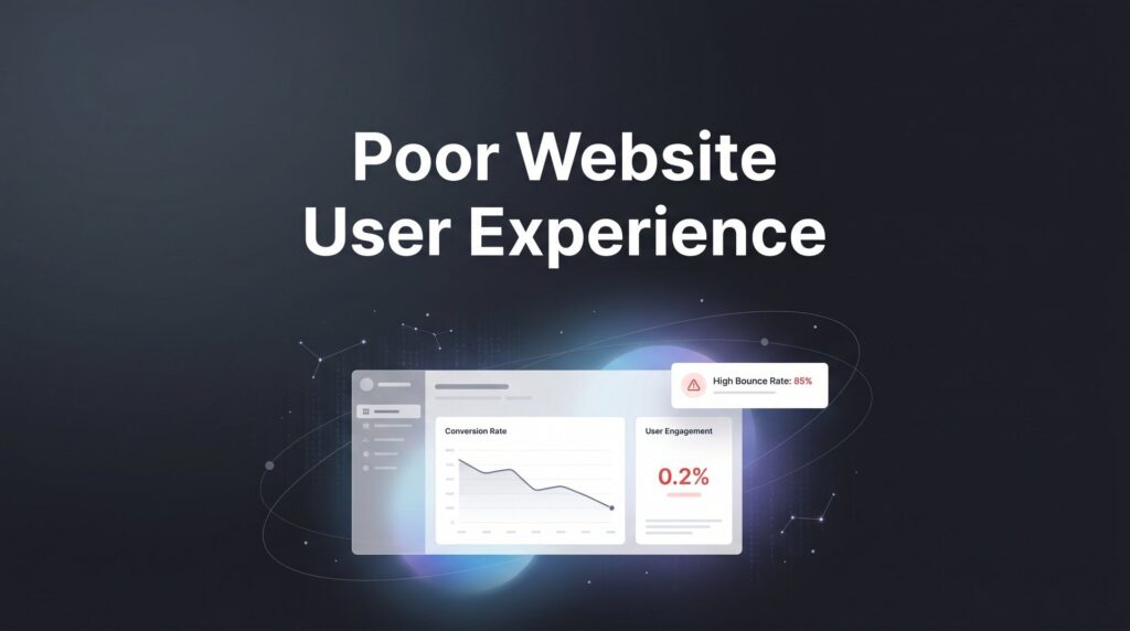
A poor website user experience is one of the most expensive and invisible problems a business can have. It silently kills conversions while you keep pouring money into traffic. Every confusing navigation menu, every slow-loading page, every buried phone number is costing you real revenue right now, today, without a single warning sign in your ad dashboard.
The frustrating part? Most UX problems follow completely predictable patterns. You don’t need a complete site redesign or a five-figure development budget to fix them. What you need is a clear, prioritized process to identify where your site is failing visitors and make targeted improvements that actually move the needle on leads and calls.
That’s exactly what this guide delivers. We’ll walk through seven practical steps to diagnose and fix the most damaging user experience problems on your site, from the way you audit your pages to how you build trust with skeptical visitors who’ve never heard of your business. Whether you run a plumbing company, a cleaning service, a law firm, or any other local business, these steps apply directly to your situation.
One important note before we dive in: you don’t have to tackle everything at once. Start with the steps that address your most obvious friction points. Even fixing one or two of these issues can produce noticeable improvements in how many visitors actually take action. The goal is progress, not perfection.
Let’s stop the bleeding.
Step 1: Audit Your Site Like a First-Time Visitor, Not the Owner
Here’s the problem with evaluating your own website: you know where everything is. You know that the contact form is under the “About” tab because that’s where you put it three years ago. You know your phone number is in the footer because you’ve seen it a hundred times. Your customers don’t know any of that, and they won’t stick around to figure it out.
Business owners are genuinely the worst judges of their own website’s usability. That’s not an insult, it’s a well-documented phenomenon. When you’re too close to something, you fill in gaps automatically. Your visitors can’t do that, and the moment they hit confusion, they leave.
Start with the five-second test. Pull up your homepage on your phone, hand it to someone who has never seen your business before, and ask them three questions: What does this company do? Where are they located? How do I contact them? If they can’t answer all three within five seconds, you have a serious UX problem. This test alone will reveal more than hours of internal review.
Next, set up session recording tools. Both Hotjar and Microsoft Clarity offer free tiers that let you watch real visitor sessions on your site. You’ll see where people scroll, where they click, where they get stuck, and where they give up. Watching a visitor rage-click on something that isn’t a link, or scroll past your phone number three times without noticing it, is genuinely eye-opening.
As you review sessions and do your own walkthrough, document every friction point in a simple spreadsheet. Include three columns: the page URL, the problem you observed, and a severity rating of high, medium, or low. High severity means it’s likely costing you leads directly. This approach mirrors the methodology used in a thorough website conversion audit, which helps you systematically find and fix revenue leaks.
Common red flags to look for include visitors scrolling past your call-to-action without clicking, people clicking on images or text that aren’t actually links, high bounce rates on your most important service pages, and visitors landing on your homepage and immediately leaving without going deeper into the site.
This audit is the foundation of everything that follows. Don’t skip it or rush through it. The more clearly you understand where your site is failing, the more precisely you can fix it.
Step 2: Fix Mobile Experience First, Because That’s Where Your Customers Are
If you’re building or evaluating your website on a desktop computer, you’re looking at it through the wrong lens. The majority of local business website traffic comes from mobile devices. Someone searching for a plumber, a dentist, or a cleaning service near them is almost certainly doing it from their phone, often in a moment of urgency. If your site isn’t built mobile-first, you’re losing the majority of your potential customers before they ever read a single word about your services.
Google has made mobile-first indexing the standard for all sites, which means Google primarily uses the mobile version of your site for ranking and indexing purposes. A site that looks beautiful on desktop but breaks on mobile is hurting your SEO and your conversions simultaneously.
Start by running your site through Google’s PageSpeed Insights tool. This free tool evaluates your Core Web Vitals, which are Google’s publicly documented performance signals: Largest Contentful Paint (LCP), Cumulative Layout Shift (CLS), and Interaction to Next Paint (INP). Google’s own benchmarks recommend an LCP under 2.5 seconds and a CLS score under 0.1. If you’re failing these thresholds on mobile, you have both a ranking problem and a user experience problem.
Beyond the technical scores, check your site manually for these common mobile failures:
Tap targets too small: Buttons and links need to be large enough to tap accurately with a finger. Tiny links crammed together cause mis-taps and frustration.
Text requiring pinch-to-zoom: If visitors have to zoom in to read your content, your font size or viewport settings need attention.
Horizontal scrolling: Content that extends beyond the screen width is a sign that your site isn’t properly responsive.
Images not sized for mobile: Large desktop images that simply scale down on mobile slow your load time and often display poorly.
One fix that pays off immediately: make your phone number a clickable tap-to-call button in the header. On mobile, a customer who wants to call you should be able to do it with one tap, not by scrolling to the footer, finding the number, copying it, and then dialing. If your website visitors aren’t calling, that extra friction is often the reason.
Finally, test on actual physical devices, not just your browser’s mobile emulator. Borrow a friend’s Android if you only have an iPhone, and vice versa. Real devices reveal rendering issues that emulators often miss.
Step 3: Slash Your Page Load Time Before Visitors Lose Their Patience
Slow pages are one of the fastest ways to destroy user experience. Visitors expect pages to load quickly, and many will abandon a page before it even finishes rendering if it takes too long. This isn’t impatience, it’s simply how people behave online when they have other options a tap away.
The biggest speed killers on local business websites tend to fall into a predictable set of categories. Uncompressed images are almost always the biggest culprit. A homepage hero image that’s 4MB in its original form has no business being served to mobile visitors on a cellular connection. Tools like ShortPixel or TinyPNG can compress images dramatically without visible quality loss, and many website platforms have plugins that automate this process.
After images, the next common problems are too many plugins or third-party scripts, cheap shared hosting that can’t handle traffic spikes, and bloated page builders that generate excessive code. Every third-party script you load, whether it’s a chat widget, an analytics tag, or a social media embed, adds to your page load time. Audit your scripts and remove anything you’re not actively using.
Here are the highest-impact speed improvements to prioritize:
Compress all images: Run every image on your site through a compression tool before uploading. Aim for file sizes under 200KB for most images.
Enable browser caching: This allows returning visitors to load your site faster because their browser stores certain files locally.
Lazy load below-the-fold images: Images that appear lower on the page don’t need to load until the visitor scrolls toward them. This makes the visible content load first and feel faster.
Upgrade your hosting if necessary: Shared hosting plans that cost a few dollars a month often can’t deliver the performance that converts visitors into customers. If your site is consistently slow, better hosting is often worth the investment.
After each fix, re-run PageSpeed Insights to measure the improvement. Speed issues are a leading contributor to a high bounce rate website problem, so don’t try to fix everything simultaneously. Tackle one change at a time so you can clearly see what’s making a difference and prioritize accordingly.
Step 4: Simplify Navigation So Visitors Find What They Need in Two Clicks
A navigation menu with fifteen items isn’t helpful, it’s overwhelming. When visitors are faced with too many choices, they often make no choice at all and leave. This is a well-established principle in user experience design: cognitive overload reduces task completion. The more decisions you force people to make, the less likely they are to take any action.
For most local service businesses, your navigation doesn’t need to be complicated. Aim for five to seven top-level items maximum. A structure like Services, About, Service Areas, Reviews, and Contact covers the majority of what a prospective customer needs to find. If you have multiple service categories, use a simple dropdown rather than listing every service as a top-level menu item.
Every page on your site should answer one clear question: what do you want the visitor to do next? If you can’t answer that question instantly when you look at a page, your structure needs work. Each page should have a clear purpose, a clear audience, and a clear next step.
As you audit your navigation, look for these common problems:
Orphan pages: Pages that exist on your site but aren’t linked from anywhere in your navigation or other content. Visitors can’t find them, and search engines give them little weight.
Outdated content: Old blog posts, expired promotions, or service pages for things you no longer offer create confusion and erode trust.
Redundant sections: Multiple pages covering the same topic in slightly different ways create dead ends and dilute your SEO.
Add breadcrumbs to your pages so visitors always know where they are in your site structure. Include internal links within your content so people can naturally move from one relevant page to another without hitting the back button repeatedly. When your website conversion rates are low, confusing navigation is often a primary culprit that needs addressing before anything else.
Step 5: Redesign Your Calls-to-Action So They Actually Get Clicked
If your call-to-action is a small “Contact Us” link buried in the footer, you’re leaving significant revenue on the table. Calls-to-action are the bridge between a visitor who’s interested and a lead who’s actually in your pipeline. When that bridge is weak, invisible, or confusing, people fall through the gap.
The first fix is language. Generic CTAs like “Submit” or “Contact Us” don’t tell visitors what they’re getting or why they should act. Benefit-driven language performs better because it speaks to what the visitor actually wants. “Get Your Free Quote” is more compelling than “Submit.” “Schedule My Service Call” is clearer than “Contact Us.” “Claim Your Free Estimate” creates a sense of value that a generic button label never could.
The second fix is placement. Visitors decide to take action at different points in their reading. Some are ready to contact you after reading your headline. Others need to read through your services, your reviews, and your about page before they’re ready. This means your primary CTA needs to appear multiple times on every important page:
Above the fold: Visible without scrolling, so visitors who are ready to act immediately can do so.
After key selling points: Following your service descriptions or testimonials, when interest is at its peak.
At the bottom of every page: For visitors who read everything before deciding.
The third fix is your forms. Every extra field you add to a contact form reduces the number of people who complete it. This is a well-established principle in conversion optimization. For most local businesses, you need three fields at most: name, phone number, and a brief description of what they need. If you’re asking for address, budget range, how they heard about you, and preferred appointment time all on the same form, you’re creating unnecessary friction.
Finally, make your CTA buttons visually impossible to miss. Use a color that contrasts strongly with the rest of your page. If you’re getting clicks but struggling to convert, learning how to improve your website conversion rate through strategic CTA design is one of the highest-leverage changes you can make. Don’t make people hunt for the next step.
Step 6: Build Trust Signals That Overcome Visitor Skepticism
Here’s something that often gets overlooked in UX discussions: poor user experience isn’t just about speed and navigation. It’s also about whether visitors trust you enough to take action. A local business website that loads quickly and has clear CTAs will still fail to convert if visitors don’t feel confident that you’re legitimate, professional, and worth calling.
Think about it from the visitor’s perspective. They found you through a search or an ad. They’ve never heard of you. They’re about to hand over their phone number or invite someone into their home. Trust isn’t optional, it’s a prerequisite for conversion.
The most effective trust signal for local businesses is social proof, and the most valuable form of social proof is Google reviews. Don’t make visitors navigate to a separate reviews page to find them. Display your star rating and a selection of real reviews prominently on your homepage and on your individual service pages. The people who need convincing aren’t going to hunt for your testimonials.
Beyond reviews, display relevant trust badges where they’re visible. If you’re a Google Partner agency, show that badge. If you’re BBB accredited, display it. Industry certifications, licensing information, and proof of insurance all matter to visitors who are evaluating whether to trust you with their home, their business, or their money. When your website traffic isn’t converting, missing trust signals are frequently the hidden cause.
Photography is another often-underestimated trust factor. Real photos of your team, your vehicles, your work, and your actual location build credibility in ways that stock photography simply cannot. Local customers want to know who’s showing up at their door. A smiling headshot of your actual technician or consultant is worth more than a polished stock image of a person in a hard hat.
Two technical trust signals that are now baseline requirements: make sure your site has an SSL certificate so it loads over HTTPS, and include a brief privacy statement near your contact forms. Chrome and other browsers display “Not Secure” warnings for HTTP sites, and those warnings actively deter visitors from filling out forms or calling. If your site still shows that warning, fixing it is urgent.
Step 7: Measure, Test, and Iterate Because UX Work Is Never Finished
You’ve made improvements. You’ve fixed the mobile issues, sped up your pages, simplified navigation, redesigned your CTAs, and added trust signals. Now comes the part that separates businesses who see lasting results from those who see a temporary bump: tracking, testing, and continuing to improve.
Start by setting up Google Analytics 4 conversion tracking if you haven’t already. Without tracking, you’re flying blind. You need to know whether your changes are actually producing more leads and calls, not just whether the site looks better to you. Set up conversion events for form submissions, phone number clicks, and any other actions that represent a lead for your business.
The key metrics to monitor on an ongoing basis include:
Bounce rate by page: Which pages are losing visitors immediately? High bounce rates on key service pages indicate a mismatch between what visitors expected and what they found.
Conversion rate by device: Are you converting mobile visitors at a similar rate to desktop visitors? A large gap usually signals remaining mobile UX issues.
Form completion rate: How many people start filling out your form versus how many actually submit it? Drop-offs in the middle of a form often indicate the form is too long or asking for information people aren’t comfortable sharing.
Average session duration: Are visitors engaging with your content or leaving after a few seconds?
Once you have baseline data, run simple A/B tests on your highest-traffic pages. Test one CTA headline against another. Test a shorter form versus a longer form. Test a different hero image or a different headline. Change one variable at a time so you can clearly attribute any change in performance to a specific test. Exploring the best CRO tools can help you run these experiments efficiently without needing a developer.
Schedule a quarterly UX review on your calendar. Revisit your session recordings, check your speed scores, and look for new friction points that may have appeared as your site evolves. UX is not a one-time project. It’s an ongoing process of observation, hypothesis, and improvement.
If you’ve implemented all of these steps and your bounce rate remains high while conversions stay flat, that’s a signal that the issues may run deeper than surface-level fixes. At that point, investing in professional CRO services for websites is worth serious consideration.
Your Next Steps: Stop Losing Leads to a Broken Experience
A poor website user experience doesn’t just frustrate visitors. It directly costs you customers and wastes every dollar you spend driving traffic to a site that doesn’t convert. The steps in this guide give you a clear, prioritized path to fix the most damaging UX problems without a complete overhaul.
Here’s your quick-reference checklist to keep things moving:
1. Audit your site through fresh eyes using session recordings from Hotjar or Microsoft Clarity and document every friction point.
2. Fix mobile experience first: tap-to-call in the header, proper responsive design, and passing Core Web Vitals on mobile.
3. Get page load times under control: compress images, minimize scripts, and upgrade hosting if necessary.
4. Simplify navigation to five to seven items and give every page a clear next step.
5. Make CTAs prominent, benefit-driven, and repeated at multiple scroll depths on every important page.
6. Add trust signals where visitors actually see them: reviews on service pages, real photos, and HTTPS sitewide.
7. Set up GA4 conversion tracking and commit to quarterly reviews and ongoing testing.
You don’t need to do everything at once to see results. Start with the fixes that address your biggest friction points first. And if you’re currently running paid ads to a site with UX problems, fixing the experience will often improve your return on ad spend more than increasing your budget ever could. Traffic without conversion is just an expensive way to educate visitors who end up calling your competitor.
At Clicks Geek, we help local businesses turn their websites into lead-generating assets through conversion rate optimization and high-performance PPC campaigns. If you want to see what this would look like for your business, we’ll walk you through how it works and break down what’s realistic in your market.