Your ads are dialed in, your targeting is sharp, and you’re sending qualified traffic to your site — but leads still aren’t coming through. Sound familiar? The problem almost always lives on the landing page.
For local businesses spending real money on PPC and paid social, a poorly optimized landing page is like a leaky bucket. No matter how much you pour in, results drain away before they ever reach your bottom line.
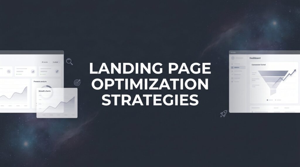
Landing page optimization isn’t about making things prettier. It’s about engineering every element on the page to move a visitor toward one specific action. Whether you’re a plumber trying to book more service calls or a roofer looking to fill your pipeline, the eight strategies below will help you turn more clicks into customers.
At Clicks Geek, conversion rate optimization is at the core of everything we build. These aren’t theoretical ideas pulled from a marketing textbook. They’re the same approaches we use to generate real leads and real revenue for local businesses every day.
1. Match Your Message to the Ad That Brought Them There
The Challenge It Solves
When someone clicks your ad and lands on a page that feels disconnected from what they just read, their instinct is to leave immediately. That disconnect, even when subtle, breaks trust before you’ve had a chance to earn it. For local businesses paying per click, every one of those bounces is money wasted.
The Strategy Explained
Message match means your landing page headline, offer, and language directly mirror the ad copy that drove the click. If your ad says “Same-Day Roof Repairs in Denver,” your landing page headline should say exactly that, or something very close to it. The visitor should feel a seamless transition, not a jarring shift.
This principle extends beyond headlines. The tone, the offer details, and even the imagery should align with the promise your ad made. When visitors see the same language that attracted them in the first place, they feel reassured they’re in the right place, and that reassurance is what keeps them on the page long enough to convert. Understanding what makes a high converting landing page starts with this fundamental alignment between ad and page.
Implementation Steps
1. Pull your top-performing ad copy and compare it side-by-side with your current landing page headline. If they don’t match closely, rewrite the headline first.
2. Create dedicated landing pages for each ad group or campaign rather than sending all traffic to a generic homepage. Specificity builds trust.
3. Review the offer, subheadline, and hero image to ensure they all reinforce the same core promise your ad made.
Pro Tips
Use dynamic text replacement if your platform supports it, so the landing page automatically reflects the search term or ad variation that drove the click. For Google Ads campaigns, this level of specificity can meaningfully reduce your bounce rate and improve Quality Score at the same time.
2. Craft a Single, Unmissable Call-to-Action
The Challenge It Solves
Most landing pages fail not because they ask too little of visitors, but because they ask too much. Navigation menus, multiple buttons, social media icons, and competing offers all pull attention in different directions. When everything is a priority, nothing is. Visitors get confused and leave without doing anything.
The Strategy Explained
A high-converting landing page has one goal and one CTA. Every element on the page, the headline, the body copy, the images, the testimonials, should funnel the visitor toward that single action. For most local service businesses, that action is either submitting a lead form or calling a phone number.
Remove the navigation menu entirely. Strip out links that lead visitors away from the page. If you have secondary CTAs, make sure they lead to the same action, just positioned differently on the page. Think of your landing page as a hallway with one door at the end. Your job is to remove all the side exits. A strong sales funnel optimization approach treats every page element as a step toward that single conversion goal.
Implementation Steps
1. Identify your single conversion goal before you touch anything else. Is it a phone call, a form submission, or a booked appointment?
2. Remove the site navigation header from your landing page template. This alone often produces a noticeable lift in conversions.
3. Audit every link and button on the page. If it doesn’t lead to your primary conversion action, remove it or replace it with a CTA button.
Pro Tips
Your CTA button text matters more than most people realize. “Get My Free Estimate” outperforms “Submit” because it reinforces value and feels personal. Write your CTA copy from the visitor’s perspective, not yours.
3. Eliminate Page Load Drag Before Anything Else
The Challenge It Solves
You can have the most compelling offer and the sharpest copy in your market, but if your page takes too long to load, most visitors will never see it. Page speed is one of those silent conversion killers that rarely gets the attention it deserves until someone runs the numbers and realizes how much business they’ve been losing.
The Strategy Explained
Google’s own research, published on Think with Google, has shown that as page load time increases, the probability of a visitor bouncing increases substantially. Their 2018 mobile benchmarks study found that 53% of mobile site visits are abandoned if pages take longer than three seconds to load. Three seconds. That’s not much runway.
For local businesses running paid traffic, slow pages mean you’re paying for clicks that never convert because visitors bail before the page even renders. Speed optimization is the foundation everything else is built on. If you’re already investing in PPC campaign optimization, ignoring page speed undermines every dollar you spend.
Implementation Steps
1. Run your landing page through Google PageSpeed Insights and Google’s Core Web Vitals report. These free tools will identify your biggest speed issues immediately.
2. Compress all images before uploading. Tools like TinyPNG or Squoosh can reduce file sizes dramatically without visible quality loss.
3. Minimize third-party scripts, tracking pixels, and plugins. Each one adds load time. Audit what’s actually necessary and cut the rest.
Pro Tips
Switch to a fast, lightweight hosting provider if your current setup is sluggish. Shared hosting is often the hidden culprit behind slow load times. For landing pages running paid traffic, the hosting investment pays for itself quickly when conversion rates improve.
4. Build Trust Above the Fold with Social Proof
The Challenge It Solves
Local service businesses face a specific trust challenge: prospects don’t know you yet, and they’re about to let a stranger into their home or business. Skepticism is the default state. If your landing page doesn’t immediately address that skepticism, visitors will quietly close the tab and call someone else.
The Strategy Explained
Robert Cialdini’s foundational research on influence, published in “Influence: The Psychology of Persuasion,” identifies social proof as one of the six core principles of human persuasion. People look to what others have done to decide what they should do. For local businesses, Google reviews, star ratings, and real testimonials are the most powerful form of social proof available.
The key is placement. Don’t bury your reviews at the bottom of the page where only motivated visitors scroll. Put your star rating and a strong testimonial above the fold, where every visitor sees it immediately. Trust badges like Google Guaranteed, BBB accreditation, or industry certifications belong there too. Businesses that invest in website conversion rate optimization know that trust elements above the fold consistently outperform those hidden below it.
Implementation Steps
1. Display your Google review star rating and total review count prominently in the hero section of your landing page. Specificity builds credibility, so “4.9 stars from 127 reviews” is stronger than a generic badge.
2. Select two or three testimonials that address specific objections or outcomes. A review that says “They showed up same-day and fixed the problem in two hours” is worth ten generic five-star ratings.
3. Add relevant trust badges near your CTA, where purchase anxiety tends to peak.
Pro Tips
Use real names and, when possible, photos with your testimonials. Anonymous reviews carry significantly less weight than ones attributed to a real person. Always get permission before using a customer’s name or image.
5. Design for Thumb-First, Desktop-Second
The Challenge It Solves
The majority of “near me” and local service searches happen on mobile devices. If your landing page was designed primarily for desktop and then squeezed into a mobile view as an afterthought, you’re creating friction at the exact moment someone is ready to reach out. A clunky mobile experience kills conversions quietly and consistently.
The Strategy Explained
Mobile-first design means building the page experience around how someone actually uses a smartphone, which is with their thumb. Buttons need to be large enough to tap without precision. The most important content and CTA should be visible without scrolling. Forms should be minimal and easy to fill on a small keyboard.
Google completed its shift to mobile-first indexing across all websites, which means mobile experience also affects how your page performs in organic search. But for paid traffic, the conversion impact is even more direct. A dedicated mobile ad optimization service can help ensure your campaigns and landing pages are fully aligned for smartphone users.
Implementation Steps
1. Test your landing page on an actual mobile device, not just a resized browser window. Scroll through it. Try to tap the buttons. Fill out the form. Note every moment of friction.
2. Add a sticky click-to-call button that remains visible as visitors scroll. For local service businesses, phone calls are often the highest-quality leads.
3. Increase tap target sizes for all buttons and links. A button that’s too small forces visitors to zoom in and try again, which breaks momentum.
Pro Tips
Reduce the amount of text visible on mobile. What reads well on a desktop becomes a wall of copy on a phone screen. Use shorter paragraphs, larger font sizes, and more visual breaks to keep mobile visitors engaged.
6. Reduce Form Friction to the Bare Minimum
The Challenge It Solves
Every field you add to a form is another reason for a visitor to stop and reconsider. Long forms signal that you’re prioritizing your own data collection over the prospect’s time. For local service businesses where the goal is simply to start a conversation, asking for too much information upfront creates unnecessary barriers between you and a potential customer.
The Strategy Explained
It’s a well-established UX principle that reducing form fields tends to improve completion rates. The specific impact varies by industry and context, but the underlying logic is consistent: the less work required, the more people follow through. For most local service businesses, a name, phone number, and a brief description of the need are all that’s required to start the conversation.
If your service genuinely requires more information before you can respond, consider a multi-step form. Breaking a longer form into two or three short steps feels less intimidating than presenting all the fields at once. The first step captures contact information, which means even if someone drops off midway, you have enough to follow up. Choosing the right landing page builders for conversions can make implementing multi-step forms significantly easier.
Implementation Steps
1. Audit your current form and ask this question about every field: “Can we have a productive first conversation without this?” If yes, remove it.
2. For complex services, build a multi-step form where step one captures name and phone number, and subsequent steps gather service details.
3. Add a reassuring line near the submit button, something like “No spam. We’ll reach out within one business hour.” It reduces the perceived risk of submitting.
Pro Tips
Test phone-only capture for high-intent campaigns. Sometimes the most effective form is simply a name and phone number field with a “Call Me Now” button. For local service businesses, a live phone call is often worth more than a form submission anyway.
7. Use Urgency and Scarcity Without Being Sleazy
The Challenge It Solves
Visitors who don’t convert today rarely come back tomorrow. Without a reason to act now, most people tell themselves they’ll think about it, close the tab, and move on to the next option. Urgency and scarcity address this inertia directly, but only when they’re genuine. Fake countdown timers and manufactured scarcity have become so common that visitors recognize them immediately, and they destroy trust instead of building it.
The Strategy Explained
Real urgency exists in most local service businesses. You have limited appointment slots. You offer same-day service windows that fill up. You run seasonal promotions with actual end dates. You have a team of a specific size that can only handle a certain number of jobs per week. These are legitimate, honest reasons to act now, and they’re more persuasive than any fake timer because they’re true.
Communicate these real constraints clearly. “We have three open slots this week for HVAC tune-ups” is compelling because it’s verifiable and specific. A seasonal offer with a real calendar deadline gives visitors a concrete reason to decide today instead of later. Pairing this approach with smart ad creative optimization ensures the urgency message is consistent from the ad through to the landing page.
Implementation Steps
1. Identify real capacity constraints in your business. How many jobs can you take per week? How many open slots do you have this month? Use those real numbers in your copy.
2. Build seasonal offers around genuine timing. A heating company offering a pre-winter inspection discount in October has a natural, believable reason for the deadline.
3. If you offer same-day or next-day service, make that a prominent feature of your CTA. “Book by noon for same-day service” is both urgent and genuinely useful to the prospect.
Pro Tips
Be specific rather than vague. “Limited availability” is easy to dismiss. “Two open slots remaining this week” creates a mental picture of scarcity that feels real. Specificity signals honesty, and honesty converts.
8. Run Continuous A/B Tests on High-Impact Elements
The Challenge It Solves
Gut instinct and design preferences are not a reliable guide to what converts. What looks great to you might underperform compared to something simpler. Without testing, you’re making permanent decisions based on temporary assumptions, and small conversion improvements left on the table add up to significant lost revenue over time.
The Strategy Explained
A/B testing means creating two versions of a page element, changing only one variable, and measuring which version produces more conversions. The discipline of changing one variable at a time is critical. If you change the headline, the button color, and the hero image simultaneously, you’ll never know which change drove the result.
Start with the highest-impact elements: your headline, your CTA button text, your hero image, and your form length. These are the variables that move the needle most. Tools like VWO, Optimizely, and even Google Ads experiments make A/B testing accessible for businesses of all sizes. For a deeper dive into testing methodology, our guide on landing page split testing walks through the process in detail. The key is patience: wait for statistical significance before declaring a winner and moving on.
Implementation Steps
1. Prioritize what to test first by identifying the element on your page that visitors interact with most and that has the most direct impact on conversions. Your headline and CTA are almost always the right starting points.
2. Set up your test with a clear hypothesis: “If we change the CTA from ‘Submit’ to ‘Get My Free Estimate,’ more visitors will click it because it communicates value.” Testing with intent produces better insights than random experimentation.
3. Let the test run until you reach statistical significance, typically at least a few hundred conversions per variation, before making a decision. Calling a winner too early leads to false conclusions.
Pro Tips
Document every test you run, including the hypothesis, the result, and what you learned. Over time, this testing log becomes a competitive asset. You’ll start to understand your specific audience’s preferences in ways that no general best practice can teach you.
Your Optimization Action Plan
These eight strategies work best when approached in sequence rather than all at once. Start with the foundations that produce the quickest wins: message match and page speed. These two fixes alone can meaningfully improve performance without requiring a full page rebuild.
From there, layer in social proof, mobile optimization, and form reduction. Once that foundation is solid, add genuine urgency elements and commit to ongoing A/B testing. That last part is where the compounding gains come from.
Here’s the bottom line: landing page optimization isn’t a one-time project. It’s an ongoing discipline. Every percentage point you improve in conversion rate means more leads from the same ad spend, which translates directly to revenue growth. The businesses that treat their landing pages as living, testable assets consistently outperform those that set them and forget them.
If you’re tired of spending money on marketing that doesn’t produce real revenue, this is the work that changes that. If you want to see what this would look like for your business, we’ll walk you through how it works and break down what’s realistic in your market. Clicks Geek builds and optimizes landing pages that convert for local businesses across the country. Let’s turn your traffic into customers.