Most landing pages leak money. A business owner spends real budget driving traffic through PPC, SEO, or social ads, and then sends visitors to a page that fails to convert. The result: expensive clicks that go nowhere, a campaign that looks active but produces nothing, and a growing suspicion that “digital marketing just doesn’t work for us.”
Here’s the reality: the traffic isn’t the problem. The destination is.
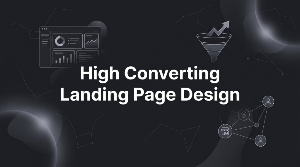
A high converting landing page design isn’t about making something pretty. It’s about building a focused, persuasive experience that guides a visitor toward one specific action: calling your business, filling out a form, or booking an appointment. Every element on the page either supports that action or gets in the way of it. There is no neutral.
This guide walks you through exactly how to build that page, step by step. Whether you’re designing from scratch or overhauling an underperforming page, these steps apply directly to local businesses that need real leads, not just traffic. The same framework applies whether you’re running a plumbing company, a dental practice, a law firm, or any other local service business investing in paid or organic traffic.
By the end, you’ll know how to structure your page, write copy that converts, choose the right visual elements, build trust with prospects, and set up testing so your page keeps improving over time. No fluff, no guesswork. Just a proven framework used by performance-driven marketers to turn ad spend into actual revenue.
Let’s get into it.
Step 1: Lock Down Your One Goal and One Audience
Before you write a single word of copy or choose a single image, you need to answer two questions with absolute clarity: What is the one action this page must drive? And who, specifically, is this page talking to?
This sounds obvious. It rarely gets done properly.
Define your single conversion action. A high converting landing page has one job. That job is either to get a phone call, collect a form submission, drive a booking, or prompt a download. Pick one. Never mix multiple competing calls-to-action on a conversion-focused page. When visitors have too many options, they often choose none. A page asking visitors to “call us, fill out the form, follow us on Instagram, or check out our blog” is a page designed to confuse, not convert.
Identify your specific audience segment. A landing page for a homeowner searching “emergency plumber near me” needs completely different messaging than one targeting a property manager looking for a maintenance contract. The pain points differ. The decision-making process differs. The language that resonates differs. One page cannot serve both audiences well.
This is where many local businesses go wrong: they build one generic page and send all their traffic to it. If you’re running PPC campaigns to different audience segments, build separate landing pages for each. It takes more time upfront, but the conversion lift more than justifies the effort.
Write your one-sentence value proposition. Before the page goes live, you should be able to complete this sentence: “This page helps [specific audience] get [specific outcome] by [your service], even if [common objection].” This single sentence becomes the foundation for every piece of copy on the page. If your headline, your benefits section, and your CTA all flow from this core statement, your page will have the kind of coherence that converts.
Match your page goal to your traffic source. PPC campaigns, Facebook ads, and organic SEO each bring visitors with different intent levels. Someone clicking a Google Search ad for “roof repair near me” is in active buying mode. Someone who saw a Facebook ad for a home improvement tip is in discovery mode. The page that converts the first visitor will not convert the second. Mismatched messaging between traffic source and landing page is one of the most common and costly mistakes in local business marketing.
Success indicator: You can describe your page’s purpose in one sentence. “This page converts HVAC homeowners in [city] into booked service calls.” If you can’t write that sentence, the page isn’t ready to build yet.
Step 2: Build a Headline That Stops the Scroll
Your headline is doing more work than any other element on your page. It’s the first thing visitors read, it takes roughly three seconds to make an impression, and it either earns the next scroll or loses the visitor entirely. Everything else on the page depends on the headline doing its job.
Most local business landing pages fail here. They lead with the company name, a generic tagline, or something vague like “Professional Services You Can Trust.” These headlines say nothing. They answer no questions. They give the visitor no reason to keep reading.
Use a proven headline structure. One formula that consistently performs in local service marketing combines three elements: the outcome the visitor wants, a timeframe or qualifier that adds specificity, and an objection removal that reduces hesitation. For example: “Get a Licensed Electrician to Your Home Today — No Service Call Fees.” That headline tells the visitor exactly what they get, when they get it, and removes a common concern before they even think to ask.
Message match is non-negotiable. If your Google Ad says “Free Roof Inspection,” your landing page headline must echo that exact promise. This principle, called message match, is one of the most impactful factors in both conversion rate and Google Ads Quality Score. When a visitor clicks an ad with a specific promise and lands on a page that says something different, their brain registers a disconnect. That disconnect creates doubt, and doubt kills conversions. The ad and the page must feel like one continuous conversation.
Write a supporting subheadline. Your main headline makes the promise. Your subheadline earns the next few seconds of attention by expanding on that promise with specificity. Add a key differentiator, a secondary benefit, or a piece of social proof that reinforces why this business is the right choice. “Serving [City] homeowners for over 15 years — fully licensed, insured, and available 7 days a week” is a subheadline that does real work.
Avoid the generic trap. “Welcome to Our Website,” “Your Trusted Local Partner,” and “Quality Service at Competitive Prices” are not headlines. They are placeholders. Every word on your landing page should be earning its space. If a phrase could appear on any competitor’s page without changing, cut it and replace it with something specific to your business and your offer.
Plan to test from day one. Write at least two headline variations before you launch. Small wording changes, a different benefit emphasis, a different qualifier, can produce meaningful differences in how visitors respond. You won’t know which performs better until you test. Build that expectation into your process from the start.
Success indicator: Your headline immediately answers the visitor’s unspoken question: “Am I in the right place, and can this business solve my problem?” If it does both, the visitor scrolls. If it doesn’t, they leave.
Step 3: Structure Your Page Layout for Conversion Flow
A well-written headline gets visitors to scroll. A well-structured page layout guides them all the way to your CTA. The two work together, and you need both.
Above the fold must work on its own. The content visible before a visitor scrolls, your above-the-fold section, needs to contain four elements: your headline, your subheadline, a relevant visual, and your primary CTA. A visitor should be able to understand what you offer, why it matters to them, and how to take action without scrolling a single pixel. This is especially critical on mobile, where screen real estate is limited and attention spans are short.
Use the Problem-Agitate-Solution structure for your body copy. Start by acknowledging the visitor’s pain point in language that shows you understand their situation. Then make them feel the weight of that problem, what happens if it goes unresolved, what the stress looks like, what the cost is. Then position your service as the clear, logical answer. This structure works because it meets visitors where they are emotionally before it asks them to act.
Place your CTA in multiple locations. Your call-to-action should appear above the fold, again after your benefits section, and once more near the bottom of the page. Don’t make visitors hunt for a way to contact you. Every time they finish reading a section and feel a moment of “yes, this is what I need,” there should be a CTA right there to capture that momentum.
Remove navigation and exit points. A landing page is not your website. It has one job. Every navigation link, social media icon, or unrelated page link is an exit door that takes visitors away from your conversion goal. Strip the page down. Remove the header navigation. Remove the footer links. Keep only what serves the conversion. This single change often produces a noticeable improvement in conversion rates for businesses that test it.
Use visual hierarchy to guide the eye. Large, bold headlines draw attention first. Clear section breaks signal transitions. Bullet points make benefits scannable for visitors who are skimming rather than reading. White space prevents cognitive overload and makes the page feel trustworthy rather than chaotic. Visual hierarchy isn’t a design preference; it’s a conversion tool.
Include local trust signals in visible locations. For local businesses, your service area, a clickable phone number, and your business address should appear prominently on the page. Visitors searching for local services want confirmation that you actually serve their area. Don’t make them dig for it.
Success indicator: A first-time visitor can understand your offer, see your CTA, and find your contact information within five seconds of landing on the page. If it takes longer than that, the layout needs work.
Step 4: Write Benefit-Driven Copy That Speaks to Real Pain Points
Features tell. Benefits sell. This is one of the oldest principles in copywriting, and it’s consistently ignored by local businesses that default to listing credentials, certifications, and service features instead of explaining what those things mean for the customer.
“Licensed and insured” is a feature. “You’re protected if anything goes wrong” is a benefit. “Same-day service available” is a feature. “Your problem gets solved today, not next week” is a benefit. The difference isn’t semantic. It’s the difference between copy that resonates and copy that gets skimmed and forgotten.
Use the language your customers actually use. Pull copy directly from Google reviews, customer service calls, and inquiry emails. When prospects read words that mirror their own thoughts and concerns, trust builds almost automatically. If your reviews say things like “they showed up on time and didn’t leave a mess,” your copy should address reliability and cleanliness directly. That’s what your customers care about. That’s what your copy should lead with.
Structure your benefits section clearly. Aim for three to five concise bullet points, each addressing a specific concern or desire your target audience has. Keep each bullet to one sentence. Lead with the benefit, not the feature. “No surprise fees — you get a firm quote before we start any work” addresses the price anxiety that stops many local service customers from picking up the phone.
Address objections directly in the copy. The top objections for most local service businesses are price, timing, trust, and service area. Don’t wait for the prospect to wonder about these. Answer them proactively in your copy. “We serve [city] and surrounding areas” removes the geographic concern. “Most jobs completed same day” removes the timing concern. “Free quotes with no obligation” removes the price anxiety. Handle objections in the copy, and you remove the mental friction that stops people from converting.
Write your CTA with action-oriented language. “Get My Free Quote” outperforms “Submit.” “Call Now for Same-Day Service” outperforms “Contact Us.” The CTA button is not a formality. It’s the final push that turns a reader into a lead. Make it specific, make it benefit-oriented, and make it feel like the obvious next step.
Write for mobile skimmers. Keep paragraphs to two or three sentences maximum. Long blocks of text lose readers, especially on mobile. Writing high-converting copy means treating every sentence as something that must earn the next one. Short sentences. Clear points. No fluff.
Success indicator: Your copy makes the visitor feel understood before it tries to sell them anything. If the copy leads with empathy and answers the question “why should I choose you?” with specifics rather than generalities, it’s doing its job.
Step 5: Add Trust Elements That Eliminate Hesitation
You can have a perfect headline, a clean layout, and compelling copy, and still lose the conversion. The reason is almost always trust. A visitor who doesn’t trust you will not hand over their phone number or their email address, regardless of how good your offer is. For local service businesses especially, trust is the primary barrier between a visitor and a lead.
Use real, attributed customer reviews. Generic testimonials without names, photos, or specific details are largely ignored. Visitors have seen too many fabricated reviews to take them seriously. What converts is a specific review from a real person: full name, ideally a photo, and a review that describes a problem they had and a result your business delivered. “John helped us fix a burst pipe at 11pm and had everything cleaned up before midnight. Couldn’t recommend more highly. — Sarah T., [City]” is a review that does conversion work. “Great service, would recommend!” is not.
Display relevant trust badges near your CTA. Google Partner status, BBB accreditation, industry certifications, awards, and years in business all signal credibility. Place these near your call-to-action button, where hesitation tends to peak. A visitor who is almost ready to submit a form but feels a flicker of doubt needs a trust signal right at that moment. Positioning matters as much as the badge itself.
Add a real face to the page. People buy from people. A headshot of the business owner or a team photo humanizes your business in a way that no logo or brand color ever will. It signals that there’s a real person behind the service, someone accountable, someone who cares about the outcome. This is particularly powerful for home service businesses where a stranger is entering a customer’s home.
Include a guarantee. A satisfaction guarantee, a response time guarantee, or a price-match guarantee directly reduces the perceived risk of contacting you. The customer is asking themselves: “What happens if this goes wrong?” Your guarantee answers that question before they ask it. The goal isn’t to give away your margin; it’s to remove the hesitation that’s stopping someone from picking up the phone.
Show social proof numbers that are real and verifiable. Years in business, number of customers served, number of five-star reviews. These numbers carry weight when they’re genuine. Avoid invented or vague claims. “Trusted by thousands” means nothing. “Over 400 five-star Google reviews” is specific and verifiable, and it converts. If you want to attract high quality leads consistently, social proof is one of the most powerful tools at your disposal.
Feature recognizable local associations. If you work with well-known local brands, organizations, or have been featured in local media, display those logos. Third-party association builds credibility through proximity. It signals that others have already vetted you.
Success indicator: A skeptical visitor scrolling your page should encounter at least three distinct trust signals before reaching your CTA. If your page can’t pass that test, add more trust elements before you send paid traffic to it.
Step 6: Optimize for Mobile and Page Speed
Everything covered so far matters significantly less if your page loads slowly or breaks on a phone. The majority of local business search traffic arrives on mobile devices. A landing page that looks polished on a desktop monitor but malfunctions on a smartphone is losing a large share of its potential leads before they even read your headline.
Test on multiple mobile screen sizes. Don’t just check your page on your own phone. Test on smaller screens. Check that your CTA button is large enough to tap easily with a thumb. Confirm that your form fields are spaced correctly so users don’t accidentally tap the wrong field. Verify that your text is readable without zooming. Make sure your phone number is a clickable “tel:” link so users can call directly from the page with one tap. These details feel minor until you realize how many conversions they’re costing you.
Page load speed is a conversion and cost issue. Slow pages cost you money in two ways: lost conversions from impatient visitors who leave before the page finishes loading, and higher cost-per-click from reduced Quality Scores in Google Ads. Google factors landing page experience into its Quality Score calculation, which directly affects how much you pay per click. A faster page earns better placement at lower cost. Speed optimization is not optional for businesses running paid traffic.
Compress images and clean up your code. Oversized images are the most common cause of slow landing pages. Compress every image before uploading. Use modern image formats where your platform supports them. Remove unnecessary scripts, third-party plugins, and tracking pixels that aren’t actively serving your conversion goal. Every unnecessary element adds load time.
Use Google’s PageSpeed Insights. It’s a free tool that analyzes your page and identifies specific performance issues ranked by impact. Address the highest-impact items first. You don’t need a perfect score, but you should be aiming for a page that loads in under three seconds on a mobile connection. Beyond that threshold, a meaningful portion of visitors will leave before the page finishes loading.
Keep your form short. Every additional field you add to a lead form reduces the completion rate. For most local businesses, name, phone number, and one qualifying question is enough to generate a quality lead and follow up effectively. You don’t need to qualify the prospect completely through the form. Your sales process handles the rest. High form abandonment rates are almost always a sign that the form is asking for too much too soon. The form’s job is to get the contact, not to close the deal.
Success indicator: Your landing page loads in under three seconds on a mobile connection, your form can be completed with one hand on a smartphone, and every interactive element, buttons, phone numbers, form fields, works correctly on small screens.
Step 7: Set Up Tracking and Run Your First A/B Test
Here’s where most local businesses stop short. They build a decent page, send traffic to it, and then make changes based on gut feel or aesthetic preference. That approach produces random results. What you want is a page that systematically improves over time based on real data, and that requires proper tracking from day one.
Install conversion tracking before the first visitor arrives. At minimum, you need Google Analytics 4 on your page, Google Ads conversion tracking if you’re running PPC, and call tracking if phone leads are a primary goal. These tools are non-negotiable. Without them, you’re flying blind. You won’t know which traffic sources are converting, which page elements are working, or whether your changes are helping or hurting.
Define what counts as a conversion. Form submissions should redirect to a dedicated thank-you page. This makes tracking clean and reliable: a visit to the thank-you page equals a completed form. Phone calls should be tracked with dynamic number insertion, which swaps your displayed phone number based on the traffic source, allowing you to attribute calls to specific campaigns. Clarity in what you’re measuring is the foundation of everything that follows.
Identify your first A/B test before you launch. The highest-impact elements to test first are your headline, your CTA button text and color, your hero image, and your form length. These elements have the most direct influence on whether visitors convert. Start with the headline. Write two versions with different angles: one leading with the outcome, one leading with the offer. Run both simultaneously and let the data tell you which resonates more with your audience.
Test one element at a time. If you change the headline, the button color, and the hero image simultaneously, you’ll have no idea which change caused the shift in conversion rate. Isolate your variables. One test, one change, one clear answer. This discipline is what separates businesses that actually improve their pages from businesses that just keep redesigning them. A landing page split testing service can help you build this discipline into your process from the start.
Wait for statistical significance. Making decisions based on small sample sizes leads to false conclusions. If your page has received 50 visitors, you don’t have enough data to declare a winner. Most A/B testing tools will indicate when you’ve reached statistical significance. Respect that threshold. Acting too early on incomplete data is one of the most common mistakes in conversion optimization.
Document every test you run. Record what you tested, your hypothesis going in, the result, and what you plan to test next. This documentation builds institutional knowledge that compounds over time. Six months from now, you’ll have a clear picture of what works for your specific audience, your specific market, and your specific offer. That’s a competitive advantage that’s very difficult to replicate.
Success indicator: You have a documented testing roadmap, conversion tracking is installed and verified, and your conversion rate shows consistent improvement month-over-month based on data-driven changes rather than opinions.
Putting It All Together: Your Landing Page Checklist
A high converting landing page design isn’t a one-time project. It’s an ongoing system. You start with a clear goal and a defined audience, build a page that communicates your value instantly, earns trust, and removes friction at every step. Then you measure, test, and improve. The page you launch is not the page you’ll have six months from now, and that’s exactly how it should work.
For local businesses investing in PPC, lead generation, or any paid traffic channel, a well-built landing page is the difference between ad spend that generates revenue and ad spend that disappears. Every dollar you put into driving traffic works harder when the destination is built to convert.
Use this checklist to audit your current page or build your next one:
✅ Single goal and defined audience
✅ Headline with strong message match to your traffic source
✅ Above-the-fold CTA visible on mobile without scrolling
✅ Benefit-driven copy that addresses real objections
✅ Minimum three trust signals positioned near the CTA
✅ Mobile-optimized with page load under three seconds
✅ Conversion tracking installed and first A/B test planned
If you work through each of these steps honestly, your page will outperform the majority of local business landing pages currently running in your market. Most of your competitors are sending paid traffic to generic pages with weak headlines and no trust signals. That’s your opportunity.
Tired of spending money on marketing that doesn’t produce real revenue? Clicks Geek builds lead systems that turn traffic into qualified leads and measurable sales growth. If you want to see what this would look like for your business, we’ll walk you through how it works and break down what’s realistic in your market.