You’re driving traffic. Your ads are clicking. People are landing on your page, starting to fill out your form, and then vanishing. If your form abandonment rate is too high, you’re essentially paying to bring leads to the finish line and watching them walk away before they cross it.
For local businesses spending real money on PPC and lead generation, every abandoned form represents lost revenue. And the frustrating part? Most form abandonment isn’t caused by disinterested visitors. It’s caused by friction: unnecessary fields, confusing layouts, slow load times, or a lack of trust signals that make people second-guess hitting “submit.”
The good news is that form abandonment is one of the most fixable conversion problems you’ll encounter. Unlike broad brand awareness challenges or complex SEO campaigns that take months to move the needle, reducing form abandonment often comes down to a handful of tactical changes that deliver measurable results fast.
Think about it this way: you’ve already done the hard work. You’ve built the campaigns, earned the clicks, and gotten someone onto your landing page. They’re interested enough to start filling out your form. That’s not a cold lead. That’s someone who raised their hand, and something in your form experience made them put it back down.
The six steps in this guide are designed to help you diagnose exactly what’s causing that drop-off and fix each issue systematically. We’ll cover how to measure the problem accurately, how to streamline your form fields, how to eliminate UX friction, how to build trust right where the form lives, how to align your form with your traffic source, and how to test and monitor your way to steady improvement.
By the end, you’ll have a clear action plan to turn more of your hard-won traffic into actual leads and customers. Let’s start where every good fix starts: with data.
Step 1: Measure Your Current Form Abandonment Rate (So You Know What You’re Fixing)
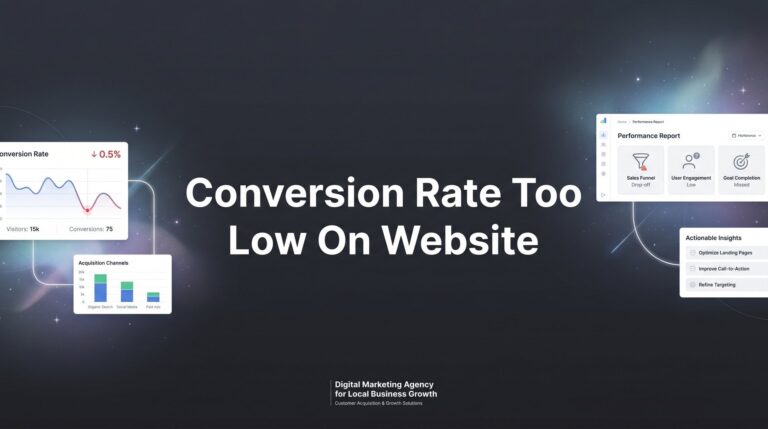
Before you change a single field or button color, you need to understand exactly where people are dropping off. “My form abandonment rate is too high” is a starting point, not a diagnosis. The real question is: which field is killing you?
Form abandonment rate is the percentage of users who interact with your form (click into a field, start typing) but never complete and submit it. The calculation is straightforward: divide the number of users who started the form by the number who submitted it, subtract from 100, and you have your abandonment rate. A high number tells you there’s a problem. Field-level data tells you where.
Setting Up Tracking in Google Analytics 4: GA4 uses event-based tracking, which makes form interaction data more accessible than older versions of Analytics. You can use the built-in form interaction events (form_start and form_submit) to capture when users begin and complete your forms. If these aren’t firing automatically, you’ll want to configure them through Google Tag Manager using custom triggers tied to your specific form fields.
Going Deeper with Session Recording Tools: Google Analytics tells you the numbers. Tools like Hotjar or Microsoft Clarity (which is free) show you the behavior. Session recordings let you watch actual users interact with your form in real time. Heatmaps show where people click, scroll, and stop. You’ll often find patterns quickly: a specific field where the cursor lingers before the tab closes, or a point in the form where users scroll up and then leave. For a deeper dive into analytics platforms, check out our guide to the best CRO tools compared for options worth exploring.
Field-Level Drop-Off Analysis: This is where the real insights live. If you’re using a form tool like Gravity Forms, Typeform, or HubSpot Forms, many of these platforms have built-in analytics showing completion rates per field. Set this up before making any changes. You want to know whether people are abandoning at the first field, the fifth field, or right before the submit button.
Establish Your Baseline: Document your current form abandonment rate before touching anything. Write it down. This number is your benchmark. Every change you make in the steps that follow should be measured against it. Without a baseline, you’re flying blind and you won’t know whether your fixes are actually working.
Once you have your tracking in place and your baseline established, you’re ready to start making changes with confidence.
Step 2: Slash Unnecessary Form Fields to the Bare Minimum
Here’s a hard truth: most forms ask for far more information than they actually need at the point of first contact. Every additional field you add is another micro-decision you’re asking your visitor to make. And every micro-decision increases the chance they’ll decide to bail instead.
The question to ask about every single field on your form is this: do we absolutely need this information before the first conversation? Not “would it be nice to have.” Not “our CRM has a spot for it.” Does the business genuinely require this data before a salesperson can make a meaningful first call?
Common Fields to Cut: Fax number (if you’re still asking for this, stop immediately). Company size. “How did you hear about us?” (you should know this from your UTM parameters). Full mailing address for a service inquiry. Job title for a local service business lead. These fields feel logical from an internal data perspective, but from the visitor’s perspective, they signal that this form is going to take effort.
What Most Local Businesses Actually Need: For the majority of local service businesses, name plus phone number or email plus one qualifying question is genuinely enough to initiate a sales conversation. Your sales team can gather everything else on the call. The form’s job is to get the lead into your pipeline, not to complete the intake process. If you’re struggling to fill that pipeline in the first place, our guide on how to attract high quality leads covers the upstream strategies that feed your forms.
Consider Multi-Step Forms: If you genuinely need more information, a multi-step or wizard-style form can dramatically reduce perceived effort. Instead of showing all fields at once (which looks like a wall of work), you break the form into two or three short screens. Step one might just be name and contact info. Step two might be one qualifying question. The progress indicator creates a sense of momentum and commitment, and users who complete step one are much more likely to finish.
The 30-Second Test: Pull up your form on your phone and time yourself filling it out. If it takes longer than 30 seconds to complete, you have too many fields. This is a quick gut check that often reveals problems immediately. Better yet, hand your phone to someone who has never seen the form and watch them fill it out without coaching them.
Trimming your form to the essentials is often the single highest-impact change you can make. Start here before anything else.
Step 3: Eliminate the UX Friction That Kills Momentum
Even a short form can bleed leads if the experience of filling it out is clunky. UX friction is anything that makes the form feel harder to complete than it should be. On mobile especially, small friction points compound quickly.
Mobile Optimization Is Non-Negotiable: The majority of local search traffic arrives on phones. If your form isn’t fully optimized for mobile, you’re handing away a significant portion of your leads before they even start. Test your form on multiple devices. Check that fields are large enough to tap accurately, that the form doesn’t require horizontal scrolling, and that the submit button is visible without zooming. A poorly optimized mobile experience also contributes to a high bounce rate on landing pages, compounding your losses.
Use the Right Input Types: This is a small technical detail that makes a big practical difference. When a phone number field uses the “tel” input type, mobile devices automatically show a numeric keypad instead of a full keyboard. When an email field uses the “email” input type, the keyboard shows the “@” symbol prominently. These small adjustments reduce the effort required to fill out each field. Check your form’s HTML or ask your developer to confirm the correct input types are in place.
Inline Validation Saves Frustration: Traditional form validation waits until the user hits submit to show errors, then flags everything at once. This is a terrible experience. Inline validation shows the user whether their input is correct as they move between fields. If someone enters an invalid email address, they see the error immediately, fix it, and move on. They don’t fill out the entire form only to get a wall of red error messages at the end and abandon in frustration.
Rethink Your CAPTCHA: Traditional CAPTCHAs that ask users to identify fire hydrants or click a checkbox introduce friction for real users while doing imperfect work against bots. If you’re using a standard CAPTCHA, consider switching to Google’s invisible reCAPTCHA, which runs its verification in the background without requiring any user interaction. This alone can recover a meaningful number of completions.
Fix Your Submit Button: “Submit” is the most passive, uninspiring button label you can use. Replace it with action-oriented text that reinforces the value: “Get My Free Quote,” “Book My Consultation,” “Start My Free Trial.” The button should be visually prominent, a contrasting color that stands out from the rest of the page, and large enough to tap easily on mobile. These kinds of details are core to understanding what makes a high converting landing page work.
Critical Pitfall to Avoid: Never let your form reset all fields when a single error is detected. This is one of the most infuriating experiences a user can have on a form, and it causes immediate abandonment. Confirm with your developer that your form preserves all entered data when showing validation errors.
Step 4: Build Trust Right Where the Form Lives
People abandon forms when they don’t trust where their information is going. This is especially true for local businesses competing in markets where consumers have been burned by sketchy contractors, fly-by-night services, or spam-heavy lead generation sites. Trust signals placed strategically near your form can be the difference between a submission and a back-button click.
Add Trust Signals Adjacent to the Form: Don’t bury your credibility indicators in your footer or on a separate “About” page. Place them directly beside or below the form where the user is making their decision. A Google reviews badge showing your star rating, a Better Business Bureau accreditation logo, a Google Premier Partner badge (if applicable), or industry certification logos all communicate legitimacy at the exact moment it matters most.
Include a Clear Privacy Statement: A single short line near the submit button does a lot of work: “We’ll never share your information. No spam, ever.” It sounds simple, but it directly addresses the hesitation many users feel about handing over their contact details. Keep it brief and genuine. A lengthy privacy policy link doesn’t have the same effect as a plain-language reassurance.
Show Social Proof in the Form Area: Numbers of customers served, a short testimonial from a real client, or a star rating pulled from Google reviews all reinforce that other people have trusted you and had good experiences. For local businesses in particular, a quote from a recognizable neighborhood or city name (“We’ve helped over 400 homeowners in the Dallas area”) creates immediate relevance and credibility. These trust-building tactics are part of a broader website conversion rate optimization approach that pays dividends across every page on your site.
Display Local Contact Information: A visible local phone number and physical address near your form signals that you’re a real, established business. This is particularly powerful for local service businesses because it answers the implicit question visitors are asking: “Is this a real company I can hold accountable?” A P.O. box or no address at all raises doubt. A real street address and local area code builds confidence.
Use Real Photos, Not Stock Images: Generic stock photos of smiling people in suits erode trust because everyone recognizes them as fake. Photos of your actual team, your real office or storefront, or your work in action create an authentic impression that stock imagery simply cannot replicate. If you’re investing in paid traffic, invest a few hours in getting real photography for your landing pages.
Step 5: Match Your Form to Your Traffic Source and Offer
One of the most overlooked causes of high form abandonment is a mismatch between what your ad promised and what the form delivers. When there’s a gap between expectation and experience, visitors feel deceived or confused, and they leave.
Think about it from the visitor’s perspective. They clicked an ad that said “Get a Free Quote in 60 Seconds.” They land on a page with a 12-field form that doesn’t mention the free quote anywhere. That disconnect creates immediate doubt. Did they click the right link? Is this going to be as simple as the ad suggested? The uncertainty alone is enough to cause abandonment.
Echo Your Ad Language in the Form Headline: If your ad says “Free Roof Inspection, No Obligation,” your form headline should say exactly that, or something very close. “Request Your Free Roof Inspection” is far more compelling than “Contact Us” or “Get in Touch.” The language continuity reassures the visitor that they’re in the right place and that the offer they clicked for is still on the table.
Segment Forms by Intent: A “Book a Consultation” form and a “Download Our Guide” form serve completely different visitor intents and should look completely different. The consultation form might need a phone number and a preferred time. The guide download might only need an email address. Forcing every visitor through the same form regardless of where they came from or what they’re looking for is a significant source of unnecessary friction.
Reinforce the Value Proposition Beside the Form: The space directly above or beside your form is prime real estate. Use it to remind the visitor what they’re getting and why it’s worth a few seconds of their time. A short bullet list of three benefits, a single strong headline, or a brief testimonial all serve this purpose. Don’t let the form sit in a visual vacuum with no supporting context.
Tie This to Your Overall Paid Search Strategy: Consistent messaging from keyword to ad to landing page to form is a fundamental principle of high-converting PPC campaigns. Every disconnect in that chain costs you conversions. When you review your forms, pull up the ads and landing pages that drive traffic to them. Read them in sequence the way a visitor would. If anything feels jarring or inconsistent, that’s where you’re losing people. Our breakdown of paid search advertising strategies covers how to build that consistency from keyword selection all the way through to conversion.
Step 6: A/B Test, Iterate, and Monitor Continuously
The first five steps will almost certainly improve your form completion rate. But “almost certainly” isn’t a strategy. The only way to know what’s actually working in your specific context, with your specific audience, is to test systematically and let the data guide your decisions.
Test One Variable at a Time: This is the cardinal rule of A/B testing. If you change the button text, the form headline, and the number of fields all at once, you’ll have no idea which change drove the improvement (or caused a drop). Isolate one variable per test. Start with the changes most likely to have the biggest impact: number of fields, submit button text, form headline, and form placement on the page are all strong candidates for your first tests.
Choose the Right Testing Tool: Google Optimize was sunset, so if you’re looking for alternatives, VWO, Convert, and Optimizely are all solid options for running controlled A/B tests on landing pages and forms. Many form platforms also have built-in split testing features worth exploring. Our comparison of conversion rate optimization tools and consultants can help you decide whether software or expert guidance is the right fit for your testing needs.
Run Tests Long Enough to Matter: This is where many businesses go wrong. They run a test for three days, see one version slightly ahead, and declare a winner. Statistical significance requires enough data to be confident the result isn’t random noise. As a general rule, run tests until you have a meaningful sample size from each variant and a confidence level you’re comfortable acting on. Rushing this process leads to false conclusions that can actually hurt your conversion rate.
Set Up Ongoing Monitoring: Form optimization isn’t a one-time project. Build a simple dashboard (in GA4, Looker Studio, or your preferred analytics tool) that tracks form starts versus completions on a weekly basis. You want to catch drops quickly. A form that was converting well can suddenly start leaking leads because of a site update, a new traffic source, or a seasonal change in visitor intent. If you’re also seeing your cost per lead climbing too high, form abandonment is often a hidden contributor worth investigating alongside your ad spend.
Document Everything and Scale What Works: Keep a running log of every test you run, what you changed, the result, and what you concluded. When you find a pattern that consistently improves completions (shorter forms, specific button text, a particular trust signal placement), apply that learning across all your forms and landing pages. Your wins should compound over time, not stay isolated to a single page.
Measure improvement over 30, 60, and 90-day windows. Steady progress in that timeframe is a strong signal that your optimization efforts are working.
Your Quick-Reference Checklist: Stop Losing Leads at the Finish Line
Form abandonment is a conversion rate optimization problem with clear, fixable causes. Here’s a condensed checklist of everything we’ve covered so you can move through each step with focus:
Step 1: Measure First. Set up form interaction tracking in GA4 and install a session recording tool like Microsoft Clarity. Establish your baseline abandonment rate before changing anything. Identify the specific fields where users are dropping off.
Step 2: Cut the Fields. Audit every field and remove anything that isn’t absolutely necessary before the first conversation. Aim for a form that takes under 30 seconds to complete. Consider multi-step forms if you genuinely need more information.
Step 3: Fix the UX. Test your form on mobile. Use correct input types. Implement inline validation. Remove or replace traditional CAPTCHA. Write an action-oriented submit button. Ensure your form never resets on error.
Step 4: Add Trust Signals. Place Google reviews, certifications, and partner logos adjacent to the form. Add a plain-language privacy statement. Include a local phone number and address. Use real photos instead of stock imagery.
Step 5: Match the Message. Echo your ad language in the form headline. Segment forms by visitor intent. Reinforce the value proposition beside the form. Audit the full path from ad to form for consistency.
Step 6: Test and Monitor. A/B test one variable at a time. Use a proper testing tool and wait for statistical significance. Build a weekly monitoring dashboard. Document your wins and apply them broadly.
Start with Step 1 because you genuinely cannot improve what you don’t track. Measurement gives every other step its meaning. And remember: every percentage point you recover in form completion rate translates directly to more leads and more revenue from the exact same ad spend you’re already deploying.
If diagnosing and fixing form issues feels overwhelming, or if you want an expert eye on your entire lead generation funnel, this is exactly the kind of conversion rate optimization work we do at Clicks Geek. If you want to see what this would look like for your business, we’ll walk you through how it works and break down what’s realistic in your market, no pressure, no fluff.
The leads are already coming to your door. Let’s make sure they walk through it.