Most small businesses pour money into driving traffic—but watch helplessly as 97% of visitors leave without taking action. You’re investing in Google Ads, Facebook campaigns, and SEO, watching the visitor counter climb, yet your phone stays silent and your inbox remains empty.
The problem isn’t your traffic; it’s your conversion rate.
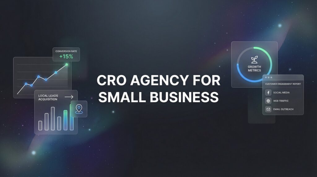
A specialized CRO agency for small business focuses on turning your existing visitors into paying customers, often delivering dramatic results without increasing your ad spend by a single dollar. While your competitors obsess over getting more clicks, smart businesses optimize what happens after the click.
This guide reveals the exact strategies professional CRO agencies use to transform underperforming websites into lead-generating machines. Whether you’re considering hiring a CRO partner or want to implement these tactics yourself, you’ll discover actionable approaches that work specifically for small business budgets and goals.
Think of conversion rate optimization as fixing the holes in your bucket before you pour in more water. Every visitor represents money you’ve already spent. Making those visitors convert is the fastest path to profitable growth.
1. Data-Driven Landing Page Optimization
The Challenge It Solves
Your landing page gets traffic, but visitors bounce within seconds. You’ve invested in design, written what you thought was compelling copy, and still—nothing. The challenge is that you’re guessing what works instead of knowing what converts.
Most small business owners design landing pages based on personal preferences or what competitors are doing. This approach ignores the most important voice: your actual customers. Without data, you’re essentially throwing darts in the dark and hoping something sticks.
The Strategy Explained
Data-driven landing page optimization uses systematic A/B testing and user behavior analysis to make evidence-based improvements. Instead of redesigning based on opinions, you test specific elements against each other and let real user behavior guide your decisions.
Professional CRO agencies start by installing heat mapping tools to see exactly where visitors click, how far they scroll, and where they abandon the page. This reveals the gap between what you think is important and what visitors actually engage with.
The magic happens when you combine quantitative data (clicks, scrolls, conversions) with qualitative insights (user recordings, feedback). You might discover that visitors never scroll far enough to see your key benefits, or that they’re clicking on elements that aren’t even links because they expect them to be.
Then comes systematic testing. Change one element at a time—headline, hero image, call-to-action button, form placement—and measure the impact. This disciplined approach prevents the common mistake of changing everything at once and never knowing what actually drove improvement.
Implementation Steps
1. Install a heat mapping tool like Hotjar or Microsoft Clarity to track user behavior on your landing pages. Let it collect data for at least two weeks or 1,000 visitors before drawing conclusions.
2. Identify your biggest drop-off points by reviewing session recordings and heat maps. Look for patterns: Do visitors leave after reading the headline? Do they scroll past your form without engaging? Are they clicking on non-clickable elements?
3. Create a testing hypothesis based on your findings. For example: “If we move the lead form above the fold, conversion rates will increase because heat maps show 60% of visitors never scroll down.”
4. Run your A/B test using tools like Google Optimize or Convert. Test one variable at a time and let the test run until you reach statistical significance—typically requiring at least 100 conversions per variation.
5. Implement the winning variation and immediately start your next test. Optimization is continuous, not a one-time project.
Pro Tips
Start with high-impact elements first: headline, primary call-to-action, and hero section. These influence visitor decisions within the first five seconds. Don’t waste time testing button colors until you’ve optimized these fundamental elements.
Small businesses often lack the traffic volume for traditional A/B testing. In these cases, use sequential testing: run version A for two weeks, then version B for two weeks, and compare results. While less statistically rigorous, it’s better than guessing.
2. Mobile-First Conversion Design
The Challenge It Solves
Your website looks stunning on your desktop monitor, but mobile visitors face a frustrating experience of tiny buttons, unreadable text, and forms that require zooming and panning. Meanwhile, the majority of your traffic comes from smartphones.
Many small businesses still design for desktop and treat mobile as an afterthought. This creates conversion barriers that silently kill your results. A visitor trying to fill out your contact form on their phone during lunch break gives up after the third time they accidentally tap the wrong field.
The Strategy Explained
Mobile-first conversion design means rebuilding your conversion paths specifically for how people actually use smartphones. This isn’t just about responsive design that shrinks your desktop layout—it’s about rethinking the entire user journey for thumbs, smaller screens, and distracted attention.
Professional CRO agencies approach mobile conversion differently than desktop. They recognize that mobile users have different contexts, behaviors, and patience levels. Someone researching on their laptop might read three paragraphs; someone on their phone during a commute needs information in scannable chunks.
The strategy prioritizes thumb-friendly tap targets, simplified navigation that doesn’t require precision clicking, and forms optimized for mobile keyboards. Every element considers the reality of one-handed phone use while standing in line or sitting in traffic.
Smart mobile-first design also leverages mobile-specific features. Click-to-call buttons that work with one tap. Location-based offers that use GPS. Mobile wallets for instant payment. These aren’t available on desktop, yet many small businesses ignore them entirely.
Implementation Steps
1. Audit your mobile conversion path by completing your own lead form on your smartphone. Note every frustration: Do you have to zoom to read text? Are buttons too small to tap accurately? Does the keyboard cover important fields?
2. Increase all tap target sizes to at least 44×44 pixels (Apple’s recommended minimum). This includes buttons, form fields, and navigation elements. Test by using your site with your non-dominant hand—if you misclick, your targets are too small.
3. Simplify your mobile form by removing non-essential fields and using mobile-optimized input types. Use “tel” for phone numbers to trigger the numeric keypad, “email” for email addresses to show the @ symbol prominently.
4. Add a prominent click-to-call button at the top of your mobile pages. For service businesses, many mobile visitors prefer calling over filling out forms. Make this action effortless with a single tap.
5. Test your mobile checkout or lead capture process in real-world conditions: while standing, with one hand, in bright sunlight. If you struggle, your customers definitely struggle.
Pro Tips
Use sticky call-to-action buttons that remain visible as users scroll. Mobile screens are small, and visitors shouldn’t have to scroll back up to find your contact button. Keep your conversion path always within thumb’s reach.
Consider that mobile users often research on their phone but convert later on desktop. Add features like “email me this quote” or “text me the details” to bridge this gap and capture leads even when immediate conversion isn’t convenient. This approach is essential for businesses focused on getting more customers through every channel.
3. Trust Signal Integration
The Challenge It Solves
Visitors land on your site, read your offer, and then leave to “think about it.” They’re interested but not convinced. The missing ingredient isn’t better pricing or flashier design—it’s trust. Small businesses especially struggle with this because they lack the brand recognition of established competitors.
Every visitor arrives with skepticism. They’ve been burned before by businesses that overpromised and underdelivered. Your job is to overcome this natural resistance by proving you’re legitimate, competent, and reliable—preferably within the first thirty seconds of their visit.
The Strategy Explained
Trust signal integration involves strategically placing social proof, credentials, and risk-reversal elements throughout your conversion path. This isn’t about cluttering your page with every badge you can find—it’s about positioning the right trust signals at the exact moments when doubt creeps in.
Professional CRO agencies understand that different trust signals work for different visitor concerns. Someone worried about quality needs customer reviews. Someone concerned about legitimacy wants to see certifications and credentials. Someone afraid of making a mistake needs guarantees and clear return policies.
The strategy maps trust signals to specific objections in your conversion funnel. Near your pricing? Show a money-back guarantee. Next to your contact form? Display recent customer testimonials. On your about page? Highlight industry certifications and years in business.
For local small businesses, community-based trust signals often outperform generic credentials. Being a member of the local chamber of commerce, sponsoring youth sports teams, or having reviews from recognizable local customers carries more weight than national certifications.
Implementation Steps
1. Collect customer testimonials systematically by emailing satisfied customers immediately after project completion. Ask specific questions: What problem did we solve? What result did you achieve? What almost stopped you from hiring us? Specific testimonials convert better than generic praise.
2. Add review snippets near your primary call-to-action buttons. When someone is about to click “Get a Quote,” seeing a testimonial from someone like them reduces last-second hesitation. Match the testimonial to the visitor’s likely concern.
3. Display relevant credentials and certifications prominently on service pages. If you’re a Google Premier Partner, show the badge. If you’ve been in business for twenty years, state it clearly. These details matter more than you think.
4. Implement a guarantee that removes risk from the buying decision. This might be a money-back guarantee, a free trial period, or a satisfaction promise. The specific guarantee matters less than demonstrating you stand behind your work.
5. Add “as featured in” logos if you’ve been mentioned in local media, industry publications, or podcasts. Even small mentions build credibility and separate you from competitors who have no external validation.
Pro Tips
Use photos with testimonials whenever possible. A review with a real person’s face converts significantly better than anonymous text. If customers are hesitant about photos, first names and city locations still add authenticity.
Update trust signals regularly to show recent activity. A testimonial from 2019 suggests you haven’t had happy customers lately. Fresh reviews from the past few months prove you’re actively delivering results right now. This ongoing effort is part of building a sustainable lead generation strategy that compounds over time.
4. Form Friction Reduction
The Challenge It Solves
Your contact form asks for twelve pieces of information because your sales team wants complete lead data. Meanwhile, potential customers see that long form and decide it’s not worth the effort. You’re losing leads before they even start typing.
Every form field represents a small decision and a small barrier. Ask yourself: would you fill out a form requiring your full address, company size, budget range, timeline, and detailed project description just to get a simple quote? Most visitors won’t either.
The Strategy Explained
Form friction reduction is the art of capturing leads while asking for the absolute minimum information necessary. The goal isn’t just shorter forms—it’s removing every unnecessary obstacle between a visitor’s interest and their conversion.
Professional CRO agencies start by questioning every single form field. Does your sales team really need the company name upfront, or can they ask during the follow-up call? Is the budget field helping qualify leads, or is it scaring away prospects who haven’t decided on a budget yet?
The strategy recognizes that you can always gather more information later. Your form’s job is to capture the lead, not to conduct a complete intake interview. Get the name and email (or phone number), then build the relationship through follow-up.
Smart friction reduction also improves the experience of required fields. Use inline validation that confirms correct entry immediately. Provide helpful placeholder text. Make error messages specific and friendly. Every small improvement removes a reason to abandon.
Implementation Steps
1. Audit your current form and mark each field as either “absolutely necessary to start the conversation” or “nice to have.” Be ruthless. If your sales team can ask it during the first phone call, remove it from the form.
2. Reduce your lead form to a maximum of three fields: name, email, and one qualifying question. For service businesses, consider name and phone number if your sales process relies on calls. Test whether removing even one field increases submissions.
3. Implement smart defaults and helpful placeholder text. Instead of a blank “Message” field, use placeholder text like “Tell us about your project…” to reduce the mental effort of starting to type.
4. Add inline validation that shows a green checkmark when fields are completed correctly. This positive reinforcement encourages form completion and catches errors before the visitor clicks submit.
5. Use a single-column layout for your form. Multi-column forms look compact but increase completion time and error rates. Stack fields vertically for the smoothest completion experience.
Pro Tips
Consider using a two-step form for complex offers. The first step asks just for an email address. After submission, the second step requests additional details. This approach captures the lead before asking for more commitment.
Test whether your form even needs a submit button label beyond “Submit” or “Send.” Clever button copy like “Get My Free Consultation” sometimes helps, but often the simplest approach works best. Let testing guide this decision. Many businesses struggling with inconsistent lead generation find that form optimization alone dramatically improves their results.
5. Page Speed Performance Optimization
The Challenge It Solves
Your beautifully designed landing page takes six seconds to load. By the time your hero image appears, half your visitors have already hit the back button. You’re paying for clicks that never even see your offer.
Slow page speed doesn’t just frustrate visitors—it actively kills conversions. Every additional second of load time increases abandonment rates. Visitors on mobile connections, which typically have slower speeds than desktop, suffer even more from bloated pages.
The Strategy Explained
Page speed performance optimization focuses on technical improvements that make your pages load faster, particularly targeting Core Web Vitals and mobile performance. This isn’t about making pages look faster—it’s about actually delivering content to visitors in under three seconds.
Professional CRO agencies treat page speed as a conversion factor, not just an SEO concern. They understand that visitors form impressions within milliseconds, and a slow-loading page signals unprofessionalism before your content even appears.
The strategy prioritizes above-the-fold content loading first. Visitors should see your headline, primary image, and call-to-action immediately, even if elements further down the page take another second to appear. This perceived speed matters as much as actual load time.
Smart optimization also considers the entire user experience. A page that loads quickly but then jumps around as images load (poor Cumulative Layout Shift) frustrates visitors just as much as slow loading. Stability and speed work together to create smooth experiences.
Implementation Steps
1. Test your current page speed using Google PageSpeed Insights and GTmetrix. Run tests on both desktop and mobile, since mobile performance often lags significantly. Note your Core Web Vitals scores: Largest Contentful Paint, First Input Delay, and Cumulative Layout Shift.
2. Compress and optimize all images on your landing pages. Use tools like TinyPNG or ImageOptim to reduce file sizes without visible quality loss. Convert images to modern formats like WebP when possible. Oversized images are the most common speed killer for small business sites.
3. Implement lazy loading for images below the fold. This technique loads only the images visible in the viewport, deferring others until the visitor scrolls down. Your hero section loads instantly while the rest loads progressively.
4. Minimize and combine CSS and JavaScript files. Each separate file requires a separate server request, slowing down your page. Use tools provided by your hosting platform or plugins to handle this automatically if you’re not technical.
5. Enable browser caching and consider a content delivery network (CDN) if your audience is geographically dispersed. These technical improvements help repeat visitors and reduce server load.
Pro Tips
Focus first on your highest-traffic landing pages and conversion pages. Optimizing your homepage matters less than optimizing the pages where you actually drive paid traffic and expect conversions. This is especially critical if you’re running Google Ads campaigns where every click costs money.
Test page speed on an actual mobile device using a 3G connection, not just desktop tools. Many small business owners optimize based on their office WiFi experience, missing how slow their pages are for mobile visitors on cellular networks.
6. Conversion-Focused Copy Audits
The Challenge It Solves
Your website copy talks about your services, your process, and your company history. Visitors read it and think, “That’s nice, but what’s in it for me?” The disconnect happens because you’re focused on what you do instead of what problems you solve.
Most small business websites suffer from inside-out thinking. You know your services intimately, so you describe them in industry terms and feature-focused language. Your visitors, however, don’t care about features—they care about whether you can solve their specific problem.
The Strategy Explained
Conversion-focused copy audits use voice-of-customer research to rewrite your messaging in the exact language your customers use to describe their problems and desired outcomes. This transformation shifts your copy from company-centric to customer-centric.
Professional CRO agencies conduct customer interviews and mine reviews to discover the actual words customers use. When a customer says they were “drowning in spreadsheets” or “losing sleep over cash flow,” those phrases become headlines because they resonate with other prospects experiencing the same pain.
The strategy replaces vague benefits with specific, measurable outcomes. Instead of “improve your marketing,” you write “get qualified leads calling you instead of chasing prospects who never respond.” The second version paints a clear picture and speaks to a specific frustration.
Smart copy audits also address objections directly in the copy. If customers typically worry about implementation time, your copy proactively addresses it: “fully operational in 48 hours, not three months.” This prevents objections from forming in the first place.
Implementation Steps
1. Interview five recent customers about their experience before hiring you. Ask: What problem were you trying to solve? What words did you use when searching for a solution? What almost stopped you from contacting us? What result did you achieve? Record these conversations if possible.
2. Mine your customer reviews, testimonials, and support tickets for recurring phrases and pain points. Create a document of actual customer language—these phrases will become your new headlines and benefit statements.
3. Rewrite your headlines to focus on outcomes rather than processes. Transform “Professional CRO Services” into “Turn More Visitors Into Customers Without Spending More on Ads.” The second version immediately communicates value.
4. Replace feature descriptions with benefit-driven explanations. Instead of “We use advanced heat mapping tools,” write “We’ll show you exactly where visitors get confused and leave, so you can fix the real problems instead of guessing.”
5. Add specificity to vague claims. Change “fast turnaround” to “initial recommendations within 48 hours.” Replace “affordable pricing” with “packages starting at $2,500.” Specific claims build more trust than generic promises.
Pro Tips
Read your copy out loud as if explaining your service to a friend at a coffee shop. If it sounds like marketing jargon or corporate speak, rewrite it in conversational language. The best converting copy sounds like a helpful conversation, not a sales pitch.
Test different value propositions by changing only your headline and subheadline while keeping everything else constant. Small copy changes often produce dramatic conversion improvements when they finally articulate the right customer benefit. A skilled digital marketing consultant can help identify the messaging that resonates most with your audience.
7. Exit-Intent Recovery Systems
The Challenge It Solves
Visitors spend three minutes on your site, read your entire landing page, and then move their cursor to close the tab. They were interested enough to engage deeply, but something stopped them from converting. Without an exit-intent system, you’ll never know who they were or why they left.
Most small businesses accept this abandonment as inevitable. They assume if someone doesn’t convert, they weren’t a real prospect. This mindset ignores the reality that timing, budget concerns, and simple distraction cause many qualified prospects to leave before converting.
The Strategy Explained
Exit-intent recovery systems detect when visitors are about to leave and present a targeted last-chance offer to capture them before they disappear forever. This isn’t about annoying pop-ups—it’s about strategic intervention at the exact moment when a visitor has decided your main offer isn’t quite right.
Professional CRO agencies use exit-intent technology to segment visitors and present different offers based on their behavior. Someone who spent five minutes on your pricing page gets a different message than someone who only viewed your homepage for thirty seconds.
The strategy recognizes that exit-intent offers work best when they reduce commitment rather than increase urgency. Instead of “Buy now and save 20%,” effective exit offers say “Not ready to commit? Download our free guide instead.” You’re giving the visitor a smaller, easier action that keeps the relationship alive.
Smart exit-intent systems also gather intelligence. Even if the visitor doesn’t convert on the exit offer, you can ask why they’re leaving: “What’s missing?” or “What stopped you from contacting us today?” This feedback reveals conversion barriers you never knew existed.
Implementation Steps
1. Install an exit-intent tool like OptinMonster, Sumo, or Unbounce’s built-in exit detection. Configure it to trigger when visitors move their cursor toward the browser’s close button or back button, but only after they’ve been on the page for at least thirty seconds.
2. Create a low-commitment offer that’s relevant to your main service but requires less decision-making. This might be a free guide, a checklist, a video tutorial, or a brief consultation. The goal is to capture contact information from visitors who aren’t ready for your primary offer.
3. Write exit-intent copy that acknowledges the visitor’s hesitation without being pushy. Try: “Before you go—grab our free guide to [solving their problem]” or “Not quite ready? Let us send you our [relevant resource] instead.”
4. Set frequency caps so the same visitor doesn’t see your exit-intent offer on every page or every visit. Once per session or once per week is typically appropriate. Overusing exit-intent turns it from helpful to annoying.
5. A/B test different exit offers to find what resonates. Test a content offer against a discount, or test different content types. Some audiences respond better to video content, others to written guides. Understanding the best advertising platforms can also help you retarget these visitors effectively.
Pro Tips
Use exit-intent offers to segment your email list. Someone who downloads a beginner’s guide is at a different stage than someone who downloaded your pricing calculator. This segmentation allows more targeted follow-up that actually converts.
Consider using exit surveys instead of offers on some pages. A simple “Quick question: What stopped you from contacting us today?” with multiple-choice answers reveals objections you can address in your main copy. This intelligence often proves more valuable than a few extra email subscribers.
Putting It All Together
Implementing these CRO strategies doesn’t require a massive budget—it requires a systematic approach to understanding and removing conversion barriers. The small businesses seeing the biggest results are those who commit to continuous testing rather than one-time fixes.
Start with strategy #1 (landing page optimization) and strategy #4 (form friction reduction) for the fastest wins. These two strategies often deliver immediate improvement because they address the most common conversion killers: unclear value propositions and unnecessarily complex forms.
As you build momentum, layer in trust signals and exit-intent systems. These compound with your other improvements, creating a conversion path that addresses objections at every stage and captures visitors even when they’re not ready to commit immediately.
Here’s your implementation roadmap: Spend week one installing analytics and heat mapping tools to understand current behavior. Week two, simplify your lead form and test the impact. Week three, add customer testimonials near your call-to-action buttons. Week four, implement exit-intent offers. By month two, you’ll have baseline data to start systematic A/B testing.
The beauty of conversion rate optimization is that improvements stack. A 10% improvement in page speed, combined with a 15% improvement from better copy, and another 20% from form simplification doesn’t add up—it multiplies. Small, consistent improvements create dramatic results over time.
Remember that CRO is never “done.” Your market evolves, your customers change, and new opportunities emerge. The businesses that win are those who build optimization into their regular workflow rather than treating it as a one-time project.
Ready to stop leaving money on the table? Whether you tackle these strategies in-house or partner with a CRO agency, the path to higher conversions starts with your very next visitor.
Tired of spending money on marketing that doesn’t produce real revenue? We build lead systems that turn traffic into qualified leads and measurable sales growth. If you want to see what this would look like for your business, we’ll walk you through how it works and break down what’s realistic in your market.
Want More Leads for Your Business?
Most agencies chase clicks, impressions, and “traffic.” Clicks Geek builds lead systems. We uncover where prospects are dropping off, where your budget is being wasted, and which channels will actually produce ROI for your business, then we build and manage the strategy for you.