You’re driving traffic to your online store. Maybe through Google Ads, SEO, or social media. But the sales numbers aren’t matching the visitor count, and you can’t figure out why.
Sound familiar? The problem usually isn’t traffic. It’s what happens after someone lands on your site.
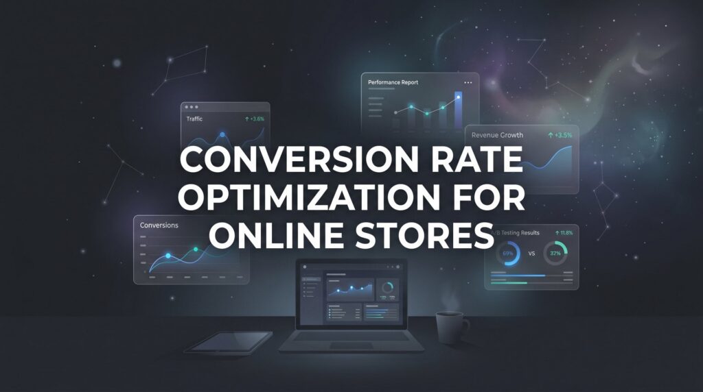
That’s where conversion rate optimization for online stores becomes the most important lever you’re probably not pulling hard enough. CRO is the systematic process of increasing the percentage of visitors who take a desired action: making a purchase, adding to cart, or signing up for your email list. Instead of spending more money to attract new visitors, CRO squeezes more revenue out of the traffic you already have.
Think about it this way. Doubling your conversion rate has the same revenue impact as doubling your traffic, but typically at a fraction of the cost. That’s why CRO is one of the highest-ROI activities any e-commerce business owner can invest in.
In this guide, we’ll walk you through exactly how to audit your current store performance, identify what’s killing your conversions, and implement proven fixes that turn browsers into buyers. No fluff, no theory. Just actionable steps you can start using today. Whether you’re running a Shopify store, WooCommerce site, or any other e-commerce platform, these principles apply universally.
Let’s get your store converting the way it should.
Step 1: Benchmark Your Current Conversion Metrics
Before you fix anything, you need to know exactly where you stand. This step is about establishing your baseline so that every improvement you make can be measured against something real.
Start by defining what “conversion” actually means for your store. For most e-commerce businesses, the primary conversion is a completed purchase. But you should also track micro-conversions: add-to-cart rate, email list signups, and wishlist additions. Each of these tells a different part of the story.
Set up proper goal tracking in Google Analytics 4 if you haven’t already. GA4’s event-based tracking model allows you to capture the full purchase funnel, from first pageview to order confirmation. Our guide on Google Analytics setup for conversion tracking walks you through this process step by step. If your tracking isn’t configured correctly, every decision you make downstream will be based on bad data.
Once tracking is solid, calculate your store-wide conversion rate. But here’s the critical part: don’t stop there. A single overall number hides more than it reveals. Segment your data across these dimensions:
Traffic source: Paid search, organic, social, and direct traffic often convert at very different rates. A visitor who clicked a branded Google Ad is in a very different mindset than someone who stumbled in from a Pinterest post.
Device type: Mobile and desktop users behave differently. Many stores see strong desktop conversion rates but struggle on mobile, where the majority of their traffic actually comes from. If you’re not segmenting by device, you’re missing one of the most actionable splits in your data.
Product category: Some product lines convert well; others are consistently underperforming. Knowing which categories are dragging your average down tells you exactly where to focus first.
Beyond conversion rate, pull these baseline metrics and write them down:
Bounce rate: The percentage of visitors who leave without interacting. High bounce rates on product pages often signal a mismatch between your ad messaging and what the page delivers.
Cart abandonment rate: How many shoppers add items to cart but never complete the purchase. According to the Baymard Institute, the average documented cart abandonment rate across industries hovers around 70%. If yours is near or above that, checkout friction is costing you real money.
Average order value (AOV): Understanding AOV helps you prioritize whether to focus on increasing conversion volume or increasing the value of each conversion.
Pages per session: Low pages-per-session on a catalog-heavy store may indicate poor internal navigation or product discovery issues.
These numbers become your scoreboard. Every test and change you make in the steps ahead gets measured against them.
Step 2: Map the Customer Journey and Find Drop-Off Points
Now that you have your baseline numbers, the next question is: where exactly are people leaving? This step is about following the trail your visitors leave behind and identifying the specific moments where intent turns into abandonment.
Start with GA4’s funnel exploration reports. Build a funnel that mirrors your actual purchase path: landing page, product page, add to cart, checkout initiation, shipping details, payment, and order confirmation. Calculate the drop-off percentage at each step. You’re looking for the stage with the steepest cliff.
Here’s where it gets interesting. Numbers tell you where people leave, but they don’t tell you why. That’s where behavior analytics tools come in. Tools like Hotjar and Microsoft Clarity (which is free) let you watch session recordings of real users navigating your store. If you’re evaluating which tools to use, our comparison of conversion rate optimization tools and consultants can help you decide.
Watch at least 20 to 30 session recordings on your most important pages. You’ll start seeing patterns quickly:
Rage clicks: Users frantically clicking on elements that aren’t clickable, which signals confusion about what’s interactive on your page.
Scroll depth: Are visitors even seeing your Add to Cart button, or are they bouncing before they scroll that far? Heatmaps show you the answer visually.
Hesitation patterns: Where do users pause for a long time before leaving? This often indicates a trust concern or an unanswered question, like unclear shipping costs or no visible return policy.
Also run heatmap analysis on your checkout pages specifically. Many store owners obsess over product page optimization while ignoring the fact that their checkout form is confusing, cluttered, or asking for unnecessary information.
Once you’ve gathered this qualitative data, prioritize ruthlessly. If your checkout funnel shows that 60% of users who reach the payment step abandon there, fixing that single point will move the needle far more than polishing a product description. Always attack the biggest leak first.
This step gives you a prioritized list of problems to solve. The remaining steps show you how to solve them.
Step 3: Optimize Your Product Pages for Trust and Clarity
Your product page is where the buying decision gets made. Everything before this point was about getting someone there. Everything after depends on whether this page does its job. Most product pages fail not because of bad products, but because they don’t answer the questions buyers are silently asking.
Start with your images. High-quality, zoomable photography is non-negotiable. Show the product from multiple angles, include close-up shots of important details, and add lifestyle images that help buyers visualize actually owning and using the item. A customer who can’t mentally place themselves with your product is a customer who doesn’t convert.
Next, rewrite your product descriptions with the buyer’s real questions in mind. Forget feature lists. Answer these three questions instead: What problem does this solve? Why choose this over alternatives? What’s included and what should I expect when it arrives? Benefit-driven copy that speaks to outcomes converts better than spec sheets every time.
Trust signals deserve their own focus on the product page. Don’t bury them in your footer or a separate FAQ page. Put them where the eye naturally goes, near the Add to Cart button:
Customer reviews and star ratings: Social proof is one of the most powerful conversion drivers in e-commerce. If you have reviews, make them visible and prominent. If you don’t have many yet, prioritize collecting them through post-purchase email sequences.
Return policy: State it clearly and simply. “Free returns within 30 days, no questions asked” removes a major psychological barrier for hesitant buyers.
Shipping information: Tell people when they’ll receive the item before they have to ask. Unexpected delivery timelines kill conversions at the product page stage.
Security badges: SSL indicators and recognized payment logos (Visa, Mastercard, PayPal) signal that your store is safe to buy from.
Finally, audit your Add to Cart button. It should be impossible to miss. Use a contrasting color that stands out from your page design, make it large enough to tap easily on mobile, and consider a sticky version that follows the user as they scroll. Choosing the right landing page builder for conversions can make implementing these design best practices significantly easier. Clear, unambiguous pricing with no hidden costs visible at a glance rounds out a product page that’s built to convert.
Step 4: Eliminate Checkout Friction That Kills Sales
You’ve convinced someone to add an item to their cart. That’s a significant win. Now the goal is to get out of their way and let them buy. Checkout friction is where enormous amounts of revenue quietly disappear, and most of it is completely preventable.
The single most impactful change many stores can make is offering guest checkout. Baymard Institute’s checkout usability research consistently identifies forced account creation as one of the top reasons shoppers abandon the checkout process. People want to buy, not register. Let them. You can always invite them to create an account after the purchase is complete.
Reduce your form fields to the absolute minimum required to fulfill the order. Every additional field is a small piece of friction, and friction compounds. If your form abandonment rate is too high, stripping unnecessary fields is often the fastest fix. Enable browser autofill for name, address, and payment details so returning users can move through checkout in seconds. Add a progress indicator so buyers always know where they are in the process and how many steps remain. Uncertainty creates anxiety, and anxiety creates abandonment.
Pricing transparency is critical. Display all costs, including shipping, taxes, and any fees, before the final checkout step. Unexpected costs appearing at the last moment are one of the most documented causes of cart abandonment. If you offer free shipping above a certain threshold, display that threshold prominently throughout the shopping experience.
Expand your payment options. Digital wallets like Apple Pay, Google Pay, and PayPal are especially important for mobile shoppers, who can complete a purchase in seconds without manually entering card details. Buy-now-pay-later options like Afterpay or Klarna can also reduce friction for higher-ticket purchases by lowering the perceived upfront cost.
A streamlined, transparent, frictionless checkout process is one of the highest-leverage places to invest your CRO effort. The traffic is already there. Don’t let a clunky form be the reason they leave.
Step 5: Speed Up Your Store and Fix the Mobile Experience
Here’s something that gets overlooked constantly: your store’s technical performance is a conversion factor, not just a technical detail. A slow page or a frustrating mobile experience doesn’t just annoy visitors. It costs you sales.
Run your key pages through Google PageSpeed Insights and pay attention to your Core Web Vitals scores, particularly Largest Contentful Paint (how quickly the main content loads) and Cumulative Layout Shift (whether elements jump around as the page loads). Google has publicly stated that page speed is a ranking factor, and slower pages generally correlate with higher bounce rates and lower conversion rates. Understanding how conversion rate optimization and SEO work together helps you prioritize technical improvements that benefit both channels.
The most common culprits for slow store performance are oversized images, unoptimized scripts, and too many third-party apps or plugins running simultaneously. Compress your images without sacrificing quality using tools like TinyPNG or your platform’s built-in optimization. Enable lazy loading so images below the fold only load when a user scrolls toward them. Audit your installed apps and remove any that aren’t actively contributing to revenue.
Now, pull out your phone and shop your own store from start to finish. Don’t just glance at it. Actually try to find a product, read the description, add it to cart, and complete a purchase. You’ll likely discover friction you never noticed on desktop:
Tap targets: Are buttons large enough to tap accurately without zooming? Small buttons are a major source of mobile frustration.
Text readability: Can you read product descriptions without pinching to zoom? If not, your font size needs adjustment.
Navigation: Can you find products intuitively on a small screen? Complex desktop navigation often becomes unusable on mobile.
Sticky Add to Cart: On mobile, a sticky bar that keeps the Add to Cart button visible as users scroll through a long product description can meaningfully improve conversion rates.
The majority of e-commerce traffic now comes from mobile devices. If your mobile experience is an afterthought, a significant portion of your potential revenue is walking out the door before you even get a chance to sell.
Step 6: Run A/B Tests to Validate Changes, Not Guesses
Everything you’ve done in the previous steps has been informed by data and best practices. Now it’s time to prove that your specific changes actually improve results in your specific store, with your specific audience. That’s what A/B testing does.
Start with high-impact, easy-to-test elements rather than attempting sweeping redesigns. Good candidates for early tests include:
CTA button text: “Add to Cart” versus “Buy Now” versus “Get Yours Today” can produce meaningfully different results depending on your audience and product type.
Headline copy: The headline on your product page or landing page is one of the highest-leverage elements to test. Small wording changes can shift how buyers perceive value.
Pricing display format: Showing the monthly equivalent of an annual price, displaying savings in dollar amounts versus percentages, or featuring the original price crossed out next to a sale price are all worth testing.
Product page layout: Image gallery position, description length, and the placement of trust signals can all be tested systematically.
For testing tools, Shopify users have access to several app-based A/B testing solutions. Other platforms can integrate with tools like VWO or Optimizely. Our breakdown of conversion optimization software vs. agency solutions can help you determine the right approach for your store’s size and budget.
Follow these non-negotiable testing rules:
One variable at a time: If you change the button color and the headline simultaneously, you won’t know which change caused the result.
Run until statistical significance: Don’t call a winner after 50 visitors. Wait until your testing tool indicates statistical significance, typically 95% confidence, before drawing conclusions.
Document everything: Keep a running log of every test, including the hypothesis, the result, and what you learned. Losing tests teach you just as much as winning ones.
The biggest mistake in CRO is making sweeping site changes based on gut feeling. A/B testing removes opinion from the equation and replaces it with evidence.
Step 7: Build a Continuous Optimization Loop That Compounds Results
This is where most e-commerce businesses leave money on the table. They run a few tests, make some improvements, and then move on. But CRO isn’t a project with a finish line. It’s a discipline that builds compounding returns over time.
Establish a monthly review cadence. Set aside time each month to analyze your key metrics against your baseline, review any completed A/B test results, identify new friction points that have emerged, and queue up the next round of optimizations. Consistency here is what separates stores that plateau from stores that keep growing.
To decide what to work on each cycle, use a simple prioritization framework called ICE scoring. Rate each potential optimization on three dimensions:
Impact: How much will this move the needle if it works? A checkout fix likely scores higher than a footer redesign.
Confidence: How confident are you, based on data, that this is actually a problem worth solving? High confidence comes from session recordings, heatmaps, and funnel drop-off data.
Ease: How quickly and cheaply can this be implemented? Sometimes a high-impact, high-confidence fix is also easy to execute, making it an obvious priority.
Score each item from 1 to 10 on each dimension, average the scores, and work down the list from highest to lowest. This keeps your team focused on what matters most rather than what’s most comfortable or interesting.
Don’t neglect post-purchase optimization either. Follow-up email sequences, review request campaigns, and upsell or cross-sell offers after the initial purchase all contribute to customer lifetime value, which is ultimately the metric that determines whether your business is profitable at scale. Exploring profitable marketing strategies for business growth can help you think beyond the initial conversion and build long-term revenue.
Finally, know when to bring in outside expertise. If you’re spending heavily on paid ads, your traffic numbers look healthy, but your store still isn’t converting at the rate it should, the problem is almost certainly in the conversion layer, not the traffic layer. Understanding CRO services pricing helps you evaluate whether professional help makes financial sense. A CRO-focused agency like Clicks Geek can diagnose and fix conversion leaks faster than months of trial and error, because we’ve seen these patterns across dozens of stores and know exactly where to look.
Your CRO Action Plan: Putting It All Together
Conversion rate optimization for online stores isn’t about one magic fix. It’s a disciplined, data-driven process that builds momentum with every cycle. Here’s your quick-reference checklist for everything we’ve covered:
1. Benchmark your current metrics and segment by traffic source, device type, and product category to find where the biggest gaps exist.
2. Map the customer journey using GA4 funnel reports and behavior tools like Hotjar or Microsoft Clarity to find your biggest drop-off points.
3. Optimize your product pages with high-quality imagery, benefit-driven copy, visible trust signals, and a prominent Add to Cart button.
4. Strip friction from your checkout by enabling guest checkout, reducing form fields, showing all costs upfront, and offering multiple payment methods.
5. Prioritize site speed and mobile experience by compressing images, auditing your scripts, and personally testing your full purchase flow on a phone.
6. A/B test changes instead of guessing, one variable at a time, with statistical significance as your standard before calling a winner.
7. Build a repeating monthly optimization loop using ICE scoring to prioritize what to tackle next and post-purchase sequences to increase lifetime value.
Every improvement stacks on the last. A meaningful lift in conversion rate can produce dramatically more revenue from the exact same traffic budget. That’s the power of treating CRO as an ongoing system rather than a one-time project.
If you’re running paid ads or investing in SEO and your store still isn’t converting the way it should, the issue isn’t your marketing. It’s your conversion layer. If you want to see what this would look like for your specific store, we’ll walk you through exactly how we diagnose conversion problems and what realistic improvements look like in your market. Let’s stop leaving money on the table.