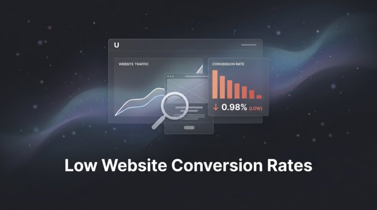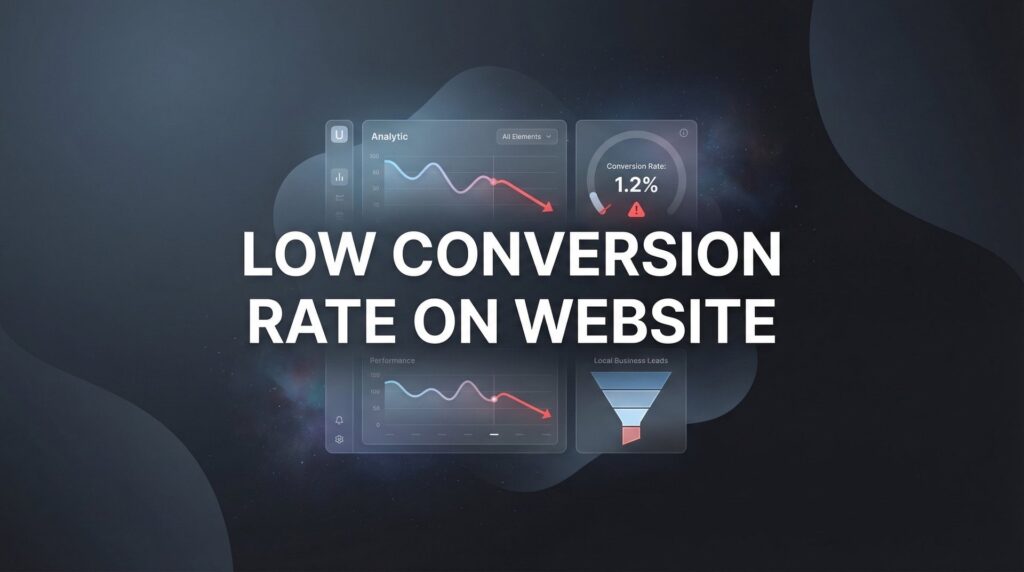
A low conversion rate on your website is more than a minor inconvenience—it’s money walking out the door every single day. You’re paying for traffic through ads, SEO efforts, and marketing campaigns, but if visitors aren’t converting into leads or customers, you’re essentially funding your competitors’ success.
The frustrating part? Most business owners know something is wrong but can’t pinpoint exactly what’s causing the leak.
This guide cuts through the noise and delivers actionable strategies that actually move the needle. We’ll cover the most common conversion killers and provide step-by-step fixes you can implement immediately. Whether your conversion rate is stuck at 1% or you’re trying to push past 3%, these proven tactics will help you turn more visitors into paying customers—without spending another dollar on traffic.
1. Speed Up Your Page Load Time
The Challenge It Solves
Your website might be bleeding potential customers before they even see your offer. Every second of delay creates frustration, and frustrated visitors hit the back button. When someone clicks your ad or search result, they expect instant gratification. A sluggish site sends the message that working with you will be equally slow and painful.
Think about your own browsing behavior. How long do you wait for a slow page? Probably not long.
The Strategy Explained
Page speed optimization isn’t just about making things faster—it’s about respecting your visitor’s time and removing the first major conversion barrier. Google has made page experience a ranking factor because user behavior data consistently shows that speed matters. Faster sites keep visitors engaged, reduce bounce rates, and create a better first impression.
The good news? Most speed issues come from a handful of fixable problems: oversized images, render-blocking scripts, and poor hosting. You don’t need to be a developer to fix website issues that are killing your conversions.
Implementation Steps
1. Run your site through Google PageSpeed Insights and GTmetrix to identify specific bottlenecks affecting your load time.
2. Compress all images using tools like TinyPNG or ShortPixel before uploading—images are typically the largest files slowing down your pages.
3. Enable browser caching and consider a content delivery network (CDN) if you serve visitors across different geographic regions.
4. Remove or defer non-essential scripts that block your page from rendering quickly, especially third-party tracking codes that aren’t critical.
5. If you’re on shared hosting and consistently seeing slow speeds, upgrade to better hosting—it’s one of the highest-ROI investments you can make.
Pro Tips
Focus on mobile speed first since most traffic now comes from phones. Test your site on an actual mobile device with a slower connection to experience what your customers experience. The perceived speed matters as much as the actual load time—use skeleton screens or progressive loading to make your site feel faster even while content loads.
2. Simplify Your Forms and Reduce Friction
The Challenge It Solves
You’ve gotten visitors interested enough to start filling out your contact form or checkout process. Then you lose them. They see a form asking for their life story and decide it’s not worth the effort. Every additional field you require is another opportunity for someone to abandon the process.
Forms are where interest either converts into action or dies completely.
The Strategy Explained
Form optimization is about finding the balance between gathering information you need and respecting how much effort you’re asking from a stranger. Each field represents friction—a small barrier between the visitor and conversion. Your job is to eliminate every field that isn’t absolutely necessary for the initial conversion.
Here’s the thing: you can always collect more information later, after you’ve established the relationship. But if you scare people away with a lengthy form upfront, you’ll never get that chance.
Implementation Steps
1. Audit your current forms and ask yourself honestly: do I need this information right now, or can I get it later?
2. Reduce contact forms to the absolute essentials—typically just name, email, and phone number for lead generation.
3. Remove dropdown menus where possible and use smart defaults or auto-complete features to reduce typing effort.
4. Use single-column form layouts rather than multi-column designs, which create visual confusion and slow completion.
5. Add inline validation that tells users immediately if they’ve made an error rather than waiting until they hit submit.
Pro Tips
Consider using a two-step form approach where you ask for basic information first, then additional details on a second screen. This psychological trick makes the initial commitment feel smaller. For e-commerce, offer guest checkout—requiring account creation before purchase kills conversions. You can always encourage account creation after the sale.
3. Craft Compelling Calls-to-Action
The Challenge It Solves
Generic “Submit” or “Click Here” buttons blend into the background. Visitors scroll past them without registering what action you want them to take. Weak CTAs fail to create urgency or communicate value, leaving visitors uncertain about what happens next. When your call-to-action doesn’t compel action, your conversion rate suffers no matter how good the rest of your page is.
The Strategy Explained
Effective CTAs do three things simultaneously: they tell visitors exactly what will happen, create a sense of urgency or benefit, and stand out visually from everything else on the page. The language you use matters enormously. Action-oriented, benefit-focused copy outperforms generic labels every time.
Your CTA is the tipping point where interest becomes action. Treat it accordingly.
Implementation Steps
1. Replace generic button text with specific, action-oriented language that describes the outcome: “Get My Free Consultation” instead of “Submit.”
2. Use contrasting colors that make your CTA button impossible to miss while still fitting your brand aesthetic.
3. Add urgency or scarcity elements where truthful: “Schedule Your Free Audit Today” or “Claim Your Spot Now.”
4. Make buttons large enough to be obvious and easily clickable on mobile devices—small buttons create unnecessary friction.
5. Place your primary CTA above the fold and repeat it strategically throughout longer pages without being obnoxious.
Pro Tips
Test first-person language in your CTAs—”Start My Free Trial” often outperforms “Start Your Free Trial” because it’s more personal. Add a brief subheading below your CTA button that addresses the main objection or reinforces the benefit. For example, “No credit card required” or “Get results in 48 hours” can push hesitant visitors over the edge.
4. Build Trust Instantly with Social Proof
The Challenge It Solves
Visitors arrive on your site as skeptics. They’ve been burned before by businesses that overpromised and underdelivered. Without evidence that you’re legitimate and effective, they’ll assume you’re just another company making empty claims. This skepticism creates a conversion barrier that no amount of clever copy can overcome alone.
Trust is the currency of online conversion, and social proof is how you earn it.
The Strategy Explained
Social proof leverages the psychological principle that people look to others’ experiences when making decisions. When visitors see that real people or recognizable companies have worked with you successfully, it reduces their perceived risk. The key is using authentic, specific social proof rather than generic testimonials that could apply to anyone.
Strategic placement matters as much as the social proof itself. You want trust signals appearing at exactly the moments when doubt creeps in.
Implementation Steps
1. Collect specific testimonials that mention concrete results or experiences rather than vague praise like “great service.”
2. Place trust badges, security certifications, or industry affiliations near conversion points like forms and checkout buttons.
3. Add customer logos or “As Seen In” media mentions in your header or immediately below your main headline if you have them.
4. Include the customer’s full name, photo, and company when possible—anonymous testimonials carry less weight than attributed ones.
5. Use review counts and ratings prominently if you have them: “Join 500+ businesses that improved their lead quality” creates social validation.
Pro Tips
Video testimonials outperform written ones when you can get them. Even a simple smartphone recording of a happy customer carries more authenticity than polished text. For B2B businesses, showcase recognizable company names or industries. For local businesses, emphasize local reviews and community connections. Place social proof near your CTA buttons—that’s where skepticism peaks.
5. Match Landing Pages to Traffic Sources
The Challenge It Solves
Visitors click your Google ad about “emergency plumbing repair” and land on your generic homepage talking about all your services. The disconnect creates confusion and doubt. They clicked expecting one thing and got something else entirely. This message mismatch is one of the fastest ways to kill conversions because it breaks the visitor’s train of thought.
When the scent trail goes cold, visitors bounce.
The Strategy Explained
Message match means maintaining consistency between what your ad promises and what your landing page delivers. The headline, imagery, and offer should align perfectly with the visitor’s expectation based on where they came from. This creates a seamless experience that feels like a natural continuation rather than a jarring transition.
Think of it like a conversation. If someone asks you about your plumbing services and you respond by talking about your company history, you’ve lost them. The same principle applies to your traffic sources and landing pages.
Implementation Steps
1. Create dedicated landing pages for each major traffic source or campaign rather than sending everyone to your homepage.
2. Mirror the exact language from your ads in your landing page headline—if your ad says “24/7 Emergency Plumbing,” your headline should too.
3. Use consistent visual elements between ads and landing pages, including colors, imagery style, and design aesthetic.
4. Remove navigation menus from dedicated landing pages to prevent visitors from wandering away from the conversion goal.
5. Ensure your landing page offer matches exactly what the ad promised—no bait and switch, even subtle ones.
Pro Tips
Use UTM parameters to track which traffic sources convert best, then double down on creating highly matched pages for your top performers. For PPC campaigns, create landing page variants for different ad groups rather than using one generic page. Understanding landing page conversion rate benchmarks helps you measure whether your message match is working. The more specific the match, the better your conversion rate.
6. Eliminate Distractions and Clarify Value
The Challenge It Solves
Your website tries to do everything at once. Multiple competing messages, sidebar widgets, popup offers, and navigation options all fight for attention. Visitors experience decision paralysis and choose the easiest option: leaving. When everything is important, nothing is important. A cluttered page with an unclear value proposition converts poorly no matter how much traffic you drive to it.
The Strategy Explained
Conversion-focused pages follow a simple principle: one page, one goal. Every element should either support the conversion goal or be removed. Your value proposition—the clear answer to “why should I choose you?”—needs to be immediately obvious above the fold. Visitors decide whether to stay or leave in seconds, so clarity wins over cleverness.
Simplification isn’t about removing information. It’s about presenting information in a hierarchy that guides visitors toward the action you want them to take.
Implementation Steps
1. Write a clear, benefit-focused headline that immediately answers “what’s in it for me?” from the visitor’s perspective.
2. Remove competing CTAs from conversion pages—if you’re asking for a consultation, don’t also ask them to follow you on social media.
3. Eliminate sidebar content, widgets, and navigation elements from dedicated landing pages that serve as escape routes.
4. Use whitespace strategically to draw attention to your most important elements rather than cramming content into every pixel.
5. Place your unique value proposition above the fold in a prominent position—visitors shouldn’t have to scroll to understand what you offer.
Pro Tips
Apply the “squint test”—step back from your page and squint. What stands out? If it’s not your headline and CTA, you have a visual hierarchy problem. Use directional cues like arrows or images of people looking toward your CTA to guide attention. Every 500 words of content, reinforce your value proposition and include a CTA—long pages need multiple conversion opportunities.
7. Implement Exit-Intent and Retargeting Recovery
The Challenge It Solves
Most visitors won’t convert on their first visit. They’re researching, comparing options, or simply not ready to commit yet. Without a recovery strategy, these visitors disappear forever, and you’ve lost the opportunity to convert them later. The traffic you’ve already paid for becomes a sunk cost with no return. You need a systematic way to recapture these abandoning visitors and bring them back when they’re ready.
The Strategy Explained
Exit-intent technology detects when visitors are about to leave and presents a last-chance offer or value proposition. Combined with retargeting campaigns that follow up with these visitors across the web, you create multiple touchpoints that increase conversion probability over time. Not everyone converts immediately, but strategic follow-up dramatically improves your overall conversion rate from the same traffic.
This strategy acknowledges the reality of modern buyer behavior: people need multiple exposures before making decisions.
Implementation Steps
1. Install exit-intent popup technology that triggers when visitors move their cursor toward the browser’s back button or close tab.
2. Create exit offers that provide additional value: a discount, free resource, or compelling reason to stay and convert now.
3. Set up retargeting pixels on your key pages to build audiences of visitors who didn’t convert on their first visit.
4. Develop a retargeting sequence that addresses common objections and reinforces your value proposition across multiple touchpoints.
5. Segment your retargeting based on which pages visitors viewed—someone who looked at pricing needs different messaging than someone who only saw your homepage.
Pro Tips
Don’t make exit popups annoying—use them sparingly and make them genuinely valuable. A free guide or consultation offer works better than a generic “Wait, don’t go!” message. For retargeting, use frequency caps to avoid ad fatigue. Showing the same ad 20 times doesn’t increase conversions—it annoys people. Test different retargeting windows: some audiences convert within days, others need weeks of nurturing.
Putting It All Together
Fixing a low conversion rate on your website isn’t about overhauling everything at once—it’s about systematic improvements that compound over time. Start with the quick wins: speed optimization and form simplification typically deliver the fastest results. Then move to CTA improvements and social proof placement. Finally, tackle the strategic elements like landing page alignment and exit-intent recovery.
The businesses that win aren’t necessarily getting more traffic; they’re simply converting more of the traffic they already have.
Every percentage point improvement in conversion rate directly impacts your bottom line without increasing your ad spend. If your current conversion rate is 1% and you improve it to 2%, you’ve just doubled your results from the same marketing budget. That’s the power of conversion focused marketing—it multiplies the effectiveness of every dollar you spend on traffic.
Here’s your implementation roadmap: Week one, fix your page speed and simplify your forms. Week two, revamp your CTAs and add strategic social proof. Week three, audit your landing page message match and eliminate distractions. Week four, implement exit-intent and launch your first retargeting campaign. Track your conversion rate weekly to measure progress and identify which changes deliver the biggest impact.
The truth is, most businesses leave enormous amounts of money on the table simply because their websites don’t convert. They keep pouring budget into ads while ignoring the leak in their bucket. Don’t be that business.
Tired of spending money on marketing that doesn’t produce real revenue? We build lead systems that turn traffic into qualified leads and measurable sales growth. If you want to see what this would look like for your business, we’ll walk you through how it works and break down what’s realistic in your market.