Your ecommerce store is getting traffic, but sales aren’t following. You’re watching potential customers browse, add items to cart, and then vanish into the digital void. This isn’t a traffic problem—it’s a conversion problem.
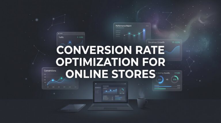
Conversion optimization for ecommerce stores is the systematic process of turning more of your existing visitors into paying customers, and it’s often the fastest path to increased revenue without spending another dollar on ads. Think about it: if you’re currently converting 2% of your visitors and you improve that to 2.4%, you’ve just increased revenue by 20% with the same traffic.
In this step-by-step guide, you’ll learn exactly how to audit your current conversion performance, identify the specific friction points killing your sales, and implement proven fixes that drive measurable results. Whether you’re running a Shopify store, WooCommerce site, or custom ecommerce platform, these seven steps will give you a clear roadmap to higher conversion rates and more profitable growth.
Let’s turn those window shoppers into buyers.
Step 1: Establish Your Conversion Baseline and Set Realistic Targets
You can’t improve what you don’t measure. Before you change a single element on your site, you need to know exactly where you stand today.
Start by calculating your current ecommerce conversion rate using this simple formula: total conversions divided by total visitors, multiplied by 100. If you had 5,000 visitors last month and 100 purchases, your conversion rate is 2%. This becomes your baseline—the number you’re working to beat.
But here’s where most store owners stop too early. Your overall conversion rate tells only part of the story. You need to track micro-conversions along the entire customer journey to understand where the real problems hide.
Add-to-Cart Rate: What percentage of product page visitors actually add items to their cart? This tells you if your product pages are compelling enough to trigger buying intent.
Checkout Initiation Rate: Of those who add items to cart, how many actually start the checkout process? A low percentage here signals cart page issues or unexpected costs scaring people away.
Email Signup Rate: How many visitors are willing to join your list? This micro-conversion gives you a second chance to convert browsers who aren’t ready to buy today.
Open Google Analytics 4 and navigate to your ecommerce reports. Your platform’s built-in analytics (Shopify, WooCommerce, BigCommerce) will also provide these metrics. Setting up proper conversion tracking for ecommerce stores is essential for accurate measurement. Document everything in a spreadsheet with the current date.
Now set specific targets. Don’t aim for the moon on your first optimization cycle. A 10-20% improvement in your primary conversion rate over 90 days is ambitious but achievable. If you’re at 2% now, target 2.2-2.4%. This focused approach keeps you motivated and prevents analysis paralysis.
Success indicator: You have documented baseline metrics for overall conversion rate, add-to-cart rate, and checkout initiation rate, plus clear 90-day improvement targets for each. Without this foundation, you’re just guessing.
Step 2: Map Your Customer Journey and Identify Drop-Off Points
Picture your ecommerce store as a physical retail space. Customers walk through the front door, browse departments, pick up products, walk to the register, and complete their purchase. At each transition point, some people leave. Your job is to figure out where you’re losing the most customers and why.
Create a visual representation of your typical customer journey. For most ecommerce stores, it looks like this: Homepage → Category Page → Product Page → Cart → Checkout → Purchase. Some visitors enter through product pages directly from ads or search, which is fine—just map those paths too.
Now open Google Analytics 4 and navigate to the funnel exploration reports. Learning how to optimize your conversion funnel will help you set up tracking that mirrors your customer journey with each stage as a step. GA4 will show you exactly how many people complete each step and where they drop off.
Here’s what you’re looking for: dramatic drop-off percentages. If 1,000 people view product pages but only 200 add to cart, you have a 80% drop-off rate at that stage. That’s your red flag. If 200 add to cart but only 150 start checkout, that’s a 25% drop-off—still significant but less urgent than the product page issue.
Calculate the drop-off percentage at each stage by subtracting the number who advanced from the number who started, then dividing by the starting number. This gives you a prioritized list of where to focus your optimization efforts.
The common pitfall? Obsessing over checkout optimization when your real problem is getting people to add items to cart in the first place. Fix your biggest leak first. If 80% of people are leaving at the product page stage, that’s where you’ll get the highest return on your optimization time.
Look for patterns across different traffic sources too. Maybe your paid traffic converts better than organic, or mobile visitors drop off at higher rates than desktop users. These insights tell you where to dig deeper.
Success indicator: You’ve created a complete funnel visualization, identified your top 2-3 highest drop-off points with specific percentages, and you know which stage will give you the biggest impact if you improve it. This is your optimization roadmap.
Step 3: Conduct a Friction Audit on Your Product Pages
Your product pages are your digital salespeople. They need to answer every question, overcome every objection, and make the buying decision feel effortless. Most ecommerce stores fail here not because their products are bad, but because their pages don’t sell.
Start with the five essential elements every high-converting product page must have: compelling images, benefit-focused descriptions, crystal-clear pricing, trust signals, and obvious calls-to-action.
Product Photography: Load your product pages on your phone right now. Can you see the product clearly? Can you zoom in to examine details? Do you have multiple angles showing the product in use, not just on a white background? Customers can’t touch your products, so your images need to compensate. If you’re selling clothing, show it on real people. If you’re selling electronics, show them in actual use cases.
Product Descriptions: Read your copy out loud. Does it focus on what the customer gets (benefits) or just what the product is (features)? Weak copy says “100% cotton fabric.” Strong copy says “Breathable cotton keeps you comfortable all day, even in summer heat.” Translate every feature into a tangible benefit the customer cares about.
Pricing Clarity: Is your price immediately visible without scrolling? Are there hidden fees that only appear at checkout? Surprise costs are conversion killers. Show the full price upfront, including any required add-ons.
Trust Signals: Do you display customer reviews prominently? Are ratings visible above the fold? Do you show how many people have purchased this product? Social proof directly impacts purchase confidence, especially for new customers who don’t know your brand yet.
Call-to-Action Buttons: Is your “Add to Cart” button visible, large, and using a contrasting color? Does it clearly state what happens when clicked? Weak CTAs blend into the page. Strong CTAs command attention and remove ambiguity.
Now here’s the critical part: test everything on actual mobile devices, not just browser simulators. Mobile commerce accounts for a significant portion of ecommerce traffic, and if your product pages don’t work flawlessly on phones, you’re losing sales every single day.
Create a spreadsheet listing every product page issue you find, then rank them by potential impact. Understanding how to increase ecommerce conversion rate starts with fixing the problems that affect your highest-traffic or highest-value products first.
Success indicator: You have a prioritized list of specific product page improvements, starting with your top-selling items, and you’ve identified at least 3-5 concrete changes you can implement this week.
Step 4: Streamline Your Checkout Process
You’ve convinced someone to buy. They’ve added items to their cart and clicked through to checkout. Now is the worst possible time to make things complicated, yet this is exactly where many ecommerce stores sabotage themselves.
Open your checkout process and count the steps. How many separate pages does a customer have to navigate? How many form fields do they have to complete? Every additional step and every unnecessary field reduces your conversion rate. Think of checkout friction like a tax on your revenue—you’re literally paying for complexity.
Eliminate Forced Account Creation: Requiring customers to create an account before purchasing is one of the fastest ways to kill a sale. Many shoppers are in a hurry, buying from a phone, or simply don’t want another password to remember. Implement guest checkout and offer account creation as an optional post-purchase step. You can still capture their email for marketing—you don’t need a full account to do that.
Display Trust Throughout Checkout: Your checkout page should scream security and legitimacy. Show SSL certificate indicators, accepted payment method logos (Visa, Mastercard, PayPal, etc.), and money-back guarantee information prominently. If you have security certifications, display those badges. Customers are about to enter credit card information—make them feel safe doing it.
Add Progress Indicators: If your checkout requires multiple steps, show customers exactly where they are in the process. A simple “Step 2 of 3: Shipping Information” bar tells them the finish line is close. Without this, customers don’t know if they’re halfway done or just getting started, which increases abandonment.
Optimize Form Fields: Review every single field in your checkout form and ask: “Do we absolutely need this information to complete the order?” Remove everything that isn’t essential. Don’t ask for a phone number if you don’t actually call customers. Don’t require a company name for consumer purchases. Auto-fill address fields when possible. Make form completion feel effortless.
Show Cost Breakdown Early: Display shipping costs, taxes, and any fees before the final payment step. Surprise costs at the last second are the number one reason for cart abandonment. If you offer free shipping above a certain threshold, make that clear before checkout even begins.
Test your entire checkout process on mobile. Can you complete it easily with your thumbs? Are buttons large enough to tap accurately? Does the keyboard pop up automatically for form fields? Mobile checkout optimization isn’t optional anymore.
Success indicator: Your checkout can be completed in under 3 minutes with fewer than 10 required form fields, guest checkout is available, and all costs are transparent before the final payment step. Time yourself going through the process—if it feels tedious to you, it’s killing conversions.
Step 5: Implement Strategic Trust and Urgency Elements
People don’t buy from stores they don’t trust, and they delay purchases when there’s no reason to act now. Your job is to build confidence and create genuine motivation to complete the purchase today.
Social Proof That Actually Converts: Customer reviews are non-negotiable for ecommerce success. Display star ratings and review counts prominently on product pages, ideally above the fold. If you’re just starting out and don’t have reviews yet, use customer testimonials, user-generated content from social media, or highlight your sales numbers (“Join 5,000+ happy customers”).
Real-time purchase notifications can work well too. When someone in Texas just bought the same product a potential customer is viewing in California, it validates their decision. But only use this if you actually have the sales volume to support it—fake notifications damage trust permanently.
Trust Badges and Guarantees: Display security badges near payment information. Show your money-back guarantee clearly on product pages and at checkout. If you offer free returns, make that visible. These elements don’t just build trust—they remove the risk from the customer’s decision.
If you’re a certified retailer for the brands you sell, display those authorization badges. If you’ve won awards or been featured in publications, show those credentials. Following best practices for conversion optimization means every piece of external validation makes the buying decision easier.
Authentic Urgency: Real scarcity works. Fake scarcity backfires. If you genuinely have limited inventory, show it: “Only 3 left in stock.” If you have a shipping deadline for holiday delivery, display it: “Order within 4 hours for delivery by Friday.” If you’re running a legitimate limited-time sale, show the countdown.
What doesn’t work? Fake countdown timers that reset when you refresh the page. Perpetual “limited time offers” that never actually end. Invented scarcity for products you have unlimited stock of. Customers are smart—they see through manipulation, and it destroys your brand credibility.
The goal is to give honest reasons to buy now rather than later, not to trick people into panic purchases they’ll regret and return.
Success indicator: Every product page displays at least three trust elements above the fold (reviews, guarantees, security badges), and any urgency messaging you use is completely authentic and verifiable. Trust is earned slowly and lost instantly—protect it.
Step 6: Set Up and Run Your First A/B Tests
You’ve made improvements based on best practices and common sense. Now it’s time to let actual customer behavior tell you what works. A/B testing removes guesswork and replaces it with data.
Start with high-impact, easy-to-test elements. Don’t begin by redesigning your entire homepage. Test specific, measurable changes: CTA button text (“Add to Cart” vs. “Buy Now”), product page headlines, pricing display formats (showing savings vs. just showing price), or even button colors.
Here’s the process: Form a hypothesis first. “I believe changing the CTA from ‘Add to Cart’ to ‘Get Yours Now’ will increase add-to-cart rate because it creates stronger ownership language.” Then design a test where 50% of visitors see version A and 50% see version B, with everything else remaining identical.
Before you launch, calculate your required sample size. Testing with too little traffic leads to false conclusions. If your product page gets 100 visitors per week, you can’t run a meaningful test in three days. You need enough visitors to reach statistical significance, which typically means hundreds or thousands of sessions depending on your current conversion rate.
Run one test at a time per page. If you test three different elements simultaneously, you won’t know which change caused the improvement or decline. Sequential testing takes longer but gives you clean, actionable data. A comprehensive guide to A/B testing for conversion optimization can help you avoid common pitfalls.
Document everything in a testing log: what you tested, why you tested it, how long the test ran, what the results were, and what you learned. Even “failed” tests teach you something valuable about your customers. Maybe that aggressive urgency language you thought would work actually decreased conversions because your audience prefers a consultative approach.
Use your platform’s built-in testing tools (Shopify has this) or implement dedicated software. Exploring the best conversion rate optimization tools will help you find the right solution for your needs. Don’t just eyeball the results—wait for statistical significance before declaring a winner.
Success indicator: You’ve completed at least one properly designed A/B test with adequate sample size, documented the results, and implemented the winning variation. You now have a testing framework you can repeat continuously.
Step 7: Create a Recovery System for Abandoned Carts
Most visitors won’t buy on their first visit. Many will add items to cart and then leave. This doesn’t mean they’re not interested—it means they got distracted, wanted to compare prices, or weren’t ready to commit yet. Your abandoned cart recovery system gives you a second chance to close the sale.
Set up an automated email sequence that triggers when someone adds items to cart but doesn’t complete checkout. The timing matters: send the first email within one hour while your store is still fresh in their mind. Send a second reminder at 24 hours. Send a final follow-up at 72 hours.
Email One (1 hour): Keep it simple and helpful. Subject line: “You left something behind.” Include images of the exact products they added to cart, make it easy to return with a direct link, and remove any barriers to completion. This email is purely a gentle reminder.
Email Two (24 hours): Add value. Answer common objections. Include customer reviews of the abandoned products. Highlight your return policy or guarantee. Provide customer service contact information if they have questions. This email builds confidence.
Email Three (72 hours): This is where you can consider offering a small incentive—free shipping or a 10% discount. But use this strategically. If you always offer a discount in the third email, you’re training customers to abandon carts to get the deal. Consider making the incentive exclusive to first-time customers or rotating when you use it.
Beyond email, implement exit-intent popups on your cart and checkout pages. When someone’s mouse moves toward the browser’s close button, trigger a popup with a compelling reason to stay: free shipping offer, satisfaction guarantee reminder, or even just a simple “Need help? Chat with us now” message.
The key with exit-intent technology is providing value, not annoyance. Don’t show popups on every page or to every visitor. Target them specifically to high-intent behaviors like cart abandonment or checkout exit. Understanding how to optimize landing pages for conversions applies these same principles to your cart and checkout pages.
Track your recovery rate: how many abandoned carts does your system actually recover? This becomes another key metric in your conversion optimization dashboard. Many ecommerce stores recover 10-15% of abandoned carts through email alone, which can represent significant revenue.
Success indicator: Your automated abandoned cart email sequence is live and sending to cart abandoners, you’re tracking recovery metrics in your analytics, and you’ve implemented at least one exit-intent intervention on your cart or checkout pages.
Your Conversion Optimization Action Plan
You now have a complete framework for conversion optimization for ecommerce stores. Here’s your action checklist to implement everything we’ve covered:
This Week: Document your baseline conversion metrics today—overall conversion rate, add-to-cart rate, and checkout initiation rate. You can’t improve what you don’t measure, and this is your starting point.
Week Two: Map your customer journey funnel in Google Analytics 4 and identify your biggest drop-off point. Focus your optimization efforts where you’re losing the most potential customers.
Week Three: Conduct a thorough audit of your product pages, starting with your top sellers. Fix the obvious issues: improve images, rewrite benefit-focused copy, add trust signals, and make CTAs prominent.
Week Four: Streamline your checkout process. Implement guest checkout if you don’t have it, reduce form fields to the absolute minimum, and ensure all costs are transparent before the final payment step.
Week Five: Add strategic trust elements and authentic urgency to your product pages. Get customer reviews displayed, add security badges, and create genuine reasons for customers to buy now.
Week Six: Design and launch your first A/B test on a high-traffic page. Start simple, ensure adequate sample size, and document everything you learn.
Week Seven: Set up your abandoned cart recovery email sequence and exit-intent popups. This automated system will recover sales 24/7 without additional effort.
Conversion rate optimization isn’t a one-time project—it’s an ongoing process of testing, learning, and improving. The stores that win are the ones that commit to continuous optimization, not the ones that make changes once and hope for the best.
Start with Step 1 this week. Measure your current performance, because three months from now, you’ll want to look back and see exactly how far you’ve come. Small improvements compound over time. A 15% increase in conversion rate might not sound dramatic, but it’s the difference between a struggling store and a profitable one.
If you want expert guidance on maximizing your ecommerce conversions and driving more profitable growth, the team at Clicks Geek specializes in building lead systems that turn traffic into qualified leads and measurable sales growth. If you want to see what this would look like for your business, we’ll walk you through how it works and break down what’s realistic in your market.