Your ads are running, traffic is flowing, but your landing page conversion rate is stuck in the gutter. You’re watching potential customers land on your page and bounce away like it’s on fire.
Here’s the uncomfortable truth: a poor landing page conversion rate isn’t just costing you leads—it’s actively burning through your ad spend while your competitors scoop up the customers you’re paying to attract.
The average landing page converts at around 2-5%, but many local businesses are limping along at 1% or less. That means for every 100 visitors you pay for, 99 are walking away empty-handed. If you’re spending $3,000 a month on ads and converting at 1%, you’re essentially throwing away $2,400 in potential revenue.
This guide cuts through the fluff and gives you seven battle-tested steps to diagnose exactly what’s killing your conversions and fix it fast. Whether you’re running Google Ads, Facebook campaigns, or driving organic traffic, these steps work across industries—from HVAC contractors to law firms to auto repair shops.
By the end, you’ll have a clear action plan to transform your underperforming landing page into a lead-generating machine.
Step 1: Diagnose the Real Problem With Your Conversion Data
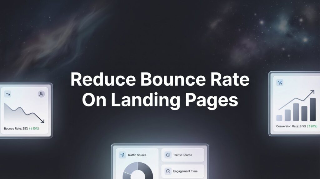
You can’t fix what you can’t measure. The first step to improving a poor landing page conversion rate is understanding exactly where and why visitors are abandoning your page.
Start with the basics: set up proper conversion tracking if you haven’t already. This sounds obvious, but you’d be surprised how many businesses run ads without knowing their actual conversion rate. Install Google Analytics 4 and set up conversion events for every meaningful action—form submissions, phone calls, chat initiations, and appointment bookings.
Once tracking is in place, dive into your metrics. Look at bounce rate first. If more than 70% of visitors leave without interacting, you have a relevance or loading speed problem. Check average time on page—anything under 30 seconds suggests visitors aren’t finding what they expected.
Scroll depth data reveals whether people are even seeing your call-to-action. If 80% of visitors never scroll past the first screen, your most compelling content might be buried too deep.
Here’s where it gets interesting: form abandonment rates tell you if people are interested but hitting friction. If visitors start filling out your form but don’t complete it, you’re asking for too much information or your form has technical issues.
Install a heatmap tool like Hotjar or Microsoft Clarity. These show you exactly where visitors click, how far they scroll, and which elements they ignore completely. Session recordings let you watch real visitor behavior—you’ll spot confusing navigation, broken buttons, and frustrating mobile experiences immediately.
The key is identifying whether your problem is traffic quality, page experience, or offer mismatch. If visitors from Google Ads bounce faster than organic visitors, your ad targeting might be off. If mobile users convert at half the rate of desktop users, you have a responsive design problem. If everyone scrolls to your pricing section then leaves, your pricing structure or value proposition needs work. Understanding these low conversion rate problems is the first step toward solving them.
Success indicator: You can pinpoint the exact stage where most visitors abandon. Maybe it’s the headline that doesn’t resonate, the form that’s too long, or the lack of trust signals. Once you know the specific problem, you can fix it systematically instead of making random changes and hoping something works.
Step 2: Align Your Message Match Between Ad and Landing Page
Think of it like this: your ad is a promise, and your landing page is where you keep it. When these don’t match, visitors feel tricked and leave immediately.
Message match is one of the biggest conversion killers for local businesses running paid ads. You pay $15 for a click from someone searching “emergency plumber near me,” and they land on a generic homepage talking about your company history and full range of services. That’s a mismatch.
Audit every ad campaign and its corresponding landing page. If your Facebook ad promises “50% off furnace tune-ups this month,” your landing page headline better say exactly that—not “Professional HVAC Services Since 1995.” The visitor clicked for the specific offer, not your company story.
Visual consistency matters too. If your ad features a red CTA button and professional photography, your landing page should maintain that same visual language. Dramatic style shifts make visitors question if they’re even on the right website.
Language matching is critical. If your Google Ad says “Free Consultation,” don’t change it to “Complimentary Strategy Session” on the landing page. Use the exact same words. Visitors are pattern-matching machines—when they don’t see the phrase they clicked on, they assume they’re in the wrong place. Understanding what a PPC landing page should accomplish helps you nail this alignment.
Here’s the common pitfall: Many businesses send all their ad traffic to one generic landing page because it’s easier to manage. This tanks conversion rates across the board. A personal injury lawyer running separate campaigns for car accidents, slip-and-falls, and workplace injuries should have three distinct landing pages, each speaking directly to that specific situation.
The fix is simple but requires discipline. Create dedicated landing pages for each major campaign or offer. Yes, this means more pages to manage, but the conversion lift makes it worth the effort. A roofing company running storm damage ads needs a storm damage landing page with headlines about emergency repairs and insurance claims—not a general roofing services page.
Success indicator: Visitors immediately see relevance to what they clicked. They should think “Yes, this is exactly what I’m looking for” within two seconds of landing on your page. When message match is tight, bounce rates drop and time on page increases because visitors recognize they’re in the right place.
Step 3: Rewrite Your Headline and Value Proposition for Clarity
Your headline has one job: make visitors want to keep reading. If it fails, nothing else on your page matters because they’re already gone.
Apply the 5-second test. Show your landing page to someone unfamiliar with your business for exactly five seconds, then ask them what you offer and why they should care. If they can’t answer clearly, your headline needs work.
Most poor landing page conversion rates stem from headlines that talk about the business instead of the customer’s problem. “Premier Auto Body Shop Serving Dallas Since 1987” tells visitors nothing about why they should choose you. “Get Your Car Fixed Right the First Time—Insurance Claims Handled” speaks directly to what they care about.
Focus on specific outcomes and benefits, not features or company history. Nobody cares that you have state-of-the-art equipment. They care that you can fix their car in three days instead of three weeks. They care that you’ll handle their insurance paperwork so they don’t have to.
Use language your target customers actually use. If you’re targeting homeowners with water damage, they’re thinking “I need someone to fix this leak before it gets worse,” not “I require comprehensive water remediation services.” Match their mental vocabulary.
Specificity builds credibility. “We’ll respond within 2 hours” beats “Fast emergency service.” “Save $500-$1,200 on your first project” beats “Competitive pricing.” “Book your appointment in under 60 seconds” beats “Easy scheduling.” Numbers and timeframes make promises concrete and believable. Following best practices for landing pages ensures your headline and value proposition work together seamlessly.
Your subheadline should reinforce and expand on the main headline. If your headline is “Get More Qualified Leads Without Wasting Money on Ads,” your subheadline might be “We build conversion-focused landing pages and PPC campaigns that turn clicks into customers for local service businesses.”
Avoid jargon and industry buzzwords. “Synergistic solutions leveraging cutting-edge technology” means nothing to anyone. “We fix what’s broken with your marketing and get you more customers” is clear and actionable.
Success indicator: A stranger can explain your offer after a quick glance. When your headline clearly communicates who you help, what problem you solve, and what outcome they can expect, visitors stick around to learn more. Your bounce rate will drop because people immediately understand the value you’re offering.
Step 4: Eliminate Friction From Your Form and CTA
Every form field you add is another reason for someone to abandon your page. Think of your form as a barrier between you and revenue—make it as low as possible.
Reduce form fields to only what’s absolutely necessary for initial contact. You don’t need their job title, company size, annual revenue, and preferred contact method just to schedule a consultation. Name, email, and phone number are enough. You can collect additional details later when they’re already engaged.
Here’s what happens when you ask for too much: Visitors start filling out your form, then see you want their address, company name, budget range, and project timeline. They think “This is too much work” and bounce. Companies that reduce forms from 7 fields to 3 often see form completion rates double.
Make your CTA button impossible to miss. Use contrasting colors that stand out from your page design. If your landing page is blue and white, make your button bright orange or green. Size matters too—mobile users need buttons large enough to tap easily without zooming in.
Replace generic button text with benefit-driven copy. “Submit” is boring and tells visitors nothing. “Get My Free Quote” tells them exactly what happens next. “Schedule My Consultation” is action-oriented and specific. “Start Saving Money Today” connects the click to the outcome they want. Learning how to optimize landing pages for conversions will help you master these CTA techniques.
Add click-to-call buttons for mobile users who prefer immediate contact. Many people on mobile don’t want to fill out forms—they want to talk to someone right now. A prominent phone number that turns into a tap-to-call button can boost conversions significantly for service businesses.
Remove unnecessary steps. If someone has to click through multiple pages just to request a quote, you’re losing people at every transition. Keep everything on one page when possible. If you must use multi-step forms, show a progress indicator so people know how much is left.
Test your form on mobile devices. Make sure fields are large enough, dropdown menus work properly, and the keyboard doesn’t cover the submit button. Autofill should work for name and email fields. Any friction in the mobile experience kills conversions because mobile users have less patience than desktop users.
Success indicator: Form completion rate increases and abandonment drops. Track the percentage of people who start your form versus those who complete it. If 100 people begin filling it out but only 40 finish, you have a friction problem. When you streamline your form, that completion rate should climb to 70% or higher.
Step 5: Build Instant Trust With Strategic Social Proof
Visitors don’t know you, and they’re naturally skeptical. Social proof answers the question “Why should I trust this business?” before they even ask it.
Add real customer testimonials with names, photos, and specific results when possible. “John S. from Dallas” is better than “J.S.” A photo makes it even more credible. Best of all is “John Smith, Owner of Smith Construction” with a photo and a specific result: “Clicks Geek helped us generate 47 qualified leads in our first month, and we closed $180,000 in new business.”
Specificity makes testimonials believable. Generic praise like “Great service, highly recommend” doesn’t move the needle. Detailed testimonials that mention specific problems solved and outcomes achieved build real trust. “We were spending $5,000 a month on ads with almost nothing to show for it. After working with this team, we’re getting 3-4 qualified leads per day and our cost per lead dropped by 60%.”
Display relevant trust badges, certifications, and partnership logos. If you’re a Google Premier Partner, show that badge prominently. Industry certifications, Better Business Bureau accreditation, and professional association memberships all signal legitimacy. For local businesses, chamber of commerce membership and years in business matter.
Include review counts and ratings from Google, Yelp, or industry platforms. “4.9 stars from 287 Google reviews” is powerful social proof. It tells visitors that hundreds of real people have had positive experiences with your business. Link directly to your review profiles so skeptical visitors can read the full reviews themselves.
For local businesses, emphasize local presence and community ties. “Proudly serving Austin for 15 years” or “Family-owned and operated in Phoenix since 2008” builds trust with local customers who prefer working with established local companies. Photos of your actual team and physical location make you feel more real and accessible. These elements are essential when learning how to create high converting landing pages.
Case studies work well for higher-ticket services. If you’re selling something that costs thousands of dollars, a detailed case study showing how you helped a similar business can be the deciding factor. Include the challenge they faced, your solution, and the measurable results they achieved.
Video testimonials outperform text when done right. A 30-second video of a real customer explaining how you solved their problem feels more authentic than written testimonials. Just make sure the video quality is decent and the audio is clear—poor production quality can backfire.
Success indicator: Visitors feel confident you’re legitimate and capable. When you have multiple forms of social proof visible above the fold, bounce rates drop and time on page increases. People scroll through your testimonials, click on your review links, and feel comfortable taking the next step because they see evidence that others have had positive experiences.
Step 6: Fix Technical Issues Killing Your Mobile Experience
More than half of your traffic probably comes from mobile devices. If your landing page doesn’t work perfectly on mobile, you’re losing conversions before visitors even see your offer.
Test page load speed and aim for under 3 seconds on mobile connections. Use Google PageSpeed Insights to identify what’s slowing you down. Large images are usually the biggest culprit—compress them without sacrificing quality. Every second of delay costs you conversions because mobile users are impatient and have plenty of other options.
Ensure buttons and forms are thumb-friendly and easy to tap. Buttons should be at least 44×44 pixels so people can tap them without zooming in or missing. Space them far enough apart that users don’t accidentally hit the wrong button. Form fields need to be large enough to tap easily and type in comfortably.
Check that your page renders correctly across different devices and browsers. What looks perfect on your iPhone might be broken on Android. Test on multiple devices and screen sizes. Your headline shouldn’t get cut off, images should scale properly, and text should remain readable without zooming. A poor website conversion rate often traces back to these mobile experience issues.
Remove pop-ups, interstitials, or elements that frustrate mobile users. Google penalizes pages that use intrusive interstitials on mobile. That newsletter pop-up that covers the entire screen and requires hunting for the tiny X to close? It’s killing your conversions. If you must use pop-ups, make them easy to dismiss and ensure they don’t appear immediately on mobile.
Make phone numbers clickable. This seems obvious, but many landing pages display phone numbers as plain text instead of tap-to-call links. On mobile, every extra step is friction. A clickable phone number lets users call you with one tap instead of copying the number and switching to their phone app.
Simplify navigation on mobile. If your desktop landing page has a full navigation menu with dropdowns, that needs to collapse into a clean mobile menu. Better yet, consider removing navigation entirely from landing pages—you want visitors to take one action, not explore your entire website.
Test your form on mobile religiously. Make sure the keyboard doesn’t cover the submit button when users are typing. Ensure dropdown menus work properly and don’t require excessive scrolling. Use appropriate input types so mobile users get the right keyboard—numeric keyboard for phone numbers, email keyboard for email addresses.
Success indicator: Mobile conversion rate approaches desktop performance. If your desktop conversion rate is 5% but mobile is only 2%, you have mobile experience problems. When you fix the technical issues, that gap should narrow significantly. Many businesses see mobile conversions match or exceed desktop once they optimize properly.
Step 7: Implement A/B Testing for Continuous Improvement
Fixing a poor landing page conversion rate isn’t a one-time project. The best-performing businesses treat optimization as an ongoing process, constantly testing and improving.
Start with high-impact elements: headlines, CTAs, and hero images first. These are the elements visitors see immediately and have the biggest influence on whether they stay or bounce. Don’t waste time testing minor details like button border radius when your headline might be completely wrong.
Test one element at a time to isolate what’s actually driving results. If you change your headline, CTA button, and form length all at once, you won’t know which change improved conversions. Run a test on just the headline first. Once you have a winner, test the CTA button next. This disciplined approach gives you clear learnings you can apply elsewhere.
Run tests long enough to reach statistical significance before declaring winners. This is where most businesses fail at A/B testing. They run a test for three days, see one version performing better, and declare it the winner. Then they’re confused when the “winning” version performs worse over time. You need enough data to be confident the difference isn’t just random chance.
How long is long enough? It depends on your traffic volume. If you get 1,000 visitors per week, you might need to run tests for 2-4 weeks. If you only get 200 visitors per week, tests might need to run for months. Use an A/B testing calculator to determine when you’ve reached statistical significance. The best conversion rate optimization tools include built-in statistical significance calculators.
Document your learnings and apply insights to future campaigns. Keep a testing log that records what you tested, which version won, and by how much. Over time, you’ll identify patterns. Maybe benefit-focused headlines always outperform feature-focused ones. Maybe orange CTA buttons consistently beat blue ones. These insights inform your strategy for new landing pages.
Focus on meaningful improvements, not just statistical wins. If Version B beats Version A by 0.2% but it took six weeks to prove it, that’s not worth the effort. Look for tests that show at least a 10-15% improvement. Those are the changes that actually move your business forward.
Test different elements for different audiences. Your headline that works great for cold traffic from Facebook might not resonate with warm traffic from Google Ads who are actively searching for your service. Consider creating variations for different traffic sources and testing within each segment.
Don’t ignore losing tests. Sometimes the biggest insights come from variations that performed worse. If a benefit-focused headline lost to a question-based headline, that tells you something important about your audience’s mindset. They’re asking questions, not looking for solutions yet. Professional conversion rate optimization services can help you design and interpret these tests effectively.
Success indicator: You have a systematic process for ongoing optimization. You’re not making random changes based on gut feelings. You’re running disciplined tests, collecting data, and making informed decisions. Your conversion rate steadily improves over time as you implement winning variations and retire losing ones.
Your Roadmap to Better Conversions
Fixing a poor landing page conversion rate isn’t about guessing or making random changes—it’s about systematic diagnosis and targeted improvements.
Start with Step 1 today: get your tracking in place and understand exactly where visitors are dropping off. You can’t improve what you can’t measure, and most conversion problems become obvious once you’re looking at the right data.
Then work through each step methodically. Don’t try to fix everything at once. Focus on the biggest issues first—usually message match, headline clarity, and form friction—then move to refinements like social proof placement and mobile optimization.
Here’s your quick-win checklist:
✓ Conversion tracking installed and verified
✓ Ad-to-landing-page message match confirmed
✓ Headline passes the 5-second clarity test
✓ Form reduced to essential fields only
✓ At least 3 pieces of social proof visible above the fold
✓ Mobile load time under 3 seconds
✓ First A/B test running
Most local businesses see meaningful improvement within 2-4 weeks of implementing these changes. The difference between a 1% and a 5% conversion rate could mean 5x more leads from the same ad spend. If you’re currently spending $4,000 monthly on ads and converting at 1%, improving to 5% means getting five times the leads without increasing your budget.
The math is simple but powerful. Better conversion rates mean lower cost per lead, more customers from the same traffic, and higher return on every marketing dollar you spend. Your competitors are fighting for the same customers—the ones with optimized landing pages win.
Remember, your landing page isn’t a set-it-and-forget-it asset. Markets change, customer expectations evolve, and new competitors emerge. Businesses that commit to ongoing testing and optimization consistently outperform those that build a page once and never touch it again.
If you’re ready to stop wasting money on traffic that doesn’t convert, Clicks Geek specializes in conversion rate optimization for local businesses. We’ve helped companies across industries transform underperforming landing pages into their top lead sources. If you want to see what this would look like for your business, we’ll walk you through how it works and break down what’s realistic in your market.
Want More Leads for Your Business?
Most agencies chase clicks, impressions, and “traffic.” Clicks Geek builds lead systems. We uncover where prospects are dropping off, where your budget is being wasted, and which channels will actually produce ROI for your business, then we build and manage the strategy for you.