Your website traffic looks healthy. Visitors are landing on your pages, reading your content, maybe even browsing multiple pages. Then they leave. No email signup. No way to follow up. No second chance to convert them into customers.
This happens thousands of times across business websites every single day. It’s the silent profit killer that most business owners don’t even notice until they start paying attention to the numbers.
Here’s what makes this problem particularly frustrating: you’ve already done the hard part. You got them to your website. You created content valuable enough to hold their attention. But without capturing their email, all that effort evaporates the moment they close their browser.
The gap between visitors and subscribers represents real money. Every person who doesn’t join your list is someone you can’t nurture, can’t follow up with, and can’t convert when they’re ready to buy.
But here’s the good news: fixing a low email opt-in rate doesn’t require a complete website rebuild or expensive marketing automation platforms. It requires understanding exactly why visitors aren’t converting and making targeted improvements to your signup strategy.
Most businesses assume their low opt-in rate means they need more traffic. That’s backwards thinking. Before you spend another dollar driving visitors to your site, you need to fix the leak in your bucket.
In this guide, you’ll learn exactly how to diagnose what’s killing your opt-in rate and implement proven fixes that turn more visitors into subscribers. Whether you’re seeing conversion rates below 1% or you simply want to improve already-solid numbers, these seven steps will help you capture more leads starting today.
Step 1: Audit Your Current Opt-In Performance and Identify the Leaks
You can’t fix what you don’t measure. The first step is getting crystal clear on your actual opt-in performance and identifying exactly where the problems exist.
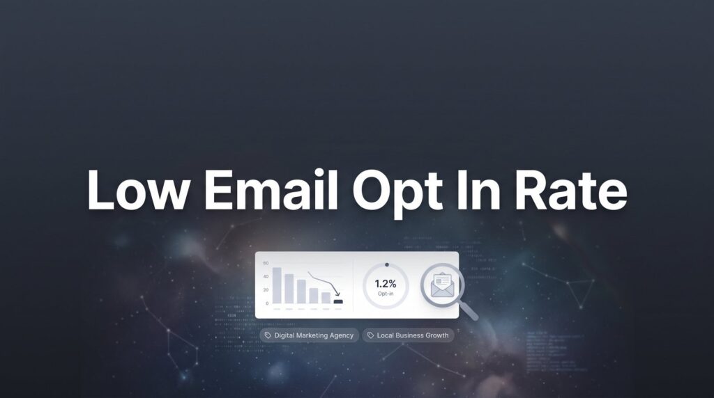
Start with the basic calculation: divide your total email signups by your unique visitors over a specific timeframe. If you had 100 signups from 10,000 visitors last month, your opt-in rate is 1%. This gives you your baseline—the number you’re working to improve.
But that overall number only tells part of the story. The real insights come from breaking down performance by individual pages.
Look at your highest-traffic pages first. These represent your biggest opportunities because even small percentage improvements translate to significant subscriber gains. A blog post getting 2,000 monthly visitors with a 0.5% opt-in rate is leaving 30-40 potential subscribers on the table if you could get it to a more typical 2-3% conversion rate.
Set up tracking to measure two critical metrics: how many people actually see your opt-in forms, and how many people who see them actually submit. This distinction matters tremendously. If 1,000 people visit a page but only 100 see your opt-in form, you have a visibility problem. If 500 people see the form but only 5 submit, you have an offer or copy problem. The right conversion rate optimization tools can help you track these metrics accurately.
Most analytics platforms can track form views and submissions as events. If you’re using Google Analytics, set up event tracking for form impressions and conversions. This takes about 15 minutes and gives you the data foundation you need for everything that follows.
Pay special attention to mobile vs. desktop performance. Many businesses discover their desktop opt-in rate is acceptable while mobile is disastrous—often because forms don’t display properly on smaller screens or load too slowly on cellular connections.
Create a simple spreadsheet documenting your findings. List your top 10-15 pages by traffic, their current opt-in rates, form visibility rates, and any obvious issues you notice. This becomes your roadmap for where to focus your optimization efforts.
The goal of this audit isn’t perfection. It’s clarity. You need to know whether you’re dealing with a visibility problem, an offer problem, or a friction problem before you start making changes.
Step 2: Craft an Irresistible Lead Magnet That Solves a Specific Problem
Generic “subscribe for updates” offers fail for a simple reason: they don’t give visitors a compelling reason to act right now. Updates about what? Why should someone care enough to hand over their email address?
The businesses that capture the most email subscribers offer something specific and immediately valuable in exchange for contact information. This is your lead magnet, and its quality directly determines your opt-in rate.
Here’s the counterintuitive truth about lead magnets: narrow, specific offers almost always outperform broad, general ones. A roofing company will get better results offering “The 7-Point Roof Inspection Checklist Every Homeowner Should Use Before Winter” than “Free Roofing Tips.” The specific offer attracts people with an immediate need and promises a concrete solution.
Think about the most common questions your customers ask before they buy. What information would help them make a better decision? What tools would make their lives easier? What mistakes do they frequently make that you could help them avoid? These questions form the foundation of effective lead generation strategies for businesses.
For local businesses, certain lead magnet formats work particularly well because they’re quick to create and immediately useful. Checklists help people ensure they don’t miss important steps. Templates save them time on tasks they need to complete anyway. Calculators help them estimate costs or returns before making decisions.
A landscaping company might offer a seasonal maintenance calendar that tells homeowners exactly what to do each month. A marketing agency could provide a campaign budget calculator that helps businesses allocate spending across channels. A law firm might create a checklist of documents needed for a specific legal process.
Before you invest time creating a lead magnet, validate the idea. Ask existing customers if they would have found it valuable. Post the concept in relevant online communities and gauge interest. Look at what competitors offer and identify gaps you could fill better.
The creation process doesn’t need to be complicated. Many highly effective lead magnets are simple PDF documents created in Google Docs or Canva. What matters is the value of the information, not production quality. A well-organized checklist in a basic PDF will outperform a beautifully designed guide that doesn’t solve a real problem.
Once you’ve created your lead magnet, the title becomes critical. It should communicate the specific benefit and outcome clearly. “Get organized” is vague. “The 30-Day Content Calendar Template for Busy Business Owners” tells people exactly what they’re getting and who it’s for.
Test your lead magnet title by asking yourself: would I give my email address for this? If the answer isn’t an immediate yes, keep refining until it is.
Step 3: Rewrite Your Opt-In Copy to Focus on Benefits, Not Features
Your lead magnet might be valuable, but if your opt-in copy doesn’t communicate that value clearly, visitors won’t convert. Most signup forms fail because they describe what the offer is instead of what it does for the person receiving it.
Think about the transformation your lead magnet provides. What’s the before state? What’s the after state? Your copy should paint that picture clearly.
Instead of “Download our SEO checklist,” try “Stop wondering if you’ve missed critical SEO steps that could be costing you rankings.” The second version addresses a specific pain point and implies a solution. It gives visitors a reason to care.
Your headline is the most important element of your opt-in form. It needs to grab attention and communicate value in seconds. Formulas that consistently work include problem-solution structures, numbered lists that promise specific outcomes, and questions that highlight pain points.
“Struggling to convert website visitors into customers?” works because it identifies with a common frustration. “Get the 5-step conversion audit that reveals exactly where you’re losing sales” works because it promises a specific, actionable outcome.
Address objections directly in your copy. People hesitate to give their email addresses for predictable reasons: they don’t want spam, they’re not sure the content will be valuable, they don’t want to commit to something ongoing. Understanding how to improve email open rates can help you deliver on the value you promise.
Counter these objections explicitly. “No spam, just actionable marketing strategies every Tuesday” addresses the spam concern and sets clear expectations. “Instant access—no waiting for email confirmation” removes a friction point. “Unsubscribe anytime with one click” gives people an exit strategy, which paradoxically makes them more likely to opt in.
The supporting copy below your headline should expand on the benefit and create urgency. If your lead magnet helps people avoid mistakes, mention what those mistakes cost. If it saves time, quantify how much. If it simplifies a complex process, acknowledge that complexity and promise clarity.
Keep the copy concise. Three to four short sentences is usually enough. Visitors are scanning, not reading carefully. Every word should earn its place by either communicating value or addressing an objection.
Test different value propositions to find what resonates with your specific audience. What works for one business won’t necessarily work for another. A B2B service company might find that time-saving benefits resonate most strongly. A consumer-focused business might get better results emphasizing immediate problem-solving.
Your call-to-action button deserves attention too. “Submit” and “Subscribe” are weak because they focus on the action, not the benefit. “Get My Free Checklist” or “Send Me the Calculator” are stronger because they reinforce what the visitor receives.
Step 4: Optimize Form Placement for Maximum Visibility Without Annoying Visitors
The best opt-in offer in the world won’t convert if visitors never see it. Form placement directly impacts both visibility and user experience, and finding the right balance is critical.
You have several strategic placement options, each with different strengths. Inline forms embedded directly in your content catch visitors when they’re already engaged with your material. Sidebar forms provide persistent visibility without interrupting the reading experience. Exit-intent popups capture attention at the moment someone’s about to leave. Scroll-triggered forms appear after visitors have demonstrated interest by reading a certain percentage of your content.
The timing question matters enormously. Show a popup too early and you interrupt visitors before they’ve had a chance to evaluate your content. Show it too late and they’ve already left. Many businesses find that triggering popups after someone has spent 30-45 seconds on a page or scrolled through 40-50% of the content strikes the right balance.
Exit-intent technology detects when someone’s mouse moves toward the browser’s close button and displays a last-chance offer. This works well on desktop because it captures attention at a moment when the visitor has already decided to leave—you’re not interrupting them, you’re giving them one more reason to stay connected.
Mobile requires different thinking. Exit-intent doesn’t work the same way because there’s no mouse movement to track. Popups that appear too quickly are particularly frustrating on mobile devices where they’re harder to close. Many businesses see better mobile results with inline forms placed naturally within content or sticky bars that remain visible at the top or bottom of the screen without blocking content.
Test your forms across actual devices, not just browser simulators. Pull up your website on your phone and navigate as a visitor would. Do forms load quickly? Are they easy to close if someone doesn’t want to engage? Can you easily tap the input fields and submit button, or are they too small for accurate tapping? Learning how to optimize landing pages for conversions includes getting these mobile details right.
Verify that your forms actually display correctly across different browsers and devices. A form that works perfectly in Chrome on desktop might break in Safari on mobile. This kind of technical failure costs you subscribers every single day until you catch and fix it.
Consider using multiple placement strategies simultaneously. An inline form in your blog content can work alongside an exit-intent popup. A sidebar form can complement scroll-triggered offers. The key is ensuring they don’t all fire at once and overwhelm visitors with signup requests.
Track performance by placement type. You might discover that exit-intent popups convert at 8% while inline forms convert at 2%, but the inline forms get 10 times more views. Both matter. Both contribute to your overall opt-in rate. The data tells you where to focus optimization efforts.
Step 5: Reduce Friction by Simplifying Your Signup Process
Every additional field in your signup form costs you subscribers. Every extra click creates another opportunity for people to abandon the process. Friction is the silent conversion killer.
Start with the fundamental question: what information do you absolutely need at the opt-in stage? For most businesses, the answer is just an email address. You can gather additional information later, after you’ve established value and built trust.
The email-only versus name-and-email debate depends on your specific situation. Asking for a name allows you to personalize emails, which can improve engagement. But it also reduces opt-in rates because it adds friction. Many businesses find that starting with email-only and asking for names in the welcome sequence works well—you maximize initial signups and gather additional information from people who are already engaged.
Look for technical friction points that create unnecessary barriers. Forms that load slowly frustrate visitors and increase abandonment. Broken forms that don’t submit properly waste interested prospects. Confusing button labels create hesitation. Error messages that don’t clearly explain what went wrong leave people stuck. These same principles apply when addressing low website conversion rate solutions across your entire site.
Test your signup flow exactly as a first-time visitor would experience it. Open an incognito browser window, navigate to your site, and try to sign up. Time how long it takes. Note every point where you hesitate or feel confused. If the process feels clunky to you, it definitely feels clunky to your visitors.
Check your confirmation process. Do people need to verify their email before receiving the lead magnet? If so, you’re adding friction and losing conversions. Many email platforms allow you to deliver the lead magnet immediately while still requiring confirmation for ongoing emails. This gives people instant gratification while maintaining list quality.
Look at your form design itself. Are the input fields large enough to easily tap on mobile? Is there enough contrast between the text and background for easy reading? Does the submit button stand out visually? Small design details impact conversion rates more than most businesses realize.
Consider the path after submission. Does a confusing “check your email” message leave people uncertain about what to do next? A clear confirmation message that tells people exactly what happens next—”Check your inbox for your checklist. It should arrive within 2 minutes.”—reduces anxiety and improves the experience.
Step 6: Build Trust Signals That Overcome Signup Hesitation
People are legitimately cautious about giving out their email addresses. They’ve been burned by spam, overwhelmed by too many emails, and frustrated by businesses that abuse their contact information. Your job is to overcome that hesitation with clear trust signals.
Privacy concerns are real and addressing them directly increases conversions. A simple statement like “We respect your privacy and will never sell your information” acknowledges the concern and provides reassurance. Link to your privacy policy for people who want details.
Social proof elements boost opt-in confidence significantly. If thousands of people have already subscribed, that number tells visitors the content must be valuable. “Join 5,000+ business owners getting weekly marketing insights” leverages social proof while reinforcing the value proposition.
Testimonials work well if you have them. A quote from a subscriber saying “These weekly tips have helped me generate 20% more qualified leads” provides both social proof and outcome-focused benefit communication. Real names and photos strengthen credibility. You can learn more about how to generate qualified leads online by combining trust signals with compelling offers.
Set clear expectations about email frequency and content. Uncertainty creates hesitation. “One email every Tuesday with actionable marketing strategies” tells people exactly what they’re signing up for. No surprises. No anxiety about being overwhelmed.
Here’s a counterintuitive trust builder: promise an easy unsubscribe. “Don’t like what you see? Unsubscribe anytime with one click—no hard feelings.” This actually increases signups because it removes the fear of commitment. People know they can easily opt out if the content doesn’t meet their expectations.
Display trust badges if they’re relevant to your business. If you’re Google certified, display that badge. If you’ve won industry awards, mention them. If you’ve been featured in reputable publications, show those logos. These signals communicate credibility and professionalism.
For service businesses where customers make significant purchasing decisions, trust signals matter even more. A law firm or financial advisor benefits tremendously from displaying credentials, years in business, and professional affiliations. These elements reassure visitors that they’re dealing with legitimate, qualified professionals.
Make sure your website itself looks professional and trustworthy. Broken links, outdated copyright dates, and poor design all undermine trust. If your website looks questionable, people won’t give you their email address no matter how good your lead magnet is.
Step 7: Test, Measure, and Iterate for Continuous Improvement
Optimization isn’t a one-time project. It’s an ongoing process of testing, learning, and improving. The businesses with the highest opt-in rates got there through systematic experimentation, not lucky guesses.
Start with simple A/B tests focused on high-impact elements. Test different headlines to see which value proposition resonates most strongly. Test different lead magnet offers to identify what your audience wants most. Test different form placements to find what generates the most visibility without annoying visitors.
Run one test at a time so you can clearly attribute results to specific changes. Testing multiple variables simultaneously makes it impossible to know what actually drove the improvement or decline.
Track metrics weekly and monthly to identify trends and spot problems quickly. Weekly tracking catches sudden drops that might indicate technical issues—a broken form, a plugin conflict, or a mobile display problem. Monthly tracking reveals longer-term trends and seasonal patterns.
Understanding statistical significance prevents you from making decisions based on random fluctuations. A test that shows a 15% improvement after 20 conversions might just be noise. The same improvement after 200 conversions is meaningful. Most A/B testing tools calculate statistical significance automatically, but if you’re tracking manually, aim for at least 100 conversions per variation before drawing conclusions. Professional conversion rate optimization services can help you design and interpret these tests correctly.
Build a testing roadmap that systematically improves your opt-in system over time. Start with the highest-impact elements—headline and offer—then move to secondary elements like copy, design, and placement. Document what you test, what you learn, and what you’ll test next.
Don’t ignore tests that fail. A headline that underperforms tells you something valuable about what doesn’t resonate with your audience. That information is just as useful as discovering what works.
Pay attention to segment-specific performance. Your opt-in rate might be strong overall but weak for mobile visitors, or strong for blog readers but weak for homepage visitors. These insights tell you where to focus your optimization efforts for maximum impact.
Set benchmarks based on your own performance rather than industry averages. Your goal is to improve your opt-in rate from where it is now, not to hit some arbitrary industry standard. If you’re at 1% and you get to 2%, you’ve doubled your lead capture. That’s a massive win regardless of what other businesses are achieving.
Your Opt-In Rate Action Plan
Fixing a low email opt-in rate comes down to systematic improvement across seven key areas. You’ve learned how to audit your current performance to identify exactly where the problems exist. You understand how to create lead magnets that solve specific problems instead of making generic promises. You know how to write copy that focuses on benefits and addresses objections directly.
You’ve seen how form placement impacts both visibility and user experience, and how to find the right balance for your specific audience. You understand that every additional field and every extra click costs you conversions. You know how to build trust signals that overcome the natural hesitation people feel about sharing their email address.
Most importantly, you understand that optimization is an ongoing process, not a one-time fix. The businesses that capture the most leads are the ones that test consistently, measure carefully, and iterate based on real data.
Start with your audit. Get clear on your current numbers and identify your biggest opportunities. Then tackle improvements systematically, testing and measuring as you go. Even small percentage improvements compound over time into significant increases in the number of qualified leads flowing into your business.
Your email list represents future revenue. Every subscriber is someone you can nurture, educate, and convert when they’re ready to buy. The time you invest in improving your opt-in rate pays dividends for months and years to come.
If you want to see what this would look like for your business with a complete lead generation system that turns traffic into qualified leads and measurable sales growth, we’ll walk you through how it works and break down what’s realistic in your market. We focus on building marketing systems that actually convert and deliver real revenue, not vanity metrics that look good but don’t impact your bottom line.