Getting more leads or sales from your website can feel tricky. The secret isn't a single magic button. It's about understanding what's happening on your site right now. This means digging into the data to see where you stand.
This guide will show you how to improve website conversion rates with simple, data-backed steps.
Your Starting Point: Auditing Website Performance
Before you can fix anything, you need a clear picture of what's working and what's not. An audit helps you find the story your data is telling you. Think of it as the foundation for every optimization decision you'll make.

It’s like a doctor diagnosing a patient. You wouldn't prescribe medicine without understanding the symptoms. Your website analytics are the symptoms. They point to problems like high bounce rates or a confusing checkout process that are killing your conversions.
Pinpoint Your Key Conversion Goals
First, let's define what a "conversion" means for your business. It’s not always a sale. A conversion is any meaningful action a visitor takes on your site.
These actions usually fall into two types:
- Macro-Conversions: These are your main goals, like a completed purchase, a submitted quote request, or signing up for a demo.
- Micro-Conversions: These are smaller steps that show user interest. Think newsletter sign-ups, PDF downloads, or watching a product video.
Tracking both gives you a full view of the customer journey. For instance, lots of newsletter sign-ups (micro) but few sales (macro) means your audience is engaged, but something is holding them back from buying.
A complete audit also means looking at what your competitors are doing. Using competitor AI analysis tools can help you benchmark your performance and find opportunities they might be missing.
Dig Into Your Website Analytics
Your analytics platform, likely Google Analytics 4, is where you'll find clues about user behavior. The key is to avoid getting overwhelmed. Focus on data that answers specific questions about where your conversion process breaks.
In Short: A website audit turns guesses into a concrete, data-driven strategy. It shows you the exact pages and user behaviors with the biggest potential for growth.
Start by looking for patterns on your most important pages.
- Where are people coming from?
- Where do they click next?
- Most importantly, where do they give up and leave?
Here are a few common problem areas to investigate first:
- High-Traffic, High-Bounce Pages: If a page gets lots of visitors but most leave without clicking anything, that's a red flag. It’s a great candidate for an update.
- Funnel Drop-Off Points: In GA4, you can build a funnel report for your checkout or lead form. This will show you the exact step where you lose the most people.
- Device Performance: Is your mobile conversion rate much lower than your desktop rate? That’s a classic sign of a poor mobile experience that needs fixing.
To keep it simple, here is a quick table of essential metrics to watch during your audit.
Key Conversion Metrics to Track
| Metric | What It Tells You | Good Starting Point |
|---|---|---|
| Conversion Rate | The percentage of users who complete a goal. | 1-2% for e-commerce; 2-5% for lead gen. |
| Bounce Rate | Percentage of single-page sessions (users who leave without interacting). | Aim for under 40%, but context matters. |
| Average Session Duration | How long users spend on your site per visit, on average. | 2-3 minutes is a solid benchmark. |
| Pages per Session | The average number of pages a user views in a session. | 2+ pages suggests good engagement. |
| Funnel Abandonment Rate | The percentage of users who start but don't finish a key process. | A >20% drop-off between steps is a red flag. |
These numbers give you a clear starting point. By focusing on these problem areas, you can create specific, actionable tasks like "redesign the shipping info step on our mobile checkout." This targeted approach is the core of successful Conversion Rate Optimization (CRO).
Winning With a Mobile-First Conversion Strategy
Let's be real: a huge number of your visitors are on their phones. If your site isn't designed for them, you're losing leads and sales. A clunky, slow, or hard-to-read mobile experience is a fast way to make someone leave.
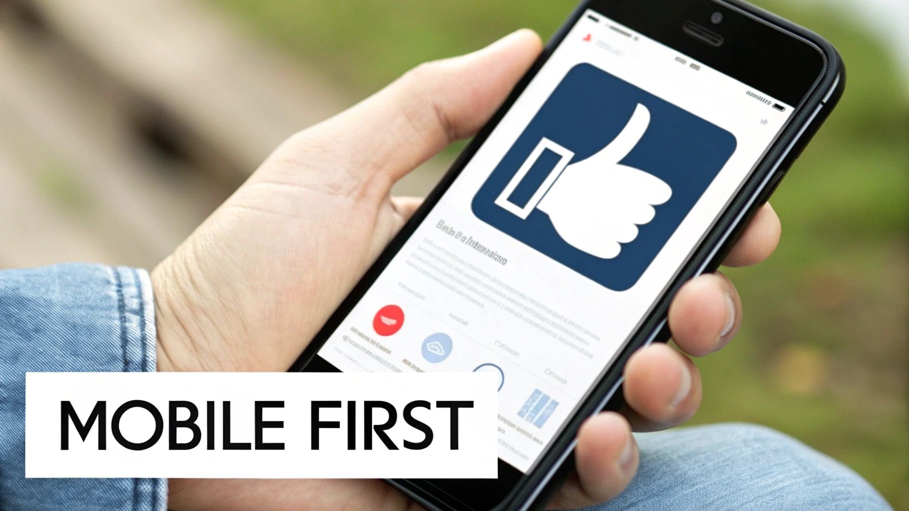
"Mobile-first" isn't just a buzzword. It's a key part of any serious conversion strategy. It means designing for the smallest screen first and then scaling up to desktop. This forces you to prioritize what's most important, leading to a cleaner experience for everyone.
What Is a good mobile conversion rate?
To win on mobile, you need to know the landscape. While mobile drives 73% of global website traffic, its conversion rate often lags behind desktop.
Recent e-commerce benchmarks put mobile conversion rates at just 2.9%, while desktops convert at 4.8%. This gap is a huge opportunity for businesses that get mobile right.
The reason for the gap is that many sites are just "mobile-friendly" instead of "mobile-optimized." Users on small screens face annoying problems like tiny buttons and long checkout forms. Fixing these issues helps close the conversion gap.
Design for Thumbs, Not Cursors
Designing for mobile means thinking about how people use their hands. They use their thumbs to tap, swipe, and scroll. Your job is to make that feel effortless.
Here are a few practical, thumb-friendly tips:
- Make Buttons Tappable: Ensure buttons and links are large enough to be easily tapped. A target size of at least 44×44 pixels is a good guideline.
- Simplify Your Navigation: Use a simple "hamburger" icon or a streamlined nav bar with just a few key options.
- Use Large, Readable Fonts: Stick to a legible font size (at least 16px for body text) and ensure high contrast between the text and background.
In Short: Keep your most important calls-to-action (CTAs) within the "thumb zone." That's the area of the screen a user can comfortably reach with their thumb.
Streamline Your Mobile Forms
Filling out forms on a phone can be annoying. If your contact form or checkout is long and complicated, your mobile abandonment rate will be high.
Simplicity is key.
Cut your forms down to the absolute essentials. Every field you remove is one less barrier to conversion. Use mobile-friendly features like dropdowns and numeric keypads for phone number fields. If you want to dive deeper, we have a guide on how to build a great mobile landing page.
How can I improve my mobile site speed?
Page speed is critical on mobile. Visitors on cellular networks have less patience for slow-loading sites. A delay of just a few seconds can spike your bounce rate.
Here are some ways to speed things up:
- Compress Your Images: Large images are a major cause of slow mobile sites. Use tools to compress them without losing too much quality.
- Minimize Your Code: Clean up your site's HTML, CSS, and JavaScript. Removing unnecessary code can make a big difference.
- Use a Content Delivery Network (CDN): A CDN stores copies of your site on servers worldwide, delivering content faster to users.
Designing Landing Pages That Actually Convert
Think of your landing pages as your digital sales pitch. When someone clicks your ad, this is where they land. You have just seconds to prove they're in the right place. A confusing page is the fastest way to waste your ad budget.

The goal is simple: create a focused experience that guides the visitor toward one specific action. Every element—from the headline to the button color—must work together to reduce friction.
The Anatomy of a High-Converting Landing Page
A landing page that works is a machine built on clarity. It needs a great headline, benefit-focused copy, good visuals, and a call-to-action (CTA) that's impossible to miss.
Here are the essential parts of a great landing page:
- A Magnetic Headline: Your first impression. It must grab attention and instantly confirm the visitor found what they were looking for.
- Benefit-Oriented Copy: Don't just list features. Explain how your product or service solves their problem.
- Compelling Visuals: A photo or video can show your product in action and build an emotional connection faster than text.
- A Crystal-Clear CTA: One page, one primary goal. Make it obvious what you want them to do next.
Building Instant Trust with Social Proof
People trust other people more than they trust brands. That's why social proof is one of the most powerful conversion tools. It’s the digital version of a friend's recommendation.
In Short: Showing that real people have used and loved your offer calms doubts and makes the decision feel safe.
How can you add social proof to your landing pages?
- Customer Testimonials: Use real quotes from happy customers. Adding a name and photo makes them feel more authentic.
- Star Ratings and Reviews: A simple 5-star rating is a powerful visual cue for quality.
- Case Studies: For B2B services, a short case study showing real results (e.g., "We helped Company X increase leads by 45%") is very convincing.
Try placing these trust signals near your CTA to give visitors that last bit of confidence.
Creating a Clear and Irresistible Call-to-Action
Your Call-to-Action (CTA) is the most important element on the page. It needs to be big, bold, and obvious.
A powerful CTA uses specific, action-focused words.
Weak CTA: "Submit"
Strong CTA: "Get Your Free Quote Now"
Weak CTA: "Learn More"
Strong CTA: "Download My Free Ebook"
The button itself should stand out. Use a color that contrasts with the rest of the page to draw the eye. We dive deeper into this in our guide on the steps to creating a great PPC landing page.
The Importance of Message Match
One of the biggest landing page mistakes is a disconnect between your ad and your page. This is called message match.
If your Google Ad promises a "50% Off Spring Sale," your landing page headline must say the same thing. If it doesn't, visitors feel misled and will leave immediately. This mismatch destroys trust. A perfect message match reassures visitors they're in the right place.
Tap Into Paid Traffic to Find Your Best Customers
Not all website visitors are the same. A person who clicks from social media has a different mindset than someone who just Googled "emergency plumber near me."
This difference in user intent is why paid traffic from channels like Google Ads is a game-changer for conversion rates. You are reaching people who are actively looking for a solution right now. They have a problem, and you have the answer.
This high-intent traffic is almost always easier to convert.
Why Paid Search Just Works
When you search on Google, you're on a mission. The ads at the top are designed to match your search. This alignment between user intent and your ad's promise is the secret to high conversion rates.
Focusing on this ready-to-buy traffic gives your conversion numbers a serious boost. Paid search averages a 3.2% conversion rate across most industries, beating organic search (2.7%) and referrals (2.9%). You can check the average conversion rates for your specific industry to see how you compare.
Paid Traffic vs Organic Traffic Conversion Potential
It's helpful to see how different traffic sources stack up. This helps you decide where to put your marketing budget for the best return.
| Traffic Source | Average Conversion Rate | Typical User Intent | Best For |
|---|---|---|---|
| Paid Search (Google Ads) | 2.5% – 4% | High (Problem/Solution Aware) | Lead generation, direct sales, immediate action |
| Organic Search (SEO) | 1.5% – 3% | Mixed (Informational to Transactional) | Building brand trust, long-term growth, authority |
| Direct Traffic | 2% – 5%+ | Very High (Brand Aware) | Nurturing existing customers, brand loyalists |
| Social Media (Paid) | 0.5% – 1.5% | Low (Passive, Discovery) | Brand awareness, top-of-funnel engagement |
| Email Marketing | 3% – 6% | High (Warm Audience) | Nurturing leads, customer retention, promotions |
Paid search is a clear winner for attracting people who are ready to act. If immediate conversions are your goal, paid search is where you should focus.
Hunting for "Buying Intent" Keywords
The foundation of a winning paid search campaign is your keyword choice. You want to bid on terms that signal "I'm ready to buy," not "I'm just browsing."
Think of it this way:
- Low Intent (Informational): "how to fix a leaky faucet"
- High Intent (Commercial/Transactional): "plumber prices near me" or "24-hour plumber service"
Using your ad budget on these high-intent, long-tail keywords means you're attracting visitors who are much more likely to convert.
Ad Copy That Makes People Click
Your ad is your digital storefront sign. It needs to grab attention. Good ad copy is sharp, direct, and speaks to the searcher's pain point.
A few quick tips:
- Include your main keyword in the headline.
- Highlight a key benefit (e.g., "Free Estimates Today").
- Use an action-oriented call-to-action like "Call Now for a Quote."
In Short: A great paid ad campaign isn't about getting tons of clicks. It's about getting the right clicks. When your keywords, ad copy, and landing page are all in sync, you turn ad spend into customers.
Bring 'Em Back with Retargeting
What about people who click your ad but leave without converting? That's where retargeting comes in.
Retargeting (or remarketing) is a smart way to show your ads to people who have already visited your website. By placing a small piece of code on your site, you can show them ads on other websites they visit.
It's a powerful way to stay top-of-mind and gently nudge them back to your site. Getting this right requires good data, so be sure you know how to set up Google Ads conversion tracking.
A/B Testing: Your Secret Weapon for Continuous Growth
Guesswork is bad for business. Data is your best friend. After finding problems in your analytics, the smart move is to use A/B testing to make informed decisions.
A/B testing (or split testing) is a simple concept. You create two versions of a webpage: the original "control" (A) and a new version with a change, the "variation" (B). You show these two versions to a similar audience and see which one performs better.
This takes the guesswork out of website changes. You don't have to argue about whether a green button is better than a red one. You just test it and let your users decide with their clicks.
How to Craft a Hypothesis That Actually Works
Every good A/B test starts with a strong hypothesis. This is an educated prediction based on what you’ve learned from your audit. A good hypothesis follows a simple structure: “If I change [X], then [Y] will happen, because [Z].”
Let's break that down:
- The Change [X]: The one specific thing you will alter.
- The Expected Outcome [Y]: The metric you hope to improve.
- The Rationale [Z]: The why behind your prediction.
For example, if analytics show people are leaving a key landing page, a solid hypothesis might be:
"If we change the headline to focus on the benefit of 'saving 2 hours per week,' then we will see more demo requests, because the current headline is too vague."
This turns a fuzzy idea into a focused, measurable experiment.
Where to Start? High-Impact A/B Testing Ideas
You could test almost anything, but it's best to start with changes that have the biggest potential impact.
Here are the heavy hitters to start with:
- Headlines & Subheadings: This is your first impression. Test a benefit-driven headline against one that asks a question.
- Call-to-Action (CTA) Buttons: Test the text ("Get Started" vs. "Claim Your Free Trial"), color, size, and placement.
- Page Layout & Design: Test a clean, single-column layout against a two-column design, or move your lead form higher on the page.
- Images & Videos: Test a product video against static images, or a photo of a real customer against a stock photo.
- Form Fields: Friction kills conversions. If your form has six fields, test a variation with just three.
Running a Clean Test and Making Sense of the Results
To get meaningful results, you have to run a clean experiment. The golden rule is to only test one variable at a time. If you change the headline and the button color, you’ll never know which change caused the result.
You also need to run the test long enough to reach statistical significance. This means you're confident the results aren't just a random fluke. Most A/B testing tools, like Google Optimize or VWO, will tell you when you've reached a confidence level of 95% or higher.
Once you have a clear winner, implement the change for all your visitors. Then, use what you learned to create your next hypothesis. This is how you build an engine for continuous growth.
Putting It All Together: Your CRO Action Plan
Okay, we’ve covered a lot. Now let's build a simple plan you can start using today. Knowing how to improve website conversion rate isn't a one-time project; it's a constant cycle of listening to your users and making smart changes.
At its core, CRO is a simple loop: find the problem, create a solution, and test to see if you were right.
This process is about creating a growth engine, not finding a single quick fix.
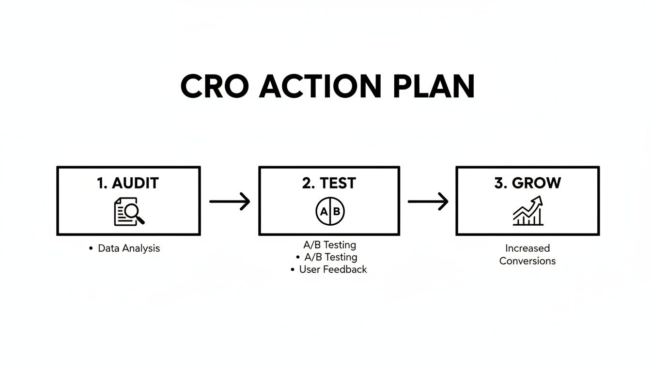
As you can see, it's a rinse-and-repeat formula. You audit, you test, and you grow. Then you do it all over again.
Your Simple CRO Checklist
Don't get overwhelmed. Just follow these steps to build momentum and see your numbers improve.
- Know Your Starting Line: First, you can't improve what you don't measure. Go into Google Analytics, find your current conversion rate, and define your main goals. This is your baseline.
- Find the Biggest Leak: Look for the single biggest drop-off point in your user journey. Is it a landing page with a high bounce rate? That's your starting point.
- Build One Solid Hypothesis: Based on that leak, make an educated guess. For example, "I bet if we cut our lead form from six fields to three, more people would complete it."
- Run Your First A/B Test: Now, test that one thing. Let your testing tool run until the result is statistically significant.
- Decide and Repeat: Did the new version win? Great—roll it out to everyone. Did it lose? No problem. You just learned what doesn't work. Use that knowledge to create your next hypothesis and start again.
In Short: The real secret to CRO is consistency. Focus on small, data-backed improvements over time. Every test, win or lose, makes you smarter.
For a deeper dive, check out these extra tips on how to improve website conversion rates.
Frequently Asked Questions
Let's tackle a few common questions that come up when improving a website's conversion rate.
What are the 3 ways to improve conversion rate?
There isn't a single magic formula, but three of the most effective strategies are:
- Optimize Your Landing Pages: Ensure your headlines, copy, and call-to-action (CTA) are clear, compelling, and match the user's intent from the ad or link they clicked.
- Improve Site Speed and Mobile Experience: A fast, easy-to-use website, especially on mobile devices, reduces friction and keeps users from leaving in frustration.
- Use A/B Testing: Don't guess what works. Continuously test different elements like headlines, button colors, and form lengths to find out what your audience actually responds to.
What is a good website conversion rate?
This is a common question, but the answer is: it depends. A "good" conversion rate varies widely based on your industry, traffic source, and the price of your product or service.
As a general benchmark, an average conversion rate is often cited as being between 2% and 5%.
In Short: Don't worry too much about universal benchmarks. The only number that truly matters is your own. Your goal should be to consistently improve your own performance month over month.
How do I start conversion rate optimization?
The best place to start is with the "low-hanging fruit." You want to focus on areas that can provide the biggest impact with the least amount of effort.
For most businesses, this means you should look at:
- Your homepage
- Your main product or service pages
- Your checkout process or lead forms
Start by using analytics to find the page in this group with the biggest drop-off or highest bounce rate. That's where you should run your first test. Fixing a small issue on a high-traffic, critical page will almost always give you a faster return than optimizing a less important page.
Ready to stop guessing and start converting? The team at Clicks Geek combines data-driven CRO strategies with expert Google Ads management and web design to turn your clicks into customers. Learn how we can help you grow your business today.