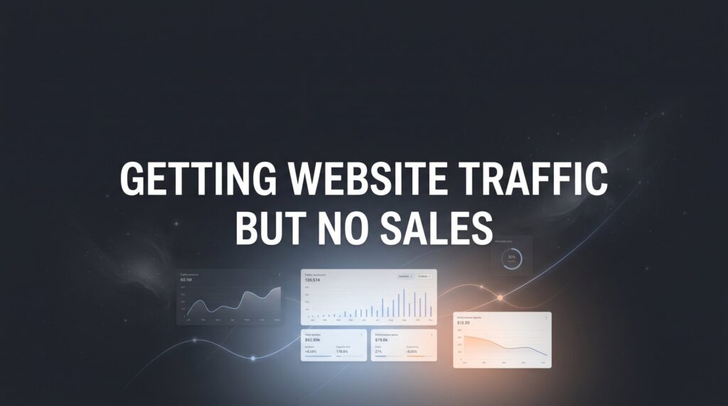
You’re checking your analytics dashboard and the numbers look great—hundreds, maybe thousands of visitors hitting your site every day. But when you look at your sales? Crickets.
This frustrating disconnect between traffic and revenue is one of the most common problems local business owners face, and it’s costing you real money every single day those visitors leave empty-handed.
The good news: this is a fixable problem.
The issue isn’t your traffic—it’s what happens after visitors arrive. Something in your conversion process is broken, and this guide will help you find exactly where the leak is and plug it.
Over the next seven steps, you’ll conduct a systematic audit of your website’s conversion path, identify the specific barriers preventing sales, and implement proven fixes that turn browsers into buyers. Whether you’re running an e-commerce store, a service business, or a local shop with online booking, these steps apply to you.
Let’s find out why your traffic isn’t converting—and fix it.
Step 1: Audit Your Traffic Quality to Ensure You’re Attracting Buyers
Not all website traffic is created equal. You could have thousands of visitors who have zero intention of buying anything from you.
Start by opening Google Analytics and navigating to your traffic sources report. Look at where your visitors are coming from: organic search, paid ads, social media, referrals, direct traffic. Now here’s the critical part—don’t just look at volume. Look at behavior.
Check the bounce rate for each traffic source. If a channel shows 70%+ bounce rates while others sit at 40%, that’s a red flag. Those visitors aren’t finding what they expected. Next, examine time on site and pages per session. Channels driving engaged visitors who explore multiple pages are sending higher-intent traffic than those where people bail after ten seconds.
Dig into your organic search traffic specifically. Open Google Search Console and review the actual queries bringing people to your site. This is where many businesses discover their problem: they’re ranking for informational, top-of-funnel keywords that attract researchers, not buyers.
For example, if you sell HVAC services and most of your traffic comes from queries like “how does air conditioning work” or “DIY AC troubleshooting,” you’re attracting people in learning mode, not buying mode. Meanwhile, queries like “emergency AC repair near me” or “HVAC installation cost [your city]” signal purchase intent.
Look at your paid traffic if you’re running ads. Are you bidding on broad, high-volume keywords that sound good but attract tire-kickers? Or are you targeting bottom-funnel terms with clear commercial intent? If your paid traffic isn’t converting, the problem often starts with keyword selection.
Create a simple spreadsheet. List your top ten traffic sources. Note the bounce rate, average session duration, and conversion rate for each. Rank them from highest to lowest converting. This reveals which channels deserve more investment and which are wasting your budget.
If you discover that a significant portion of your traffic comes from low-intent sources, you have two options: either adjust your content strategy to better qualify these visitors and move them toward a purchase, or redirect your marketing efforts toward channels and keywords that attract buyers from the start.
The fastest fix? Double down on what’s already working. If one traffic source converts at 5% while another converts at 0.5%, shift budget toward the winner.
Step 2: Identify Where Visitors Drop Off in Your Conversion Funnel
You can’t fix what you can’t see. Most businesses have no idea where their conversion funnel actually breaks.
Set up funnel visualization in Google Analytics if you haven’t already. Define the key steps in your conversion path: homepage to product/service page, product page to cart or contact form, cart to checkout, checkout to purchase confirmation. Google Analytics will show you exactly what percentage of visitors make it through each step.
The drop-off points tell you where to focus. If 80% of visitors leave your product pages without adding anything to cart, your product pages have a problem. If people add items to cart but 70% abandon before checkout, something about your checkout process is killing conversions.
Now layer in qualitative data. Install a heatmap tool like Hotjar or Microsoft Clarity. These tools show you where people actually click, how far they scroll, and where their mouse hovers. You’ll often discover that your most important call-to-action sits below where most visitors stop scrolling, or that people repeatedly click on elements that aren’t clickable.
Session recordings are even more revealing. Watch actual visitors navigate your site. You’ll see them hesitate, backtrack, and abandon in real-time. Pay attention to patterns. If multiple recordings show people scrolling up and down a pricing page like they’re searching for something, they probably can’t find the information they need to make a decision.
Common drop-off points and what they mean: High landing page bounce rates indicate a mismatch between what your traffic source promised and what your page delivers. Exits from product or service pages suggest unclear value propositions or missing information. Cart abandonment points to pricing surprises, unexpected shipping costs, or complicated checkout processes. Form abandonment means your forms are too long, too invasive, or not worth the effort.
Create a prioritized hit list. Which pages have the highest traffic AND the highest exit rates? Those are your biggest leaks. A page that gets 10,000 visitors and loses 8,000 of them costs you more than a page that gets 100 visitors and loses 80. Understanding why website traffic doesn’t convert starts with identifying these exact friction points.
Document everything you find: specific pages with problems, exact drop-off percentages, and behavioral patterns from recordings. This becomes your roadmap for the fixes you’ll implement in the following steps.
Step 3: Fix Your Value Proposition and Messaging Clarity
Here’s a brutal test: show your homepage to someone who’s never seen your business before. Give them five seconds. Then hide it and ask them what you do and why they should choose you.
If they can’t answer clearly, your messaging is costing you sales.
Most business websites bury their value proposition under vague corporate-speak and generic claims. “Industry-leading solutions.” “Customer-focused approach.” “Innovative services.” These phrases mean nothing to visitors trying to decide if you can solve their problem.
Your headline—the first thing people see above the fold—should immediately answer three questions: What do you do? Who do you do it for? Why should I care?
Compare these two headlines. Generic: “Your Trusted Partner for Business Growth.” Specific: “PPC Management That Delivers Qualified Leads to Local Service Businesses—Without Wasting Your Budget on Clicks That Don’t Convert.”
The second version tells you exactly what they do, who it’s for, and what specific problem they solve. No guessing required.
Audit every key page on your site. Do your product or service pages clearly explain what the customer gets? Not features—benefits. Not “24/7 monitoring”—”Sleep soundly knowing we catch problems before they cost you money.”
Eliminate jargon that makes you sound smart but confuses visitors. If your target customer wouldn’t use that terminology in a normal conversation, neither should you. Technical language creates distance. Plain language builds connection.
Replace vague claims with concrete proof. Instead of “We help businesses succeed,” try “We’ve generated 847 qualified leads for local contractors in the past 12 months.” Specificity builds credibility. This approach is essential when learning how to improve your website conversion rate.
Add numbers wherever possible. “Fast turnaround” becomes “Projects completed in 3-5 business days.” “Affordable pricing” becomes “Plans starting at $299/month.” Concrete details help visitors make decisions.
Review your above-the-fold content on mobile devices. That’s where most of your traffic views your site. Can visitors immediately understand your offer without scrolling? If your value proposition sits below the fold on mobile, most visitors will never see it.
Your messaging should speak directly to the pain points your customers experience. If you sell accounting services to small businesses, your headline shouldn’t talk about “comprehensive financial solutions.” It should say something like “Stop Worrying About Tax Season—We Handle Your Books So You Can Focus on Running Your Business.”
Clear messaging isn’t about being clever. It’s about being instantly understood.
Step 4: Eliminate Technical Barriers Killing Your Conversions
Your website could have the most compelling offer in your industry, but if it loads like it’s 1999, visitors won’t stick around to find out.
Test your page speed using Google PageSpeed Insights. Enter your URL and check both mobile and desktop scores. Anything below 50 is a serious problem. Even scores in the 60-70 range leave money on the table.
The most common speed killers: oversized images, too many third-party scripts, bloated code, and cheap hosting that can’t handle traffic spikes. Compress your images—there’s no reason a product photo needs to be 5MB. Remove or defer non-essential scripts. Consider upgrading your hosting if your current plan struggles during peak hours.
Now test your site on actual mobile devices. Not just in Chrome’s mobile emulator—grab your phone and navigate through your conversion path like a real customer would. Try to fill out your contact form. Attempt to complete a purchase.
You’ll likely discover frustrating issues: buttons too small to tap accurately, form fields that don’t trigger the right keyboard, text too tiny to read without zooming, horizontal scrolling that makes navigation impossible. Each friction point increases the likelihood that visitors give up.
Check your checkout process specifically. Count how many steps visitors must complete from “Add to Cart” to “Order Confirmed.” Every additional step increases abandonment rates. Can you combine steps? Eliminate required fields that aren’t absolutely necessary?
The classic conversion killer: forcing visitors to create an account before purchasing. Offer guest checkout. You can always ask them to create an account after they’ve completed their purchase. These technical issues often explain why you’re not getting customers online despite decent traffic numbers.
Run a broken link audit using a tool like Screaming Frog or Ahrefs. Broken links destroy credibility. If a visitor clicks on “Learn More” and lands on a 404 error page, they’re gone. They’re not coming back.
Test your forms rigorously. Do they actually submit? Do visitors receive confirmation emails? Does the thank-you page load correctly? You’d be surprised how many businesses have contact forms that silently fail, losing leads without anyone noticing.
Look for error messages that confuse rather than help. “Invalid input in field 7” means nothing to a user. “Please enter a valid phone number” tells them exactly what to fix.
Technical problems often hide in plain sight because you, as the business owner, know how to navigate around them. Fresh eyes catch what you’ve become blind to. Ask someone unfamiliar with your site to complete a purchase or submit a contact form while you watch. Don’t help them. Just observe where they struggle.
Step 5: Build Trust Signals That Overcome Buyer Hesitation
People don’t buy from businesses they don’t trust. Your job is to eliminate every reason for doubt before it stops a sale.
Start with customer reviews and testimonials. But here’s the key: placement matters as much as having them. Don’t bury testimonials on a separate “Reviews” page that nobody visits. Place them exactly where buying decisions happen.
Put a testimonial about your product quality directly on your product pages. Feature a review about your checkout process near your “Buy Now” button. Add a testimonial about your customer service on your contact page. Match the proof to the concern visitors have at that specific moment.
Make testimonials specific and credible. Generic praise like “Great service!” does nothing. But “They responded to my emergency call within 20 minutes and had my AC running again before dinner—saved our family reunion” tells a story people believe.
Include the customer’s full name, photo, and city if possible. Anonymous testimonials feel fake even when they’re real.
Add trust badges and security indicators, especially on checkout pages. Display recognized logos: SSL certificates, payment processor badges, industry association memberships, Better Business Bureau ratings. These visual cues signal legitimacy. Addressing a poor website conversion rate often comes down to building this kind of credibility.
Create or improve your About page. This isn’t about your company history or mission statement. It’s about showing the humans behind the business. Include photos of your team. Tell the story of why you started the business. Show your face—literally. People buy from people, not faceless corporations.
Display your contact information prominently. A physical address, phone number, and email address visible in your footer tells visitors you’re a real business that stands behind its work. Hiding contact information triggers suspicion.
If you offer guarantees or warranties, make them visible. “30-Day Money-Back Guarantee” or “Lifetime Warranty on All Parts” reduces purchase risk. Place these assurances near your calls-to-action.
Show social proof beyond testimonials. “Join 3,000+ local businesses who trust us for their marketing” or “Rated 4.9/5 stars from 500+ verified customers” leverages the power of consensus. People feel safer doing what others have already done successfully.
If you’ve won awards, been featured in media, or earned certifications, display them. Google Premier Partner status, industry certifications, or features in recognized publications all build credibility.
Trust isn’t built with one element. It’s the cumulative effect of multiple signals that tell visitors: “This business is legitimate, competent, and safe to do business with.”
Step 6: Optimize Your Calls-to-Action for Maximum Response
Your call-to-action is where intent becomes action. If visitors can’t find it, don’t understand it, or don’t feel compelled by it, they won’t convert.
Audit every CTA on your key pages. Can you spot them immediately without searching? If your “Request a Quote” button blends into your background color or sits in a location visitors rarely look, it’s invisible.
Test CTA visibility by taking screenshots of your key pages and showing them to someone unfamiliar with your site. Ask them to point to where they’d click to take the next step. If they hesitate or point to the wrong element, your CTA needs work.
Button text matters more than most businesses realize. Generic labels like “Submit” or “Click Here” waste the most valuable real estate on your page. Action-oriented, benefit-focused text performs better.
Compare these: “Submit Form” versus “Get Your Free Audit.” “Learn More” versus “See How Much You Could Save.” “Buy Now” versus “Start Saving Today.” The second option in each pair tells visitors exactly what happens when they click and hints at the benefit they’ll receive.
Create urgency without being pushy. “Limited Spots Available This Month” or “Schedule Your Free Consultation Today” encourages immediate action. But avoid fake scarcity—countdown timers that reset daily destroy trust.
Test different CTA colors. Your button should contrast sharply with surrounding elements. If your site uses blue as a primary color, a blue CTA button disappears. Try orange, green, or red—colors that naturally draw the eye. Professional sales funnel optimization services often start by auditing these exact CTA elements.
Size matters too. Your CTA button should be large enough to notice and tap easily on mobile devices, but not so oversized that it looks desperate or unprofessional.
Match your CTA to visitor intent at different stages. Someone on your blog reading an educational article isn’t ready for “Buy Now.” They might respond to “Download Our Free Guide” or “See Real Examples.” Someone on a pricing page is much closer to purchase—”Start Your Free Trial” or “Schedule Your Installation” makes sense there.
Use multiple CTAs on long pages, but make sure they’re all driving toward the same conversion goal. If visitors have to scroll through 2,000 words of content, they shouldn’t have to scroll back to the top to find your CTA again.
Test CTA placement above the fold for high-intent pages. If someone lands on your “Emergency Plumbing Services” page from a Google search at 11 PM with a burst pipe, they don’t want to scroll through three paragraphs before finding your phone number. Put the CTA where they can see it immediately.
Run simple A/B tests on your highest-traffic pages. Change one element at a time—button color, text, placement—and measure the impact. Small improvements compound over time.
Step 7: Implement Conversion Tracking and Continuous Testing
You can’t improve what you don’t measure. Most businesses track traffic but ignore the metrics that actually matter: conversions, revenue, and ROI.
Set up proper conversion tracking in Google Analytics. Define what counts as a conversion for your business: completed purchases, form submissions, phone calls, appointment bookings. Configure goals or events to track each action.
If you’re running paid advertising, connect your conversion tracking to your ad platforms. Google Ads, Facebook Ads, and other platforms need to know which clicks result in sales so they can optimize toward your actual business goals, not just clicks. Understanding marketing attribution models helps you identify which channels actually drive revenue.
Install call tracking if phone calls are important conversions for your business. Dynamic number insertion lets you track which marketing channels drive phone leads, not just web form submissions.
Create a simple dashboard that shows your key conversion metrics at a glance. Traffic is interesting, but conversion rate, cost per acquisition, and revenue per visitor are what determine profitability.
Establish a weekly review ritual. Every Monday morning, check your conversion data from the previous week. Look for sudden drops or spikes. A 50% decrease in conversion rate over three days signals a problem that needs immediate attention—maybe a technical issue broke your checkout process, or a recent site change killed conversions.
Build a testing roadmap based on potential impact. You have limited time and resources. Focus on changes that could move the needle significantly. Testing button colors on a page that gets 50 visitors per month won’t matter. Testing your checkout process that 5,000 people see every month could dramatically impact revenue.
Use A/B testing tools to validate changes before rolling them out site-wide. Split your traffic between the current version and a new version. Let the test run until you have statistically significant data. Don’t make decisions based on three days of data and 47 visitors.
Document what you test and what you learn. Create a spreadsheet tracking every test: what you changed, why you changed it, the results, and whether you implemented the winning version. This prevents you from re-testing the same things and helps you build on what works.
Remember that conversion optimization is continuous, not a one-time project. Consumer behavior changes. Your competition evolves. New devices and browsers emerge. What works today might need adjustment in six months.
Set quarterly goals for conversion rate improvement. Even small gains compound. Improving your conversion rate from 2% to 2.5% means 25% more revenue from the same traffic. That’s a bigger impact than increasing traffic by 25% while conversion rate stays flat.
Your Conversion Optimization Action Plan
Let’s recap what you’ve covered and what needs to happen next.
You’ve audited your traffic quality and identified which sources send buyers versus browsers. You’ve mapped your conversion funnel to pinpoint exactly where visitors drop off. You’ve clarified your value proposition so visitors immediately understand what you offer and why it matters. You’ve eliminated technical barriers that were silently killing conversions. You’ve strategically placed trust signals throughout your conversion path. You’ve optimized your calls-to-action for visibility and action. And you’ve implemented conversion tracking so you can measure what actually works.
Here’s your quick-reference checklist: Traffic quality verified and low-intent sources identified. Funnel drop-off points mapped and prioritized. Value proposition clarified and above-the-fold messaging sharpened. Technical barriers eliminated—speed, mobile, checkout. Trust signals strategically placed throughout conversion path. CTAs optimized for visibility and action. Conversion tracking implemented for ongoing measurement.
The gap between traffic and sales doesn’t close overnight, but each step you complete moves the needle. Start with Step 2 if you need quick wins—identifying drop-offs is where most businesses find their biggest leaks.
Some businesses can implement these fixes themselves. Others realize they need expert eyes to diagnose the specific problems killing their conversions. The difference between guessing and knowing exactly what’s broken is the difference between wasting months testing random changes and implementing fixes that actually drive revenue.
Tired of spending money on marketing that doesn’t produce real revenue? We build lead systems that turn traffic into qualified leads and measurable sales growth. If you want to see what this would look like for your business, we’ll walk you through how it works and break down what’s realistic in your market.
Your traffic is already there. Now make it count.