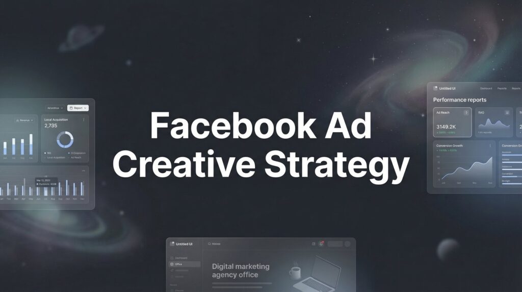
You’ve got the targeting dialed in. Your budget is set. You hit “publish” on your Facebook campaign with confidence. Then you watch your money evaporate as people scroll right past your ad like it doesn’t exist.
Here’s the uncomfortable truth most business owners discover too late: your Facebook ads aren’t failing because you picked the wrong audience or spent too little. They’re failing because your creative is forgettable.
Every day, Facebook users scroll past thousands of images, videos, and messages. Your ad has roughly three seconds—often less—to interrupt that scroll, communicate value, and convince someone to stop and pay attention. Most ads lose that battle instantly. Not because the offer is bad or the targeting is wrong, but because the visual and message blend into the feed like wallpaper.
The stakes are higher than you think. Weak creative doesn’t just mean fewer conversions. It means you’re paying premium prices for every result you do get. Facebook’s algorithm punishes boring ads with higher costs and limited reach, while rewarding engaging creative with lower costs and expanded delivery. The difference between a mediocre ad and a great one isn’t just performance—it’s profitability.
This guide breaks down the strategic framework behind Facebook ad creative that actually converts. You’ll learn the psychology that makes people stop scrolling, how to choose the right format for your goal, the messaging frameworks that turn cold traffic into leads, and the testing methodology that separates profitable campaigns from expensive experiments. No fluff, no theory—just the practical strategies local businesses use to create ads that drive real revenue.
Why Your Ad Creative Determines Everything That Happens Next
Let’s start with a reality check about how Facebook advertising actually works. Your targeting puts your ad in front of the right people. Your budget determines how often they see it. But your creative—the image, video, and copy—is the single variable that decides whether someone stops scrolling or keeps moving.
Think about your own behavior on Facebook. You’re scrolling through your feed, half-paying attention, thumb moving automatically. What makes you stop? It’s never the advertiser’s targeting sophistication. It’s always something visual or textual that breaks your pattern and demands attention.
That split-second decision—stop or scroll—determines everything that follows. No matter how perfect your audience or how generous your budget, if your creative doesn’t interrupt the scroll, nothing else matters. The targeting just ensures you’re wasting money on the right people.
Here’s where it gets more consequential: Facebook’s algorithm is watching what happens when people see your ad. High engagement—clicks, reactions, comments, shares—signals to the platform that your ad is valuable content people want to see. The algorithm responds by showing your ad to more people at lower costs. Strong creative literally earns you algorithmic rewards.
Weak creative triggers the opposite effect. Low engagement signals that your ad isn’t resonating. The algorithm responds by making you pay more for every impression and restricting your reach. Your cost per result climbs while your campaign performance tanks. You’re not just getting fewer conversions—you’re paying more for each one you do get. If you’re experiencing this, understanding why your Facebook ads are not converting is the first step toward fixing the problem.
The compounding cost of mediocre creative is brutal. As your ad accumulates impressions without engagement, frequency increases. The same people see your forgettable ad multiple times, which accelerates ad fatigue. Performance degrades faster, costs spike higher, and you’re forced to refresh creative sooner. The entire campaign lifecycle shortens because your creative couldn’t hold attention.
This is why businesses burn through ad budgets without results. They treat creative as an afterthought—something to throw together quickly so they can launch the “real work” of targeting and optimization. But creative is the real work. It’s the foundation everything else is built on.
When you nail the creative, everything gets easier. Lower costs give you more flexibility with bidding. Higher engagement extends the lifespan of each ad. Better conversion rates mean you can scale profitably. The campaign becomes a revenue generator instead of a budget drain.
The businesses winning with Facebook ads aren’t necessarily spending more or targeting better. They’re creating ads that people actually want to stop and look at. That’s the game.
The Visual Psychology That Stops the Scroll
Your ad creative has one job before it can do anything else: break the pattern. Facebook feeds are visually monotonous by design—a predictable rhythm of friend photos, text posts, and occasional videos. Your ad needs to interrupt that rhythm so abruptly that the thumb stops moving.
Pattern interruption isn’t about being weird or random. It’s about strategic contrast. If the feed is showing mostly static images, movement catches the eye. If everything is bright and colorful, stark simplicity stands out. If most content features people facing forward, a profile view creates visual tension. You’re looking for the element that doesn’t belong.
Color psychology plays a bigger role than most advertisers realize. Warm colors like red and orange create urgency and grab attention in a feed dominated by blues and whites. High contrast between elements—dark text on light backgrounds, bright subjects against muted environments—helps key information pop. But the goal isn’t just attention for attention’s sake. The colors and contrast need to guide the viewer’s eye to the most important element: your core message or call to action.
The three-second rule is unforgiving. In those first three seconds of exposure, your ad must communicate three things: what benefit you’re offering, why it’s relevant to this person right now, and what curiosity gap makes them want to learn more. If any of those elements are unclear or require too much cognitive effort to decode, the scroll continues.
This is why busy, cluttered visuals kill performance. When someone has to work to understand what they’re looking at, they don’t work—they scroll. Visual hierarchy matters enormously. The most important element should dominate the frame. Secondary elements should support it. Everything else should get out of the way.
Face direction is a subtle but powerful tool. When a face in your ad looks directly at the viewer, it creates connection and engagement. When the face looks toward your headline or CTA, it directs the viewer’s attention there. When the face looks away from your key elements, it literally guides eyes away from what matters most. Small detail, massive impact.
Movement amplifies everything. Video creative that starts with immediate motion—a quick zoom, a sudden action, a dynamic transition—capitalizes on our biological wiring to notice movement. But the movement needs purpose. Random motion for the sake of motion just creates visual noise. The best video ads use movement to reveal information progressively, building curiosity that pulls viewers through the message.
Unexpected imagery works because our brains are prediction machines. We’re constantly anticipating what comes next based on patterns. When an image violates those expectations—a surprising juxtaposition, an unusual perspective, an object where it doesn’t belong—our attention locks in to resolve the cognitive dissonance. The key is making the unexpected element relevant to your message, not just random.
Authenticity has become a visual signal. Overly polished, stock-photo-style imagery often triggers skepticism because it looks like advertising. User-generated content style—real people, natural lighting, slightly imperfect composition—can actually outperform professional production because it reads as more genuine. The feed is full of real people sharing real moments. Ads that mimic that aesthetic blend in just enough to avoid the “skip the ad” reflex while standing out enough to capture attention.
The visual isn’t just decoration for your message. It is your message. Before someone reads a single word of copy, the image or video has already communicated value, relevance, and credibility. Get the visual wrong and the copy never gets read. Get it right and you’ve won half the battle.
Matching Format to Objective and Audience Temperature
Not all Facebook ad formats are created equal, and choosing the wrong one for your goal is like bringing a hammer to a surgery. Each format has strategic advantages that align with specific objectives and audience awareness levels.
Single image ads are the workhorse format. They’re simple to create, easy to test at scale, and incredibly effective for direct, straightforward offers. When your value proposition is clear and your audience already understands what you do, a compelling image with strong copy often outperforms more complex formats. The simplicity is the strength—there’s nothing to distract from your core message.
But single images have limitations. They can’t tell stories well. They can’t demonstrate processes or showcase multiple benefits. They rely entirely on that one visual to do all the heavy lifting. For cold audiences who’ve never heard of you, a single image often can’t provide enough context to overcome skepticism.
Video ads excel at storytelling and demonstration. They give you time to build context, establish credibility, and walk prospects through a logical argument for why they should care. For complex services or offers that require education, video provides the canvas to explain without overwhelming. The first three seconds still matter enormously—if you don’t hook attention immediately, viewers scroll before your story gets going.
The production quality question matters less than most people think. Highly polished video can signal professionalism and establish premium positioning. But for Facebook ads for local business, user-generated-style video often converts better because it feels more authentic and less like traditional advertising. A business owner speaking directly to camera from their actual location can outperform a slick commercial because it builds personal connection.
Carousel ads are underutilized by most advertisers, which is a mistake. They’re perfect for showcasing multiple products, walking through a multi-step process, or presenting different angles of the same core offer. Each card is an opportunity to address a different objection, highlight a different benefit, or appeal to a different motivation. The swipe-through format also generates engagement signals that Facebook’s algorithm rewards.
The strategic play with carousels is sequencing. The first card needs to hook attention just like any other ad. But subsequent cards can build on that hook, creating a narrative arc that pulls viewers through to your CTA. You’re not just showing multiple images—you’re telling a story across cards.
Stories and Reels placements require format-specific creative. The vertical, full-screen format demands different composition and pacing than feed ads. Text needs to be larger and more prominent. Visual elements need to fill the vertical space. The viewing context is different too—people consume Stories and Reels in rapid succession, so your ad needs to work even faster to capture and hold attention.
The audience temperature principle should guide your format selection. Cold audiences who’ve never heard of you need more context and credibility-building, which often means video or carousel formats that give you room to make your case. Warm audiences who’ve visited your website or engaged with your content can convert from simpler formats because they already have context. Hot audiences who are close to buying often respond best to direct, simple creative that removes friction from the final decision.
Format selection isn’t about personal preference or what’s trendy. It’s about matching the communication tool to the job you need it to do. A single image can’t tell the story a video can. A video can’t showcase product variety like a carousel. Understanding these strategic differences means you’re not just creating ads—you’re deploying the right weapon for each specific battle.
Copy That Moves People From Scroll to Click
Your visual stops the scroll. Your copy closes the deal. Even the most attention-grabbing image can’t convert without words that speak directly to what your prospect wants, fears, or needs right now.
The hook-story-offer framework is the foundation of high-converting ad copy. Your hook is the opening line—the first thing someone reads after your visual captures their attention. It needs to do one thing: make them want to read the next sentence. The best hooks tap into pain or desire immediately. Not vague, generic statements, but specific problems or aspirations your audience recognizes instantly.
Think of it like this: “Struggling to get new customers?” is generic. “Spending $2,000 a month on ads and getting three phone calls that never convert?” is specific. The second one makes the right person think, “That’s exactly my situation.” Specificity creates relevance, and relevance keeps people reading. This principle applies whether you’re running campaigns for insurance, real estate, or Facebook ads for home service companies.
The story section builds the bridge between problem and solution. This isn’t your company history or a feature dump. It’s the credibility moment where you demonstrate understanding and establish authority. For local businesses, this often means acknowledging the specific challenges of your market, showing you understand why previous solutions failed, or presenting social proof that others like them got results.
The story doesn’t need to be long. Sometimes it’s a single sentence that reframes the problem or introduces a new perspective. Other times it’s a brief case example that illustrates transformation. The goal is moving from “I have this problem” to “This person understands my problem and might have the answer.”
The offer is where you present the next step. Not your entire service catalog, not every feature you offer—just the one action you want them to take right now. For lead generation campaigns, that’s usually requesting a consultation, downloading a resource, or claiming a specific offer. The offer needs to feel like the natural, logical next step after the story you just told.
Copy length is one of the most debated aspects of Facebook ads, and the answer is frustratingly context-dependent. Short copy works when your audience already understands what you do and just needs a reason to act now. Long copy works when you’re introducing a new concept, overcoming skepticism, or selling something that requires explanation.
The real question isn’t length—it’s awareness level. Eugene Schwartz’s awareness stages provide the framework. If your audience is problem-aware but not solution-aware, you need to educate them about the solution before pitching your specific service. If they’re solution-aware and product-aware, you can be much more direct. Matching copy length to awareness level means you’re providing exactly the information needed to move them to the next stage.
Call-to-action psychology is more nuanced than most advertisers realize. “Buy Now” works great for hot traffic ready to purchase. But for cold audiences or service businesses, “Learn More” often dramatically outperforms aggressive CTAs because it matches the actual intent. Someone scrolling Facebook isn’t necessarily ready to buy—they’re gathering information. “Learn More” removes friction by acknowledging that reality.
The CTA button matters less than the CTA copy in your actual ad text. The line right before your CTA is where you reinforce the value and eliminate the last objection. “See exactly how this would work for your business” is more compelling than “Click here.” “Find out what’s realistic in your market” acknowledges uncertainty and positions the next step as educational rather than salesy.
Conversational tone outperforms corporate speak in almost every scenario. People don’t talk like marketing copy, and when your ad reads like a human having a real conversation rather than a company broadcasting a message, it generates more response. Use contractions. Ask questions. Address objections directly. Write like you’re explaining your service to a friend, not pitching a boardroom.
The biggest copy mistake is trying to say everything. Your ad isn’t your website. It’s not a brochure. It’s a conversation starter designed to generate one specific action. Every sentence should either hook attention, build desire, or drive toward that action. If it doesn’t serve one of those purposes, delete it.
Testing Your Way to Winning Creative
Creative testing separates businesses that scale profitably from those that plateau or burn out. But most advertisers test wrong—they tweak button colors and headline variations when they should be testing fundamentally different approaches.
The concept-first testing methodology is the smart approach. Start by testing big, distinct creative ideas against each other. Different visual styles, different messaging angles, different value propositions. You’re not testing whether blue or red performs better—you’re testing whether problem-focused messaging beats benefit-focused messaging. Whether customer testimonial creative outperforms demonstration creative. Whether urgency-driven offers convert better than value-driven offers. Professional ad creative testing services can help you structure these experiments for maximum learning.
These are concept-level differences. Each test teaches you something strategic about what resonates with your audience. When you find a winning concept—a creative approach that clearly outperforms others—then you iterate. That’s when you test variations: different headlines on the winning visual style, different CTAs on the winning message, different thumbnails on the winning video concept.
Testing concepts first and iterating second prevents the trap of optimizing mediocrity. If your core creative concept is weak, no amount of headline tweaking will save it. But if your concept is strong, smart iterations can compound performance significantly.
Structuring tests for clean data is critical. You need to isolate the creative variable so you can confidently attribute performance differences to the creative itself, not audience fluctuations or budget changes. This typically means running creative tests within the same campaign, same audience, same budget allocation. When you change multiple variables simultaneously, you can’t learn what actually drove the results.
Early performance indicators help you identify winners before spending your full test budget. Click-through rate is the first signal—it tells you whether your creative is compelling enough to generate interest. But CTR alone doesn’t predict conversions. You need to watch cost per result and conversion rate together. A creative with high CTR but terrible conversion rate is generating curiosity without delivering on the promise. A creative with lower CTR but strong conversion rate might be pre-qualifying better, attracting fewer but more qualified clicks.
The thumbstop ratio—the percentage of people who see your ad and stop to view it—is increasingly important as a leading indicator. Facebook provides this metric in Ads Manager. High thumbstop rates indicate your visual is doing its job of interrupting the scroll. Combined with strong CTR and conversion rates, thumbstop ratio helps you identify creative that works at every stage of the funnel.
Sample size matters. Don’t kill a creative after 50 impressions or declare a winner after 100 clicks. You need statistical significance, which typically means several hundred impressions minimum and ideally dozens of conversions per variant. The exact threshold depends on your conversion rates and cost per result, but premature decisions based on small samples lead to false conclusions.
Testing frequency is a balancing act. Test too often and you never give creative time to accumulate meaningful data. Test too infrequently and you miss opportunities to improve. A practical cadence for most businesses is launching new creative tests every 1-2 weeks while letting existing winners run until performance degrades. When a creative’s cost per result increases significantly or conversion rate drops, that’s your signal to introduce fresh concepts.
Documentation makes testing valuable long-term. Keep a record of what you tested, what won, and what insights you gained. Over time, you’ll identify patterns—certain visual styles consistently outperform, specific messaging angles always resonate, particular formats deliver better results for specific objectives. These patterns become your creative playbook, dramatically shortening the time from concept to winning ad.
Your Strategic Action Plan for Creative That Converts
Strategy without execution is just theory. Here’s how to actually implement everything we’ve covered and build a sustainable creative system for your Facebook campaigns.
Start with your minimum viable creative library. You need enough assets to launch campaigns without immediate fatigue, but not so many that you’re drowning in production before you have any performance data. For most local service businesses, that means 3-5 distinct creative concepts, each with 2-3 variations. That gives you 6-15 ads to test and rotate, which is enough to run campaigns for several weeks while gathering data on what works.
Each creative concept should test a different strategic angle. One might focus on the problem you solve. Another highlights the transformation or result. A third leverages social proof or credibility markers. The variations within each concept test execution details—different headlines, different CTAs, different visual compositions—but maintain the core strategic angle.
Refresh cycles prevent ad fatigue from killing your performance. Even winning creative eventually wears out as the same people see it repeatedly. Frequency is the key metric to watch. When frequency climbs above 3-4 (meaning the average person has seen your ad 3-4 times) and performance starts declining, it’s time to introduce fresh creative. Don’t wait until performance falls off a cliff—proactive refreshes maintain momentum.
The refresh doesn’t mean scrapping everything. Often, you can extend a winning creative’s lifespan by creating variations that maintain the core concept while changing the execution. New headline on the same visual. Same message with a different image. Same video with a different thumbnail. These refreshes feel new to your audience while preserving the strategic approach that was working.
The DIY versus professional production question depends on your specific situation. User-generated-style content that you can produce yourself often performs well for local service businesses because authenticity matters more than polish. A business owner speaking directly to camera about their service can outperform expensive production.
But there’s a threshold where professional execution delivers ROI that justifies the investment. If you’re spending $5,000+ monthly on ads, investing in quality creative production makes sense because even small performance improvements at that scale generate significant returns. Professional designers can create visual assets that you simply can’t replicate with DIY tools. Professional videographers can produce content that elevates your brand positioning. Understanding how to scale Facebook ads means knowing when to level up your creative investment.
Build creative production into your ongoing process, not a one-time project. High-performing Facebook advertisers aren’t creating one batch of ads and hoping they last forever. They’re consistently producing new creative, testing new angles, and refreshing winning concepts. That might mean dedicating time monthly to shoot new footage, design new images, or write new copy variations.
The businesses that win long-term with Facebook ads treat creative as a competitive advantage, not a necessary evil. They invest time understanding what makes their audience stop and click. They test systematically to discover what works. They refresh proactively to maintain performance. And they scale the winners while continuously searching for the next breakthrough concept. For a deeper dive into building a complete customer acquisition strategy, consider how creative fits into your broader marketing system.
Final Thoughts: From Creative Guesswork to Strategic System
Facebook ad creative isn’t about being the most artistic or the most clever. It’s about being the most strategic. Understanding the psychology that stops the scroll. Matching format to objective. Writing copy that speaks to real desires and real problems. Testing systematically to separate what you think should work from what actually works.
Most businesses approach creative as an afterthought—something to throw together so they can launch campaigns and get to the “real work” of optimization. But creative is the real work. It’s the foundation that determines whether your targeting and budget deliver results or drain your bank account.
The framework is straightforward: create visuals that interrupt patterns and communicate value instantly. Choose formats that match your goal and audience awareness level. Write copy that hooks, builds credibility, and presents a clear next step. Test concepts before iterations. Refresh proactively before fatigue kills performance. Document what you learn so every test makes future campaigns smarter.
Take a hard look at your current ads. Are they truly scroll-stopping, or do they blend into the feed? Is your copy speaking to specific problems and desires, or relying on generic benefits? Are you testing strategically, or just hoping the next tweak will be the breakthrough? The gap between where you are and where you need to be is your opportunity.
Tired of spending money on marketing that doesn’t produce real revenue? We build lead systems that turn traffic into qualified leads and measurable sales growth. If you want to see what this would look like for your business, we’ll walk you through how it works and break down what’s realistic in your market.
Want More Leads for Your Business?
Most agencies chase clicks, impressions, and “traffic.” Clicks Geek builds lead systems. We uncover where prospects are dropping off, where your budget is being wasted, and which channels will actually produce ROI for your business, then we build and manage the strategy for you.