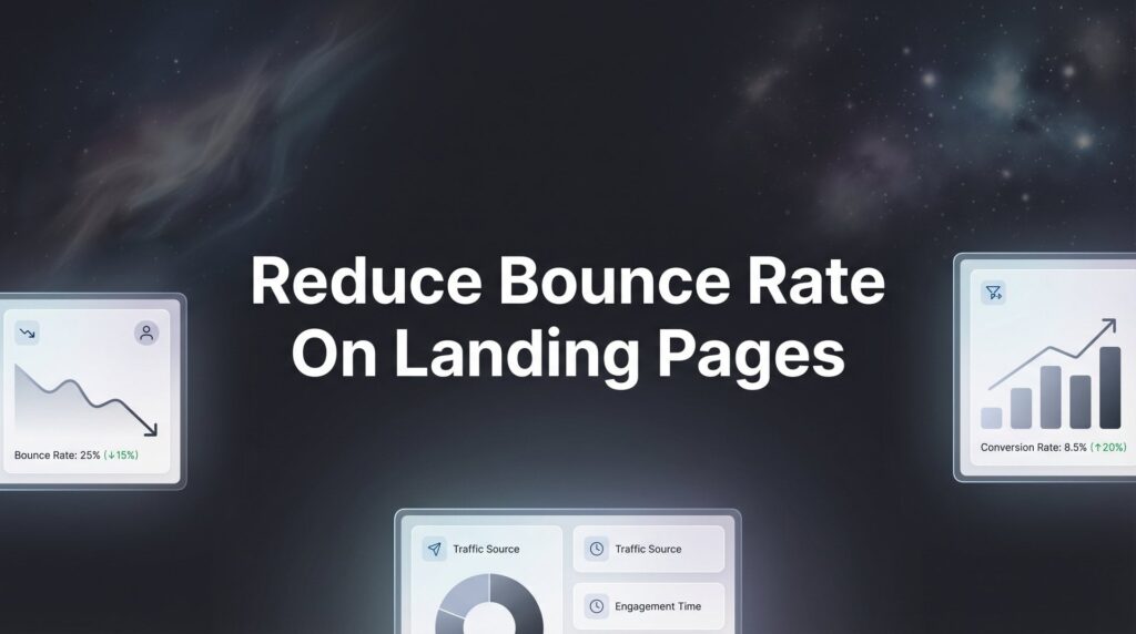
Your landing page is bleeding money—and you probably don’t even realize it. Every visitor who bounces is a lead lost, a sale evaporated, and ad spend wasted. If you’re running PPC campaigns and watching visitors leave within seconds, you’re essentially paying for people to ignore you.
The good news? Bounce rate isn’t some mysterious metric you can’t control. It’s a direct reflection of whether your landing page delivers what your ad promised—and whether it does so fast enough to hold attention.
In this step-by-step guide, we’ll walk you through exactly how to diagnose why visitors are bouncing and implement fixes that turn those bounces into conversions. These aren’t theoretical tips—they’re the same strategies we use at Clicks Geek to help local businesses stop hemorrhaging leads and start seeing real ROI from their marketing spend.
Step 1: Diagnose Your Current Bounce Rate Problem
You can’t fix what you don’t measure. Before implementing any changes, you need to understand exactly where your bounce rate problem exists and how severe it actually is.
Open Google Analytics 4 and navigate to Reports > Engagement > Landing Pages. This view shows you which pages visitors enter your site on and how they behave once they arrive. Look specifically at the bounce rate column—but here’s the critical part most people miss: context matters enormously.
A landing page bounce rate means something different depending on your traffic source. Paid search traffic from highly specific keywords might have a lower bounce rate than broad display ads because the intent is clearer. Social media traffic often bounces at higher rates because users are casually browsing rather than actively searching for solutions.
What constitutes a “good” bounce rate? For paid landing pages specifically designed for conversion, you’re looking at benchmark ranges of 40-60% for most industries. Service-based local businesses often see rates between 50-70%, while e-commerce product pages might range from 20-45%. Understanding these benchmarks is essential when addressing high bounce rate on landing pages.
But the real diagnostic power comes from comparing traffic sources. Click on “Add comparison” in GA4 and segment by traffic source. If your Google Ads traffic bounces at 75% while organic search bounces at 45%, you’ve identified a message mismatch problem—your ads are attracting the wrong people or making promises your page doesn’t keep.
Next, set up scroll depth tracking if you haven’t already. In GA4, go to Configure > Events and create a custom event that fires when users scroll to 25%, 50%, 75%, and 100% of your page. This reveals whether people are bouncing immediately or reading partway through before leaving.
If most visitors don’t scroll past 25%, your above-the-fold content is failing. If they’re scrolling to 75% but still bouncing, you likely have a call-to-action problem or trust issue near the bottom.
Create a simple spreadsheet documenting your findings: current overall bounce rate, bounce rate by traffic source, average scroll depth, and which specific pages or campaigns show the worst performance. This becomes your prioritization roadmap—fix the biggest problems first for maximum impact.
Step 2: Align Your Ad Message with Landing Page Content
Picture this: you click an ad promising “Same-Day HVAC Repair” and land on a page with a headline about “Comprehensive Heating and Cooling Solutions.” Even though these concepts are related, your brain registers a disconnect. That fraction-of-a-second confusion is all it takes for visitors to hit the back button.
This is the scent trail concept in action. Visitors follow a trail of clues from your ad to your landing page, and any break in that trail triggers doubt and abandonment.
Start by opening your active PPC campaigns and pulling up the ad copy for your top-spending keywords. Write down the exact headline and description text. Now open the landing page those ads point to and compare the headline word-for-word. If you’re unsure what makes an effective PPC landing page, this alignment is the foundation.
Your landing page headline should echo the primary promise from your ad. If your ad says “Get a Free Quote in 60 Seconds,” your landing page headline better include “Free Quote” and reference the speed element. Not similar words—the exact same words that convinced someone to click.
Visual consistency matters just as much as copy. If your ad features images of your team, your landing page should show team photos above the fold. If your ad highlights a specific service or product, that exact service should dominate the landing page visuals.
Check your offer consistency too. If your ad promotes “20% Off First Service,” that exact discount and its terms need to appear prominently on the landing page—not buried in fine print, not slightly different, but identical to what the ad promised.
Here’s a quick audit checklist for message match:
Keyword Matching: If someone searches “emergency plumber near me” and clicks your ad, the landing page should include “emergency” and location references, not generic plumbing services.
Urgency Alignment: Ads using urgency language (“Limited Time,” “Today Only,” “While Supplies Last”) must carry that same urgency onto the landing page with countdown timers or explicit deadlines.
Benefit Consistency: Whatever benefit you led with in the ad (speed, price, quality, convenience) should be the first benefit mentioned on the landing page.
The fastest fix you can implement right now: copy your ad headline verbatim and paste it as your H1 landing page headline. It’s not elegant, but it works because it eliminates any possibility of message confusion.
Step 3: Slash Your Page Load Time Below 3 Seconds
Speed isn’t just a nice-to-have feature—it’s the difference between a visitor who sees your offer and one who bounces before your page even loads. Every second of delay increases bounce rate exponentially.
Start by benchmarking your current performance. Open Google PageSpeed Insights and enter your landing page URL. Run the test for both mobile and desktop. You’ll get a performance score from 0-100 and specific recommendations for improvement.
For a second opinion, run the same URL through GTmetrix. This tool provides additional insights about waterfall loading patterns—showing you exactly which elements are slowing down your page and in what order they load.
Your target: load time under 3 seconds on mobile connections. Anything slower and you’re losing visitors before they even see your headline.
The biggest culprit in most cases? Unoptimized images. If you’re uploading photos straight from a camera or stock site without compression, you’re probably serving 5MB images when 200KB would look identical on screen.
Use TinyPNG or ImageOptim to compress images before uploading them. For images already on your site, implement lazy loading so images below the fold don’t load until visitors scroll down. Most modern website builders have lazy loading as a simple checkbox option in settings.
Next, tackle render-blocking resources. These are JavaScript and CSS files that prevent your page from displaying until they fully load. PageSpeed Insights will flag these specifically. The fix usually involves either deferring non-critical scripts or inlining critical CSS directly into your HTML. These technical optimizations are part of comprehensive landing page optimization services.
If you’re using a page builder like WordPress with multiple plugins, each plugin often adds its own scripts. Audit your plugins ruthlessly—if you’re not actively using a feature, remove the plugin entirely. Tools like Asset CleanUp can help you disable scripts on specific pages where they’re not needed.
For local service businesses, mobile speed is particularly critical because most searches happen on phones, often on cellular connections slower than your office WiFi. Test your page on an actual phone using a 3G connection simulation in Chrome DevTools to see what real customers experience.
One often-overlooked speed killer: autoplay videos and animations. That slick background video might look impressive on your desktop, but it’s murdering your mobile load time. Replace it with a static image or remove it entirely for mobile visitors.
Step 4: Restructure Above-the-Fold Content for Instant Clarity
You have about five seconds to communicate your value proposition before visitors decide whether to stay or leave. Most landing pages waste those precious seconds on logo animations, generic imagery, or vague headlines that could apply to any business.
The five-second test is simple: show your landing page to someone unfamiliar with your business for exactly five seconds, then hide it and ask what you offer and why they should care. If they can’t answer both questions clearly, your above-the-fold content has failed.
Your headline is the single most important element on the page. It should answer “What’s in it for me?” within the first seven words. Not what you do, but what problem you solve or benefit you deliver.
Compare these headlines: “Professional HVAC Services Since 1995” versus “Get Your AC Fixed Today—No Overtime Charges.” The first is about you. The second is about solving the visitor’s immediate problem. Learning how to create high converting landing pages starts with mastering this headline strategy.
Position your primary call-to-action where eyes naturally land first. Eye-tracking studies consistently show visitors look at the top-left corner first on desktop and the center-top on mobile. Your CTA button should occupy this prime real estate, not be buried below three paragraphs of company history.
Now for the hard part: removing distractions. Every element above the fold should either explain your offer or move visitors toward conversion. That means eliminating:
Full Navigation Menus: Landing pages aren’t your website homepage. Remove or minimize navigation that gives visitors an easy exit path to browse other pages instead of converting.
Competing Offers: If you’re running an ad for AC repair, don’t distract visitors with furnace installation offers above the fold. One page, one clear offer.
Visual Clutter: Stock photos of smiling models, decorative graphics, and busy backgrounds all compete for attention with your actual message. Strip them out.
Use whitespace strategically to direct attention. The human eye is drawn to contrast and isolation—a button surrounded by empty space gets more attention than one crowded by text and images.
Your above-the-fold content should follow this hierarchy: compelling headline that matches your ad promise, one supporting sentence explaining the benefit, a clear call-to-action button, and optionally a relevant image or video that reinforces the offer. That’s it. Everything else moves below the fold.
Step 5: Build Trust Signals That Eliminate Hesitation
Even if your offer is perfect and your page loads instantly, visitors won’t convert if they don’t trust you. For local service businesses especially, you’re asking potential customers to invite strangers into their homes or hand over payment information—trust isn’t optional.
Strategic placement of testimonials matters more than having them at all. Don’t bury customer reviews at the bottom of the page. Position your strongest testimonial directly below your primary call-to-action as social proof that others have taken this action successfully.
The most powerful testimonials are specific. “Great service!” tells visitors nothing. “They showed up within 2 hours on a Sunday and fixed our AC for $200 less than the other quote” tells a complete story with concrete details that build credibility. These trust elements directly impact your landing page conversion rate.
If you’re a Google Premier Partner like Clicks Geek, display that badge prominently. Certifications, industry awards, and recognizable trust badges (Better Business Bureau, industry associations, Google reviews rating) all serve as third-party validation that you’re legitimate.
Add real contact information in your header or footer—a local phone number and physical address. Generic contact forms feel impersonal and raise questions about whether you’re even a real local business. Click-to-call buttons with your actual number visible build immediate credibility.
For service businesses, showing your team matters. Real photos of actual employees (not stock images) humanize your business and make it feel less risky to reach out. Include names and brief bios if possible.
Use specific numbers and results instead of vague claims. “We’ve helped over 500 local businesses” is more convincing than “We help many businesses.” “Average response time: 2 hours” beats “Fast service.”
Security indicators matter for any page collecting information. Display SSL certificates, privacy policy links, and if you’re collecting payment information, show accepted payment methods and security badges from processors like Stripe or PayPal.
One trust signal many businesses overlook: proof of local presence. For local service businesses, mention your service area specifically, show photos of local landmarks or neighborhoods, and reference community involvement. This signals you’re not some out-of-state call center but an actual local business invested in the community.
Step 6: Optimize Your Forms and CTAs for Friction-Free Action
You’ve gotten visitors to scroll down and they’re ready to convert—then they see a form asking for 12 fields of information and decide it’s not worth the effort. Form friction is one of the most common conversion killers, yet it’s completely within your control to fix.
Start by reducing form fields to the absolute minimum required to follow up. Do you really need their company name, job title, and industry to send a quote? Probably not. Ask for name, phone, email, and maybe one qualifying question. That’s it.
Every additional field you add typically reduces completion rates. If you need more information eventually, you can collect it during the sales call or in a follow-up email. The form’s job is to capture the lead, not to pre-qualify them to death. Mastering this balance is key to understanding how to generate qualified leads online.
Your CTA button copy should focus on value, not action. Compare “Submit” versus “Get My Free Quote.” The first is about what you want them to do. The second is about what they get in return. Other high-converting alternatives: “Show Me Pricing,” “Book My Consultation,” “Start Saving Money.”
Button color and size matter more than you’d think. Your CTA should be the most visually prominent element on the page—use a contrasting color that stands out from your background and make it large enough to be obviously clickable. On mobile, ensure it’s easily tappable with a thumb.
For multi-step forms, add progress indicators so visitors know how much more information you’re asking for. A progress bar showing “Step 2 of 3” reduces abandonment because people can see the finish line. Breaking a long form into multiple short steps often increases completion compared to showing all fields at once.
Consider adding micro-commitments before the main form. A simple question like “What service are you interested in?” with clickable buttons can increase engagement. Once someone clicks a button, they’ve made a small commitment and are more likely to complete the full form.
Test CTA placement throughout your page. Don’t assume one CTA at the bottom is enough. Place CTAs at natural break points: after explaining the problem, after presenting your solution, after showing testimonials. Different visitors will be ready to convert at different points in their journey down the page.
Remove any optional fields entirely. If it’s not required, don’t include it. The word “optional” next to a field actually increases friction because it makes visitors wonder why you’re asking for unnecessary information.
Step 7: Implement Mobile-Specific Optimizations
Testing your landing page on desktop and assuming it works on mobile is a recipe for high bounce rates. Mobile visitors have different behaviors, smaller screens, and less patience for pages that don’t work perfectly on their devices.
Start by testing on actual mobile devices, not just Chrome’s mobile emulator. Grab your phone and navigate to your landing page. Try to complete a conversion. You’ll immediately spot issues that desktop testing misses—buttons that are hard to tap, text that’s too small to read, forms that trigger the wrong keyboard types.
Tap targets need to be thumb-friendly. The minimum recommended size is 48×48 pixels with adequate spacing between clickable elements. If your CTA button is smaller or too close to other links, visitors will accidentally tap the wrong thing and get frustrated.
For local service businesses, click-to-call functionality is critical. Your phone number should be clickable throughout the page, not just in the header. Many mobile visitors prefer calling over filling out forms, so make calling as easy as one tap.
Simplify navigation for mobile even more than desktop. That hamburger menu should contain the absolute minimum—ideally nothing at all on a dedicated landing page. Every navigation option is a potential exit point.
Check for horizontal scrolling issues. If any element is wider than the screen and requires side-to-side scrolling, you’ve created a terrible mobile experience. Images, forms, and content blocks should all fit within the mobile viewport without horizontal scroll. Following best practices for landing pages means prioritizing mobile responsiveness.
Form fields on mobile need special attention. Make sure you’re using the right input types so phones display the appropriate keyboard. Use type=”tel” for phone numbers to bring up the numeric keypad, type=”email” for email addresses to include the @ symbol, and so on.
Test your page on both iOS and Android devices if possible. They render pages slightly differently and have different default behaviors. What works perfectly on an iPhone might have issues on a Samsung.
Consider mobile-specific content variations. Your desktop headline might be three lines of text, but on mobile that pushes your CTA way down the screen. Shorten headlines for mobile, reduce paragraph lengths, and prioritize the most critical information at the very top.
Page speed on mobile deserves its own attention. Test using Chrome DevTools with 3G throttling enabled to simulate real mobile network conditions. What loads instantly on your office WiFi might crawl on cellular data.
Putting It All Together
Reducing bounce rate isn’t about implementing one magic fix—it’s about systematically removing every friction point between your visitor and conversion. Start with Step 1 to diagnose where you’re losing people, then work through each optimization in order.
Quick checklist to verify you’ve covered everything:
✓ Bounce rate benchmarked and tracked by traffic source in Google Analytics 4
✓ Ad-to-landing page message alignment verified with matching headlines and offers
✓ Page load time tested and optimized to under 3 seconds on mobile
✓ Above-the-fold content delivers instant clarity about your offer and value
✓ Trust signals prominently displayed with specific testimonials and credentials
✓ Forms simplified to minimum required fields with value-focused CTA copy
✓ Mobile experience tested on actual devices with tap-friendly design
Remember, every percentage point you shave off your bounce rate translates directly to more leads and better ROI on your ad spend. A landing page with a 70% bounce rate converting at 5% gives you 1.5 conversions per 100 visitors. Drop that bounce rate to 50% and suddenly you’re getting 2.5 conversions from the same traffic—a 67% increase in leads without spending another dollar on ads.
The businesses that win in PPC aren’t necessarily the ones with the biggest budgets—they’re the ones with landing pages that actually convert the traffic they’re paying for. When your ad spend generates qualified leads instead of bounces, every dollar works harder and your cost per acquisition drops dramatically.
Tired of spending money on marketing that doesn’t produce real revenue? We build lead systems that turn traffic into qualified leads and measurable sales growth. If you want to see what this would look like for your business, we’ll walk you through how it works and break down what’s realistic in your market.
Want More Leads for Your Business?
Most agencies chase clicks, impressions, and “traffic.” Clicks Geek builds lead systems. We uncover where prospects are dropping off, where your budget is being wasted, and which channels will actually produce ROI for your business, then we build and manage the strategy for you.