Your landing page is getting traffic, but visitors aren’t converting. Sound familiar? You’re not alone—most local businesses watch potential customers bounce without ever filling out a form or picking up the phone.
The problem isn’t your offer or your pricing. It’s that your landing page isn’t engineered to convert.
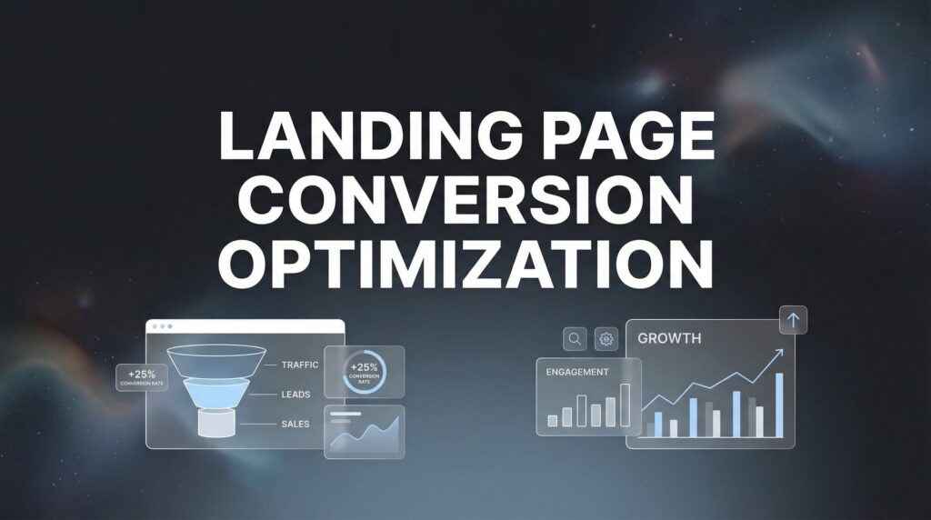
Landing page conversion optimization is the systematic process of turning more visitors into leads, calls, and paying customers. And here’s the reality: small improvements compound fast. A page converting at 2% versus 5% means the difference between struggling and scaling.
Think about it. If you’re spending $3,000 monthly on ads driving 1,000 visitors, a 2% conversion rate gives you 20 leads. Bump that to 5%, and you’re suddenly generating 50 leads from the exact same traffic spend. That’s 150% more opportunities without increasing your ad budget by a single dollar.
This guide walks you through exactly how to optimize your landing pages step-by-step, using the same conversion rate optimization services principles we apply at Clicks Geek to generate high-quality leads for local businesses. No fluff, no theory—just actionable steps you can implement today to start seeing better results from the traffic you’re already paying for.
Step 1: Audit Your Current Performance and Identify Conversion Killers
You can’t improve what you don’t measure. Before changing a single element on your landing page, you need to understand exactly where you stand and where visitors are dropping off.
Start by setting up proper tracking with Google Analytics 4 and conversion goals. This isn’t optional—it’s the foundation of everything that follows. Configure goals for every conversion action: form submissions, phone calls, live chat initiations, and any other way visitors can become leads.
Calculate your current conversion rate using this simple formula: total conversions divided by total visitors, multiplied by 100. If you had 50 form submissions from 2,000 visitors, that’s a 2.5% conversion rate. This becomes your baseline—the number you’re trying to beat.
Here’s where it gets interesting. Install a heatmap tool like Hotjar or Microsoft Clarity to see exactly what visitors are doing on your page. These tools reveal where people click, how far they scroll, and most importantly, where they abandon the page entirely.
You’ll often discover surprising patterns. Maybe visitors are clicking on elements that aren’t actually clickable, creating frustration. Or they’re scrolling past your form without ever seeing it. Perhaps they’re rage-clicking on your phone number because it’s not formatted as a clickable link on mobile.
Check mobile performance separately from desktop. Most local business traffic comes from mobile searches, yet many landing pages are still designed with a desktop-first mentality. Pull up your page on an actual phone, not just a browser’s mobile simulator. Is the text readable without zooming? Are buttons large enough to tap accurately? Does the form work smoothly with a mobile keyboard?
Document the top three friction points killing your conversions. Common culprits include page load times exceeding three seconds, forms asking for too much information, weak or confusing calls-to-action, missing trust signals, and poor mobile responsiveness.
Run a speed test using Google PageSpeed Insights. Anything below 50 on mobile is actively costing you conversions. Visitors won’t wait—they’ll hit the back button and choose your competitor instead.
This audit phase typically takes 2-3 hours, but it’s the most valuable time you’ll spend. You’re gathering data that tells you exactly what to fix first, rather than guessing based on what you think might work. If you’re dealing with low website conversion rate solutions, this diagnostic step is essential before implementing any fixes.
Step 2: Align Your Headline and Hero Section with Visitor Intent
The first five seconds determine whether a visitor stays or leaves. Your headline and hero section need to immediately confirm they’re in the right place and that you can solve their specific problem.
Here’s the critical principle: match your headline directly to the ad or search query that brought visitors to the page. If someone clicks an ad about emergency plumbing repair, your landing page better say “Emergency Plumbing Repair” in the headline—not “Full-Service Plumbing Solutions.”
This concept is called message match, and it’s one of the fastest ways to boost conversions. When visitors see consistent messaging from ad to landing page, their confidence increases. When the messaging shifts, doubt creeps in and they start looking for other options.
Lead with the outcome customers want, not your company features. Bad headline: “Family-Owned HVAC Company Serving the Area Since 1985.” Better headline: “Get Your AC Fixed Today—Same-Day Service Guaranteed.”
Notice the difference? The first headline is about you. The second is about solving the customer’s immediate problem. People don’t care how long you’ve been in business until after they know you can help them right now.
Include a clear value proposition within the first five seconds of viewing. This means your headline plus one supporting sentence should communicate exactly what you offer, who it’s for, and why it matters. For example: “Professional Kitchen Remodeling for Northern Virginia Homeowners. Get a custom design and accurate quote in 48 hours—no high-pressure sales tactics.”
Add trust signals above the fold. This is the portion of your page visible without scrolling, and it’s prime real estate. Include elements like Google Partner badges, review ratings with star counts, years in business, or industry certifications. These signals answer the unspoken question every visitor has: “Can I trust these people?”
Test headline variations—this single element often drives the biggest conversion lifts. Try different angles: problem-focused versus solution-focused, specific versus general, urgency-driven versus benefit-driven. One roofing company increased conversions by 34% simply by changing their headline from “Expert Roofing Services” to “Roof Leak? Get It Fixed This Week.”
Your hero image matters too, but not in the way most businesses think. Skip the generic stock photos of people shaking hands or pointing at laptops. Use images that show your actual work, your real team, or the transformation you provide. A before-and-after photo of a completed project beats a stock image every time. For more guidance on crafting effective hero sections, check out these best practices for landing pages.
Step 3: Streamline Your Forms and Reduce Friction Points
Every form field you add is another opportunity for visitors to abandon your page. The harsh reality is that most businesses ask for way more information than they actually need to qualify a lead.
Cut your form fields to the absolute minimum: name, phone number, email address, and one qualifying question. That’s it. You don’t need their company name, job title, address, and detailed project description before the first conversation. You’re not conducting an interrogation—you’re trying to start a dialogue.
Think about it from the visitor’s perspective. They’re on their phone, probably in a hurry, and you’re asking them to fill out a 10-field form with tiny input boxes. They’ll take one look and decide it’s not worth the effort.
Use multi-step forms for complex services where you do need more information. Break intimidating forms into digestible chunks. Step one might ask for contact info. Step two asks about the project timeline. Step three gathers specific details. This approach feels less overwhelming and actually increases completion rates because of the commitment effect—once someone starts, they’re more likely to finish.
Add prominent click-to-call buttons for mobile users who prefer phone contact. Many people would rather talk than type, especially for urgent services. Make your phone number large, bold, and tappable. Use the tel: link format so clicking it immediately initiates a call.
Include inline validation and helpful error messages to prevent abandonment. Nothing frustrates visitors more than filling out an entire form, hitting submit, and then seeing a generic error message with no guidance on what went wrong. Validate fields as users complete them and provide specific, helpful feedback: “Please enter a valid email address” is better than “Error: Invalid input.”
Position your form above the fold or use sticky CTAs that follow the scroll. If visitors have to hunt for your form, many won’t bother. A sticky button that remains visible as they scroll down ensures the conversion opportunity is always present.
Consider adding a progress indicator for multi-step forms. Knowing they’re on “Step 2 of 3” reduces anxiety and increases completion rates. People want to know how much effort they’re committing to before they start.
Test removing optional fields entirely. If a field is truly optional, it probably shouldn’t be on the form at all. Every field sends a message about how much effort you’re requiring. The message you want to send is: “This is quick and easy.” Understanding conversion funnel optimization helps you identify exactly where form friction is costing you leads.
Step 4: Build Trust Through Strategic Social Proof Placement
Visitors need proof that you’ve successfully solved problems for people like them. Social proof answers the question: “Has this worked for others?” The more specific and relevant your proof, the more powerful it becomes.
Feature real customer reviews with names, photos, and specific results when possible. Generic testimonials like “Great service, highly recommend!” don’t move the needle. What works is specificity: “Mike repaired our water heater the same day we called. He explained everything clearly and charged exactly what he quoted. Our hot water was back on in two hours.” — Jennifer M., Alexandria
Display your Google review rating prominently and link directly to your Google Business Profile. If you have 4.8 stars from 127 reviews, that’s powerful social proof. Make it clickable so skeptical visitors can read the reviews themselves. The link builds credibility because it shows you’re not hiding anything.
Add industry certifications, licenses, and partner badges relevant to your service. If you’re a Google Premier Partner, display that badge. If you’re licensed and insured, say so explicitly. If you’re certified by manufacturers or industry associations, include those logos. These credentials signal professionalism and competence.
Include case study snippets showing before-and-after results or specific outcomes. You don’t need a full case study on your landing page—just enough detail to prove you’ve delivered results. “Increased qualified leads by 180% in 90 days for a local HVAC company” tells a story that generic claims can’t match.
Place trust elements near your CTA buttons where hesitation typically occurs. When someone is about to submit a form or make a call, that’s when doubt peaks. Positioning a five-star review or certification badge right next to your form submission button addresses that doubt at the critical moment.
Use numbers that demonstrate scale and experience. “Over 500 kitchens remodeled” or “Trusted by 1,200+ Northern Virginia families” provides social proof through volume. Large numbers suggest you’ve been tested and proven by many others.
Consider adding real-time social proof widgets that show recent conversions. Messages like “John from Arlington just requested a quote” create urgency and demonstrate that others are taking action right now. This works particularly well for high-volume services. Learning how to create high converting landing pages means mastering these trust-building techniques.
Step 5: Optimize Page Speed and Technical Performance
A slow landing page kills conversions before visitors even see your offer. Research consistently shows that page speed directly impacts both conversion rates and user satisfaction. Every second of delay costs you money.
Test your page speed using Google PageSpeed Insights and aim for scores above 80 on both mobile and desktop. This tool provides specific recommendations for improvement and shows how your page performs on real-world connection speeds. Anything below 50 on mobile means you’re actively losing conversions to impatient visitors.
Compress images and use next-gen formats like WebP without sacrificing visual quality. Images are typically the largest files on landing pages. A hero image that’s 2MB can often be compressed to 200KB with no visible quality loss. Use tools like TinyPNG or ImageOptim to compress images before uploading them.
Minimize third-party scripts that slow down initial page rendering. Every tracking pixel, chat widget, and social media plugin adds load time. Audit what you’ve installed and remove anything that’s not essential. If you’re using five different analytics tools, consolidate to the one or two you actually use for decision-making.
Ensure your page loads in under three seconds on mobile connections. Test on an actual mobile device using a 4G connection, not just WiFi. The experience on a phone with moderate signal strength is what most of your visitors encounter. If your page takes five seconds to load, many visitors will bounce before seeing anything.
Enable browser caching so returning visitors load your page faster. Configure your server to tell browsers they can store certain files locally. This dramatically improves load times for anyone who visits multiple pages on your site.
Use lazy loading for images below the fold. There’s no reason to load images that aren’t immediately visible. Lazy loading delays loading those images until visitors scroll down, which speeds up initial page load significantly.
Verify success by running speed tests before and after changes to quantify improvements. Document your baseline score, make your optimizations, then test again. You should see measurable improvement. If your score went from 45 to 82 on mobile, that’s a win you can track against conversion rate changes. These website optimization tips can help you identify additional technical improvements.
Consider using a content delivery network for faster global load times. CDNs distribute your page files across multiple servers worldwide, so visitors load the page from a server geographically close to them. This matters more than you might think for local businesses with visitors searching from various locations within your service area.
Step 6: Implement A/B Testing and Continuous Improvement
Optimization isn’t a one-time project—it’s an ongoing process of testing, learning, and improving. The businesses that consistently outperform competitors are the ones that never stop testing.
Start with high-impact elements: headlines, CTA buttons, form length, and hero images. These elements typically drive the biggest conversion lifts. Testing whether your button should say “Get a Free Quote” versus “Request Your Quote” might seem minor, but small changes often produce surprising results.
Run one test at a time to isolate what’s actually moving the needle. If you change your headline, button color, and form length simultaneously, you won’t know which change drove the improvement. Test one variable, measure the result, then move to the next test.
Let tests reach statistical significance before declaring winners. This typically requires at least 100 conversions per variation, though more is better. Running a test for three days with 20 conversions doesn’t tell you anything reliable. The variation that performed better might have just gotten lucky with timing or traffic quality.
Use proper A/B testing tools like Google Optimize, VWO, or Optimizely rather than manually switching elements and comparing periods. These tools split traffic randomly and account for statistical significance, giving you reliable results you can trust. Our guide on the best conversion rate optimization tools covers which platforms work best for different business sizes.
Document every test result to build institutional knowledge about what works for your audience. Create a simple spreadsheet tracking what you tested, the results, and your interpretation. Over time, patterns emerge. You might discover that urgency-focused headlines consistently outperform benefit-focused ones for your specific audience.
Create a monthly optimization calendar to ensure continuous improvement. Schedule specific tests each month: January focuses on headline variations, February tests CTA button copy, March experiments with form length. This systematic approach prevents optimization from becoming an afterthought.
Test radical variations alongside incremental ones. Sometimes a completely different approach outperforms minor tweaks. Try a version with no form at all—just a prominent phone number and chat button. Test a video hero section versus a static image. Some of your biggest wins will come from bold experiments.
Pay attention to segment performance, not just overall averages. A change might decrease desktop conversions while significantly improving mobile conversions. If 75% of your traffic is mobile, that’s still a winning test even though the overall average looks flat.
Don’t just test to test—test with hypotheses. Before running an experiment, write down what you expect to happen and why. “I believe reducing the form from 7 fields to 4 will increase conversions by at least 20% because visitors on mobile are abandoning due to form length.” This approach builds your understanding of what drives behavior. If you need help getting started, consider working with professional landing page optimization services to accelerate your testing program.
Putting It All Together
Landing page conversion optimization isn’t a one-time project—it’s an ongoing process that compounds over time. The businesses winning in local markets aren’t necessarily getting more traffic than their competitors. They’re converting more of the traffic they already have.
Start with your audit to understand where you’re losing conversions today. Install heatmaps, verify your tracking is working correctly, and calculate your baseline conversion rate. You need to know where you stand before you can measure improvement.
Then work through each step systematically. Align your messaging so visitors immediately know they’re in the right place. Reduce friction by cutting your form to four fields or fewer. Build trust by adding three strong trust signals above the fold. Speed up your page so it loads in under three seconds on mobile. And implement a testing calendar so optimization becomes a regular habit, not a one-time event.
Here’s your quick-start checklist for this week:
1. Install a heatmap tool and verify conversion tracking is configured correctly
2. Rewrite your headline to match the exact intent of your primary traffic source
3. Cut your form fields to the absolute minimum needed to qualify a lead
4. Add your Google review rating, relevant certifications, and one specific customer testimonial above the fold
5. Test your mobile page speed and compress any images larger than 500KB
These five actions take less than a day to implement and typically produce measurable conversion improvements within the first week. You’re not trying to achieve perfection—you’re trying to eliminate the most obvious conversion killers while you build momentum for deeper optimization. If you’re struggling with poor performance, our guide on how to fix low conversion rates provides a systematic seven-day approach.
The compound effect of these improvements is where the real power lives. A 1% improvement each month doesn’t sound dramatic, but over a year that’s a 12.7% increase in conversions from the same traffic investment. For a business spending $5,000 monthly on ads, that’s the equivalent of getting an extra $635 worth of results every month without increasing spend.
Remember that different elements matter more for different industries. A home services business converting emergency calls needs prominent click-to-call buttons and trust signals about licensing and insurance. A B2B software company needs detailed case studies and specific ROI examples. Adapt these principles to your specific market and customer expectations.
At Clicks Geek, we’ve seen these same principles transform lead generation for local businesses across industries. The systematic approach works because it’s based on understanding visitor behavior and removing obstacles between interest and action. Tired of spending money on marketing that doesn’t produce real revenue? We build lead systems that turn traffic into qualified leads and measurable sales growth. If you want to see what this would look like for your business, we’ll walk you through how it works and break down what’s realistic in your market.
Now it’s your turn to put these steps to work. Start with the audit, implement the quick wins, and commit to testing one element each month. Your landing page conversion rate six months from now will thank you.