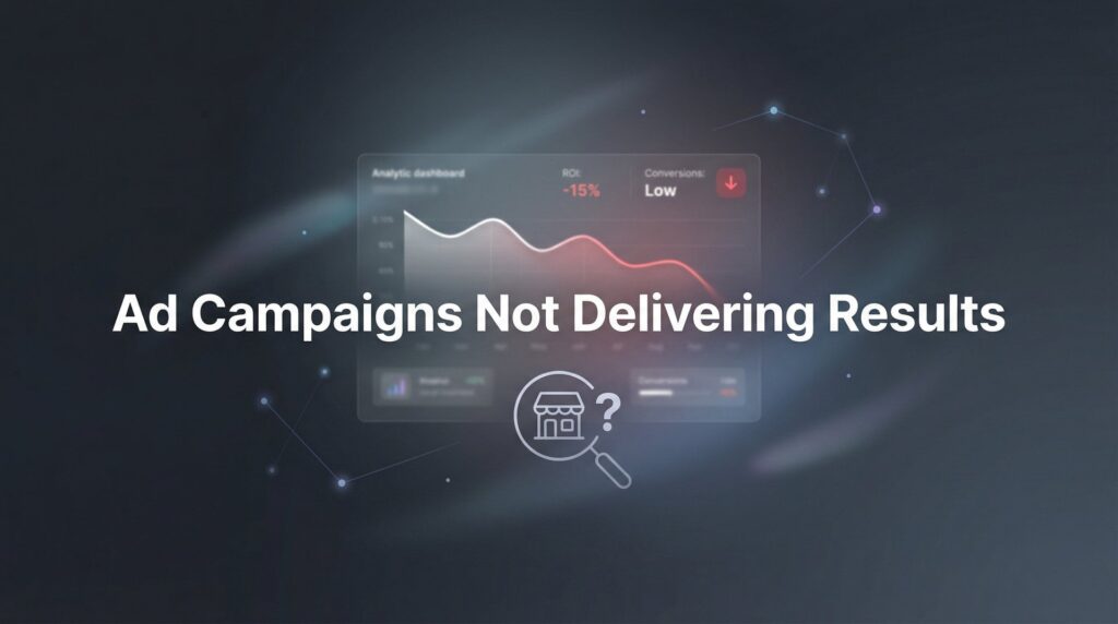
Your website looks professional, loads reasonably fast, and you’re even getting traffic—but the phone isn’t ringing and your inbox stays empty. This frustrating disconnect between website visitors and actual business inquiries is one of the most common problems local business owners face.
The good news? It’s almost always fixable.
The issue typically isn’t that your website is “broken”—it’s that it’s missing critical conversion elements that turn passive browsers into active leads. Think of it like having a beautiful storefront with no door handle. People can see inside, they’re interested, but they can’t figure out how to actually come in and do business with you.
In this step-by-step guide, we’ll walk you through exactly how to diagnose why your website isn’t generating business inquiries and implement proven fixes that drive real results. Whether you’re a plumber, lawyer, contractor, or any service-based business, these steps will help you transform your website from an expensive digital brochure into a lead-generating machine.
Let’s get started.
Step 1: Audit Your Current Conversion Points (Most Sites Have Zero)
Here’s a sobering reality: many business websites have exactly zero clear ways for visitors to contact them above the fold. By “conversion point,” we mean any element that allows a visitor to take action—contact forms, prominent phone numbers, chat widgets, quote request buttons, or appointment schedulers.
Start by opening your website on your phone and laptop. Pretend you’re a customer who needs your service right now. Without scrolling, can you immediately see how to contact the business? Can you find a phone number to call? Is there a button that says what to do next?
Now scroll through your homepage, service pages, and about page. Count every opportunity a visitor has to reach out. Most business owners are shocked to discover their contact information is buried in the footer, hidden on a separate “Contact” page, or worse—displayed as an image that mobile users can’t tap to call.
Check your mobile experience specifically. Pull out your phone and try to call your business from your website. Is the phone number clickable? Does it automatically open your phone dialer? If not, you’re losing inquiries every single day. Mobile users expect tap-to-call functionality, and if they have to manually type your number, many simply won’t bother.
Look at each page individually. Your homepage might have a contact form, but what about your service pages? When someone lands on your “Emergency Plumbing” or “Personal Injury Law” page from Google, do they see an immediate way to reach you, or do they have to hunt for it? This is a classic case of website visitors not converting to customers due to friction in the user experience.
The fix here is straightforward: every page needs at least two conversion points visible without scrolling. A clickable phone number in your header and a clear call-to-action button (“Get a Free Quote,” “Schedule Service,” “Call Now”) should appear on every single page. Your contact form should be accessible from anywhere, not hidden three clicks deep.
Success indicator: You should be able to identify at least 2-3 conversion opportunities on every page within 3 seconds of landing there.
Step 2: Analyze Your Traffic Sources to Confirm You’re Reaching the Right People
Getting traffic means nothing if those visitors aren’t potential customers. A website with 1,000 monthly visitors from people searching “plumber near me” will generate far more inquiries than a site with 10,000 visitors from random blog readers around the world.
Log into Google Analytics 4 (if you don’t have it installed yet, that’s Step 7). Navigate to Reports, then Acquisition, then Traffic Acquisition. This shows you where your visitors are coming from: organic search, direct traffic, social media, or referrals.
Look at your organic search traffic first. Click into it to see which search queries are bringing people to your site. Are they searching for your services plus your location? Terms like “emergency electrician Dallas” or “divorce lawyer Chicago” indicate high commercial intent. If most of your traffic comes from informational queries like “how to fix a leaky faucet,” you’re attracting DIY-ers, not customers.
Check your geographic data under Reports, then Demographics, then Locations. If you’re a local service business in Phoenix but most of your traffic comes from India, the Philippines, or random international locations, that traffic is worthless for generating local inquiries. This often happens when businesses have blog content that ranks globally but doesn’t target their service area. If you’re experiencing this issue, you may need to improve your website ranking for local search terms.
Now look at bounce rates by page (Reports, then Engagement, then Pages and Screens). A bounce rate above 70% typically means visitors aren’t finding what they expected. If someone searches for “24-hour locksmith” and lands on a page about your company history, they’ll bounce immediately. High bounce rates signal a disconnect between search intent and page content.
Compare your top landing pages to your service offerings. Are visitors landing on pages that match what you actually want to sell? If your “About Us” page gets more traffic than your main service pages, you have an SEO problem, not a conversion problem.
The goal is to attract qualified, local traffic from people actively searching for your services. If your current traffic doesn’t match this profile, you’ll need to adjust your SEO strategy, but at least you’ll know why inquiries aren’t happening.
Success indicator: At least 60% of your traffic should come from local searches with commercial intent, and your bounce rate on key service pages should be below 60%.
Step 3: Rewrite Your Headlines and Value Proposition for Clarity
Apply the 5-second test to your homepage right now. Can a visitor understand exactly what you do, who you serve, and where you serve them within 5 seconds of landing on your site? If the answer is anything other than an immediate “yes,” you’re losing potential customers.
Generic headlines kill conversions. “Welcome to Our Company,” “Quality Service You Can Trust,” and “Your Partner in Success” communicate absolutely nothing. Visitors don’t have time to decode vague marketing speak. They need to know instantly if they’re in the right place.
Your headline should include three critical elements: what you do, who you serve, and where you operate. Compare these examples:
Weak: “Providing Excellent Home Services Since 1995”
Strong: “Same-Day Emergency Plumbing in Austin—Licensed & Insured, 24/7 Availability”
The strong version tells visitors exactly what service you provide, confirms you serve their location, and includes trust-building details (licensed, insured) plus a competitive advantage (same-day, 24/7). Someone searching for an emergency plumber in Austin knows immediately they’re in the right place.
Look at your subheadline too. This is where you differentiate yourself from competitors. Why should someone choose you instead of the ten other businesses that do the same thing? Skip the generic “quality” and “excellence” claims—everyone says that. Instead, state your specific advantage:
“Flat-rate pricing with no hidden fees—you’ll know the exact cost before we start work.”
“Exclusively serving [City Name] for 20 years—we know your neighborhood and respond in 30 minutes.”
“Free initial consultation with a board-certified attorney—no obligation, just straight answers.”
Scroll through your service pages and apply the same test. Each page should have a headline that clearly states the specific service and includes location-specific language. “Air Conditioning Repair” becomes “AC Repair in Phoenix—Emergency Service Available, All Major Brands.” If you’re struggling to find customers, unclear messaging is often the root cause.
This isn’t just about conversion optimization—it helps with SEO too. When your headlines match what people search for, Google rewards you with better rankings, and visitors immediately recognize they’ve found what they need.
Success indicator: Show your homepage to someone unfamiliar with your business. If they can’t tell you what you do, who you serve, and where you operate within 5 seconds, your messaging needs work.
Step 4: Add Trust Signals That Eliminate Buyer Hesitation
People don’t buy from businesses they don’t trust, especially for services that involve entering their home, handling their legal issues, or managing their money. Trust signals are the psychological proof points that tell visitors you’re legitimate, reliable, and safe to do business with.
Start with Google reviews. If you have a 4.5+ star rating with 20+ reviews, display that prominently on your homepage using a Google review widget or by embedding your Google Business Profile reviews. Don’t just say “5-star rated”—show the actual reviews with customer names, photos, and specific feedback.
Add certification and licensing badges near your main call-to-action. If you’re a licensed contractor, display your license number and state board logo. If you’re BBB accredited, show that badge. Industry-specific certifications (NATE for HVAC, Bar Association membership for lawyers, etc.) belong above the fold, not hidden on an “About” page.
Replace stock photos with real images of your team, your work vehicles, and completed projects. Stock photography screams “generic template website” and erodes trust. Visitors want to see the actual person who’ll show up at their door. A photo of your team with names and roles makes you real and accountable.
If you’ve been featured in local media, worked with recognizable clients, or have notable partnerships, showcase those logos. “As Seen In” sections with logos from local news stations, newspapers, or industry publications provide third-party validation of your credibility. Understanding why you’re not getting customers online often comes down to missing these trust elements.
Place trust signals strategically near decision points. That means next to your contact form, near your main call-to-action buttons, and on your service pages. When someone is about to pick up the phone or fill out a form, they’re experiencing maximum hesitation. Trust signals at that exact moment push them over the edge.
Include your years in business and any guarantees you offer. “Serving [City] since 1998” tells visitors you’re established and reliable. “100% satisfaction guarantee” or “We’ll match any competitor’s written estimate” reduces the perceived risk of choosing you.
Success indicator: Every page should have at least 2-3 visible trust signals (reviews, certifications, guarantees, real photos) positioned near calls-to-action.
Step 5: Optimize Your Contact Forms (Shorter Forms = More Submissions)
Your contact form might be the single biggest conversion killer on your website. Every additional form field you require reduces the number of people who’ll actually complete it. Yet many business websites demand a novel’s worth of information before someone can even request a quote.
Here’s the rule: ask only for information you absolutely need to respond. For most service businesses, that’s name, phone number, email, and a brief message field. That’s it. You don’t need their address, company name, preferred contact time, budget range, or how they heard about you—at least not at this stage.
Think about it from the visitor’s perspective. They’re comparison shopping, probably filling out forms on three or four competitor websites. The business that makes it easiest to reach out gets the inquiry. If your form has 12 fields and your competitor’s has 4, guess who gets the lead? If you’re dealing with customers not filling out forms, form length is almost always a contributing factor.
Add a compelling headline above your form that states the benefit of reaching out. Instead of “Contact Us,” try “Get Your Free Quote in 24 Hours” or “Schedule Your Free Consultation Today.” People need a reason to take action, and “Contact Us” doesn’t provide one.
Include response time expectations right on the form. “We typically respond within 2 hours during business hours” or “Expect a call back within 30 minutes” sets clear expectations and increases trust. People hesitate to submit forms when they don’t know if anyone will actually respond or when.
Test your form functionality religiously. Fill it out yourself from a mobile device, tablet, and desktop. Does it actually send? Do you receive the notification? Does it work on all browsers? Broken forms are silent conversion killers—visitors try to contact you, fail, and you never even know they tried.
Consider offering a low-commitment option alongside your standard form. “Get a Free Quote” feels less intimidating than “Request Service” or “Contact Us.” Some businesses add a simple “Call Me Now” button that just asks for a phone number—nothing else. This ultra-low-friction option captures leads who aren’t ready to fill out even a short form.
Make your submit button descriptive and action-oriented. Replace generic “Submit” buttons with specific outcomes: “Get My Free Estimate,” “Schedule My Consultation,” or “Request Emergency Service.” This small change clarifies exactly what happens when they click.
Success indicator: Your form should have 4-5 fields maximum, include response time expectations, and be tested monthly to confirm it’s working across all devices.
Step 6: Create Urgency and Clear Calls-to-Action on Every Page
Passive websites generate passive results. If your site doesn’t tell visitors exactly what to do next, they’ll do nothing. Every page needs a clear, compelling call-to-action that creates urgency and removes ambiguity about the next step.
Start by auditing your CTA buttons. “Submit,” “Learn More,” and “Click Here” are weak, generic, and don’t communicate value. Replace them with specific, action-oriented language that describes the outcome: “Get My Free Quote,” “Schedule Service Today,” “Call for Emergency Repairs,” or “Claim Your Free Consultation.”
Add time-sensitive elements where appropriate and honest. If you genuinely have limited availability, say so: “Only 3 spots available this week.” If you’re running a seasonal promotion, include an expiration date. If you offer same-day service, emphasize that advantage. Urgency motivates action, but it must be real—fake scarcity damages trust.
Make sure every single page has at least one clear next step. Your blog posts, service pages, about page, and even your 404 error page should guide visitors toward contacting you. Never leave someone wondering “okay, I’m interested, now what?” If they have to search for how to reach you, many won’t bother. For a comprehensive approach to solving this, check out our guide on how to improve website conversion rate.
Use contrasting button colors that stand out from your site’s color scheme. If your website is primarily blue, your CTA buttons shouldn’t be blue—they should be orange, green, or another high-contrast color that draws the eye. The button should be impossible to miss.
Include your phone number as a clickable button, not just text in the header. On mobile devices especially, a large, tappable “Call Now” button should appear prominently. Many local service inquiries happen on mobile, and making it effortless to call dramatically increases conversion rates.
Create multiple CTAs for different visitor mindsets. Some people are ready to buy now—they need a “Schedule Service” button. Others are still researching—they might prefer “Get a Free Estimate” or “See Our Work.” Offering both high-commitment and low-commitment options captures more leads at different stages of decision-making.
Position CTAs strategically throughout longer pages. Don’t make someone scroll back to the top after reading your entire service page. Add CTAs at the top, middle, and bottom of content-heavy pages. When someone is convinced and ready to act, the opportunity to do so should be immediately available.
Success indicator: Every page should have at least one highly visible, action-oriented CTA button in a contrasting color, with phone numbers clickable on mobile devices.
Step 7: Set Up Tracking to Measure What’s Working (And What Isn’t)
You can’t improve what you don’t measure. Without proper tracking, you’re flying blind—spending money on your website and marketing with no idea which elements actually generate inquiries and which are wasted effort.
Start with Google Analytics 4 if you haven’t already installed it. This free tool tracks visitor behavior, traffic sources, and most importantly, conversions. Set up conversion goals for every meaningful action: form submissions, phone clicks, chat initiations, and downloads. In GA4, navigate to Admin, then Events, then Create Event to set up custom conversion tracking.
For phone tracking specifically, implement a call tracking solution. Services like CallRail or CallTrackingMetrics assign unique phone numbers to different pages and marketing campaigns, so you know exactly which pages drive calls. This is critical for service businesses where phone inquiries often outnumber form submissions 3-to-1.
Install a heatmap tool like Hotjar or Microsoft Clarity (free) to see where visitors actually click, how far they scroll, and where they abandon pages. Heatmaps reveal the truth about user behavior—you might discover that nobody sees your CTA because it’s positioned below where most people stop scrolling, or that visitors are clicking on elements that aren’t actually clickable. This diagnostic approach is essential when troubleshooting website traffic but no conversions.
Create a simple spreadsheet to track baseline metrics before you make changes. Record your current monthly website visitors, form submissions, phone calls, and conversion rate. This gives you a benchmark to measure against after implementing improvements. Without a baseline, you won’t know if your changes actually worked.
Set up weekly or monthly conversion reports in GA4. Navigate to Reports, then Engagement, then Conversions to see which pages and traffic sources generate the most inquiries. This data tells you what’s working so you can double down on successful elements and fix or eliminate underperforming ones.
Track not just quantity but quality of leads. Not all inquiries are equal—some turn into paying customers while others waste your time. Add a simple lead quality rating system (A, B, C) and track which sources and pages generate the best leads. You might discover that one service page generates fewer inquiries but higher-quality prospects. If you’re struggling with lead generation, quality tracking helps you focus on what actually drives revenue.
Schedule a monthly 30-minute review session to analyze your data. Look for trends: Are inquiries increasing? Which pages convert best? Where do people drop off? What traffic sources deliver the highest-quality leads? Use these insights to continuously refine your website and marketing approach.
Success indicator: You should be able to answer “How many inquiries did we get last month?” and “Which page generates the most leads?” within 2 minutes of opening your analytics dashboard.
Your Action Plan: From Broken to Converting
Let’s recap your implementation checklist:
☐ Audit and add conversion points to every page—phone numbers, forms, and CTAs visible without scrolling
☐ Verify traffic sources are bringing qualified local visitors actively searching for your services
☐ Rewrite headlines with clear value propositions that include your service, location, and key differentiator
☐ Add trust signals (reviews, certifications, real photos) near all calls-to-action
☐ Simplify contact forms to essential fields only—name, phone, email, message
☐ Create urgent, action-oriented calls-to-action with contrasting button colors
☐ Set up conversion tracking to measure results and identify what’s working
Your website has the potential to be your hardest-working salesperson—available 24/7, never taking a day off, consistently bringing in qualified leads while you focus on delivering excellent service. But only if it’s built to convert.
Start with Step 1 today, and work through each step systematically over the next week or two. You don’t need to implement everything at once. Many business owners see measurable improvement in inquiry volume within 2-4 weeks of implementing these changes, with the biggest impact typically coming from Steps 1, 3, and 5.
The difference between a website that generates inquiries and one that doesn’t usually comes down to these fundamentals: making it obvious what you do, making it easy to contact you, and giving people compelling reasons to choose you over competitors. Master these elements, and your website transforms from a digital placeholder into a genuine business asset.
If you’d rather have experts handle this transformation while you focus on running your business, Clicks Geek specializes in turning underperforming websites into lead-generation engines for local businesses. We don’t just build pretty websites—we build systems that turn traffic into qualified leads and measurable sales growth. If you want to see what this would look like for your business, we’ll walk you through how it works and break down what’s realistic in your market.
Want More Leads for Your Business?
Most agencies chase clicks, impressions, and “traffic.” Clicks Geek builds lead systems. We uncover where prospects are dropping off, where your budget is being wasted, and which channels will actually produce ROI for your business, then we build and manage the strategy for you.