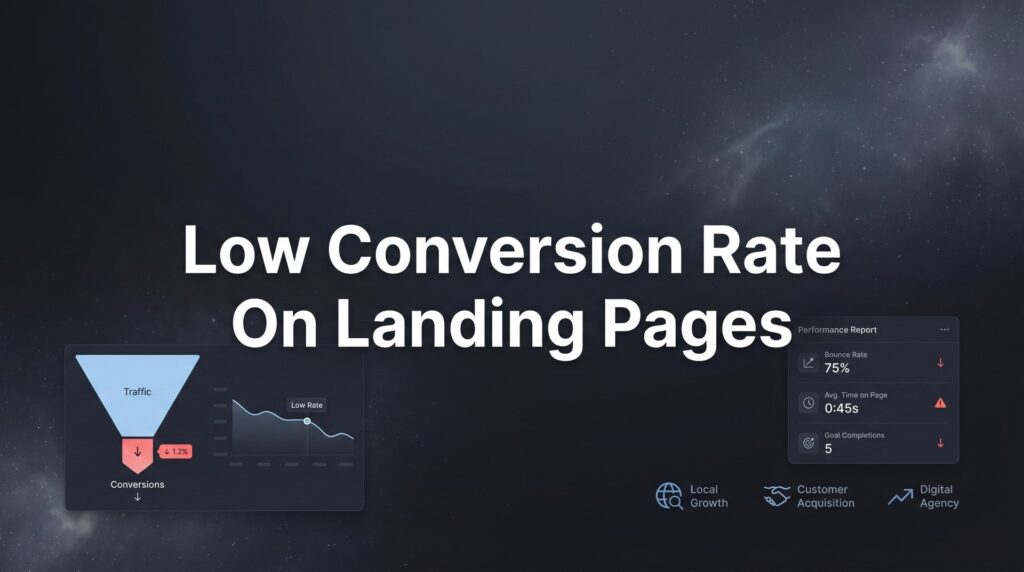
Your ads are driving traffic, but your landing page isn’t closing the deal. A low conversion rate on landing pages is one of the most frustrating problems in digital marketing—you’re paying for every click, yet watching potential customers bounce without taking action.
The good news? Most conversion killers are fixable once you know where to look.
This guide breaks down seven battle-tested strategies that transform underperforming landing pages into lead-generating machines. Whether you’re seeing 1% conversions or struggling to break 3%, these tactics address the root causes that keep visitors from becoming customers.
1. Align Your Ad Message with Your Landing Page Promise
The Challenge It Solves
Picture this: A potential customer clicks your ad promising “Free Roof Inspection in 24 Hours,” but lands on a generic homepage talking about your company history. That disconnect triggers immediate doubt. Did they click the wrong thing? Is this even the same company?
This message mismatch is one of the fastest conversion killers. When visitors experience cognitive dissonance between what they expected and what they see, most leave within seconds.
The Strategy Explained
Message match means your landing page delivers exactly what your ad promised—same headline language, same offer, same visual style. If your ad highlights “24-hour emergency service,” your landing page headline should echo that urgency and timeframe.
This isn’t about copying text word-for-word. It’s about maintaining the promise thread from ad to page. Your visitor should feel like they’re continuing the same conversation, not starting a new one with a different company.
The visual elements matter just as much. If your ad shows a specific product or service image, that same image should appear prominently on your landing page. Color schemes, fonts, and overall design language should feel consistent.
Implementation Steps
1. Pull up your top-performing ad and the landing page it sends traffic to. Read them side-by-side and identify any disconnects in messaging, offer details, or visual presentation.
2. Rewrite your landing page headline to mirror the core promise from your ad. If your ad says “Get Your Free Quote in Under 60 Seconds,” your landing page headline should reinforce that speed and simplicity promise.
3. Match your visual elements by using the same or similar imagery from your ad creative. If you’re advertising a specific service package, show that package prominently on the landing page.
Pro Tips
Create dedicated landing pages for different ad campaigns rather than sending all traffic to one generic page. A plumbing company running separate campaigns for “emergency repairs” and “bathroom remodeling” needs distinct landing pages that speak to each specific need. Learning how to create high converting landing pages for each campaign type will dramatically improve your results. The emergency repair page should emphasize speed and availability, while the remodeling page should showcase transformations and design options.
2. Simplify Your Page to One Clear Action
The Challenge It Solves
Too many landing pages suffer from decision paralysis. Visitors see multiple CTAs competing for attention: “Call Now,” “Get a Quote,” “Schedule Consultation,” “Download Guide,” “Chat with Us.” Each option seems important, but together they create confusion about what to do next.
When people face too many choices, research in behavioral psychology shows they often choose nothing at all. Your landing page isn’t your website homepage—it has one job, and that job requires singular focus.
The Strategy Explained
A high-converting landing page guides visitors toward exactly one conversion goal. Everything on the page—every headline, image, and design element—should support that single action. Remove navigation menus, sidebar links, and secondary CTAs that give visitors an escape route.
Think of your landing page as a conversation with a specific purpose. You wouldn’t ask someone for their phone number while simultaneously offering them three other ways to stay in touch. You’d ask for the one thing that moves the relationship forward.
This doesn’t mean you can’t offer the same CTA in multiple locations. Having a “Get Your Free Quote” button at the top, middle, and bottom of your page works perfectly—as long as they all lead to the same action.
Implementation Steps
1. Audit your current landing page and count every clickable element. Navigation links, social media icons, footer links, multiple form options—write them all down. You’ll likely find dozens of exit points you didn’t realize existed.
2. Remove or hide your main navigation menu. Yes, this feels uncomfortable at first, but navigation gives visitors permission to leave. Your landing page should be a focused experience, not a browsing opportunity.
3. Consolidate all CTAs to support one conversion goal. If you’re collecting leads, every button should open the same form. If you’re driving phone calls, every CTA should trigger the phone dialer or prominently display your number.
Pro Tips
The exception to the single-action rule is offering a low-commitment alternative for visitors who aren’t ready for your primary CTA. If your main goal is scheduling a consultation, you might include a secondary option to “Download Our Free Guide” for those not ready to talk. Following best practices for landing pages means making sure your primary CTA dominates the visual hierarchy and appears first.
3. Speed Up Your Page Load Time
The Challenge It Solves
You’ve crafted the perfect headline and offer, but none of it matters if visitors leave before your page finishes loading. Every second of delay chips away at your conversion rate as impatient visitors hit the back button.
Mobile users are especially intolerant of slow pages. Someone searching for “emergency plumber near me” on their phone while water floods their basement isn’t going to wait five seconds for your hero image to render. They’ll move to the next result immediately.
The Strategy Explained
Page speed optimization focuses on reducing the time between when someone clicks your ad and when they can actually interact with your landing page. This involves compressing images, minimizing code, leveraging browser caching, and choosing fast hosting.
The goal isn’t perfection—it’s making your page load fast enough that visitors don’t notice the wait. On mobile, this typically means getting your page interactive within three seconds. On desktop, you have slightly more tolerance, but not much.
Speed improvements often deliver the fastest conversion gains because they affect every single visitor. A 2-second improvement in load time impacts 100% of your traffic, while a headline change might only resonate with a portion of your audience.
Implementation Steps
1. Test your current page speed using Google’s PageSpeed Insights tool. Run tests for both mobile and desktop versions, and focus on the mobile score since that’s where speed issues hurt most.
2. Compress all images on your landing page using tools like TinyPNG or built-in compression in your website platform. Most landing pages use images that are 5-10 times larger than necessary, creating massive unnecessary load time.
3. Remove unnecessary scripts and tracking codes. Every analytics tool, chat widget, and third-party integration adds load time. Audit what’s actually essential versus what’s nice-to-have, and remove anything that doesn’t directly support conversions.
Pro Tips
Consider using a content delivery network (CDN) if you’re running paid traffic at scale. CDNs store copies of your page on servers around the world, so visitors load your page from a nearby location rather than your main server. This geographic optimization can cut load times in half for visitors far from your hosting location.
4. Build Trust Above the Fold
The Challenge It Solves
New visitors land on your page with natural skepticism. They don’t know you, haven’t heard of your business, and are deciding within seconds whether you’re legitimate or just another company making empty promises.
If your landing page looks like every other generic template on the internet, visitors have no reason to trust you over your competitors. Without trust signals visible immediately, most people won’t scroll far enough to discover your credibility markers buried at the bottom.
The Strategy Explained
Above the fold means the portion of your page visitors see without scrolling—typically the top 600-800 pixels on desktop and even less on mobile. This prime real estate needs to establish credibility fast through trust signals like customer reviews, industry certifications, recognized brand logos, or specific results you’ve delivered.
The most powerful trust signals are specific and verifiable. “Google Premier Partner Agency” carries more weight than “Award-Winning Agency.” A testimonial from “Sarah Chen, Owner of Chen’s Bakery” with a photo beats an anonymous quote every time.
Think about what would make you trust a business you’ve never heard of. Industry certifications, years in business, number of customers served, recognizable client logos—these elements answer the unspoken question: “Why should I trust you?”
Implementation Steps
1. Identify your strongest trust signals. This might be your Google Partner status, Better Business Bureau rating, years in business, number of projects completed, or client logos from recognizable companies.
2. Place your top 2-3 trust signals in your hero section, visible without scrolling. This could be a certification badge next to your headline, a 5-star review snippet, or logos of well-known clients you’ve worked with.
3. Add a brief customer testimonial or result near your primary CTA. When someone is deciding whether to fill out your form, seeing “We got 47 qualified leads in our first month” from a real customer provides the social proof that tips the decision.
Pro Tips
Video testimonials outperform text testimonials significantly when placed above the fold. A 15-second clip of a happy customer explaining their result feels more authentic than any written quote. If you have even one video testimonial, test it prominently in your hero section—just make sure it’s set to autoplay on mute so it doesn’t annoy visitors. These tactics are part of learning how to optimize landing pages for conversions effectively.
5. Write Headlines That Speak to Pain Points
The Challenge It Solves
Most landing page headlines talk about the business: “Welcome to XYZ Plumbing” or “Professional Roofing Services Since 1995.” These headlines waste your most valuable real estate by making the page about you instead of about solving your visitor’s problem.
Your visitor clicked your ad because they have a problem right now. They’re not interested in your company history or generic service descriptions. They want to know if you understand their specific situation and can fix it.
The Strategy Explained
Pain-point headlines acknowledge the specific problem your visitor is experiencing and promise a solution. Instead of “Professional HVAC Services,” try “Is Your AC Broken in the Middle of Summer? We’ll Have It Running Today.” The second headline speaks directly to the visitor’s current frustration.
The best headlines follow a simple formula: acknowledge the pain, then promise the outcome. “Tired of wasting money on ads that don’t convert? We’ll show you exactly what’s broken and how to fix it.” This approach creates immediate relevance because it mirrors the visitor’s internal dialogue.
Your headline should make visitors feel understood. When someone reads your headline and thinks “Yes, that’s exactly my problem,” you’ve created the connection that makes them want to keep reading.
Implementation Steps
1. List the top three problems your service solves. Not features, not benefits—actual problems your customers experience. A tax accountant might identify: “Afraid of getting audited,” “Paying too much in taxes,” “Drowning in receipts and paperwork.”
2. Write three headline variations that acknowledge each pain point directly. Use “you” language and speak to the emotional aspect of the problem, not just the technical issue.
3. Test your headline by reading it out loud as if you’re talking to a friend with this problem. If it sounds like marketing speak rather than a real conversation, rewrite it until it sounds natural.
Pro Tips
Pair your pain-point headline with a subheadline that provides the solution or outcome. The headline grabs attention by acknowledging the problem, while the subheadline provides hope by previewing the solution. “Struggling to Get Qualified Leads from Your Website?” (headline) “We’ll audit your site and show you exactly what’s blocking conversions—for free.” (subheadline) This approach directly addresses low website conversion rate solutions that actually work.
6. Reduce Form Friction
The Challenge It Solves
You’ve done everything right—matched your message, simplified your page, built trust—but visitors still abandon your form halfway through. Every additional field you require creates another opportunity for someone to decide it’s not worth the effort.
Form friction is especially deadly on mobile devices, where typing is tedious and autocomplete often fails. A form that feels reasonable on desktop can feel like an interrogation on a phone screen.
The Strategy Explained
Form optimization means collecting only the information you absolutely need to follow up effectively, then making those fields as easy as possible to complete. Every field you remove increases your completion rate, but you need enough information to qualify leads and respond appropriately.
The key question: “Can we collect this information later in the sales process?” If you’re generating leads for a roofing company, you need name, phone, address, and maybe the type of roof. You don’t need their budget, timeline, and detailed project description in the initial form. Get them into your pipeline first, then gather details during the follow-up call.
Smart form design also means using appropriate field types. Dropdown menus for states, auto-formatting for phone numbers, and placeholder text that shows the expected format all reduce the mental effort required to complete your form.
Implementation Steps
1. Review every field in your current form and label it as “essential,” “helpful,” or “nice to have.” Essential fields are required to contact and qualify the lead. Helpful fields improve your follow-up but aren’t mandatory. Nice-to-have fields are things you’re just curious about. Delete everything that’s not essential.
2. Optimize your remaining fields for mobile completion. Use input types that trigger the right keyboard (type=”tel” for phone numbers, type=”email” for email addresses), enable autocomplete attributes, and ensure your form fields are large enough to tap easily on a phone screen.
3. Remove unnecessary labels and instructions that make your form look longer than it is. Instead of a label above each field and placeholder text inside, use clear placeholder text that disappears when someone starts typing. This creates more visual space and makes the form feel faster.
Pro Tips
Consider using a multi-step form for longer information requests. Instead of showing 8 fields at once, break them into 2-3 screens with progress indicators. “Step 1 of 3: Tell us about your project” feels more manageable than seeing all 8 fields stacked vertically. Using the right conversion rate optimization tools can help you implement and test multi-step forms effectively. Just make sure the first step only asks for 2-3 pieces of information so people commit before realizing how much you’re asking for.
7. Test One Element at a Time
The Challenge It Solves
You’ve implemented several changes to your landing page and conversions improved. Great news, right? Except now you don’t know which change actually worked. Was it the new headline? The simplified form? The trust badges? When you change everything at once, you learn nothing.
Random optimization is expensive. You might accidentally remove something that was working while adding something that hurts conversions, ending up with no net improvement despite all your effort.
The Strategy Explained
Structured A/B testing means changing exactly one element between your control version and your test version, then running both simultaneously until you have statistically significant data. This isolation lets you know with confidence whether each change improves or hurts your conversion rate.
The testing process is straightforward: identify your hypothesis (changing X will improve conversions because Y), create a variation with only that change, split your traffic evenly between both versions, and wait until you have enough data to make a decision. Then implement the winner and move to your next test.
This disciplined approach builds conversion knowledge over time. After six months of structured testing, you’ll know exactly what works for your audience instead of guessing based on best practices that might not apply to your specific situation.
Implementation Steps
1. Prioritize your testing roadmap based on potential impact and ease of implementation. Start with high-traffic elements that could significantly affect conversions: headline, primary CTA button, form length, or trust signals in the hero section.
2. Create your first A/B test by changing only one element. If you’re testing your headline, everything else on the page stays identical between versions. Learning the fundamentals of A/B testing for landing pages will help you set up tests correctly using platforms like Google Optimize, Unbounce, or your landing page builder.
3. Run your test until you reach statistical significance, typically requiring at least 100 conversions per variation. Don’t stop your test early just because one version is winning after a day. Traffic patterns vary by day of week and time of day, so you need sustained data to trust your results.
Pro Tips
Document every test you run, including what you changed, why you thought it would work, the results, and what you learned. This testing log becomes invaluable over time as you identify patterns in what resonates with your audience. You might discover that urgency-focused headlines always outperform benefit-focused ones, or that shorter forms work better even when conventional wisdom suggests otherwise.
Putting These Strategies Into Action
Start with a quick audit: check your ad-to-page alignment, count your CTAs, and test your page speed using Google’s PageSpeed Insights. These three diagnostics often reveal the biggest conversion leaks and give you clear starting points.
Then work through the remaining strategies systematically—add trust signals above the fold, rewrite your headline to address pain points directly, simplify your form to essential fields only, and set up your first A/B test. Most local businesses see meaningful conversion improvements within 2-4 weeks of implementing these fixes.
The key is focusing on one change at a time and measuring results before moving forward. Don’t try to fix everything simultaneously. Make one improvement, let it run for a week or two, measure the impact, then move to the next strategy.
Remember that conversion optimization is an ongoing process, not a one-time fix. Your first round of improvements might boost conversions from 2% to 4%, but there’s always room to test and refine further. The businesses that consistently outperform their competitors are the ones that treat optimization as a continuous discipline.
Tired of spending money on marketing that doesn’t produce real revenue? We build lead systems that turn traffic into qualified leads and measurable sales growth. If you want to see what this would look like for your business, we’ll walk you through how it works and break down what’s realistic in your market.