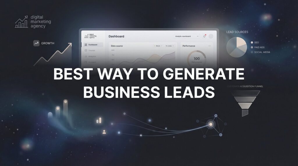
You’re spending money on ads. Traffic is flowing to your site. Google Analytics shows hundreds—maybe thousands—of visitors each month. But when you check your bank account, the sales numbers tell a different story.
Here’s the uncomfortable truth: Most businesses don’t have a traffic problem. They have a conversion problem.
Think about it this way: if your site converts at 2% and you get 1,000 visitors, you make 20 sales. Double that conversion rate to 4%, and suddenly you’re making 40 sales from the exact same traffic. Same ad spend. Same effort. Double the revenue.
That’s the power of conversion rate optimization, and it’s exactly why we focus so heavily on CRO at Clicks Geek. We’ve seen businesses transform their profitability not by chasing more clicks, but by converting more of the visitors they already have.
This guide walks you through six concrete steps to improve your online sales conversion. These aren’t theoretical concepts or vague suggestions. They’re the exact tactics we implement for clients who need marketing that actually produces revenue, not just vanity metrics.
Every step includes specific actions you can take today, common pitfalls to avoid, and clear success indicators so you know what’s working. Let’s get started.
Step 1: Audit Your Current Conversion Funnel for Leaks
You can’t fix what you can’t see. Before making any changes, you need to understand exactly where potential customers are slipping through the cracks.
Start by setting up proper tracking in Google Analytics. If you haven’t configured goals or events for key actions—like reaching the checkout page, submitting a lead form, or completing a purchase—do that first. Without tracking, you’re flying blind.
Next, map out your entire customer journey. What does a typical visitor experience from the moment they land on your site until they complete a purchase or submit their information? Write down every single page they encounter: landing page, product page, cart page, checkout page, confirmation page.
Now comes the detective work. Pull up your analytics and identify your biggest leak points. Look for pages with unusually high exit rates or bounce rates. Check your shopping cart abandonment rate. Review the behavior flow reports to see where visitors drop off most frequently.
Here’s what you’re looking for: If 1,000 people visit your product page but only 200 add items to their cart, you’ve found a leak. If 200 people add items but only 50 complete checkout, that’s another leak. Each drop-off point represents lost revenue.
Create a baseline conversion rate for each stage of your funnel. Document these numbers. This baseline becomes your measuring stick for improvement. When you implement changes in the following steps, you’ll compare new performance against these numbers to see what’s actually working. For a deeper dive into this process, our guide on how to optimize your conversion funnel walks through each stage in detail.
The success indicator for this step is simple: You should be able to pinpoint exactly where you’re losing potential customers and quantify how many people you’re losing at each stage. If you can say “I lose 60% of visitors between the product page and cart,” you’ve completed this step successfully.
One common mistake: Don’t get lost in vanity metrics like total page views or time on site. Focus exclusively on conversion-related metrics. The only numbers that matter are the ones tied directly to revenue.
Step 2: Speed Up Your Site and Fix Mobile Experience
A slow website kills conversions faster than almost anything else. Visitors won’t wait around while your pages load. They’ll bounce to a competitor before your site even finishes rendering.
Test your page load speed using Google PageSpeed Insights. Aim for a score above 90 on mobile and desktop. If you’re scoring below 70, you’ve got serious work to do. Pay special attention to your load time—if pages take longer than three seconds to load, you’re hemorrhaging potential sales.
The most common culprit? Images. Large, uncompressed images slow sites to a crawl. Compress every image on your site using tools like TinyPNG or ShortPixel. Convert images to modern formats like WebP when possible. For product images, balance quality with file size—a crystal-clear photo means nothing if visitors leave before it loads.
Eliminate unnecessary scripts and plugins. Every third-party tool you’ve added—chat widgets, social sharing buttons, analytics trackers—adds weight to your pages. Audit every script and ask: “Do we actually use this?” If the answer is no, remove it.
Now let’s talk about mobile, because this is where most local businesses lose money without realizing it. Pull up your site on your phone right now. Actually do it. Try to complete a purchase or fill out a contact form.
Are the buttons large enough to tap accurately? Can you read the text without zooming? Does the checkout process work smoothly, or do form fields behave strangely? Is your phone number clickable so mobile users can call with one tap?
Here’s a reality check: Most traffic to local business sites comes from mobile devices. If your mobile experience is broken or frustrating, you’re turning away your biggest source of potential customers. Desktop might look perfect, but that’s not where your money is coming from.
Test your checkout process specifically on mobile. Add a product to your cart, proceed through checkout, and complete the purchase. If anything feels clunky or confusing, your customers are experiencing it too—and they’re abandoning their carts because of it.
Success indicators for this step: Your PageSpeed Insights scores improve significantly, your mobile bounce rate decreases, and your mobile conversion rate starts trending upward. If mobile conversions remain flat after speed improvements, you’ve still got user experience issues to address.
Step 3: Rewrite Your Product Pages to Address Buyer Objections
Your product pages are doing one of two things: convincing visitors to buy or giving them reasons to leave. Most product pages lean heavily toward the latter without realizing it.
Stop leading with features. Nobody cares about the technical specifications until they understand what’s in it for them. Lead with benefits and outcomes instead. Don’t say “Our software has automated reporting.” Say “Get your weekly performance reports without lifting a finger.”
Think about what your customers actually want to achieve. They’re not buying your product—they’re buying the result your product delivers. A landscaping company isn’t selling lawn care services; they’re selling a beautiful yard that impresses the neighbors without the homeowner spending their Saturday pushing a mower.
Frame everything around outcomes. What does life look like after someone uses your product or service? Paint that picture clearly, and you’ll see engagement on product pages increase immediately.
Now add social proof directly on these pages. Reviews and testimonials aren’t nice-to-haves—they’re conversion essentials. Display star ratings prominently. Include specific testimonials that address common concerns. Add trust badges if you have relevant certifications or security credentials. If you’re struggling to collect and display reviews effectively, check out these solutions for managing online customer reviews.
Here’s the key: Your social proof needs to feel real and specific. Generic five-star reviews that say “Great product!” don’t move the needle. But a detailed review that says “We were skeptical about the price, but after three months our customer acquisition cost dropped by half” addresses price objections while demonstrating real results.
Answer objections before customers ask them. What are the top three to five reasons someone might hesitate to buy from you? Price concerns? Uncertainty about whether it works for their situation? Worry about implementation difficulty? Trust issues with a company they’ve never heard of?
Address each objection directly on the page. If price is an issue, show ROI or payment plans. If trust is an issue, display your Google reviews and years in business. If implementation seems complex, outline your onboarding process or offer a money-back guarantee.
Finally, your calls-to-action need to be specific and compelling. Replace generic buttons that say “Submit” or “Buy Now” with specific actions: “Get My Free Quote,” “Start My 30-Day Trial,” “Schedule My Free Consultation.” Tell people exactly what happens when they click.
Success indicators: Time on product pages increases because visitors are actually reading your content. Bounce rate decreases because the page answers their questions. Add-to-cart rate improves because you’ve addressed the objections that previously made them leave.
Step 4: Simplify Your Checkout or Lead Capture Process
Every form field you add is a barrier to conversion. Every extra step in your checkout process is an opportunity for customers to abandon their purchase. Friction kills sales.
Audit your checkout process or lead capture forms right now. How many fields are you asking people to fill out? Be brutally honest: Do you actually need every single piece of information you’re requesting?
For e-commerce, reduce checkout fields to the absolute minimum. Name, email, shipping address, payment information. That’s it. Don’t ask for phone numbers unless you genuinely need them. Don’t require account creation. Don’t ask for information you can collect later.
Speaking of account creation: Add a guest checkout option immediately if you don’t have one. Forcing people to create an account before purchasing is one of the fastest ways to kill conversions. Yes, you want their email for marketing. You can ask for that after they complete the purchase, not before.
For lead generation forms, the same principle applies. If you’re asking for name, email, phone number, company name, company size, budget, timeline, and a description of their needs, you’re asking for too much. Start with name and email. You can qualify them further after they submit. Our guide on how to generate qualified leads online covers how to balance lead quality with form simplicity.
Make the value exchange crystal clear. Why should someone give you their information? What do they get in return? “Download our free guide” is vague. “Get our 23-page guide to cutting your ad costs in half” tells them exactly what they’re receiving and why it’s worth their email address.
Display security and trust signals prominently during checkout. Show accepted payment methods. Display security badges from Norton, McAfee, or your SSL provider. Include your money-back guarantee if you offer one. Add customer service contact information so people know they can get help if something goes wrong.
For local businesses specifically, prominently display your physical address and phone number. Make that phone number clickable on mobile. Many local customers prefer to call rather than fill out forms—don’t make them hunt for your contact information.
Test your entire process on mobile again. Forms that work fine on desktop often break on mobile. Fields might not auto-fill correctly. The keyboard might cover submit buttons. Payment information might be difficult to enter. Test it yourself before customers encounter these problems.
Success indicators: Your cart abandonment rate drops significantly. Form completion rates increase. The average time to complete checkout decreases because you’ve removed unnecessary steps. If you’re still seeing high abandonment, you haven’t simplified enough.
Step 5: Implement Strategic Exit-Intent and Urgency Triggers
Not everyone who visits your site is ready to buy immediately. Some need a little extra nudge. Exit-intent technology and strategic urgency can recover a portion of visitors who would otherwise leave without converting.
Set up exit-intent popups that trigger when someone moves their cursor toward the browser’s back button or close tab. These popups should offer something compelling: a discount code, free shipping, a bonus item, or a lead magnet that captures their email.
The key word here is “compelling.” A popup that says “Wait! Don’t leave!” without offering anything of value won’t work. But a popup that says “Before you go: Get 15% off your first order” gives visitors a concrete reason to reconsider.
For lead generation, offer a valuable resource in exchange for their email. “Download our free checklist” or “Get our pricing guide” works better than simply asking them to subscribe to your newsletter. People need to know what they’re getting.
Now let’s talk about urgency, because this is where many businesses shoot themselves in the foot. Legitimate urgency works. Fake urgency destroys trust and tanks conversions long-term.
Real urgency looks like: “Only 3 rooms left at this rate” (if you actually only have 3 rooms), “Sale ends Friday” (if the sale actually ends Friday), “Limited to first 50 customers” (if you’re genuinely limiting it to 50). This creates genuine motivation to act now rather than later.
Fake urgency looks like: Countdown timers that reset when you refresh the page, “Only 2 left in stock!” messages that never change, perpetual “limited time offers” that run indefinitely. Customers aren’t stupid. They recognize fake scarcity, and it makes them trust you less, not more.
Use urgency sparingly and honestly. If you have a legitimate reason for time sensitivity—seasonal inventory, early-bird pricing, limited appointment slots—communicate that clearly. If you don’t have a real reason, don’t manufacture one.
Install retargeting pixels on your site to bring back visitors who didn’t convert. Set up campaigns that show ads to people who viewed specific products or reached checkout but didn’t complete their purchase. These campaigns often deliver strong return on ad spend because you’re targeting people who already showed interest. If your ads aren’t converting to sales, retargeting is often the missing piece.
Success indicators: Your exit popups capture email addresses or recover abandoned carts at a meaningful rate. Your retargeting campaigns show positive ROAS. Most importantly, you’re using these tactics without damaging trust—if customers complain about fake urgency or manipulative popups, you’ve gone too far.
Step 6: Test, Measure, and Optimize Continuously
Conversion optimization isn’t a one-time project. It’s an ongoing process of testing, learning, and improving. The businesses that win are the ones that treat optimization as a continuous discipline, not a checkbox to complete.
Start running A/B tests on individual elements of your site. Test one thing at a time—headlines, call-to-action buttons, product images, pricing displays, form layouts. When you test multiple changes simultaneously, you can’t determine which change actually moved the needle.
Test your headlines first. A compelling headline can dramatically increase engagement. Try different approaches: benefit-focused versus feature-focused, question-based versus statement-based, short versus detailed. Let the data tell you what resonates with your specific audience.
Test your calls-to-action next. Button color matters less than you think, but button copy matters enormously. “Buy Now” versus “Get Started” versus “See Pricing” can produce wildly different results. Test them systematically.
Set up conversion tracking for every step of your funnel. You should be able to see exactly how many people move from one stage to the next. When you make a change, you need to know whether it improved conversions, hurt them, or made no difference. If you’re unsure whether your tracking is set up correctly, our guide on fixing marketing conversion tracking will help you get it right.
Review your data weekly. Look for trends. Are conversions improving? Are certain traffic sources converting better than others? Are specific products or services outperforming expectations? Use this information to inform your next round of optimizations.
Document everything you learn. What works for one business might not work for yours. Generic best practices are a starting point, but your specific audience might respond differently. Keep detailed notes about what you’ve tested and what results you achieved.
Here’s a critical point: Wait for statistical significance before drawing conclusions. If you run a test for two days and see a 10% improvement, that might be noise, not signal. Run tests long enough to collect meaningful data—typically at least two weeks or several hundred conversions per variation.
Make incremental improvements rather than massive overhauls. Small, consistent gains compound over time. Improving your landing page conversion by 10%, your product page engagement by 15%, and your checkout completion by 12% doesn’t sound dramatic. But multiply those improvements together, and you’ve more than doubled your overall conversion rate. The right conversion rate optimization tools can make this testing process significantly easier.
Success indicator: Your conversion rate shows a consistent upward trend over 90 days. You have documentation of what you’ve tested and what worked. You can explain why certain changes improved performance based on data, not guesses.
Your Conversion Optimization Checklist
Let’s recap the six steps to improve your online sales conversion:
Step 1: Audit your conversion funnel and identify exactly where you’re losing potential customers.
Step 2: Speed up your site and ensure your mobile experience is flawless.
Step 3: Rewrite product pages to lead with benefits and address buyer objections directly.
Step 4: Simplify your checkout or lead capture process by removing unnecessary friction.
Step 5: Implement exit-intent technology and legitimate urgency triggers strategically.
Step 6: Test continuously, measure results, and optimize based on real data.
Here’s what makes conversion optimization so powerful: The improvements compound. When you improve each step of your funnel by just 10-15%, the cumulative effect multiplies your overall conversions significantly. A visitor who’s 10% more likely to add to cart, 15% more likely to complete checkout, and 12% more likely to return becomes dramatically more valuable over time.
Remember, conversion optimization is ongoing work, not a one-time fix. Customer behavior evolves. Your market changes. New competitors emerge. The businesses that consistently win are the ones that never stop testing and improving. If you’re experiencing website traffic but no conversions, these six steps will help you diagnose and fix the problem.
Tired of spending money on marketing that doesn’t produce real revenue? At Clicks Geek, we build lead systems that turn traffic into qualified leads and measurable sales growth. If you want to see what this would look like for your business, we’ll walk you through how it works and break down what’s realistic in your market.
The difference between a 2% conversion rate and a 4% conversion rate is the difference between struggling to break even and building a genuinely profitable business. Start with Step 1 today. Your future revenue depends on it.
Want More Leads for Your Business?
Most agencies chase clicks, impressions, and “traffic.” Clicks Geek builds lead systems. We uncover where prospects are dropping off, where your budget is being wasted, and which channels will actually produce ROI for your business, then we build and manage the strategy for you.