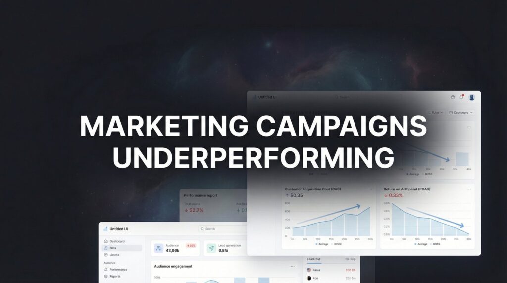
You’ve spent good money on ads, but visitors aren't converting into leads. What's wrong? Often, the problem isn't your ad—it's your landing page. This guide covers the most important best practices for landing page design. These are the strategies we use to turn clicks into customers for service businesses.
This isn't theory. It’s a clear roadmap for building pages that actually work. We'll cover:
- How to write a headline that grabs attention.
- The secrets behind high-converting forms and buttons.
- Simple ways to build trust with social proof.
- Technical details like page speed and mobile-first design.
Let's dive in.
What are the key elements of a high-converting landing page?
A high-converting landing page combines several key elements to guide a user toward a single action. Think of it like a focused sales pitch.
The most critical elements are:
- A Clear Value Proposition: An attention-grabbing headline that instantly explains what you offer and why it matters.
- Compelling Visuals: High-quality images or a short video that supports your message.
- Benefit-Focused Copy: Text that explains the outcome or solution for the customer, not just lists of features.
- Social Proof: Testimonials, reviews, or case studies to build trust.
- A Single, Obvious Call-to-Action (CTA): One clear button or form that tells the user what to do next.
Each element works together to answer the visitor's questions, build confidence, and make it easy to convert.
1. Clear Value Proposition and Headline Optimization
You have about three seconds to get a visitor's attention. If they can't figure out what you do and why they should care, they'll leave. Your headline and value proposition are the most important part of your page. They must answer: "What is this?" and "Why should I care?"
Skip vague promises and get to the point.
- Instead of: "Marketing Services That Grow Your Business"
- Try: "Get 15+ New Customers Per Month with Our Proven Google Ads System"
The second one is specific. It speaks directly to a desired outcome. This makes the value tangible.
In Short: Your headline must clearly state the specific, valuable result a customer will get.

How to Implement This
A good headline combines clarity with a strong hook. To optimize your headlines for clarity and SEO, consider properly utilizing heading tags.
Here are some tips:
- Use Specific Numbers: "Increase Revenue by 35%" is stronger than "Increase Your Revenue."
- Match the Ad Copy: Your landing page headline must reflect the promise in your ad.
- Call Out Your Audience: Speaking directly to your ideal customer (e.g., "Google Ads for Plumbers") increases relevance.
- A/B Test Variations: Don't settle for your first idea. Test 3-5 different headlines to see which performs best.
2. Single-Column Layout with Minimal Navigation
When a visitor lands on your page, guide them down one path. Don't give them a maze of options. A single-column layout with no main menu is a core principle of modern landing page design.
Removing links keeps the user focused on your offer. If you pay for a click, you don't want the person wandering off to your "About Us" page. Channel them toward your phone number or form.
In Short: Remove all distracting navigation to keep the user focused on the one conversion goal.
How to Implement This
This strategy is one of the most effective best practices for landing page design because it supports your campaign's single goal.
Here are some tips:
- Remove the Main Navigation: Hide the main header and footer from your website.
- Create a Linear Flow: Arrange your content logically: headline, benefits, social proof, and then the call-to-action.
- Use Sticky CTAs on Mobile: A CTA button that stays at the top or bottom of the screen on mobile can increase conversions.
- Limit Page Length: Keep it concise. Use 3-5 sections covering only essential information.
3. Strategic Use of Social Proof and Trust Signals
People trust other people more than brands. When someone lands on your page, they wonder, "Can I trust this company?" Social proof answers this question. It shows that other people have trusted you and had a good experience.
This is essential for high-ticket services. Displaying case studies, client logos, and reviews turns your claims into facts. It tells visitors that choosing you is a safe decision.
In Short: Use testimonials, reviews, and case studies to build instant credibility and reduce visitor hesitation.

How to Implement This
Place trust signals throughout the page, especially near your call-to-action.
Here are some tips:
- Use Specific Metrics: Don't say "great results." A testimonial that says, "They helped us generate a $47K monthly revenue increase," is much better.
- Add Video Testimonials: A real client speaking on camera feels more authentic and converts well.
- Show Real Faces: Include the client's name, company, and a headshot with their testimonial.
- Integrate Third-Party Reviews: Embed a live feed of your Google or Yelp reviews for unbiased proof.
- Place Proof Near the CTA: Put your best testimonial or client logos right above your contact form.
4. High-Converting Form Design and Optimization
The form is where a visitor becomes a lead. A bad form is a locked door. People will give up. Optimizing your form is a crucial best practice for landing page design because it directly impacts your ability to capture leads.
The goal is to make it as easy as possible to submit. Every field you add creates friction. Each extra field can lower conversions.
In Short: Keep your forms short and simple to reduce friction and increase the number of submissions.

How to Implement This
Ask for the minimum amount of information you need. You can learn more about how to optimize landing pages for conversions.
Here are some tips:
- Keep Fields to a Minimum: Start with the basics: name, email, and phone number.
- Use Benefit-Driven Button Text: Change "Submit" to something that reinforces value, like "Get My Free Audit."
- Add a Trust Statement: A line like "We hate spam" or "No-obligation quote" can ease anxiety.
- Test Button Colors: High-contrast colors like orange or green usually perform well. Test what stands out on your page.
How do you write a good landing page copy?
Good landing page copy focuses on benefits, not features. It answers the visitor's question, "What's in it for me?" The copy should be clear, concise, and written in a way that speaks directly to the target audience's problems and desires.
To write effective copy:
- Lead with the benefit. Instead of saying "We offer AI optimization," say "Get more customers without managing ads yourself."
- Use "you" language. Frame everything around the customer's experience.
- Address pain points directly. Mention the problems your service solves.
- Keep sentences and paragraphs short. Make the text easy to scan.
- Use bullet points and bold text to highlight key information.
This approach makes your copy more persuasive and connects with the reader on an emotional level.
5. Benefit-Focused Copy Over Feature Listing
Your customers don’t buy features; they buy solutions. One of the most important best practices for landing page design is leading with benefits. Your copy must answer the visitor’s question: "What's in it for me?"
Translate your processes into tangible results.
- Instead of: "We offer Google Ads management with AI optimization."
- Say: "Get 15+ qualified customers monthly without managing ads yourself."
The first is a feature. The second is a direct benefit that speaks to ROI and time savings.
In Short: Focus your copy on the results and solutions your customer will get, not the technical details of what you do.
How to Implement This
This requires shifting your perspective from what you do to what your customer gets. Great copy is a key part of any conversion-focused web design.
Here are some tips:
- Translate Every Feature: For each feature, ask "so what?" until you get to a clear benefit.
- Quantify the Outcome: Use numbers to make benefits concrete. "Save 10 hours/week" is better than "Save time."
- Use 'You' Language: Frame copy around the customer. "You'll never miss a customer call again."
- Address Pain Points: Directly mention the problems your service eliminates, like "Stop wasting money on ads that don't work."
6. Compelling Visuals and Video Implementation
People process images much faster than text. A powerful image or video can communicate value more effectively than paragraphs of copy. High-quality visuals build trust and create an emotional connection.
Landing pages with video can increase conversions by up to 80%. For a service business, visuals make your work tangible. Show before-and-after photos. Display a screenshot of results. Visuals offer immediate proof.
In Short: Use high-quality, authentic images and videos to show your value and build trust quickly.
How to Implement This
Choose visuals that support your value proposition and guide the user.
Here are some tips:
- Show, Don't Just Tell: Use authentic photos of your team or work, not generic stock photos.
- Place Video Strategically: Put your main video (30-60 seconds) above the fold.
- Prioritize Authenticity: A real client testimonial filmed on a smartphone can feel more genuine than a polished studio video.
- Optimize for Speed: Compress all images and videos for the web. A slow-loading video will hurt more than it helps.
7. Strategic CTA Button Placement and Design
Your landing page has one job: get visitors to take one action. The call-to-action (CTA) button is the gateway to that conversion. Placement, copy, and design are critical.
Your button text should be a mini value proposition.
- Instead of: "Submit"
- Use: "Get Your Custom Quote" or "Schedule Your Free Audit"
This clarity reduces friction and encourages clicks.
In Short: Design your CTA button to be highly visible, and use action-oriented text that clearly states the benefit.
How to Implement This
Make your button impossible to miss and irresistible to click.
Here are some tips:
- Use Contrasting Colors: Your button needs to pop. Test bright orange, green, or red.
- Write Action-Oriented Copy: Start with a verb and promise an outcome, like "Get My Free Inspection."
- Place It Strategically: Place a CTA above the fold, mid-page, and at the bottom.
- Make Phone Numbers Clickable: For local services, ensure your phone number is a clickable
tel:link for mobile users. - Ensure Proper Sizing: On mobile, buttons should be at least 44×44 pixels to be easily tappable.
8. Speed Optimization and Technical Performance
A slow landing page is a budget killer. Every one-second delay in load time can reduce conversions by 7%. If a visitor from a paid ad leaves before your page loads, you’ve lost a lead and wasted money.
Speed optimization is one of the most critical technical best practices for landing page design. Your page must load in under two seconds. For one client, we saw a 30% conversion increase just by cutting their load time from four seconds to 1.5 seconds.
In Short: A fast-loading page is essential; aim for under two seconds to avoid losing visitors and wasting ad spend.
How to Implement This
Your goal is to achieve a good Google PageSpeed Insights score (75+).
Here are some tips:
- Compress Your Images: Use tools like TinyPNG to shrink image file sizes.
- Implement Lazy Loading: Make images and videos load only when a user scrolls to them.
- Use a Content Delivery Network (CDN): Services like Cloudflare deliver your page from a server close to the visitor.
- Minimize Code: Minify your CSS and JavaScript files.
- Test on Mobile Networks: Check your page speed on slower 3G and 4G connections.
What is the best structure for a landing page?
The best structure follows a logical story that guides the user from interest to action. There is no single template, but a high-performing structure generally includes these sections in order:
- Hero Section: An attention-grabbing headline, a brief sub-headline, a compelling visual (image or video), and the primary call-to-action (CTA).
- Social Proof: A section with client logos, testimonials, or star ratings placed early to build immediate trust.
- Problem & Solution (Benefits): Clear, concise copy explaining the problem you solve and the benefits of your solution. Use bullet points for easy scanning.
- How It Works: A simple, 3-4 step overview of your process. This makes your service feel transparent and easy to understand.
- Deeper Proof/Case Study: A more detailed testimonial or a mini-case study with specific results.
- Final Call-to-Action: A clear, low-friction form or prominent CTA button to capture the lead.
This single-column flow eliminates distractions and presents information in a persuasive sequence.
9. Mobile-First Design and Responsive Optimization
Over 60% of website traffic comes from mobile devices. This means you must design for the small screen first. Mobile-first design involves creating the experience for a smartphone user, then scaling it up.
This approach prioritizes the majority of your visitors. Instead of shrinking a complex desktop page, you start with the essential elements. For a local service, this might mean putting a click-to-call button front and center.
In Short: Design your landing page for mobile users first to ensure it's fast, simple, and easy to use for most of your audience.
How to Implement This
Focus on speed, simplicity, and thumb-friendly navigation.
Here are some tips:
- Design for Small Screens First: Start your design at a mobile width (like 375px).
- Use Thumb-Friendly Touch Targets: Make all buttons and links at least 44×44 pixels.
- Simplify Forms: Limit mobile forms to 2-3 essential fields.
- Implement Click-to-Call Buttons: Use
<a href='tel:+1234567890'>to let users call with one tap. - Hide Non-Essential Elements: Hide complex menus or sidebars on mobile.
- Test on Real Devices: Test your page on actual iPhones and Android devices.
10. Urgency and Scarcity Tactics with Ethical Implementation
Most people procrastinate. Creating a sense of urgency or scarcity gives them a reason to act now. This can be a powerful tool for driving conversions.
The key is to be authentic. A fake countdown timer will destroy trust. When done right, urgency works.
- Instead of: "Contact Us Today"
- Try: "Free Google Ads Audit (This Month Only – 3 Spots Remaining)"
This creates a real reason for immediate action. The offer is scarce and time-sensitive.
In Short: Use genuine urgency or scarcity—like a limited-time offer or limited spots—to encourage immediate action.
How to Implement This
Create genuine motivation without using deceit.
Here are some tips:
- Tie Urgency to Reality: Link scarcity to your actual capacity. "We only take on 5 new clients per month" is believable.
- Use Real Countdown Timers: If you have a sale that truly expires, a timer is a great visual cue.
- Combine Scarcity and Urgency: "First 10 callers this week get 20% off."
- Be Prominent: Place your urgency message near your CTA button.
- A/B Test Your Tactics: Test a countdown timer against a static deadline like "Offer ends Friday."
Putting It All Together: Your Action Plan
We’ve covered the key best practices for landing page design. The goal isn't to fix everything at once. Success comes from focused, consistent improvement.
Think of your landing page as a dynamic sales tool you can constantly sharpen. The journey starts by picking one or two high-impact areas from this list and making a change.
Your First Steps
Start with a simple audit of your most important landing page. Ask yourself:
- Clarity Check: Can a new visitor understand what I offer in five seconds?
- Friction Check: Is my form too long? Are there distracting links?
- Trust Check: Have I included genuine reviews or testimonials?
- Mobile Check: How does this page look and feel on my own phone?
Choose the area where your page is weakest. The biggest wins often come from rewriting the headline or adding social proof.
From Good to Great: The Power of Testing
The difference between a good landing page and a great one is data. You have to prove a new headline is better with A/B testing.
A/B testing (or split testing) means creating two versions of your page and showing them to different visitors to see which performs better.
- Maybe you test a red button vs. a green one.
- Or a short form vs. a longer one.
Only change one element at a time. This way, you'll know exactly which change caused the result. This methodical process removes guesswork and lets you systematically improve performance. A well-optimized landing page is a critical part of creating effective marketing funnels.
Mastering these best practices is about empathy. It's about building an experience that is clear, helpful, and trustworthy for your customer.
Feeling like your landing pages and ad campaigns could be working harder for you? At Clicks Geek, we specialize in managing Google and Facebook Ads with a laser focus on generating exclusive leads for local and service-based businesses. We handle the complex parts of campaign and landing page optimization so you can focus on running your business. Check us out to see how we can help.