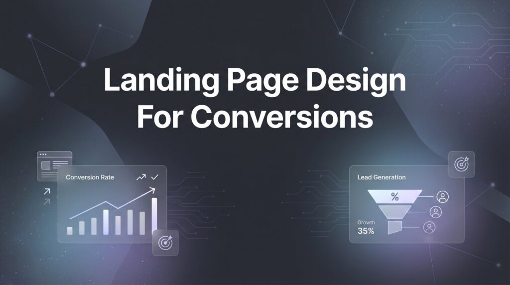
Your landing page is where money is made or lost. You can drive thousands of visitors through paid ads, but if your landing page design fails to convert, you’re essentially lighting cash on fire. The frustrating truth? Most landing pages look professional but perform terribly. They’re designed by people who prioritize aesthetics over psychology, beauty over behavior.
This guide cuts through the design fluff and focuses on what actually moves the needle: conversion-focused landing page design strategies that turn visitors into leads and customers. Whether you’re running PPC campaigns, promoting a service, or capturing leads for your local business, these nine strategies will transform your landing pages from digital brochures into conversion machines.
Let’s get into the tactics that separate high-converting pages from expensive failures.
1. Single-Focus Messaging: The Power of One Clear Goal
The Challenge It Solves
Visitors arrive at your landing page with questions, distractions, and competing priorities. When you present multiple options, navigation menus, and sidebar content, you’re asking them to make decisions—and every decision point is an opportunity to leave. The attention ratio concept is simple: the more choices you offer, the lower your conversion rate.
Most landing pages fail because they try to be everything to everyone. They include links to other services, blog posts, about pages, and social media. Each of these represents a conversion killer.
The Strategy Explained
Single-focus messaging means aligning every element on your page toward one specific conversion goal. If you want phone calls, remove the contact form. If you want form submissions, eliminate phone numbers from the header. Strip away navigation menus entirely. Remove footer links that lead away from the page.
Your headline, subheadline, body copy, images, and call-to-action should all reinforce the same message and drive toward the same outcome. This creates a conversion tunnel, not a browsing experience. When visitors have nowhere else to go, they either convert or leave—and that clarity actually improves results. Understanding how to optimize landing pages for conversions starts with this fundamental principle.
Implementation Steps
1. Identify your single conversion goal before designing anything (lead form submission, phone call, purchase, demo request).
2. Remove all navigation menus, header links, and footer navigation that could lead visitors away from your conversion goal.
3. Audit every element on the page and ask: “Does this move visitors closer to conversion or create an alternative path?” Delete anything that doesn’t directly support your goal.
4. Ensure your call-to-action appears multiple times on the page, especially above the fold and at natural decision points in your copy.
Pro Tips
If you absolutely must include secondary information like privacy policies or terms of service, use small text links at the bottom of the page that open in modal windows rather than navigating away. Test removing your logo link—many high-converting pages make the logo non-clickable to prevent accidental exits.
2. Above-the-Fold Hierarchy: Win in Three Seconds
The Challenge It Solves
You have approximately three seconds to communicate value before visitors bounce. If the top portion of your landing page doesn’t immediately answer “What is this?” and “Why should I care?”, you’ve lost them. Many landing pages bury their value proposition beneath generic imagery or vague headlines that force visitors to scroll and hunt for meaning.
The above-the-fold section is your first impression, your elevator pitch, and your conversion foundation all rolled into one.
The Strategy Explained
Above-the-fold hierarchy means structuring the top portion of your landing page to communicate three critical elements instantly: a clear headline that states your offer, a compelling subheadline that explains the benefit, and a visible call-to-action that tells visitors exactly what to do next.
Think of this section as a billboard. Drivers passing at 60 mph need to grasp your message in seconds. Your landing page visitors are moving even faster. Use large, readable headlines. Position your primary CTA button prominently. Include a supporting image or video that reinforces your message rather than decorates the space.
Implementation Steps
1. Craft a headline that clearly states what you’re offering without clever wordplay or vague promises (be specific and benefit-focused).
2. Write a subheadline that expands on the headline by addressing the primary pain point or desired outcome your audience cares about.
3. Place your primary call-to-action button in the top right or centered below your headline, using contrasting colors that make it impossible to miss.
4. Test your above-the-fold section by showing it to someone unfamiliar with your business for three seconds, then asking them to explain what you offer—if they can’t, rewrite it.
Pro Tips
Avoid stock photography of smiling people in suits or generic office scenes. If you use imagery, make it specific to your offer—screenshots of your software, photos of your actual product, or relevant visuals that support comprehension. Many high-converting pages use hero videos that auto-play on mute with captions explaining the offer. Following best practices for landing pages ensures your above-the-fold section captures attention immediately.
3. Strategic Trust Signals: Overcome Skepticism Systematically
The Challenge It Solves
Every visitor arrives with built-in skepticism. They’ve been burned by overpromising businesses before. They’ve wasted money on solutions that didn’t deliver. They don’t know you, and they certainly don’t trust you yet. Without credibility markers, even the best offer will struggle to convert because doubt kills action.
The challenge isn’t just proving you’re legitimate—it’s proving you’re the right choice for their specific situation.
The Strategy Explained
Strategic trust signals are credibility elements placed at psychologically critical moments throughout your landing page. These include customer testimonials with names and photos, recognizable brand logos of clients you’ve served, industry certifications, security badges for payment processing, case study results, media mentions, and guarantee statements.
The key word is strategic. Dumping twenty logos at the bottom of your page accomplishes nothing. Place trust signals where doubt naturally occurs—near your call-to-action buttons, after bold claims, and alongside pricing information. Match the trust signal to the objection it needs to overcome.
Implementation Steps
1. Identify the three biggest objections or concerns your target audience has about your offer (price, effectiveness, reliability, time commitment, etc.).
2. Select trust signals that directly address each objection—use testimonials that mention price value, display certifications that prove expertise, show results that demonstrate effectiveness.
3. Place trust signals immediately after making claims or asking for action, positioning them where visitors need reassurance most.
4. Use real testimonials with full names, photos, and ideally company names or locations—vague quotes from “John S.” damage credibility more than they help.
Pro Tips
Video testimonials outperform text testimonials significantly because they’re harder to fake and convey authenticity through tone and body language. If you’re a Google Premier Partner like Clicks Geek, prominently display that badge—it carries weight with business owners who understand what it represents. Specificity builds trust: “increased leads by 40%” beats “got more leads.”
4. Friction-Free Form Design: Make Conversion Effortless
The Challenge It Solves
Forms are necessary friction. You need information to qualify leads and follow up effectively, but every additional form field reduces completion rates. Many businesses sabotage their own conversion rates by asking for unnecessary information upfront—job titles, company sizes, detailed project descriptions—when all they really need is a name, email, and phone number to start a conversation.
The longer your form, the higher your abandonment rate. It’s that simple.
The Strategy Explained
Friction-free form design means requesting only the minimum information required to achieve your business goal, then optimizing the form experience to make completion as easy as possible. This includes reducing field count, using smart defaults and field masking, providing clear error messages, and ensuring mobile users can complete forms without frustration.
Consider what you actually need versus what would be nice to have. You can always ask follow-up questions via email or during the sales conversation. The form’s job is to capture the lead, not conduct the entire qualification process. If you’re struggling with how to create high converting landing pages, form optimization is often the quickest win.
Implementation Steps
1. Audit your current form and remove any fields that aren’t absolutely necessary for initial contact or qualification—aim for 3-5 fields maximum for lead generation.
2. Use single-column form layouts rather than multi-column designs, which create visual confusion and increase completion time.
3. Implement inline validation that shows users errors immediately as they complete each field, rather than waiting until they click submit.
4. For mobile users, ensure form fields are large enough to tap easily, use appropriate input types (number pad for phone fields, email keyboard for email fields), and minimize typing with dropdown menus where appropriate.
Pro Tips
Test a two-step form process: ask for email first with a low-commitment button like “Get Started,” then request additional information on the next screen. This can improve overall completion rates because users have already invested action in the process. For high-ticket services, longer forms can actually improve lead quality by filtering out tire-kickers—know your business model.
5. Visual Design That Guides: Use Psychology, Not Just Aesthetics
The Challenge It Solves
Beautiful design means nothing if it doesn’t guide visitors toward conversion. Many landing pages win design awards but lose money because they prioritize artistic expression over user behavior. Visitors don’t naturally know where to look or what to do next—your design needs to tell them through visual hierarchy, directional cues, and strategic use of white space.
Without intentional visual guidance, visitors scan randomly and miss your most important elements.
The Strategy Explained
Visual design that guides means using color contrast, sizing, positioning, and directional elements to create a clear visual path from headline to call-to-action. This includes making your CTA button a color that contrasts sharply with your background, using arrows or eye-gaze in images to point toward important elements, creating white space around critical content to make it stand out, and sizing elements according to their importance.
Think of your landing page as a funnel with visual guardrails. Every design choice should either guide visitors forward or get out of the way. Decorative elements that don’t serve this purpose are conversion killers.
Implementation Steps
1. Choose a primary CTA button color that contrasts sharply with your page background—if your page is blue, use orange or red buttons, not another shade of blue.
2. Size your headlines progressively: main headline largest, subheadlines medium, body copy smallest, creating a clear visual hierarchy that guides reading order.
3. Use directional cues like arrows pointing to your CTA, or position images of people looking toward your form or button rather than away from it.
4. Add generous white space around your call-to-action buttons and forms to make them stand out and feel less cluttered.
Pro Tips
Run a five-second test: show someone your landing page for five seconds, then ask what they remember and what they think they should do next. If they can’t identify your CTA or primary message, your visual hierarchy needs work. Heat mapping tools can reveal where visitors actually look versus where you want them to look. Professional landing page optimization services often use these tools to identify visual hierarchy problems.
6. Mobile-First Design: Optimize for Thumbs, Not Cursors
The Challenge It Solves
Mobile traffic dominates most industries now, yet many landing pages are still designed primarily for desktop users and then awkwardly adapted for mobile. This creates frustrating experiences: tiny buttons that are impossible to tap accurately, text that requires zooming to read, forms that extend beyond screen width, and slow-loading images that chew through mobile data.
When mobile users encounter friction, they don’t persevere—they leave immediately.
The Strategy Explained
Mobile-first design means building your landing page with mobile users as the primary consideration, then enhancing the experience for larger screens. This includes using thumb-friendly button sizes (minimum 44×44 pixels), ensuring text is readable without zooming (minimum 16px font size), optimizing images for mobile bandwidth, and structuring content in a single vertical column that scrolls naturally.
Mobile users behave differently than desktop users. They’re often multitasking, standing in line, or browsing during commercial breaks. Your mobile landing page needs to work in these contexts—quick to scan, easy to navigate with one hand, and fast to load on cellular connections.
Implementation Steps
1. Design your landing page on a mobile screen first, ensuring all critical elements (headline, value proposition, CTA) fit within the first two screen heights without scrolling.
2. Make all clickable elements at least 44 pixels in height and width, with adequate spacing between them to prevent mis-taps.
3. Use system fonts or fast-loading web fonts rather than custom typography that requires additional file downloads and rendering time.
4. Test your landing page on actual mobile devices in various conditions—not just on your desktop browser’s mobile preview, which doesn’t accurately represent real-world performance.
Pro Tips
Click-to-call buttons are conversion gold for mobile landing pages. Make your phone number tappable so mobile users can call immediately without copying and pasting. Consider using sticky CTAs that remain visible as users scroll on mobile—this keeps conversion opportunities present throughout the experience. Implementing call tracking for marketing campaigns helps you measure which mobile visitors actually convert to phone calls.
7. Authentic Urgency and Scarcity: Create Pressure Without Deception
The Challenge It Solves
Without urgency, visitors delay action indefinitely. They bookmark your page, intend to return later, and never do. The problem is that fake urgency damages credibility—countdown timers that reset on refresh, claims of “only 3 spots left” that never change, or fabricated deadlines that aren’t real create skepticism that spreads beyond your landing page to your entire brand.
You need urgency that’s both effective and honest.
The Strategy Explained
Authentic urgency means creating legitimate time-sensitivity or limited availability based on real business constraints. This includes actual promotional deadlines, genuine inventory limitations, scheduled price increases, limited consultation slots, or seasonal offers. The key is that the urgency must be verifiable and consistent—if you say the offer ends Friday, it actually ends Friday.
Scarcity works through similar psychology but focuses on availability rather than time. Limited spots in a program, exclusive access for early adopters, or capacity constraints in service businesses all create authentic scarcity that motivates action.
Implementation Steps
1. Identify real constraints in your business that create natural urgency or scarcity (limited service capacity, actual promotional periods, genuine inventory, scheduled price changes).
2. Communicate these constraints clearly and specifically—”We accept 5 new clients per month” or “This pricing expires April 30th” rather than vague “limited time” claims.
3. Follow through on your stated deadlines and limitations without exception—your credibility depends on consistency between what you say and what you do.
4. Use countdown timers only for real deadlines, and ensure they don’t reset or extend when visitors refresh the page or return later.
Pro Tips
Social proof creates urgency through different psychology. Showing “15 people booked consultations this week” or “3 spots remaining this month” leverages both scarcity and social validation. For service businesses, calendar-based urgency works well: “Our next available consultation is May 15th” creates urgency without artificial pressure.
8. Page Speed Optimization: Eliminate Load Time Conversion Killers
The Challenge It Solves
Every second of load time costs you conversions. Visitors who encounter slow-loading pages abandon before your content even appears. This is particularly devastating for paid traffic—you’re paying for clicks that never see your offer. The challenge intensifies on mobile connections where slower networks and limited processing power make speed optimization even more critical.
Many landing pages sabotage themselves with massive image files, unnecessary scripts, and bloated code that creates multi-second delays.
The Strategy Explained
Page speed optimization means systematically eliminating technical barriers that slow load times. This includes compressing images to appropriate file sizes, minimizing HTTP requests by combining files, leveraging browser caching, using content delivery networks for faster asset delivery, and removing unnecessary third-party scripts that bog down performance.
The goal is sub-three-second load times on mobile connections. Faster pages consistently convert better because they reduce abandonment and create better user experiences. Speed also impacts your ad quality scores in platforms like Google Ads, affecting both your ad position and cost per click. Understanding what is a PPC landing page includes recognizing that speed directly affects your quality score and cost efficiency.
Implementation Steps
1. Run your landing page through Google PageSpeed Insights or GTmetrix to identify specific performance bottlenecks and prioritize fixes.
2. Compress all images using tools like TinyPNG or ImageOptim, aiming for file sizes under 200KB for hero images and under 100KB for supporting visuals.
3. Remove or defer non-essential JavaScript and third-party scripts (analytics, chat widgets, social media embeds) that don’t directly contribute to conversion.
4. Implement lazy loading for images below the fold so they only load when users scroll to them, reducing initial page weight.
Pro Tips
Consider using WebP image format instead of JPEG or PNG—it provides better compression with minimal quality loss. If you’re using video backgrounds or autoplay videos, provide fallback images for mobile users and compress videos aggressively. Test your landing page on actual mobile networks (not just WiFi) to experience real-world performance.
9. Continuous A/B Testing: Build a System for Compounding Improvements
The Challenge It Solves
Opinions about what works on landing pages are worthless. Your preferences, your designer’s aesthetic judgments, and industry best practices are all inferior to actual data from your specific audience. The challenge is that most businesses treat landing page optimization as a one-time project rather than an ongoing process, missing the compounding improvements that come from systematic testing.
Without testing, you’re guessing. With testing, you’re learning and improving continuously.
The Strategy Explained
Continuous A/B testing means establishing a systematic process for testing variations of landing page elements, measuring results statistically, implementing winners, and immediately moving to the next test. This includes testing headlines, CTA button copy and colors, form field counts, image choices, social proof placement, and offer presentation.
The power comes from compounding improvements. A five percent lift from a better headline, plus three percent from optimized button copy, plus seven percent from reduced form fields creates multiplicative gains over time. Businesses that test continuously pull away from competitors who launch once and forget. Mastering A/B testing for landing pages is essential for sustained conversion rate improvements.
Implementation Steps
1. Start with high-impact elements that affect the most visitors: headline variations, CTA button copy, and above-the-fold layout before testing minor details.
2. Run tests to statistical significance before declaring winners—this typically requires at least 100 conversions per variation to achieve reliable results.
3. Test one variable at a time (headline OR button color, not both simultaneously) so you know what actually caused performance changes.
4. Document all test results in a spreadsheet including what you tested, the winner, the improvement percentage, and insights gained—this builds institutional knowledge.
Pro Tips
Don’t just test random elements. Develop hypotheses based on user behavior data from heat maps, session recordings, and analytics. Test dramatic differences rather than subtle variations—changing button text from “Submit” to “Get Started” will show clearer results than testing two shades of blue. For low-traffic pages, consider sequential testing rather than split testing landing pages to reach significance faster.
Your Implementation Roadmap
High-converting landing pages aren’t accidents—they’re engineered through strategic design decisions backed by behavioral psychology and continuous optimization. Start with single-focus messaging and above-the-fold clarity. These foundational elements determine whether visitors even engage with your page.
Layer in trust signals strategically, reduce form friction to the absolute minimum, and ensure your visual design guides rather than decorates. Prioritize mobile experience because that’s where most of your traffic lives. Create authentic urgency without damaging credibility, optimize page speed to eliminate technical barriers, and establish a systematic testing process that compounds improvements over time.
The businesses that master landing page design don’t just get more leads—they get more profitable leads at lower acquisition costs. Every percentage point improvement in conversion rate directly impacts your customer acquisition cost and overall marketing ROI. When you’re spending money on PPC campaigns or any form of paid traffic, your landing page is the difference between profitable growth and wasted budget.
Your next step? Audit your current landing pages against these nine strategies and identify your biggest opportunity. One strategic improvement can transform your entire campaign performance. Look for the element that’s creating the most friction or the biggest missed opportunity, fix it, measure the impact, and move to the next improvement.
Tired of spending money on marketing that doesn’t produce real revenue? We build lead systems that turn traffic into qualified leads and measurable sales growth. If you want to see what this would look like for your business, we’ll walk you through how it works and break down what’s realistic in your market.
Want More Leads for Your Business?
Most agencies chase clicks, impressions, and “traffic.” Clicks Geek builds lead systems. We uncover where prospects are dropping off, where your budget is being wasted, and which channels will actually produce ROI for your business, then we build and manage the strategy for you.