Your website is getting traffic, but those visitors aren’t turning into customers. Sound familiar? You’re not alone—most local business websites convert at just 2-3%, meaning 97 out of every 100 potential customers leave without taking action. That’s money walking out the door every single day.
The good news? Conversion rate optimization isn’t rocket science. It’s a systematic process of understanding what’s stopping visitors from converting and removing those barriers one by one.
In this step-by-step guide, we’ll walk you through exactly how to improve your website’s conversion rate using the same strategies we implement for our clients at Clicks Geek. You’ll learn how to audit your current performance, identify the biggest conversion killers, and implement changes that actually move the needle on your bottom line.
Whether you’re a plumber trying to get more service calls, a contractor wanting more quote requests, or any local business owner tired of paying for traffic that doesn’t convert—these steps will help you turn more visitors into paying customers.
Step 1: Establish Your Conversion Baseline and Set Measurable Goals
You can’t improve what you don’t measure. Before making any changes to your website, you need to know exactly where you stand right now.
Start by calculating your current conversion rate using Google Analytics 4. Navigate to Reports, then Engagement, and look at your Events. Your conversion rate is simple math: divide the number of conversions by your total visitors, then multiply by 100. If you had 1,000 visitors last month and 20 of them contacted you, that’s a 2% conversion rate.
Here’s where most business owners make a mistake: they only track one conversion type. Your website likely has multiple conversion points—phone calls, contact form submissions, live chat conversations, direction requests, and quote downloads. Each of these represents a potential customer taking action, so track them all.
In Google Analytics 4, set up conversion events for each action you want visitors to take. Phone calls can be tracked using call tracking numbers or event tracking when someone clicks your phone number. Form submissions should trigger a thank-you page that fires a conversion event. Chat interactions can be tracked through your chat platform’s integration.
Now set a realistic improvement target. If you’re currently converting at 2%, aiming for 10% overnight isn’t reasonable. A 50% improvement—moving from 2% to 3%—is achievable and represents a massive revenue increase. That’s 50% more leads from the same traffic you’re already paying for.
Create a simple tracking spreadsheet with weekly columns. Record your total visitors, total conversions, and conversion rate every Monday morning. This weekly check-in keeps you accountable and helps you spot trends quickly. When you make a change to your site, you’ll see within 2-3 weeks whether it moved the needle.
Set a specific deadline for your initial goal. “I will improve my conversion rate from 2% to 3% by the end of next quarter” gives you a concrete target to work toward and a timeframe to measure success.
Step 2: Audit Your Website’s User Experience and Speed
Most local business traffic comes from mobile devices. People searching for a plumber while standing in their flooded bathroom aren’t pulling out a laptop—they’re using their phone. If your site doesn’t work flawlessly on mobile, you’re losing conversions before they even start.
Pull out your smartphone right now and visit your website. Can you easily read the text without zooming? Are buttons large enough to tap accurately? Does your phone number appear as a clickable link? Try filling out your contact form on your phone—is it frustrating or seamless?
Next, run your site through Google PageSpeed Insights. This free tool analyzes your mobile and desktop performance, giving you specific recommendations for improvement. Pages that load in under three seconds perform significantly better than slower pages. Every additional second of load time costs you conversions.
The most common speed killers for local business sites are oversized images and unnecessary plugins. That hero image on your homepage probably doesn’t need to be 5MB. Compress images using free tools before uploading them. Remove plugins you’re not actively using—each one adds load time.
Test your navigation structure by asking someone unfamiliar with your business to find your contact information and service area pages. If they struggle, your actual visitors are struggling too. Your phone number should be visible at the top of every page. Your main services should be accessible within one click from your homepage.
Check your site on different devices and browsers. What looks perfect on your iPhone might be broken on Android. What works in Chrome might fail in Safari. Use free tools like BrowserStack to test across multiple combinations without buying a dozen devices.
Look for friction points that cause visitors to bounce. Pop-ups that cover content before someone has read anything? That’s friction. Auto-play videos that blast sound? Friction. Forms that require creating an account before getting a quote? Major friction. Every unnecessary step between a visitor and conversion is costing you money. If you’re experiencing website traffic but no conversions, these friction points are likely the culprit.
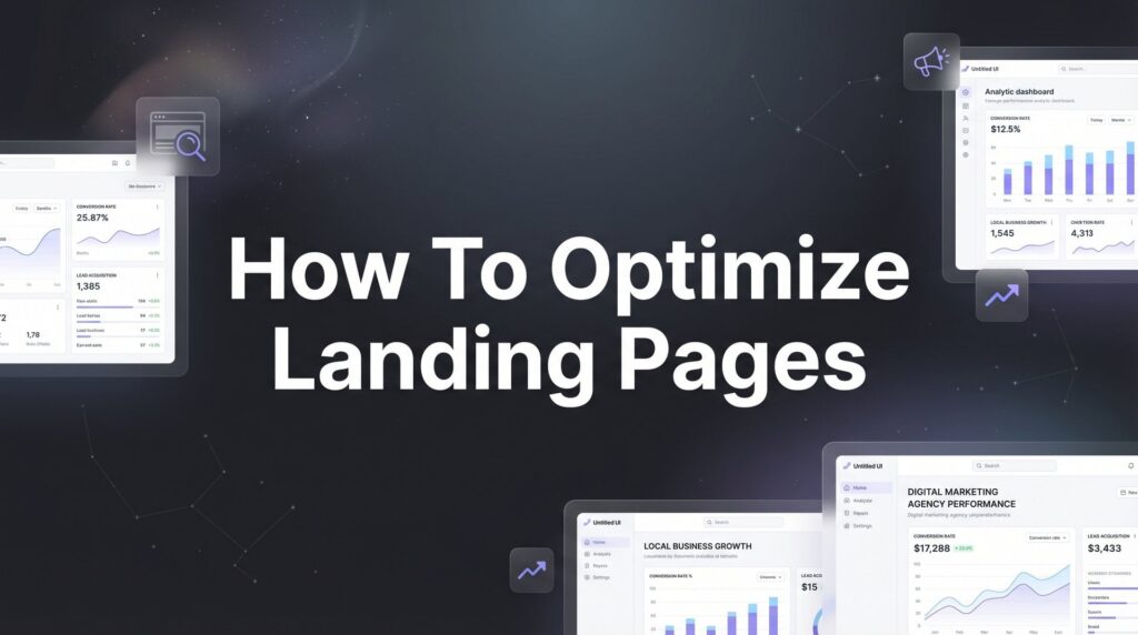
Step 3: Optimize Your Landing Pages for Immediate Clarity
You have about three seconds to communicate what you do and why someone should care. If your headline is vague or your value proposition is buried below the fold, visitors will hit the back button faster than you can say “bounce rate.”
Start with your headline. It should match the visitor’s intent and speak directly to their problem. If someone searches “emergency plumber near me” and lands on a page with the headline “Quality Plumbing Services Since 1985,” you’ve missed the mark. A better headline: “Emergency Plumber Available Now—We’ll Fix Your Problem Today.”
Your value proposition needs to answer one question: why should I choose you instead of the five other businesses I’m comparing? “We’re reliable and professional” doesn’t cut it—everyone says that. “We arrive within 60 minutes or your service call is free” is specific and compelling. “We guarantee our work for two years, not 90 days like our competitors” gives a concrete reason to choose you.
Position your most important information above the fold—the part of the page visible without scrolling. This should include your headline, a brief explanation of what you do, your primary call-to-action, and your phone number. Think of above-the-fold as your billboard on a highway. People are moving fast, and you need to communicate instantly.
Remove competing calls-to-action that dilute focus. If your page has buttons for “Get a Quote,” “Schedule Consultation,” “Download Our Guide,” “Watch Our Video,” and “Sign Up for Newsletter,” you’re asking visitors to make too many decisions. Decision paralysis kills conversions. Pick the ONE action you most want visitors to take on each page and make that the dominant CTA.
Add trust signals strategically throughout your page, but don’t bury them. Your Google reviews, industry certifications, and guarantees should be visible without scrolling. People need reassurance before they’ll contact a business they’ve never heard of. Display your average star rating and number of reviews prominently. Show logos of professional associations you belong to. If you offer a guarantee, make it bold and specific.
Use benefit-focused copy throughout your page. Features tell, benefits sell. “We use commercial-grade equipment” is a feature. “We fix your problem right the first time so you don’t pay for multiple visits” is a benefit. Always translate features into the tangible outcomes your customers care about. For a deeper dive into this process, check out our guide on how to optimize landing pages for conversions.
Step 4: Strengthen Your Calls-to-Action and Form Design
Your call-to-action buttons are the gateway to conversions. If they’re weak, unclear, or hard to find, you’re leaving money on the table even when everything else is working.
Write action-oriented CTA copy that creates urgency without being pushy. “Submit” and “Send” are weak. “Get My Free Quote” and “Schedule My Appointment” are stronger because they’re specific and personal. “Call Now for Same-Day Service” adds urgency. The best CTAs tell visitors exactly what will happen when they click and why they should do it now.
Test your button visibility by squinting at your page or viewing it in grayscale. Can you still immediately identify where to take action? Your CTA buttons should stand out through size, color contrast, and placement. If they blend into the background, people will miss them. Use colors that contrast sharply with your page background—a bright orange button on a blue background works better than a gray button on a white background.
Place CTAs at logical decision points throughout your page, not just at the top and bottom. After you’ve explained a key benefit, add a CTA. After displaying compelling social proof, add a CTA. After addressing a common objection, add a CTA. Give people multiple opportunities to convert as they move through your content.
Now let’s talk about your forms. Every field you require reduces your conversion rate. People are busy and impatient. Asking for name, email, phone, address, company name, job title, budget, timeline, and “how did you hear about us” is conversion suicide. For most local businesses, you only need a name and phone number to follow up. Email is optional. Everything else can be discussed during the conversation.
Make your forms mobile-friendly. Use large input fields that are easy to tap. Enable auto-fill so people don’t have to type everything manually. Use the correct input types—when asking for phone numbers, trigger the number keyboard on mobile devices. When asking for email, trigger the email keyboard with the @ symbol readily available.
Add a clear privacy statement near your form. “We respect your privacy and will never share your information” takes five seconds to read and significantly increases trust. People are rightfully cautious about giving out contact information online.
Step 5: Build Trust and Eliminate Conversion Objections
People don’t buy from businesses they don’t trust. Before someone hands over their contact information or credit card, they need reassurance that you’re legitimate, competent, and won’t waste their time.
Display social proof prominently throughout your site. Your Google reviews are gold—don’t hide them. Embed your Google review feed directly on your homepage and service pages. Show your average rating and total number of reviews in large, readable text. Include specific testimonials that address common concerns. A review that says “They showed up on time and fixed my problem in 30 minutes” is more valuable than “Great service!”
Add photos of real team members, not stock photos. People want to know who they’re going to be dealing with. A photo of your actual technicians or service team with their names builds instant credibility. Stock photos of models in hard hats do the opposite—they signal that you’re hiding something.
Create an FAQ section that addresses every hesitation or concern a potential customer might have. What’s your pricing like? How quickly can you respond? What if I’m not satisfied? Do you guarantee your work? What areas do you serve? Are you licensed and insured? Answer these questions clearly and honestly before people have to ask them.
Implement live chat or callback options for visitors who need reassurance before converting. Some people aren’t ready to fill out a form but have a quick question. Make it easy for them to get that question answered. Even a simple “Text us at [number]” option can capture leads who would otherwise leave.
Use strategic urgency without being manipulative. “We have two available slots for emergency service today” is honest urgency if it’s true. “Only 3 spots left—offer expires in 10 minutes!” when that’s not actually true is manipulative and damages trust. Limited availability and time-sensitive offers work when they’re genuine. They backfire when people sense they’re fake.
Display your credentials and certifications where they matter. If you’re a licensed contractor, show your license number. If you’re a Google Premier Partner like Clicks Geek, display that badge. If you’ve won local business awards, show them. These signals tell visitors you’re established and accountable. Understanding website conversion rates and what drives them helps you prioritize which trust elements matter most.
Step 6: Test, Measure, and Continuously Improve
Conversion rate optimization isn’t a one-and-done project. The businesses that consistently outperform their competitors are the ones that never stop testing and improving.
Start with simple A/B tests on your highest-impact elements. Test different headlines on your homepage. Test button colors and CTA copy. Test form lengths. Free tools and platforms exist for basic split testing—you don’t need expensive software to get started. Create two versions of a page element, split your traffic evenly between them, and let the test run for at least two weeks or until you reach statistical significance. Our roundup of the best conversion rate optimization tools can help you find the right testing platform for your budget.
Use heatmap tools to see where people actually click, how far they scroll, and where they abandon your pages. What you assume visitors are doing versus what they’re actually doing are often completely different. Heatmaps reveal the truth. You might think your main CTA is obvious, but heatmaps might show everyone clicking on something else entirely.
Watch session recordings of actual visitors using your site. These are like security camera footage for your website—you see exactly how real people navigate, where they get confused, and why they leave without converting. When you watch ten people struggle with the same element, you know exactly what to fix next.
Create a monthly optimization routine to maintain momentum. Block out two hours on your calendar each month dedicated solely to conversion optimization. Review your analytics, identify your worst-performing pages, pick one thing to test, and implement the change. Consistency beats intensity—small improvements every month compound into massive results over a year.
Know when to make changes versus when to let tests run longer. If you’re getting minimal traffic, statistical significance takes longer to achieve. Don’t make decisions based on three days of data. On the flip side, if something is clearly performing worse after two weeks with solid traffic, don’t let it run for three months. Use your judgment along with your data.
Track your wins and losses in a simple document. When a test succeeds, note what you changed and by how much conversions improved. When a test fails, note what you tried and why you think it didn’t work. This running record becomes your playbook for future optimization efforts. If you need a faster turnaround, our guide on how to fix low conversion rates in 7 days provides a more aggressive timeline.
Your Conversion Optimization Action Plan
Improving your website’s conversion rate isn’t a one-time project—it’s an ongoing process of testing, learning, and refining. The difference between a 2% conversion rate and a 4% conversion rate is literally double the leads from the same traffic. That’s double the revenue without spending another dollar on advertising.
Start with Step 1 today: calculate your current conversion rate and set a specific improvement goal. Write it down. Put a deadline on it. Then work through each subsequent step methodically, making incremental changes and measuring results. You don’t need to implement everything at once—in fact, you shouldn’t. Make one change, measure the impact, then move to the next.
Here’s your quick checklist before you go:
✓ Baseline conversion rate calculated and documented
✓ Page speed under 3 seconds on mobile devices
✓ Clear headline and value proposition above the fold
✓ Single, focused CTA on each landing page
✓ Trust signals visible without scrolling
✓ Contact forms reduced to essential fields only
✓ Monthly testing routine scheduled on your calendar
The businesses that win in local markets aren’t necessarily the ones with the biggest advertising budgets. They’re the ones that convert their traffic most effectively. While your competitors are throwing money at ads and wondering why their phone isn’t ringing, you’ll be systematically improving your conversion rate and turning more of your existing traffic into paying customers. Once your site is converting well, you can focus on how to generate qualified leads online to fill your pipeline with the right prospects.
Need help implementing these strategies or want a professional conversion audit? At Clicks Geek, we specialize in turning underperforming websites into lead-generating machines for local businesses. We’ve helped countless businesses double and triple their conversion rates by implementing exactly what you’ve learned in this guide. If you want to see what this would look like for your business, we’ll walk you through how it works and break down what’s realistic in your market. We don’t do cookie-cutter solutions—every business has different conversion barriers, and we identify yours specifically.
The traffic is already coming to your site. The question is: what percentage of those visitors are you converting into customers? Start optimizing today, and watch that percentage climb month after month.
Want More Leads for Your Business?
Most agencies chase clicks, impressions, and “traffic.” Clicks Geek builds lead systems. We uncover where prospects are dropping off, where your budget is being wasted, and which channels will actually produce ROI for your business, then we build and manage the strategy for you.