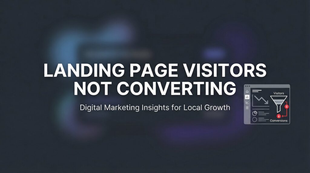
You’re driving traffic to your landing page. The clicks are coming in. But the conversions? Crickets.
If your landing page visitors aren’t converting, you’re essentially paying for window shoppers who never walk through the door. This is one of the most frustrating problems in digital marketing—and one of the most fixable.
The good news is that low conversion rates almost always stem from identifiable, correctable issues. Whether it’s a confusing value proposition, friction in your form, or a mismatch between your ad and your landing page, there’s a systematic way to diagnose and fix the problem.
In this guide, we’ll walk you through exactly how to identify why your landing page visitors aren’t converting and what to do about it. You’ll learn how to audit your current page, pinpoint the specific conversion killers, and implement changes that turn more visitors into leads and customers.
Let’s stop the bleeding and start converting.
Step 1: Audit Your Traffic-to-Page Match
The first place to look when landing page visitors aren’t converting is the journey they took to get there. Think of it like this: if your ad promises a free guide to local SEO, but your landing page talks about enterprise-level marketing solutions, you’ve created a disconnect that kills conversions instantly.
Message match is the foundation of conversion optimization. Your visitors arrive with specific expectations based on what they clicked. When the landing page doesn’t deliver on that promise, they bounce.
Start by reviewing your ad copy alongside your landing page headline and opening paragraph. Do they use the same language? Address the same pain point? Offer the same solution? If someone clicks an ad about “reducing customer acquisition costs,” your landing page better lead with that exact benefit, not a generic pitch about “growing your business.”
Next, examine the intent behind your traffic sources. Not all clicks are created equal. Someone searching “how to improve conversion rates” is in research mode—they’re gathering information. Someone searching “landing page optimization service” is ready to buy. If you’re sending informational-intent traffic to a hard-sell page, your conversions will suffer.
Open Google Analytics and segment your traffic by source. Look at bounce rate, time on page, and conversion rate for each channel. You might discover that your Facebook ads convert at half the rate of your Google Search ads. That’s not a landing page problem—that’s an audience targeting problem.
Pay special attention to traffic from different ad campaigns. Create UTM parameters for each campaign so you can track which specific messages resonate. You might find that your “increase sales” messaging converts better than your “save time” messaging, even though both go to the same landing page.
Success indicator: When you read your ad copy and then look at your landing page, the connection should be obvious. A visitor shouldn’t have to think “Wait, is this the right page?” If there’s any confusion about whether they’re in the right place, you’ve identified your first conversion killer.
Step 2: Evaluate Your Above-the-Fold Experience
You have three seconds. That’s how long you have to communicate what you offer and why someone should care before they hit the back button.
Your above-the-fold section—everything visible without scrolling—needs to answer three critical questions instantly: What is this? Who is it for? What should I do next?
Start with your headline. Does it clearly communicate the primary benefit, or is it trying to be clever? “Transform Your Marketing Results” sounds nice but says nothing. “Get 30% More Qualified Leads Without Increasing Your Ad Spend” tells visitors exactly what they’ll get.
Your headline should speak directly to the pain point or desire that brought the visitor to your page. If they clicked because they’re frustrated with low conversion rates, your headline should acknowledge that frustration and promise a solution.
Now look at your call-to-action button. Can you see it without scrolling on a laptop? On a phone? If visitors have to hunt for the next step, many won’t bother. Your CTA should be visually distinct, positioned prominently, and impossible to miss.
The hero section should create a clear visual hierarchy. Most landing pages fail because they try to say too much at once. You don’t need five different value propositions competing for attention. Pick the strongest benefit and make it the star of the show.
Remove anything that doesn’t support the primary conversion goal. Navigation menus give visitors an escape route. Multiple CTAs create decision paralysis. Sidebar widgets distract from the main message. Every element on your landing page should either move visitors toward conversion or get cut. Following best practices for landing pages means ruthlessly eliminating distractions.
Test your page on actual devices. Pull it up on your phone right now. Can you read the headline easily? Is the CTA button big enough to tap without zooming? Does the page load quickly? Mobile users are even less patient than desktop users, and a clunky mobile experience will tank your conversion rate.
Success indicator: Show your landing page to someone who’s never seen it before. Give them three seconds, then hide it. If they can tell you what you’re offering and what action to take, your above-the-fold experience works. If they’re confused or can only describe vague concepts, you need to simplify.
Step 3: Identify and Eliminate Conversion Friction Points
Friction is anything that makes converting harder than it needs to be. Every unnecessary step, confusing element, or technical hiccup creates resistance that costs you conversions.
Let’s start with the biggest friction point: your form. Count the fields you’re asking visitors to fill out. Now cut that number in half. Do you really need their company size, industry, and budget range to start a conversation? Or are you creating unnecessary barriers?
Every additional form field reduces conversion rates. If you’re asking for ten pieces of information when three would work, you’re choosing data collection over conversions. Understanding why customers aren’t filling out forms can help you identify exactly which fields are killing your conversions. Ask yourself: what’s the minimum information I need to follow up effectively? Name and email? Phone number? That’s it. Everything else can wait until after they’ve converted.
Page speed is another massive friction point that many businesses ignore. Pull up Google PageSpeed Insights and run your landing page through it. If your page takes more than three seconds to load, you’re losing visitors before they even see your offer.
Slow load times are especially deadly on mobile. Compress your images. Minimize your code. Remove unnecessary scripts. A fast-loading page isn’t just better for user experience—it directly impacts your conversion rate and your ad costs.
Look for navigation confusion. Does your page have multiple calls-to-action that compete with each other? “Download the guide” and “Schedule a call” and “Start your free trial” all on the same page? That’s decision paralysis. Pick one primary action and make everything else secondary or remove it entirely.
Check your page on mobile devices—not just in a browser’s mobile view, but on actual phones. Tap through the entire conversion process. Are buttons easy to hit? Does the form work smoothly? Do dropdown menus function properly? Many businesses lose half their potential conversions simply because their mobile experience is broken.
Success indicator: Time yourself completing your own conversion process. If it takes more than 30 seconds from landing on the page to submitting the form, there’s too much friction. The path from arrival to conversion should feel effortless.
Step 4: Strengthen Your Trust Signals and Social Proof
Here’s the reality: people don’t trust businesses they’ve never heard of. Your visitors are skeptical, and they should be. Your job is to overcome that skepticism with credible proof that you deliver results.
Testimonials are powerful, but only if they’re specific and believable. “Great service, highly recommend!” tells visitors nothing. “We increased our qualified leads by 47% in the first two months working with Clicks Geek” gives concrete evidence of results.
Place your strongest testimonials near your call-to-action. That’s the moment of highest doubt—right before someone commits. A well-placed testimonial that addresses common objections can be the difference between a conversion and a bounce.
Trust badges matter, especially for transactions that require personal information or payment details. Display security certifications, industry associations, and partner logos. If you’re a Google Premier Partner, show that badge. If you’ve won awards or been featured in publications, include those logos.
Ditch the stock photos. When visitors see generic business people shaking hands or pointing at whiteboards, they know it’s fake. Use real photos of your team, your office, or your actual customers. Authenticity builds trust in ways that polished stock imagery never can.
Show specific results when possible. Instead of saying “We help businesses grow,” say “Our clients typically see a 35% increase in conversion rates within 90 days.” Specific numbers are more credible than vague promises, but only use real data you can back up. If you’re struggling with website visitors not buying, weak trust signals are often the culprit.
Consider adding a brief case study or success story. A short paragraph about how you solved a problem for a client similar to your visitor makes your offer tangible. It transforms your promise from theoretical to proven.
Success indicator: Ask yourself honestly: would I trust this business based on what I see on this page? If you have any hesitation, your visitors definitely do. Add trust signals until the answer is an unqualified yes.
Step 5: Craft a Compelling and Specific Offer
Vague offers get vague results. “Contact us to learn more” doesn’t motivate action. “Get a free 30-minute conversion audit with specific recommendations for your business” tells visitors exactly what they’ll receive and why it’s worth their time.
Your offer needs to be specific enough that visitors can visualize the value. What exactly will they get? When will they get it? What will it help them accomplish? The more concrete your offer, the easier it is for someone to say yes.
Evaluate whether your offer matches your audience’s stage in the buying journey. If you’re targeting people who are just learning about their problem, asking them to “schedule a sales call” is too big a commitment. Offer a guide, checklist, or assessment instead. Save the sales conversation for people who are further along.
Add appropriate urgency or scarcity when it’s genuine. “Limited spots available this month” works if it’s true. “Offer expires in 3 hours” on a page that resets the timer every time someone visits destroys trust. Use urgency honestly or not at all.
Your CTA button text matters more than most people realize. “Submit” is boring. “Get Started” is generic. “Send Me the Free Conversion Checklist” describes the value and sets clear expectations. Your button should tell visitors exactly what happens when they click. Learning how to optimize landing pages for conversions starts with crafting offers that compel action.
Test different offer types to see what resonates with your audience. Some audiences respond better to free consultations. Others prefer downloadable resources. Some want case studies or ROI calculators. Don’t assume you know what your audience wants—test and find out.
Success indicator: Your offer should answer the question “Why should I act now?” clearly and compellingly. If a visitor could reasonably think “I’ll come back to this later,” your offer isn’t strong enough or urgent enough.
Step 6: Implement Tracking and Run Systematic Tests
You can’t fix what you can’t measure. Without proper tracking, you’re optimizing blind—making changes based on gut feeling rather than actual user behavior.
Start with heat mapping tools. Services like Hotjar or Crazy Egg show you where visitors actually click, how far they scroll, and where they abandon your page. You might discover that nobody’s seeing your testimonials because they’re placed too far down the page. Or that visitors are clicking on non-clickable elements because they look like buttons.
Heat maps reveal the gap between what you think visitors do and what they actually do. That gap is where conversion opportunities hide.
Set up conversion tracking properly before you change anything. You need baseline metrics to measure against. What’s your current conversion rate? What’s your bounce rate? What’s the average time on page? Without these numbers, you won’t know if your changes actually improved performance.
When you run A/B tests, change one element at a time. Test your headline against a different headline. Test your CTA button color. Test your form length. If you change five things simultaneously and conversions improve, you won’t know which change drove the improvement. Mastering A/B testing for landing pages is essential for data-driven optimization.
Document everything. Create a simple spreadsheet that tracks what you tested, when you tested it, and what the results were. Over time, you’ll build a conversion optimization playbook specific to your audience. You’ll learn that your visitors respond better to benefit-driven headlines than feature lists. That shorter forms convert better even if they generate slightly lower-quality leads. That social proof near the CTA boosts conversions by a measurable percentage.
Be patient with testing. You need enough traffic and conversions to reach statistical significance. Testing with 50 visitors won’t tell you anything reliable. Wait until you have at least a few hundred visitors per variation before drawing conclusions.
Success indicator: You’re making optimization decisions based on data, not opinions. When someone suggests a change, your first question is “How will we measure if this works?” You have a clear process for testing, measuring, and implementing winning variations.
Putting It All Together
Fixing landing page conversion problems isn’t about guessing—it’s about systematic diagnosis and targeted fixes. Start with your traffic-to-page match, then work through your above-the-fold experience, friction points, trust signals, offer strength, and finally implement proper tracking.
Here’s your quick checklist before you go:
✓ Ad messaging matches landing page content
✓ Headline and CTA visible above the fold
✓ Form asks only for essential information
✓ Page loads in under 3 seconds on mobile
✓ Trust signals placed near conversion points
✓ Offer is specific with clear value
✓ Tracking and testing systems in place
Work through these steps methodically, and you’ll transform your landing page from a traffic dead-end into a conversion machine. The visitors are already coming to your page. Now you’re giving them every reason to take action.
Remember: conversion optimization is an ongoing process, not a one-time fix. Markets change. Audiences evolve. Competitors adjust their messaging. The businesses that win are the ones that continuously test, measure, and refine their approach based on real data.
Tired of spending money on marketing that doesn’t produce real revenue? We build lead systems that turn traffic into qualified leads and measurable sales growth. If you want to see what this would look like for your business, we’ll walk you through how it works and break down what’s realistic in your market.
Want More Leads for Your Business?
Most agencies chase clicks, impressions, and “traffic.” Clicks Geek builds lead systems. We uncover where prospects are dropping off, where your budget is being wasted, and which channels will actually produce ROI for your business, then we build and manage the strategy for you.