A great landing page isn’t just about looking good; it's a dedicated conversion machine. It’s the single most critical link between a potential customer clicking your ad and them becoming a client.
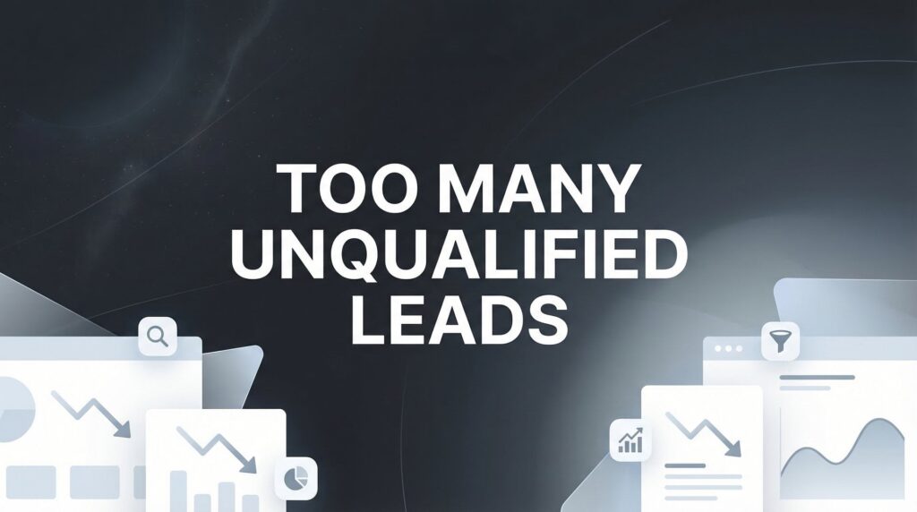
The problem? Most business landing pages get it wrong. They are often cluttered, confusing, or simply fail to answer the one question every visitor has: "What's in it for me?" This leads to high bounce rates, wasted ad spend, and missed opportunities.
This guide cuts through the noise. We’re breaking down the essential landing page design best practices proven to get results. Whether you're a local business running Google Ads or a larger company needing a high-performing website, these principles will directly impact your bottom line. Following these foundational elements will help you create a landing page that performs great.
Instead of vague advice, we'll give you specific, actionable steps. You'll learn how to craft a compelling value proposition, optimize your calls-to-action (CTAs), streamline your forms, and build trust instantly.
Frequently Asked Questions About Landing Page Design
Before we dive in, let's answer a few common questions.
What are the key elements of a good landing page?
A good landing page has five key elements: a clear and compelling headline (value proposition), persuasive copy with social proof (testimonials, logos), a single, focused call-to-action (CTA), a simple lead capture form, and a mobile-first design that loads quickly.
What makes a landing page high-converting?
A high-converting landing page excels at one thing: getting a visitor to take a specific action. This is achieved through message match (the page matches the ad the user clicked), a design that builds trust, a clear offer, and minimal friction in the conversion process (like a short form).
How do you structure a landing page?
Structure a landing page for easy scanning. Start with your main value proposition "above the fold." Follow with sections that build trust, explain benefits (not just features), and handle objections. Use clear headings, bullet points, and place your CTA in multiple strategic spots.
1. Clear Value Proposition & Benefit-Driven Copy
Your landing page has about five seconds to answer one crucial question for every visitor: "What's in it for me?" If the answer isn't immediately obvious, they're gone.
That's why a clear, benefit-driven value proposition is the most critical element of your page. It’s a cornerstone of effective landing page design best practices.

From Features to Benefits
Most businesses describe what they do (features), but customers buy based on what they get (benefits). A feature is "Google Ads Management." A benefit is "Get 73 New Customers Without Hiring More Sales Staff." The difference is huge. Benefits speak directly to your customer's pain points.
In Short: Your headline shouldn't describe your service; it should describe the customer's success after using your service.
How to Implement Benefit-Driven Copy
Ready to craft a value proposition that converts? Here’s how:
- Use the "Which Means" Formula: Take a feature and add "which means…" to find the real benefit. "We offer AI-powered call answering" (feature) becomes "We offer AI-powered call answering, which means you never miss a lead, even after hours."
- Speak Your Customer's Language: Look at customer reviews and support tickets. How do they describe their problems? Use their exact phrasing in your copy.
- Add Specificity: Vague promises are forgettable. Instead of "Grow Your Business," try Clicks Geek's approach: "Get 10+ New Customers This Month." Specific numbers feel real.
- Align with Ad Copy: Ensure your landing page headline matches the promise made in your ad. This "message match" reassures visitors they're in the right place.
2. Single Primary Call-to-Action (CTA)
Once a visitor understands your value, they need a clear next step. Offering too many choices ("Sign Up," "Learn More," "Read Our Blog") creates confusion.
The best landing page design practices say you should guide visitors toward one single goal. A prominent, singular call-to-action (CTA) channels all attention toward the one action you want them to take.
From Suggestion to Instruction
A weak CTA suggests an action. A strong CTA instructs the user on what to do next to solve their problem. "Submit" is a suggestion. "Get My Free Quote Now" is a clear, benefit-driven instruction. It tells the user what they're getting and why they should click.
In Short: Your landing page should have one primary goal, and every element, especially your CTA button, should steer the visitor toward that single action.
How to Implement a Powerful CTA
Here’s how to create a CTA button that gets clicked:
- Use Action-Oriented Verbs: Start your CTA copy with a strong command verb. Use direct language like Get, Claim, Schedule, Start, or Book.
- Add a Specific Benefit: Enhance your action verb by stating the outcome. Instead of "Schedule a Consultation," try Clicks Geek's approach: "Schedule Your Free Audit." This frames the click as a gain for the user.
- Make it Stand Out: Your CTA button should be visually striking. Use a contrasting color that pops against the background but still fits your brand. Don't make visitors hunt for it.
- Strategic Placement is Key: Place your CTA where visitors are most likely to convert. This includes above the fold and at the bottom of the page. This ensures the next step is always within reach.
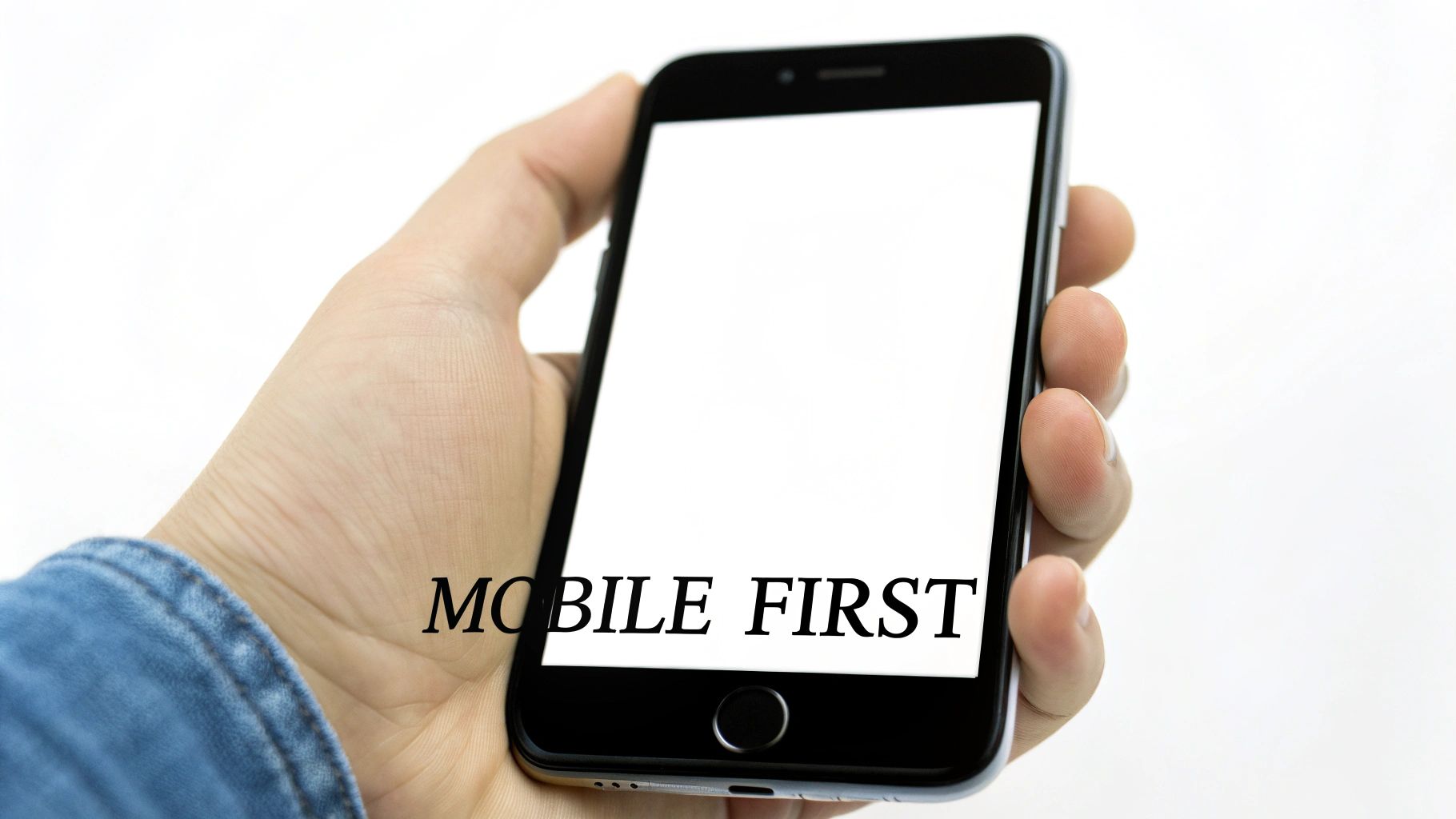
3. Mobile-First Responsive Design
If your landing page isn't designed for a smartphone, it's not designed for most of your visitors. Over half of all web traffic comes from mobile devices.
A "mobile-first" approach is a fundamental pillar of modern landing page design best practices. This means designing the mobile experience first, then adapting it for larger screens.
From Desktop-Down to Mobile-Up
The old way was to shrink a desktop site for mobile. This often resulted in a clunky, slow experience. The mobile-first approach flips this. By starting with the smallest screen, you must prioritize what matters: a clear headline, a compelling offer, and an easy-to-tap CTA.
In Short: Don't just make your desktop site fit on a phone; build an experience that feels native to the mobile user from the ground up.
How to Implement Mobile-First Design
Here’s how to build a landing page that converts on any screen:
- Simplify Forms Drastically: Typing on a phone is hard. Minimize form fields to the absolute essentials. Use single-column layouts and large, finger-friendly fields.
- Prioritize "Thumb-Zone" CTAs: Place your main CTA buttons where a user's thumb can easily reach them, usually in the lower half of the screen. This makes taking action feel effortless.
- Implement Click-to-Call: For local service businesses, a "Click to Call" button is a conversion goldmine. It allows users to contact you with a single tap.
- Test on Real Devices: Emulators are helpful, but nothing beats testing on actual iPhones and Android devices. This helps you catch real-world issues. You can discover more examples of high-converting mobile landing pages to see these principles in action.
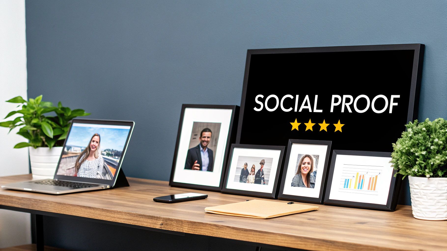
4. Trust Signals and Social Proof
No one wants to be the first customer. Visitors arrive at your landing page skeptical, asking, "Can I trust this company?" Your job is to answer "Yes!" by using trust signals and social proof.
These elements act as third-party validation. They show that other people have already trusted you and had a great experience.
From Claims to Credibility
Anyone can claim they're the best. Social proof is the evidence that backs it up. It’s the difference between saying "We get great results" and showing a testimonial that says "They got us 73 new customers in 90 days." One is a claim; the other is a credible story.
In Short: Don't just tell visitors you're trustworthy; show them why others already trust you.
How to Implement Trust Signals
Here are some effective ways to showcase social proof:
- Feature Quantified Testimonials: Vague praise like "Great service!" is good, but specific results are better. Use testimonials with numbers, like "Our lead volume increased by 200%." Always include the client's full name and company.
- Display Authority Badges: Prominently feature official certifications. For example, Clicks Geek highlights its Google Premier Partner status near the top of the page. This instantly communicates expertise.
- Showcase Client Logos: Create a "logo bar" featuring recognizable companies you've worked with. This is a quick, visual way to show that established businesses trust your services.
- Leverage Case Studies: For visitors who need more detail, link to in-depth case studies. These should outline the client's problem, your solution, and the specific results you achieved.
5. Focused Form Design (Progressive Profiling)
Your landing page form is the finish line. Make it a simple step, not a giant hurdle. Asking for too much information upfront causes visitors to leave.
Focused form design prioritizes capturing only the most essential lead information first. This approach respects the user's time and boosts conversion rates. It's a crucial part of landing page design best practices.
Less Friction, More Leads
Every field you add to a form creates friction. The goal is to balance lead quality with conversion volume. You can always ask for more information later. For the first contact, keep it lean. A local business might only need a name, service type, and phone number.
In Short: Treat your form like a quick handshake, not an interrogation. Get the essential contact info now and build the relationship later.
How to Implement Focused Form Design
Ready to turn your form into a conversion machine? Here's how:
- Start with the Bare Minimum: Identify the fewest fields you need to qualify and contact a lead. Clicks Geek often uses just a name and phone number on their Google Ads landing pages.
- Use Progressive Profiling: This is a technique where you ask for more information over time. The first time a lead fills a form, it's short. The next time they visit, the form asks for something new (like company size).
- Add Context and Reassurance: Tell visitors why you need certain information. A simple note like, "We use your zip code to provide an accurate quote," can help.
- Leverage Conditional Logic: Use smart forms that show or hide fields based on a user's previous answers. This keeps the form feeling short and relevant.
6. Fast Page Load Speed and Performance
You can have the best copy and design, but if your landing page is slow, most people will never see it. Every millisecond counts.
Fast page load speed is a fundamental part of landing page design best practices. It directly impacts your bounce rate, ad costs, and conversion rate.
From Milliseconds to Money
The link between speed and conversions is clear. Google's research shows that as page load time goes from 1 to 3 seconds, the chance of a user bouncing increases by 32%. A slow page tells visitors you don't value their time. For paid ads, speed is even more critical, as Google rewards fast pages with better Quality Scores.
In Short: A slow landing page is like a store with a locked door. No matter how great the products are inside, most customers will just leave.
How to Implement Speed Optimization
Here’s a practical checklist to get started:
- Benchmark and Diagnose: Start by running your URL through Google's PageSpeed Insights. This free tool gives you a performance score and a list of improvements.
- Aggressively Optimize Images: Images are often the biggest cause of slow pages. Use a tool like TinyPNG to compress your images before uploading. Serve them in modern formats like WebP.
- Enable Caching and Compression: Use a plugin or work with a developer to enable browser caching. This allows repeat visitors to load the page almost instantly.
- Minify Code and Defer Scripts: Minifying removes unnecessary characters from your CSS and JavaScript files. Deferring non-critical scripts ensures they load after the main content, so the user sees your value proposition right away.
7. Clear Value Hierarchy and Scannable Content
Visitors don’t read websites; they scan them. If your landing page is a wall of text, you’ve already lost.
A clear visual hierarchy guides your visitor’s eye through the most important information. This is a non-negotiable part of modern landing page design best practices.
From Cluttered to Clear
Most people try to say everything at once. Effective design does the opposite: it uses structure to create a path. By organizing content with headlines, subheadings, and bullet points, you allow users to absorb key benefits in seconds. This isn't about "dumbing down" your content; it's about making your genius easy to grasp.
In Short: Don't make visitors work to understand your offer. Guide their eyes to the value with intentional structure and scannable formatting.
How to Implement a Clear Hierarchy
Here’s how you can create a scannable structure:
- Embrace the "F-Pattern": Users often scan pages in an F-shaped pattern. Place your most critical information (headline, key benefits) at the top and left side of the page.
- Break Up Text with Subheadings: Use H2 headings for major sections and H3s for subsections. This creates logical breaks and allows visitors to jump to the parts that interest them.
- Swap Paragraphs for Bullets: Identify any paragraph that lists benefits or features and convert it into a bulleted list. Clicks Geek does this well, turning a generic pitch into powerful, bite-sized benefits like "Get 10+ New Customers This Month."
- Use White Space Strategically: Don't crowd your elements. Generous spacing around headlines, images, and CTAs makes them stand out and gives the page a clean, professional feel.
8. Strategic Use of Video and Multimedia Elements
Sometimes, telling isn't as powerful as showing. Static text and images can only convey so much.
Strategically placed video can be a game-changer in your landing page design best practices. It allows you to connect with visitors on a deeper, more engaging level.
From Static Page to Dynamic Experience
A landing page with video is an experience. A client testimonial video lets prospects see and hear a real person's success story. A quick demo video can explain a complex service in 60 seconds. Multimedia transforms a passive visitor into an engaged participant.
In Short: Video and interactive elements allow you to demonstrate your value and build a human connection, turning passive browsers into active leads.
How to Implement Video and Multimedia
Here’s how to do it effectively:
- Embed Client Testimonials: Instead of just text, feature short video testimonials from happy clients. A local roofer showing a satisfied homeowner in front of their new roof is very persuasive.
- Create Explainer Demos: For complex services, a short screen-share video showing a sample dashboard can demystify your process and showcase your expertise.
- Keep It Short and Sweet: Aim for videos under two minutes. Use muted autoplay with clear captions, as many users browse without sound. Place your CTA button near the video.
- Optimize for Performance: Ensure your video files are compressed for fast loading, especially on mobile. Always use a fallback image so your page layout doesn't break if the video fails to load.
9. A/B Testing and Data-Driven Optimization
Guesswork is the enemy of conversions. The most effective landing pages are proven to work through continuous testing.
A/B testing and data-driven optimization transform your page from a static brochure into a dynamic conversion machine. This is a non-negotiable part of modern landing page design best practices.
From Guessing to Knowing
A/B testing (or split testing) is simple: you create two versions of your page (A and B), change one single element, and show each version to a portion of your audience. By tracking which version gets more conversions, you replace opinions with hard data. Does a red button work better than a green one? Testing provides definitive answers.
In Short: Stop debating what works and start testing to discover what actually drives more leads and sales for your business.
How to Implement A/B Testing
Here's a practical framework for getting started:
- Start with High-Impact Elements: Focus on the big movers first: your main headline, your call-to-action (CTA) button copy, the number of fields in your form, and your hero image.
- Change One Variable at a Time: To know what caused a change, you can only test one element per experiment. If you change both the headline and the CTA, you won't know which one was responsible.
- Ensure Statistical Significance: A test needs enough data to be reliable. Aim for at least 100 conversions per variant before calling a winner. Run tests for a minimum of one to two weeks.
- Document Everything: Keep a spreadsheet that tracks your hypothesis, the variable tested, the results, and the key learning. This process is fundamental to successfully optimizing your Google Ads campaign for success.
10. Alignment Between Ad Copy and Landing Page Messaging
Imagine clicking an ad for "50% Off Pizza Delivery" and landing on a page about the restaurant's history. You'd leave instantly.
Aligning your ad copy with your landing page messaging, called "message match," is a critical landing page design best practice. It reassures visitors they've come to the right place and delivers on the exact promise that earned their click.
From Click to Conversion
Message match creates a seamless user journey. When the headline and offer from your ad are mirrored on your landing page, it validates the user's decision. This consistency reduces bounce rates and builds trust. For paid campaigns, it also helps boost your Google Ads Quality Score, which can lower your cost per click.
In Short: Your landing page shouldn't just be related to your ad; it should feel like the second half of the same conversation.
How to Implement Message Match
Here’s how to perfectly align your messaging:
- Mirror Your Ad's Headline: Make your landing page headline the same as, or a direct continuation of, your ad headline. If the ad says, "Same-Day HVAC Service in Dallas," your page headline must echo that promise.
- Reflect the User's Search: If your ad is triggered by "emergency plumber near me," your landing page copy should include phrases like "Emergency Plumbers in Your Area."
- Spotlight the Offer: Did your ad mention a "Free 5-Minute Quote"? That exact phrase should be front and center on the landing page, likely in the headline and near the CTA.
- Create Ad-Specific Variants: Don't send all your traffic to one generic page. Build dedicated landing pages for different ad groups, each tailored to the specific keywords in that campaign. You can learn more about this by reading how to improve your Google Ads landing page Quality Score.
Top 10 Landing Page Best Practices Comparison
| Item | 🔄 Implementation complexity | ⚡ Resource requirements | 📊 Expected outcomes | 💡 Ideal use cases | ⭐ Key advantages |
|---|---|---|---|---|---|
| Clear Value Proposition & Benefit-Driven Copy | 🔄 Medium — audience research + iterative testing | ⚡ Moderate — experienced copywriter, research, A/B tests | 📊 +20–40% conversions (typical when well-executed) | 💡 Service-based & local businesses; paid-ad landing pages | ⭐ Increases relevance; lowers bounce; improves ad alignment |
| Single Primary Call-to-Action (CTA) | 🔄 Low–Medium — design + strategic placement | ⚡ Low — button design, copy, placement testing | 📊 +30–50% vs pages with competing CTAs | 💡 Lead capture, bookings, demo/trial flows | ⭐ Reduces decision paralysis; simplifies analytics; higher-quality leads |
| Mobile-First Responsive Design | 🔄 Medium–High — mobile-first redesign & testing | ⚡ Moderate — responsive dev, device testing, performance work | 📊 +25–40% mobile conversions; better mobile quality scores | 💡 Mobile-heavy traffic, local searches, ecommerce checkout | ⭐ Faster mobile UX; lower bounce; improved search ranking |
| Trust Signals and Social Proof | 🔄 Low–Medium — collect & place credibility assets | ⚡ Moderate — testimonials, case studies, permission management | 📊 +25–50% conversions with strong, specific proof | 💡 New visitors, high-trust purchases, service providers | ⭐ Reduces perceived risk; builds authority; differentiates from competitors |
| Focused Form Design (Progressive Profiling) | 🔄 Medium — form logic + CRM integration | ⚡ Moderate — form tools, CRM/automation, follow-up sequences | 📊 +25–50% when reducing fields; +10–40% lift via progressive profiling | 💡 Lead-gen landing pages, B2B, local service inquiries | ⭐ Less friction up front; higher volume leads; richer data over time |
| Fast Page Load Speed & Performance | 🔄 Medium–High — technical optimizations & monitoring | ⚡ High — dev expertise, CDN/premium hosting, tooling | 📊 Each 1s saves 3–7% conversions; 3s+ can lose 40%+ of visitors | 💡 High-traffic paid pages, ecommerce, SEO-critical pages | ⭐ Improves conversions, Quality Score, lowers CPC; reduces bounce |
| Clear Value Hierarchy & Scannable Content | 🔄 Low — content structure & design discipline | ⚡ Low — copy edits, layout adjustments, design tweaks | 📊 +15–25% engagement and conversion improvements | 💡 Info-heavy pages, quick-scan audiences, accessibility needs | ⭐ Faster comprehension; higher engagement; better accessibility |
| Strategic Use of Video & Multimedia Elements | 🔄 Medium–High — production, placement, optimization | ⚡ High — video production, hosting, mobile optimization | 📊 +25–80% conversions (quality & placement dependent) | 💡 Service demos, testimonial-led pages, complex offerings | ⭐ Boosts trust & engagement; clearly demonstrates results |
| A/B Testing & Data-Driven Optimization | 🔄 High — test planning, statistical rigor, iteration | ⚡ High — testing platform, analytics, sufficient traffic | 📊 +20–50% improvement over 6–12 months with consistent testing | 💡 Continuous optimization programs, sites with steady traffic | ⭐ Removes guesswork; compounds ROI; identifies high-impact changes |
| Alignment Between Ad Copy & Landing Page Messaging | 🔄 Medium — coordination across ads and pages | ⚡ Moderate — multiple landing variants, copy synchronization | 📊 Improves Quality Score; can lower CPC 10–25% and raise conversions | 💡 PPC campaigns, segmented ad groups, local intent ads | ⭐ Reduces bounce; meets expectations; improves ad relevance |
Your Next Step: From Practice to Profit
You've made it through the essential checklist for high-converting landing pages. Mastering these landing page design best practices isn’t about a one-time launch. It's about building a repeatable system for turning clicks into customers.
The journey from a good landing page to a great one is iterative. The core principles we've discussed are your guide, ensuring you focus on what truly matters to your audience and your bottom line.
Recapping the Core Pillars of Conversion
Let's quickly recap the most critical takeaways:
- Clarity Above All: Your value proposition is a promise. If a visitor can't understand what you offer within five seconds, the battle is lost.
- The Power of One: A single, compelling Call-to-Action (CTA) is your page's North Star. Every element should guide the user toward that one action.
- Mobile is the Mandate: Your page must be designed with a mobile-first mindset. This means fast load times and effortless forms.
- Trust is Your Currency: Social proof, testimonials, and security badges are essential signals that tell visitors, "You're in the right place, and you can trust us."
Your Action Plan: Turning Knowledge into Results
Reading about best practices is easy; implementing them is where growth happens. Don't feel overwhelmed. Instead, adopt a methodical approach.
Here’s a simple plan to get started today:
- Start with a Quick Audit: Pull up your most important landing page. Score it against the 10 principles we covered. Be honest. Where are the biggest gaps?
- Tackle the Low-Hanging Fruit: Pick one or two high-impact changes you can make this week. Often, this means clarifying your headline or simplifying your form.
- Commit to a Testing Cadence: The only way to know if your changes are working is to test them. Set up a simple A/B test. Change only one variable at a time and let the data tell you what your audience prefers.
This process transforms you from a page builder into a conversion strategist. To further explore comprehensive strategies, you can review these additional 10 landing page optimization best practices. Building on this foundation is key to sustained success. A well-designed landing page is your most effective digital salesperson, working 24/7 to generate leads.
Ready to turn your landing pages into powerful lead-generation machines but don't have the time to manage the testing and optimization yourself? The team at Clicks Geek specializes in creating and managing high-performance PPC campaigns, with landing page conversion as a core focus. Let us build the pages that turn your ad spend into measurable profit.