Your landing page is getting traffic, but visitors aren’t converting. They land, they look, they leave—and your ad spend goes down the drain. This is one of the most frustrating problems local business owners face, and it’s costing you real money every single day.
The good news? Landing page conversions aren’t mysterious. They follow predictable patterns, and with the right adjustments, you can turn more of your existing traffic into paying customers without spending another dollar on ads.
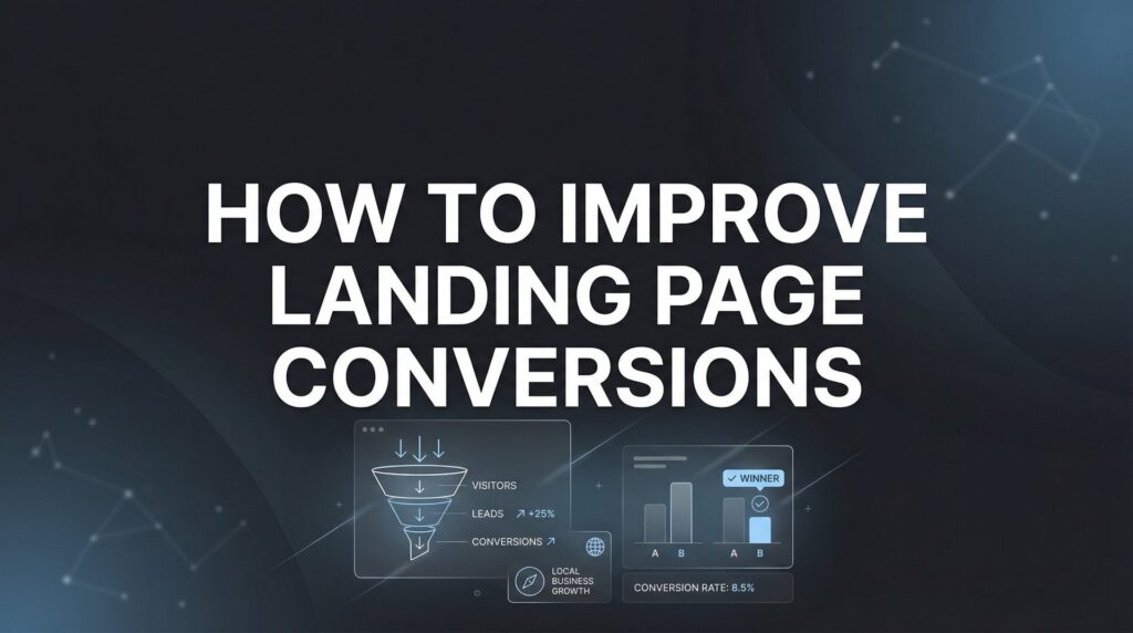
In this guide, we’ll walk you through six proven steps to diagnose what’s killing your conversions and fix it systematically. Whether you’re running a service business, local practice, or e-commerce operation, these principles apply. By the end, you’ll have a clear action plan to implement immediately—and a framework for continuous improvement that compounds over time.
Step 1: Audit Your Current Performance and Identify the Leaks
You can’t improve what you don’t measure. Before you change a single word or move a button, you need to understand exactly how your landing page is performing right now.
Start by setting up proper marketing conversion tracking in Google Analytics and your ad platforms. This isn’t optional—it’s the foundation of everything that follows. You need to track not just form submissions, but also micro-conversions like button clicks, scroll depth, and time spent on specific sections.
Your baseline metrics should include your current conversion rate, bounce rate, average time on page, and scroll depth. These numbers tell you where visitors are dropping off. A high bounce rate with low scroll depth means people aren’t even engaging with your content. A high scroll depth with low conversions means they’re reading but not convinced.
Here’s where it gets interesting: Install a heatmap tool to see exactly what visitors are doing on your page. Tools in this category show you where people click, how far they scroll, and where their attention lingers. You’ll often discover that visitors are clicking on elements that aren’t clickable, or completely ignoring your carefully crafted CTA button.
Document everything you find. Screenshot your current page, note your metrics, and save your heatmap data. This becomes your control group. When you make changes in the following steps, you’ll compare against this baseline to see what actually works.
One pattern emerges consistently: Most landing pages have one major leak that’s responsible for the majority of lost conversions. It might be a slow load time, a confusing headline, or a form that asks for too much information. Your audit will reveal it.
The businesses that win at conversion optimization aren’t necessarily the ones with the best designers or writers. They’re the ones who measure obsessively and let data guide their decisions.
Step 2: Align Your Message Match from Ad to Landing Page
Picture this: Someone clicks on your ad promising “Same-Day HVAC Repair in Phoenix” and lands on a generic homepage talking about your company’s 30-year history. That disconnect? It just killed your conversion.
Message match is the principle that your landing page headline should directly reflect the promise or keyword from your ad. If your ad says “Get a Free Quote,” your landing page headline better say something remarkably similar—not “Welcome to Our Services.”
This goes beyond just matching words. The visual design, tone, and even the imagery should create a sense of continuity. If your ad uses professional photography and a clean, modern aesthetic, your landing page needs to match that vibe. Visitors make split-second judgments about whether they’re in the right place.
Let’s say you’re running multiple ad campaigns targeting different customer segments. A common mistake is sending all that traffic to the same landing page. The ad targeting commercial clients talks about enterprise solutions, while the ad targeting homeowners emphasizes affordability and convenience. They need different landing pages with tailored messaging.
Test headline variations that mirror your highest-performing ad copy. If one ad is crushing it with “Fix Your AC Before Summer Hits,” use that exact phrasing or a close variant as your landing page headline. Understanding how to improve your ads goes hand-in-hand with optimizing your landing pages.
The disconnect costs you money in two ways. First, you’re paying for clicks from people who immediately bounce because they feel misled. Second, you’re losing conversions from qualified prospects who would have bought if the experience felt cohesive.
When you nail message match, visitors don’t have to think. They see your ad, click through, and immediately recognize they’re in the right place. That seamless transition is what keeps them engaged long enough to convert.
Step 3: Craft a Value Proposition That Stops the Scroll
You have about five seconds to communicate why someone should care about your offer. That’s not hyperbole—it’s what the data consistently shows across industries.
Your headline needs to communicate the specific outcome visitors will achieve, not just what you do. “Professional Plumbing Services” is what you do. “Get Your Plumbing Emergency Fixed Today—Guaranteed” is the outcome they’ll achieve. See the difference?
The best headlines address the primary concern your audience has right now. For emergency services, it’s speed and reliability. For high-ticket services, it’s often risk reduction and proven results. For local businesses competing on convenience, it’s accessibility and ease of working with you.
Your subheadline exists to reinforce credibility and reduce perceived risk. This is where you can mention your years in business, certifications, guarantees, or the specific problem you solve. Think of it as your headline’s supporting actor—it adds depth without stealing the spotlight.
Here’s a simple test: Show your landing page to someone who’s never seen it before. Give them five seconds, then hide it. Ask them what you offer and why they should care. If they can’t articulate it clearly, your value proposition isn’t strong enough.
Many local businesses make the mistake of leading with features instead of benefits. “We use state-of-the-art equipment” is a feature. “We diagnose your problem accurately the first time so you don’t pay for repeat visits” is a benefit that addresses a real concern. Following best practices for landing pages means always leading with what matters most to your visitor.
The strongest value propositions tap into either desire or pain. For some businesses, you’re selling the dream outcome—a beautiful kitchen, a thriving lawn, financial security. For others, you’re solving an urgent problem—a broken furnace in winter, a legal issue that needs immediate attention, a pest infestation that’s getting worse.
Don’t try to be clever at the expense of clarity. Your headline isn’t the place for wordplay or industry jargon. Save the personality for your body copy. The headline’s job is singular: Make visitors want to keep reading.
Step 4: Optimize Your Call-to-Action for Maximum Clicks
Your CTA button is where conversions happen or die. Everything else on your page exists to get visitors to click that button, so it better be optimized for maximum impact.
First rule: Position your primary CTA above the fold. Visitors shouldn’t have to scroll to find it, especially on mobile devices. But here’s the thing—you also need to repeat it strategically throughout the page. After you’ve made your value proposition clear, CTA. After you’ve addressed objections with social proof, CTA. After your feature breakdown, CTA again.
Button text matters more than most people realize. “Submit” and “Get Started” are weak because they describe the action, not the benefit. Compare that to “Get My Free Quote” or “Schedule My Consultation Today”—these tell visitors exactly what happens when they click.
Create visual contrast so your CTA button is the most prominent element on the page. If your page uses blue tones, make your button orange or green. It should practically jump off the screen. Use whitespace around it so nothing competes for attention.
Now let’s talk about friction. Every form field you add reduces conversions. Ask yourself: Do you really need their company size, job title, and how they heard about you? Or can you start with just name, email, and phone number?
For service businesses, phone numbers often convert better than email-only forms because they signal serious intent. But requiring both can feel like too much. Test what works for your audience. Some businesses find that offering multiple CTA options—”Call Now” and “Request Quote”—captures different segments of their audience.
The psychology of CTA optimization is fascinating. Adding a small line of text under your button like “No credit card required” or “Get a response within 24 hours” can boost conversions by reducing anxiety about what happens next. If you want to improve your website conversion rate, start with your CTA placement and copy.
One pattern that consistently works: Make your CTA button large enough to tap easily on mobile devices. Thumb-friendly design isn’t just good UX—it directly impacts your conversion rate when most of your traffic comes from smartphones.
Step 5: Build Trust with Strategic Social Proof Placement
Trust is the invisible barrier between interest and action. Your prospects are skeptical—they’ve been burned before, and they’re not sure if you’re the real deal. Social proof breaks through that skepticism.
Display testimonials that address specific objections your prospects have. A generic “Great service!” testimonial does almost nothing. But “I was worried about the cost, but they gave me a detailed breakdown upfront and stuck to it” addresses a real concern. That’s the testimonial that converts.
Include trust badges, certifications, and partner logos near your CTA. If you’re a Google Premier Partner, BBB accredited, or certified in your industry, display those credentials prominently. They signal that you’ve been vetted by third parties.
Use real customer photos and full names when possible. Stock photos of smiling people in business attire scream fake. A slightly grainy photo of an actual customer with their full name and city builds authenticity. If you can include their business name or a link to their company, even better.
Case study snippets work particularly well for high-consideration services. Instead of just saying you increased someone’s revenue, show the before-and-after numbers. “We helped Johnson Plumbing go from 15 leads per month to 47 leads per month in 90 days” is concrete and believable.
The placement of social proof matters as much as the content. Put testimonials right after you make a bold claim. If you promise same-day service, immediately follow with a testimonial from someone praising your fast response time. Learning how to create high converting landing pages means mastering this strategic placement of trust elements.
For local businesses, location-specific social proof hits harder. “Serving Phoenix for 20 years” resonates more with Phoenix residents than “Trusted nationwide.” People want to know you understand their specific market and have a track record in their community.
Step 6: Eliminate Technical Friction That Kills Conversions
You can have the perfect headline, compelling offer, and strong social proof—and still lose conversions because your page loads too slowly or breaks on mobile devices.
Test your page load speed right now. If it takes longer than three seconds to become interactive, you’re losing visitors before they even see your content. Compress images, minimize scripts, and use a reliable hosting provider. Speed isn’t just a nice-to-have—it directly correlates with conversion rates.
Mobile optimization is non-negotiable. Most of your traffic probably comes from smartphones, and if your landing page isn’t designed mobile-first, you’re throwing money away. Tap targets need to be large enough for thumbs. Text needs to be readable without zooming. Forms need to work smoothly with mobile keyboards.
Here’s a counterintuitive move that consistently improves conversions: Remove your navigation menu. Landing pages with navigation menus give visitors escape routes. Every link you include is a potential exit point. Your landing page should have one goal—get the conversion. Anything that distracts from that goal needs to go.
Verify your forms work correctly across all browsers and devices. It sounds basic, but form errors are conversion killers. Test on Chrome, Safari, Firefox, and mobile browsers. Make sure error messages are clear and helpful, not cryptic technical jargon.
Check that your phone numbers are clickable on mobile devices. This small detail makes a huge difference for businesses that want phone calls. The same goes for addresses—make them tap-to-navigate so visitors can easily get directions.
Security matters more than ever. If you’re collecting any personal information, use HTTPS and display security badges. Visitors are increasingly aware of data privacy, and an unsecured form will make them hesitate. If you’re experiencing website traffic but no conversions, technical friction is often the hidden culprit.
Your Path to Measurably Better Conversions
Start by auditing your current metrics so you have a baseline. Then work through message match, value proposition, CTA optimization, social proof, and technical fixes in order. Test one change at a time so you know what’s actually moving the needle.
Remember, conversion rate optimization isn’t a one-time project. It’s an ongoing process of testing, learning, and improving. Even small improvements compound dramatically over time. A landing page converting at 5% instead of 2% means you’re getting 2.5 times more customers from the same traffic. That’s the difference between a profitable campaign and a money pit.
The businesses that dominate their markets aren’t necessarily spending more on advertising. They’re converting more of the traffic they already have. That efficiency creates a massive competitive advantage because they can afford to bid higher, test more aggressively, and scale faster than competitors who are bleeding money on poorly optimized pages.
Document every change you make and track the results for at least two weeks before making another adjustment. This discipline separates successful optimization from random guessing. You’re building a system that gets better over time, not just making changes and hoping something sticks.
Tired of spending money on marketing that doesn’t produce real revenue? We build lead systems that turn traffic into qualified leads and measurable sales growth. If you want to see what this would look like for your business, we’ll walk you through how it works and break down what’s realistic in your market.
Ready to stop leaving conversions on the table? Implement these steps systematically, and you’ll see results. The traffic you’re already paying for will work harder for you, and every dollar you spend on advertising will generate more return. That’s how you build a marketing system that actually drives business growth.
Want More Leads for Your Business?
Most agencies chase clicks, impressions, and “traffic.” Clicks Geek builds lead systems. We uncover where prospects are dropping off, where your budget is being wasted, and which channels will actually produce ROI for your business, then we build and manage the strategy for you.