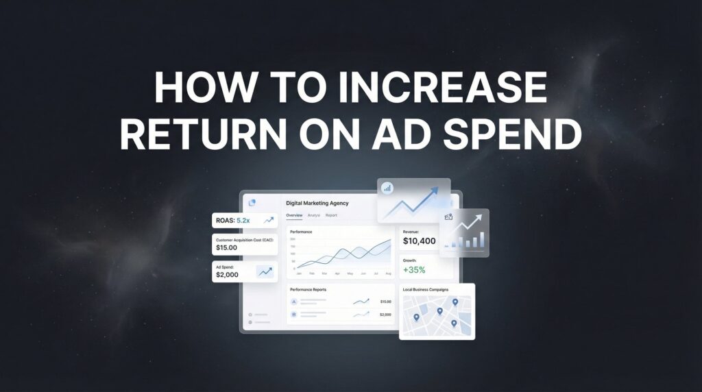
You’re paying for traffic. You’re watching the visitor counter climb. But when you check your phone for new leads? Cricket sounds. Your website is getting attention, but it’s not converting that attention into actual business—and every visitor who leaves without calling or filling out your form represents money you’ll never get back.
Here’s the truth most marketing agencies won’t tell you: conversion optimization isn’t about clever tricks or psychological manipulation. It’s about removing every unnecessary barrier between someone who needs your service and the moment they decide to contact you. It’s about building trust faster than your competitors and making the path to “yes” so clear that prospects feel confident taking action.
Whether you’re a plumber competing with twenty other companies in your area, a lawyer trying to stand out in a crowded market, or a contractor looking to fill your calendar with qualified projects, these nine conversion optimization techniques work. They’re not theory—they’re battle-tested approaches that prioritize real ROI over vanity metrics like “engagement” or “time on site.”
The best part? You don’t need a massive website overhaul or a six-figure budget. You need strategic changes in the right places, implemented in the right order. Let’s break down exactly what moves the revenue needle.
1. Ruthless Above-the-Fold Clarity
The Challenge It Solves
Your potential customers are making snap judgments about your business in less than three seconds. If they land on your homepage and can’t immediately understand what you do, who you serve, and why they should care, they’re gone. This isn’t about being clever or creative—it’s about being instantly clear. Most local business websites fail this test spectacularly, burying their value proposition under generic welcome messages and vague taglines that could apply to anyone.
The Strategy Explained
Above-the-fold clarity means a visitor should be able to answer three questions within seconds of landing on your page: What do you do? Can you help me? What should I do next? This requires stripping away everything that doesn’t directly answer these questions. Your hero section needs a clear headline that states your service and location, a subheadline that addresses the specific problem you solve, and a prominent call-to-action that tells visitors exactly what to do next.
Think of it like this: if someone interrupted you at a networking event and asked what your business does, you wouldn’t start with your company history or your mission statement. You’d tell them exactly what problem you solve and who you solve it for. Your website needs that same directness.
Implementation Steps
1. Write a headline that includes your service and location: “Emergency Plumbing Repair in Austin” beats “Your Trusted Home Services Partner” every single time.
2. Add a subheadline that addresses the specific pain point: “24/7 Response for Burst Pipes, Water Heater Failures, and Drain Emergencies—Usually On-Site Within 60 Minutes.”
3. Place a single, clear call-to-action button that tells visitors exactly what happens when they click: “Call Now for Emergency Service” or “Get Your Free Estimate.”
Pro Tips
Test your clarity by showing your homepage to someone unfamiliar with your business for three seconds, then asking them what you do. If they can’t tell you, your above-the-fold section isn’t clear enough. Also, make your phone number clickable and prominent on mobile—many local service businesses see the majority of their conversions happen via phone call, not form fills.
2. Strategic Form Field Reduction
The Challenge It Solves
Every form field you add creates friction. Each additional question is another reason for a prospect to abandon your form and check out a competitor instead. Many businesses make the mistake of asking for everything they might possibly want to know—budget, timeline, project details, referral source—when all they really need is enough information to start a conversation. This over-questioning kills conversions, especially on mobile devices where typing is already a pain.
The Strategy Explained
Form field reduction is about identifying the absolute minimum information you need to follow up with a lead effectively. For most local service businesses, that’s name, phone number, and maybe a brief description of the problem. Everything else can wait until the actual conversation. The goal isn’t to pre-qualify every lead through your form—it’s to generate enough qualified conversations that you can close deals.
This approach requires a mindset shift. You’re not trying to filter out unqualified leads through your form; you’re trying to make it as easy as possible for potentially qualified leads to reach you. The qualification happens during the phone call or consultation, not through form fields.
Implementation Steps
1. Audit your current forms and identify which fields are actually necessary versus which are “nice to have”—remove everything that isn’t essential for follow-up.
2. For service businesses, test a three-field form: Name, Phone Number, and “What can we help you with?” as a brief text area.
3. Remove any fields that exist solely for your internal tracking or CRM organization—you can collect that information later in the sales process.
Pro Tips
If you’re worried about lead quality dropping with fewer fields, track it. Many businesses find that shorter forms generate more total leads without significantly impacting qualification rates. The math works in your favor: if you double your lead volume while quality drops by 20%, you’re still way ahead. Also, consider offering multiple contact options—some people prefer forms, others want to text, and many just want to call. Give them all three options.
3. Trust Signal Placement That Converts Skeptics
The Challenge It Solves
Local service businesses face a unique trust challenge: you’re asking customers to invite strangers into their homes or businesses, often for expensive work they don’t fully understand. Every prospect is thinking “How do I know these people won’t rip me off?” or “What if they do a terrible job?” Most websites address this by dumping all their trust signals—reviews, certifications, guarantees—onto a single “About Us” page that nobody reads. That’s not strategic trust building; that’s trust signal hoarding.
The Strategy Explained
Strategic trust signal placement means putting specific proof points exactly where doubt occurs in the customer journey. Someone viewing your emergency service page needs to see response time guarantees and emergency availability badges right there, not buried three clicks away. Someone on your pricing page needs to see your satisfaction guarantee and transparent pricing promise at that exact moment of hesitation. Someone about to fill out your form needs to see recent reviews from customers like them right above that submit button.
The key is matching the type of trust signal to the specific concern at each stage. Certifications matter most when someone is evaluating technical competence. Reviews matter most when someone is deciding whether to take action. Guarantees matter most when someone is worried about risk. Understanding how to improve website conversion rate starts with placing these trust elements strategically throughout your site.
Implementation Steps
1. Place your most recent Google reviews or testimonials directly above your contact form—prospects need to see social proof at the moment they’re deciding to reach out.
2. Add relevant certifications and licenses to service-specific pages where technical competence matters: your electrician license on electrical service pages, your HVAC certification on heating and cooling pages.
3. Feature your guarantee or warranty prominently on pricing and service pages where prospects are evaluating risk—make it specific, not generic (“100% Satisfaction Guarantee or We’ll Make It Right” beats “We Stand Behind Our Work”).
Pro Tips
Video testimonials outperform written ones because they’re harder to fake and more emotionally compelling. If you can get even one customer to record a 30-second video on their phone talking about their experience, use it. Also, recency matters—a review from last week is more valuable than one from last year. Update your featured testimonials regularly to show you’re actively doing great work, not coasting on past success.
4. Page Speed as a Conversion Lever
The Challenge It Solves
Every second your page takes to load costs you conversions. This isn’t about SEO or technical perfectionism—it’s about the reality that people on mobile devices, often searching for emergency services or time-sensitive solutions, will simply hit the back button if your site doesn’t load fast. They’ll call your competitor instead. Page speed issues are particularly brutal for local service businesses because so much traffic comes from mobile searches with urgent intent.
The Strategy Explained
Page speed optimization for conversion purposes focuses on perceived speed—how quickly visitors see usable content—rather than perfect technical scores. Your goal is to get the hero section, headline, phone number, and primary CTA visible within two seconds, even if background images or secondary content takes longer to fully load. This means prioritizing above-the-fold content loading, compressing images aggressively, and eliminating render-blocking resources that prevent the initial paint.
For local service businesses, mobile speed matters even more than desktop because the majority of your traffic likely comes from people searching on their phones. Someone with a burst pipe or a broken AC unit isn’t going to wait around for your fancy animations to load—they need your phone number now.
Implementation Steps
1. Test your mobile page speed using Google’s PageSpeed Insights tool and focus on the “Largest Contentful Paint” metric—this measures when your main content becomes visible.
2. Compress all images to WebP format and ensure hero images are sized appropriately for mobile devices (most websites serve desktop-sized images to mobile users unnecessarily).
3. Remove any non-essential scripts from your homepage, particularly chat widgets, social media feeds, or tracking pixels that aren’t critical for conversion—every script adds load time.
Pro Tips
Your phone number and primary CTA button should load first, before anything else. If someone is on a slow connection or impatient, at least they can still call you. Also, test your site speed on an actual mobile device using a throttled connection—the tools give you numbers, but real-world testing shows you what your customers actually experience. Many businesses are shocked to discover their site takes 8-10 seconds to become usable on mobile.
5. CTA Button Psychology and Placement
The Challenge It Solves
Most business websites treat their call-to-action buttons as an afterthought—small, vaguely worded, and placed randomly throughout the page. The result? Visitors who are ready to take action can’t figure out what they’re supposed to do next. This is particularly problematic for service businesses where the conversion action might be calling, filling out a form, or scheduling online. If your CTA doesn’t clearly communicate the next step and make it visually obvious, you’re losing ready-to-buy customers.
The Strategy Explained
Effective CTA button strategy combines visual prominence with action-oriented, benefit-focused copy. Your button needs to stand out through size, color contrast, and whitespace. The text needs to tell visitors exactly what happens when they click and what benefit they’ll receive. “Submit” is weak. “Get Your Free Quote” is stronger because it’s specific and benefit-focused. “Call Now for Same-Day Service” is even better for emergency services because it addresses urgency and availability.
Placement matters as much as design. Your primary CTA should appear above the fold, then repeat naturally throughout the page at logical decision points. After explaining your services, place a CTA. After showing testimonials, place another. After addressing common objections, place one more. Give visitors multiple opportunities to convert without being obnoxious about it. The best landing page optimization services focus heavily on CTA placement and design as a primary conversion lever.
Implementation Steps
1. Make your primary CTA button at least 50% larger than you think it should be—it needs to dominate the visual hierarchy and be instantly recognizable as the action button.
2. Use action-oriented copy that starts with a verb and includes a benefit: “Schedule Your Free Inspection,” “Get Emergency Service Now,” or “Request Your Custom Quote.”
3. Place your phone number as a clickable button on mobile that appears fixed at the bottom of the screen—this makes calling you a single tap from anywhere on your site.
Pro Tips
Color psychology matters, but contrast matters more. Your CTA button should be the highest-contrast element on your page. If your site is blue, don’t make your button blue—make it orange or red so it pops. Also, test button copy that addresses the specific stage of the buyer journey. Someone on your homepage might respond to “Learn More,” while someone on a service page is ready for “Get Started Today.”
6. Exit-Intent Recovery Tactics
The Challenge It Solves
Someone visits your site, browses your services, maybe even reads a few testimonials—then leaves without taking action. That’s a lost opportunity, and it happens constantly. Most businesses just accept this abandonment as normal. Exit-intent technology detects when someone is about to leave and gives you one last chance to capture their attention with a compelling offer. The challenge is doing this without being annoying or desperate.
The Strategy Explained
Exit-intent recovery works when you offer genuine value at the moment of abandonment. This isn’t about desperate discounts or manipulative countdown timers. For service businesses, effective exit-intent offers might include a downloadable guide, a free consultation, a limited-time booking incentive, or even just a reminder of your unique guarantee. The key is addressing whatever objection caused them to leave in the first place.
The best exit-intent popups are specific to the page someone is leaving. If they’re abandoning your pricing page, maybe they need reassurance about your satisfaction guarantee. If they’re leaving a service page, maybe they need to see one more testimonial. Generic “Don’t leave!” messages don’t work—targeted value propositions do. Exploring low website conversion rate solutions can help you identify which recovery tactics work best for your specific situation.
Implementation Steps
1. Set up exit-intent triggers that only appear after someone has been on your site for at least 30 seconds—immediate popups annoy visitors who just arrived.
2. Offer something valuable that addresses common objections: “Before you go—download our free guide to choosing the right contractor” or “Quick question: What’s stopping you from scheduling service today?”
3. Make the popup easy to dismiss and ensure it only appears once per visitor—multiple exit-intent popups on the same visit kill trust faster than they generate leads.
Pro Tips
For service businesses, a simple “Need help deciding? Text us your questions at [number]” exit-intent popup can be surprisingly effective. It’s low-commitment, addresses the hesitation directly, and opens a conversation channel that feels less formal than a phone call. Also, track which pages have the highest exit rates and create page-specific exit-intent offers that address why people are leaving that particular page.
7. Landing Page Message Match
The Challenge It Solves
Someone clicks your ad for “emergency water heater repair” and lands on your generic homepage that talks about all your services. The disconnect is jarring—they were looking for one specific thing, and now they have to hunt around your site to find it. This message mismatch kills conversions because it creates doubt. Did they click the wrong ad? Are you actually the right company? Many businesses lose half their paid traffic to this basic mistake.
The Strategy Explained
Message match means your landing page headline, imagery, and copy should directly reflect the ad copy and keywords that brought the visitor there. If your ad promises “24/7 Emergency Water Heater Repair,” your landing page headline should say exactly that—not “Professional Plumbing Services” or “Your Trusted Home Repair Partner.” The visitor should feel like they’re in the right place immediately, with zero cognitive friction between the ad and the page.
This principle extends beyond just headlines. If your ad emphasizes same-day service, your landing page should prominently feature your availability. If your ad mentions free estimates, that offer should be front and center. Every element of the landing page should reinforce the promise that got someone to click in the first place. Following a comprehensive Google Ads optimization guide will help you align your ad messaging with your landing pages for maximum impact.
Implementation Steps
1. Create dedicated landing pages for each major service or ad campaign—don’t send all traffic to your homepage and expect visitors to navigate to the right service page.
2. Mirror your ad copy in your landing page headline and opening paragraph—if your ad says “Same-Day AC Repair,” your landing page should lead with that exact phrase.
3. Remove navigation menus from landing pages to keep visitors focused on the conversion action rather than exploring other parts of your site—you want them to take action now, not browse.
Pro Tips
Test your message match by clicking through your own ads and honestly assessing whether the landing page delivers on the ad promise. If you feel any confusion or disconnect, your prospects feel it ten times stronger. Also, use the same imagery style between ads and landing pages when possible—visual consistency reinforces the message match and builds trust.
8. Urgency and Scarcity Without the Sleaze
The Challenge It Solves
People procrastinate. Even when they need your service, they’ll tell themselves they’ll call tomorrow, or next week, or when things get really bad. This delay costs you conversions because the longer someone waits, the more likely they are to forget about you or find a competitor. But most urgency tactics feel manipulative—fake countdown timers, artificial scarcity, or pressure tactics that damage trust more than they drive action.
The Strategy Explained
Legitimate urgency works when it’s based on real constraints or consequences. For service businesses, this might be genuine scheduling limitations, seasonal demand, or the actual consequences of delaying necessary repairs. If you really do book up quickly during peak season, saying so isn’t manipulation—it’s helpful information. If delaying AC repair in summer really does risk a complete system failure, explaining that is educational, not sleazy.
The key is being honest and specific. “Only 2 spots left this week” works if it’s true and you can back it up. “Schedule now before temperatures hit 100°” works if you’re in a climate where that’s a real concern. “This promotion ends Friday” works if it actually ends Friday and isn’t a perpetual countdown timer that resets every day. Understanding how to optimize your conversion funnel helps you identify where urgency messaging has the greatest impact without feeling forced.
Implementation Steps
1. Highlight real scheduling constraints: “We’re booking 2-3 weeks out for non-emergency projects” or “Only 3 emergency slots available today” (if true).
2. Educate about timing consequences: “Waiting to repair that small leak often leads to water damage that costs 10x more to fix” or “AC systems that fail in peak summer take longer to repair due to parts availability.”
3. Use seasonal urgency when relevant: “Schedule your furnace inspection now before winter demand fills our calendar” or “Spring is our busiest season for roof repairs—book now for fastest service.”
Pro Tips
The most effective urgency for local service businesses is often simple availability transparency. Show your actual calendar availability or mention your current booking timeline. Prospects appreciate knowing when you can actually help them, and it naturally creates urgency without feeling pushy. Also, emergency services can legitimately emphasize the cost of delay—burst pipes, electrical hazards, and security issues all have real consequences that justify immediate action.
9. Continuous Testing With Limited Traffic
The Challenge It Solves
Most A/B testing advice assumes you’re getting tens of thousands of visitors per month. But local service businesses often operate with a few hundred to a few thousand monthly visitors. Traditional testing wisdom says you need huge sample sizes to reach statistical significance, which means small businesses either don’t test at all or make changes based on insufficient data. This leaves money on the table because even small improvements compound over time.
The Strategy Explained
Testing with limited traffic requires a different approach. Instead of running elaborate multivariate tests, focus on sequential testing of high-impact changes. Test one major element at a time—your headline, your primary CTA, your form length—and give each test enough time to gather meaningful data even with lower traffic. Accept that you won’t reach perfect statistical significance, but you can still identify clear winners when one variation consistently outperforms another over several weeks.
The goal isn’t academic perfection; it’s practical improvement. If Version B generates 40% more leads than Version A over a month, that’s actionable data even if it wouldn’t satisfy a statistician. For small businesses, the cost of not testing and potentially missing a significant improvement is higher than the risk of implementing a change based on directionally correct data. The best conversion rate optimization tools offer features specifically designed for lower-traffic websites that need meaningful insights without massive sample sizes.
Implementation Steps
1. Start with your highest-traffic pages and test the biggest potential impact items first—your homepage headline, your primary CTA button, or your form length.
2. Run tests for at least 2-4 weeks or until you have at least 100 conversions per variation (whichever comes first)—this provides enough data to identify meaningful differences.
3. Keep a testing log that tracks what you tested, the results, and what you learned—this builds institutional knowledge and prevents you from re-testing the same things.
Pro Tips
Focus on conversion rate improvements that matter for your business model. If you’re a high-ticket service business, going from 2 conversions per week to 3 is a 50% improvement that significantly impacts revenue, even if the absolute numbers are small. Also, test radically different variations rather than minor tweaks—you need clear winners with limited traffic, so test big changes like completely different headlines or dramatically different form approaches. If you need help implementing these strategies, working with professional conversion rate optimization services can accelerate your results significantly.
Putting It All Together
Conversion optimization isn’t a one-and-done project—it’s an ongoing process of removing friction, building trust, and making the path to “yes” as clear as possible. But that doesn’t mean you need to implement everything at once. Start with the fundamentals that have the biggest immediate impact.
Begin with above-the-fold clarity and trust signal placement. These are quick wins that don’t require technical expertise but dramatically improve how prospects perceive your business. Make sure visitors immediately understand what you do and see evidence that you’re trustworthy. Get those two things right, and you’re already ahead of most local service businesses.
Next, tackle the technical improvements that prevent conversions. Fix your page speed, especially on mobile. Reduce your form fields to the bare minimum. Make your CTAs impossible to miss. These changes require a bit more effort but deliver measurable results you can track.
Finally, layer in the advanced tactics—exit-intent recovery, message match optimization, strategic urgency, and systematic testing. These are the refinements that take a good conversion rate and make it great. They’re worth the effort, but only after you’ve nailed the basics.
Remember: every improvement compounds. A 10% increase in conversion rate doesn’t just mean 10% more leads—it means your entire marketing budget becomes 10% more effective. Your ads work better. Your SEO efforts pay off more. Your referrals generate more business. That’s why businesses that treat conversion optimization as an ongoing priority consistently outperform their competitors.
Tired of spending money on marketing that doesn’t produce real revenue? We build lead systems that turn traffic into qualified leads and measurable sales growth. If you want to see what this would look like for your business, we’ll walk you through how it works and break down what’s realistic in your market.
Want More Leads for Your Business?
Most agencies chase clicks, impressions, and “traffic.” Clicks Geek builds lead systems. We uncover where prospects are dropping off, where your budget is being wasted, and which channels will actually produce ROI for your business, then we build and manage the strategy for you.