Your website is generating traffic, but the leads aren’t coming in like they should. Sound familiar? Most local business owners pour money into driving visitors to their site without realizing their website itself is the problem. A website conversion audit systematically identifies exactly where potential customers are dropping off and what’s stopping them from taking action.
Think of your website like a retail store. You wouldn’t keep investing in billboards to drive foot traffic if customers walked in, looked around confused, and left without buying anything. Yet that’s exactly what happens when businesses focus solely on traffic generation while ignoring conversion optimization.
This guide walks you through the same conversion audit process that agencies like Clicks Geek use to help local businesses transform underperforming websites into lead-generating machines. By the end, you’ll know how to evaluate your site’s user experience, analyze your conversion funnel, and prioritize the fixes that will have the biggest impact on your bottom line.
No fluff, no theory—just actionable steps you can implement this week.
Step 1: Gather Your Baseline Conversion Data
You can’t improve what you don’t measure. Before you change a single thing on your website, you need to document exactly where you’re starting from. This baseline data becomes your benchmark for measuring success.
Start by logging into Google Analytics and pulling your current conversion rates. Look at form submissions, phone calls tracked through call tracking software, purchases, or whatever action represents a lead for your business. Don’t just look at the overall conversion rate—break it down by traffic source.
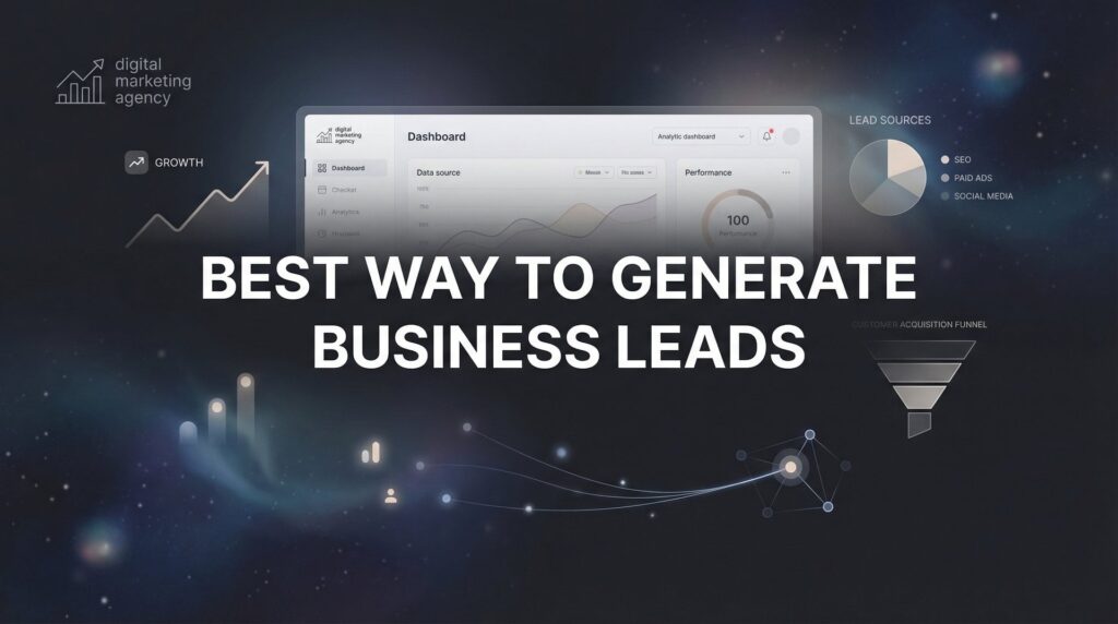
Here’s where it gets interesting: You’ll often discover that your Google Ads traffic converts at a completely different rate than your organic search traffic or social media visitors. One HVAC company found their Facebook traffic had a 0.3% conversion rate while their Google search traffic converted at 4.2%. They were pouring money into the wrong channel.
Calculate your cost per lead and cost per acquisition for each traffic source. If you’re spending $500 on Google Ads and getting 10 leads, that’s $50 per lead. If those leads close at 20%, your cost per acquisition is $250. These numbers matter because they tell you whether improving conversions or reducing traffic spend will have a bigger impact.
If you haven’t set up goal tracking in Google Analytics yet, stop everything and do it now. This is non-negotiable. You need to track form submissions, button clicks, phone calls, and any other conversion action. Without proper tracking, you’re flying blind. Many businesses struggle with marketing conversion tracking issues that cost them thousands in wasted ad spend.
Set up conversion tracking for at least the past 90 days of data. This gives you enough volume to spot patterns without getting thrown off by weekly fluctuations. A single week of data might show a spike because you ran a promotion. Three months reveals the real trends.
Document your current bounce rates for key landing pages. If 70% of visitors are leaving your service page without clicking anything, that page has serious problems. Compare bounce rates across different pages to identify your worst performers.
Finally, note your average session duration and pages per session. These metrics indicate engagement. If people spend 8 seconds on your site before leaving, they’re not finding what they expected. If they’re clicking through three or four pages but still not converting, you’ve got a different problem—probably unclear calls to action or missing trust signals.
Step 2: Audit Your Landing Pages for Conversion Killers
Your landing page has about five seconds to communicate what you do and why someone should care. Most local business websites fail this test spectacularly.
Open your homepage and your top three landing pages. Set a timer for five seconds, look at each page, then look away. Can you clearly articulate what the business does and what action you should take? If you can’t, your visitors can’t either.
Check the alignment between your ads or search terms and your landing page messaging. If your Google Ad promises “same-day plumbing repairs,” but your landing page headline says “Full-Service Plumbing Solutions,” you’ve created disconnect. The visitor’s brain has to work to figure out if they’re in the right place. That cognitive load costs you conversions.
Look at your above-the-fold content—everything visible before scrolling. Your value proposition should be crystal clear. “We fix leaking pipes” is clearer than “Your trusted partner in residential and commercial plumbing excellence.” Clarity beats cleverness every time.
Count how many navigation options you’re presenting. If your main navigation has 12 menu items, you’re overwhelming visitors with choices. Decision paralysis is real. The more options you present, the less likely someone is to pick any of them. Successful landing pages often remove the main navigation entirely to keep focus on one conversion goal.
Test your page load speed using Google’s PageSpeed Insights tool. This evaluates your Core Web Vitals—the technical performance metrics that Google considers critical for user experience. If your page takes more than three seconds to load, you’re losing potential customers before they even see your content.
Page speed matters more than most business owners realize. A slow site doesn’t just frustrate users—it signals unprofessionalism. If your website is slow, prospects assume your service will be slow too. Fair or not, that’s how human psychology works.
Check for confusing navigation structures. Can someone figure out how to contact you within two clicks from any page? Is your phone number visible without scrolling? These seem like small details, but they create friction that compounds across your visitor’s journey.
Identify pages where visitors should logically take the next step but don’t. If 1,000 people view your services page but only 20 click through to your contact form, something on that services page is stopping them. Maybe the next step isn’t clear. Maybe you’re asking them to make too big a leap without enough information. Understanding website conversion rates helps you benchmark whether your numbers are normal or problematic.
Step 3: Analyze Your Forms and Call-to-Action Elements
Your contact form is where interested prospects become leads or disappear forever. Every unnecessary field you add reduces the number of people who’ll complete it.
Count the fields in your contact form. If you’re asking for name, email, phone, company, job title, budget, project timeline, and how they heard about you, you’re asking for too much. For most local businesses, name, phone, and a brief message field is sufficient. You can gather additional details during the follow-up conversation.
Think about it from the user’s perspective. They’re already taking a risk by reaching out to a stranger. Every additional field feels like more commitment before they know if you’re even the right fit. Reduce friction by asking only what you absolutely need to respond effectively.
Evaluate your call-to-action buttons. “Submit” is weak. “Get Started” is better. “Get Your Free Quote” is even better because it’s specific and benefit-focused. Your CTA copy should tell people exactly what happens when they click.
Check the visual prominence of your CTA buttons. They should stand out through color contrast, size, and white space around them. If your CTA button is the same blue as your brand colors and blends into the page, it’s invisible. High-converting sites often use contrasting colors for CTAs—if your site is blue, your CTA might be orange or green.
Test your forms on mobile devices. Actually pull out your phone and try to complete your contact form. Are the tap targets large enough? Does the keyboard cover the submit button? Does the form auto-fill information from your phone? These details determine whether mobile visitors convert or give up in frustration.
Review what happens after form submission. Does your confirmation page just say “Thanks, we’ll be in touch”? That’s a missed opportunity. A strong confirmation page reinforces the decision, sets expectations for next steps, and might offer additional resources or a secondary conversion opportunity.
Check your email autoresponder. Do you send an immediate confirmation email? Does it provide helpful information while they wait for your response? A well-crafted autoresponder keeps your business top-of-mind and reduces the chance they’ll reach out to your competitors while waiting to hear back.
Look at CTA placement throughout your site. You shouldn’t only have conversion opportunities on your contact page. Strategic CTAs should appear after compelling content, at the end of blog posts, in your header, and anywhere someone might be ready to take action. Learning how to optimize landing pages for conversions can dramatically improve your CTA effectiveness.
Step 4: Review Trust Signals and Social Proof Placement
Local service businesses face a unique challenge: You’re asking strangers to let you into their homes or trust you with their business. Trust signals are what bridge that gap.
Take inventory of your existing trust elements. Do you display customer reviews prominently? Are testimonials scattered throughout your site or buried on a single testimonials page nobody visits? Are your certifications, licenses, and professional memberships visible?
Trust signals matter most at decision points. If someone is reading your services page and considering whether to contact you, that’s when they need reassurance. A testimonial from a customer who had similar needs, placed right before your contact form, can be the nudge that converts hesitation into action.
Check where your trust signals are currently placed. Many businesses collect great reviews and testimonials but display them in all the wrong places. Your “About Us” page shouldn’t be the only place you mention your 15 years of experience. That credibility should be woven throughout your site.
Look at what your competitors are displaying. If every other HVAC company in your area shows their Better Business Bureau rating and you don’t, prospects notice. If competitors display Google reviews on their homepage and you don’t, you’re at a disadvantage even if your reviews are better.
Verify that all trust badges and certifications are current and, where applicable, clickable. An expired certification or a trust badge that doesn’t link to verification hurts more than it helps. It signals carelessness.
Consider adding specific trust signals you’re missing. Do you offer a guarantee? Display it prominently. Are you licensed and insured? Say so clearly. Have you been in business for 20 years? That’s a trust signal. Do you have before-and-after photos of your work? Visual proof is powerful.
Review your Google My Business reviews and star rating. Many local businesses don’t realize their GMB rating appears in search results before people even click through to their website. If you have 3.2 stars, you’ve lost the lead before they visit your site. Managing your online reputation is part of conversion optimization.
Step 5: Conduct a Mobile Experience Deep-Dive
Most local business websites receive the majority of their traffic from mobile devices, yet they’re designed and optimized primarily for desktop. This disconnect costs conversions.
Test your complete user journey on actual mobile devices—not just the responsive preview in your browser. The responsive preview shows you layout, but it doesn’t reveal how your site actually feels to use on a phone. Grab your phone and go through the entire process of finding information and submitting a contact form.
Check your click-to-call functionality. When someone taps your phone number, does it immediately dial? It should. If your phone number is just text without a clickable link, you’re creating unnecessary friction. Mobile users expect to tap a number and have their phone dial automatically.
Is your phone number visible without scrolling on mobile? Many websites hide phone numbers in hamburger menus or at the bottom of the page. For service businesses, your phone number should be prominently displayed at the top of every page on mobile.
Evaluate button and link sizing for thumb-friendly navigation. Apple recommends touch targets be at least 44×44 pixels. If your buttons are smaller, users will accidentally tap the wrong thing, get frustrated, and leave. Test this yourself—if you find yourself zooming in to tap something accurately, your mobile experience needs work.
Check for mobile-specific friction points like horizontal scrolling, text that’s too small to read without zooming, or images that don’t scale properly. These issues scream “unprofessional” and erode trust. If you’re experiencing these problems, you may need to fix website issues before focusing on conversion optimization.
Test your forms on mobile. Are the form fields large enough to tap easily? Does the keyboard obscure the submit button? Does tapping into a phone number field bring up the numeric keyboard instead of the full keyboard? These small details determine whether someone completes your form or abandons it.
Review your mobile page speed separately from desktop. Mobile connections are often slower, and mobile processors are less powerful. A page that loads quickly on desktop might crawl on mobile. Use Google’s mobile-specific PageSpeed Insights to identify mobile performance issues.
Look at your mobile navigation structure. If your desktop site has dropdown menus with multiple levels, how does that translate to mobile? Nested mobile menus are often confusing. Simplify your mobile navigation to make key pages accessible in one or two taps.
Step 6: Prioritize and Create Your Fix-It Action Plan
You’ve identified dozens of potential improvements. Trying to fix everything at once is overwhelming and counterproductive. You need a systematic approach to prioritization.
Create a spreadsheet listing every issue you’ve identified. For each issue, score it on two dimensions: impact and effort. Impact is how much fixing this issue will likely improve conversions. Effort is how difficult or time-consuming it will be to implement.
High-impact, low-effort fixes are your quick wins. These go at the top of your priority list. Maybe your contact form has 12 fields and you can reduce it to 4. That takes 10 minutes to implement and could significantly boost form submissions. Do it today.
High-impact, high-effort changes come next. These are worth doing, but they require more planning and resources. A complete website redesign might be high-impact, but it’s also high-effort. You’ll need to schedule it appropriately and possibly bring in outside help. Exploring website design services can help you understand what’s involved in a professional redesign.
Low-impact, low-effort fixes can be batched together. Updating an outdated certification badge takes five minutes but won’t move the needle much. Do these when you have spare time, but don’t prioritize them over bigger opportunities.
Low-impact, high-effort items go to the bottom of the list or get eliminated entirely. If something requires significant work but won’t meaningfully improve conversions, it’s probably not worth doing at all.
Set specific, measurable improvement targets. “Improve conversion rate” is too vague. “Increase contact form submissions from 2% to 3% within 60 days” is specific and measurable. You’ll know whether your changes worked.
Create a timeline for implementation. Don’t just make a list and hope things get done. Assign dates to each priority item. Block time on your calendar to work through your audit fixes, or assign them to team members with clear deadlines.
Establish an A/B testing plan for major changes before full rollout. If you’re considering a significant redesign of your homepage, test the new version against the current version with 50% of your traffic going to each. Let data determine which version performs better rather than going with your gut. The best conversion rate optimization tools make this testing process much easier to manage.
Plan to re-audit quarterly. Conversion optimization isn’t a one-time project. Your market changes, your competitors evolve, and new best practices emerge. Schedule time every three months to run through this audit process again and identify new opportunities.
Your Quick-Reference Conversion Audit Checklist
You now have a systematic framework for identifying exactly what’s costing you leads. Start with your baseline data, work through each audit step, and prioritize fixes by impact.
The businesses that win aren’t necessarily getting more traffic—they’re converting more of the traffic they already have. A plumbing company that improves their conversion rate from 2% to 4% has just doubled their leads without spending another dollar on advertising. That’s the power of conversion optimization.
Run through this audit checklist and you’ll spot opportunities you’ve been overlooking. Maybe your mobile experience is costing you half your potential leads. Maybe your contact form is unnecessarily complex. Maybe your value proposition isn’t clear within those critical first five seconds. Whatever the issues are, you now know how to find them.
Start with the quick wins—the high-impact, low-effort fixes that you can implement this week. Update that contact form. Add click-to-call functionality. Make your phone number more prominent on mobile. These changes take minimal time but can produce immediate results. If you’re dealing with website traffic but no conversions, these quick fixes often reveal the underlying problems.
Then tackle the bigger opportunities. Improving page speed might require developer help. Redesigning your landing pages takes more effort. But these high-impact changes are what transform an underperforming website into a lead-generating asset.
Track everything. Document your baseline metrics before making changes, then monitor the impact of each improvement. This data tells you what’s working and what isn’t, allowing you to double down on successful changes and abandon strategies that don’t move the needle.
If you want expert eyes on your conversion funnel, Clicks Geek specializes in CRO for local businesses and can identify opportunities you might miss. Sometimes an outside perspective reveals blind spots you’ve developed from being too close to your own business. If you want to see what this would look like for your business, we’ll walk you through how it works and break down what’s realistic in your market.
But whether you DIY or bring in help, stop leaving money on the table. You’re already paying for traffic. Make sure your website converts that traffic into leads and customers. Run this audit quarterly, implement the high-priority fixes, and watch your cost per lead drop while your revenue climbs.
The difference between a website that generates leads and one that wastes traffic often comes down to a handful of fixable issues. You now know how to find them and fix them. Get started today.
Want More Leads for Your Business?
Most agencies chase clicks, impressions, and “traffic.” Clicks Geek builds lead systems. We uncover where prospects are dropping off, where your budget is being wasted, and which channels will actually produce ROI for your business, then we build and manage the strategy for you.