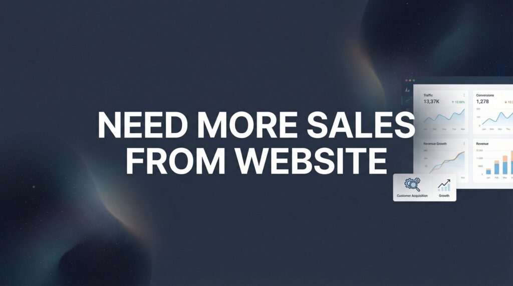
Your website is getting traffic, but your phone isn’t ringing. Sound familiar? You’re not alone—most local business websites function as expensive digital brochures rather than sales-generating machines. The gap between website visitors and paying customers represents thousands of dollars in lost revenue every month.
Here’s the reality: getting more sales from your website isn’t about driving more traffic or redesigning your homepage. It’s about systematically removing the friction that stops visitors from becoming buyers.
In this step-by-step guide, we’ll walk you through the exact process Clicks Geek uses to transform underperforming websites into lead-generating assets. Whether you run a service business, local shop, or professional practice, these seven steps will help you identify what’s broken and fix it fast.
By the end, you’ll have a clear action plan to start converting more of your existing traffic into real revenue.
Step 1: Audit Your Current Conversion Points
Before you can fix what’s broken, you need to know where the breaks are. Your first task is to create a complete inventory of every place on your website where a visitor can take action.
Start by opening your website in a fresh browser window. Pretend you’re a potential customer who just found you on Google. Now document every single conversion opportunity: contact forms, phone numbers, email addresses, chat widgets, “Get a Quote” buttons, appointment schedulers, and any other call-to-action elements.
Here’s what most business owners discover during this audit: their contact information is buried. The phone number only appears in the footer. The contact form lives on a separate “Contact Us” page that requires three clicks to reach. The chat widget doesn’t work on mobile.
Check if your primary contact methods are visible above the fold—that means without scrolling—on every major page. Not just your homepage. Your service pages, your blog posts, your about page. Every single one.
Now comes the critical part: test everything yourself. Fill out your own contact form. Does it actually send? Try it on your phone. Are the form fields easy to tap? How many fields are you forcing people to complete? Click your phone number on mobile. Does it trigger the dialer or just sit there like dead text?
Many business owners are shocked to discover their forms haven’t been working for months. Or that their “mobile-friendly” site requires visitors to pinch and zoom to fill out fields. If you’re experiencing website traffic but no conversions, broken conversion points are often the culprit. Or that their chat widget crashes on iPhones.
Document everything in a simple spreadsheet: the location of each conversion point, whether it works properly, and whether it’s visible without hunting. This becomes your roadmap for the improvements ahead.
Success indicator: You have a documented list of all conversion points and know which ones are actually generating leads. If you can’t tell which forms or buttons are producing results, you’re flying blind.
Step 2: Fix Your Value Proposition in 10 Words or Less
Your homepage headline is the most valuable real estate on your entire website. Yet most businesses waste it on meaningless corporate speak that says absolutely nothing.
Pull up your homepage right now. Read your main headline out loud. Does it instantly answer three questions: What do you do? Who do you serve? Why should they care?
If your headline says something like “Quality Service You Can Trust” or “Your Partner in Success,” you’ve failed the test. These phrases could apply to literally any business in any industry. They communicate zero value.
Compare that to: “AC Repair for Phoenix Homeowners—Fixed Right the First Time or It’s Free.” That headline tells you exactly what they do, who they serve, and includes a compelling reason to choose them. All in 16 words.
The best value propositions focus on outcomes, not processes. Don’t tell visitors you provide “comprehensive digital marketing solutions.” Tell them you “help local contractors get more qualified leads without wasting money on ads that don’t work.”
Try the 5-second rule. Show your homepage to someone who’s never seen it before. Give them five seconds to look at it, then take it away. Can they explain what you do and why you’re different? If not, your value proposition needs work.
Eliminate vague language entirely. Words like “quality,” “professional,” “experienced,” and “dedicated” mean nothing because everyone claims them. Get specific about the actual results you deliver. “Increased revenue by 40%” beats “improved business performance.” “Cut your tax bill by $8,000” beats “optimized tax strategy.”
Your headline should make a promise that matters to your specific audience. If you serve anxious first-time homebuyers, address their anxiety. If you work with overwhelmed small business owners, acknowledge their overwhelm. Speak directly to what keeps them up at night.
Success indicator: A stranger can explain what you do and why you’re different after a quick glance at your homepage. If they’re confused or have to read multiple paragraphs to figure it out, keep refining.
Step 3: Add Trust Signals Where Decisions Happen
You’ve probably got testimonials somewhere on your website. Maybe a dedicated reviews page. Maybe a carousel that rotates through customer quotes. Here’s the problem: nobody’s looking there when they’re deciding whether to call you.
Trust signals need to live exactly where visitors are making decisions. That means right next to your contact forms. Directly above your phone number. Surrounding your “Get a Quote” button. Not hidden three clicks away on a separate page.
Think about how you buy things online. When you’re about to enter your credit card information, what makes you feel safe? You look for security badges. You check for reviews. You scan for guarantees. Your website visitors do the same thing before they contact you.
Place your best testimonials strategically. If you have a contact form on your homepage, put a powerful customer quote right above it. If your service page has a “Schedule Consultation” button, add a relevant review from someone who used that exact service.
Generic praise doesn’t work. “Great service, highly recommend!” tells visitors nothing. Specific results create trust: “Called on Tuesday with a plumbing emergency. They arrived within 90 minutes and fixed it for $200 less than the quote from the other company.” That’s believable because it’s detailed.
Include names and photos when possible. “John M. from Phoenix” is more credible than “A Satisfied Customer.” Real faces and full names signal authenticity. Obviously get permission first, but most happy customers are willing to be featured.
Don’t forget professional trust signals. If you’re a Google Premier Partner like Clicks Geek, display that badge prominently. Licensed contractor? Show your license number. Industry certifications? Put them where people can see them. These credentials matter most when visitors are on the fence about contacting you.
Add guarantees near conversion points too. “100% Money-Back Guarantee” or “Free Second Opinion” or “No-Obligation Quote” reduces the perceived risk of reaching out. Make it crystal clear that contacting you doesn’t commit them to anything.
Success indicator: Every conversion point on your site has at least one trust element within visual range. When someone is looking at your contact form, they should simultaneously see proof that you deliver results.
Step 4: Reduce Form Friction to the Absolute Minimum
Every field you add to a contact form kills conversions. It’s that simple. Yet most business websites ask for everything short of a blood sample before someone can request a quote.
Pull up your main contact form right now. Count the required fields. If you’re asking for more than three pieces of information, you’re losing leads. Name, phone number, and one qualifying question. That’s it. That’s all you need for initial contact.
But my sales team needs to know their budget and timeline and project scope! Here’s the thing: you can ask those questions during the phone call. Right now, your job is to get them to raise their hand. Once you’re having a conversation, you can gather all the details you want.
Long forms create decision fatigue. Every additional field makes the visitor think: “Do I really want to share this information? Is this worth my time? Maybe I’ll come back later.” Spoiler: they won’t come back later.
Replace lengthy contact forms with easier alternatives when possible. A click-to-call button requires zero fields. A chat widget feels conversational rather than formal. A simple “Get a Quote” form with just name and phone removes barriers. These are fundamental low website conversion rate solutions that work across industries.
If you absolutely must collect more information, use multi-step forms that reveal fields progressively. The first screen asks for name and email. The second screen asks qualifying questions. This feels less overwhelming than a wall of empty boxes.
Add microcopy that reduces anxiety. Right below your email field, add “We’ll never share your information.” Near the submit button, include “We typically respond within 2 hours.” These tiny reassurances matter more than you think.
Button text matters too. “Submit” is cold and corporate. “Get My Free Quote” is action-oriented and benefit-focused. “Send” is neutral. “Start My Project” creates excitement. Choose words that match your brand voice while emphasizing what the visitor receives.
Test your form on mobile obsessively. Pull out your phone and try to complete it while standing in line at the grocery store. Can you easily tap each field? Does the keyboard cover important information? Do you have to zoom in to read anything? If it’s even slightly annoying on mobile, it’s costing you leads.
Success indicator: Your primary contact form takes less than 30 seconds to complete on mobile. Time yourself. If it takes longer, start cutting fields until you hit that target.
Step 5: Create Urgency Without Being Sleazy
Urgency works. But fake urgency backfires spectacularly. If your website claims “Only 3 spots left!” every single day for six months, visitors know you’re lying. Trust evaporates instantly.
Create legitimate scarcity instead. If you genuinely only take on five new clients per month, say so. If your seasonal pricing ends on a specific date, communicate that clearly. If you’re booked two weeks out, let visitors know they need to schedule now for availability later.
The key word is “legitimate.” Don’t manufacture fake deadlines or invented capacity constraints. Use the real limitations your business actually faces. Contractors have scheduling capacity limits. Consultants have client load limits. Service businesses have genuine busy seasons.
Action-oriented button text creates natural urgency. “Get My Free Quote” implies immediate action. “Schedule Your Consultation” suggests taking the next step right now. Compare that to passive text like “Learn More” or “Submit,” which invite procrastination.
Tell visitors exactly what happens next. Uncertainty kills conversions. “Click here and we’ll call you within 2 hours to discuss your project” is far more compelling than a generic “Contact Us” button with no indication of what follows.
Use time-based language that feels honest. “Book your spring tune-up now before our schedule fills” works for an HVAC company in March. “Lock in 2026 pricing before our rate increase in April” works if you’re actually raising prices in April. Just don’t lie about it.
Include next-step clarity everywhere. After someone fills out your form, what happens? Do you call them? Email them? Send them a proposal? Tell them upfront. “Submit your information and we’ll send you a custom quote within 24 hours” removes the anxiety of not knowing what to expect.
Avoid countdown timers and flashing banners that scream “car dealership sale.” These tactics might work for e-commerce, but they undermine credibility for professional services and local businesses. Subtle urgency beats aggressive pressure every time.
Success indicator: Your CTAs create motivation to act now rather than “think about it later” while maintaining your professional credibility. If your urgency tactics make you cringe, they’re probably making your visitors cringe too.
Step 6: Optimize Your Highest-Traffic Pages First
Not all pages are created equal. Some pages get ten visitors per month. Others get hundreds. Yet most business owners optimize randomly without considering which pages actually matter.
Log into Google Analytics right now. Navigate to Behavior > Site Content > All Pages. Sort by pageviews. Your top 5-10 pages represent the majority of your traffic and therefore your biggest conversion opportunities.
Most businesses discover their blog posts drive significant traffic. Maybe you wrote an article about “common plumbing problems in older homes” that ranks well on Google. Hundreds of homeowners read it every month. But does that article have a clear path to conversion?
Add relevant CTAs to every high-traffic page that match visitor intent on that specific page. Don’t just slap a generic “Contact Us” button everywhere. If someone’s reading about emergency AC repairs, offer emergency service. If they’re reading about kitchen remodeling costs, offer a free estimate for kitchen projects.
Context matters enormously. A visitor reading your blog post about “signs you need a new roof” is probably researching whether they have a problem. They’re not ready to hire you yet. Offer them a “Free Roof Inspection” instead of asking them to “Schedule Installation.” Meet them where they are in their decision process.
Service pages often get substantial traffic but lack clear conversion paths. Your “Commercial Cleaning Services” page might get 200 visits per month. Great. Does it have a phone number above the fold? A quote request form? A “Schedule Walkthrough” button? Or just paragraphs of text with no obvious next step?
Ensure every high-traffic page has at least one conversion opportunity tailored to that page’s content. Your homepage might have your main contact form. Your blog posts might have content upgrades or consultation offers. Your service pages might have quote request buttons. Understanding website conversion rates helps you benchmark whether your pages are performing or underperforming.
Don’t forget about pages that rank for commercial intent keywords. If you’re getting traffic for “hire electrician Phoenix,” that visitor is ready to buy. That page needs aggressive conversion elements: prominent phone number, simple contact form, clear pricing information, and trust signals.
Review your top pages monthly. Traffic patterns shift. New pages start ranking. Old pages lose traffic. Optimization is ongoing, not a one-time project. Focus your energy where it creates the biggest impact.
Success indicator: Your top traffic pages each have at least one conversion opportunity tailored to that page’s content. If visitors can read your most popular content without ever seeing a way to contact you, you’re hemorrhaging potential leads.
Step 7: Implement Speed and Mobile Fixes That Impact Sales
Your website might look beautiful on your office desktop. But if it takes seven seconds to load on a phone, nobody’s sticking around to see it.
Test your site speed using Google PageSpeed Insights right now. Enter your URL and run the test for both desktop and mobile. Pages loading over three seconds lose significant conversions. The longer the wait, the higher the abandonment rate.
Common speed killers include oversized images, excessive plugins, unoptimized code, and cheap hosting. You don’t need to become a developer to fix most of these. Compress your images using tools like TinyPNG. Remove plugins you’re not actually using. Consider upgrading from that $5/month hosting plan if your business depends on this website.
Mobile optimization goes beyond speed. Pull out your phone and actually use your website like a customer would. Try to complete your contact form. Can you easily tap the fields? Does the keyboard cover important information? Do you have to pinch and zoom to read anything?
Verify your phone number is click-to-call on mobile. This sounds obvious, but countless business websites display their phone number as plain text rather than a tappable link. On mobile, that number should trigger the dialer when tapped. If it doesn’t, you’re making customers work harder than necessary.
Check that your most important content and CTAs appear without scrolling on mobile devices. Mobile screens are smaller. What appears “above the fold” on desktop often gets pushed down on phones. Your primary call-to-action needs to be visible immediately on mobile. For a deeper dive into these technical improvements, our guide on website optimization tips covers the fixes that actually move the needle.
Test your forms on multiple devices. What works perfectly on your iPhone might break on Android. What looks fine on your tablet might be unusable on a small phone. Borrow different devices and test everything. Or use browser tools that simulate various screen sizes.
Button sizes matter on mobile. Tiny buttons that require precision tapping create friction. Make your CTA buttons large enough to tap easily with a thumb. Apple recommends minimum touch targets of 44×44 pixels. If your buttons are smaller, people will accidentally tap the wrong thing and get frustrated.
Navigation should be simple on mobile. Dropdown menus with multiple levels work fine on desktop but become nightmares on phones. Simplify your mobile menu to essential pages only. Every extra tap between a visitor and your contact information is an opportunity for them to give up.
Success indicator: Your site scores 70+ on mobile PageSpeed and all conversion elements work flawlessly on phones. If you’re scoring below 70, prioritize the fixes Google recommends. If your forms or buttons don’t work perfectly on mobile, fix them before anything else.
Putting It All Together
Getting more sales from your website comes down to removing barriers between interested visitors and taking action. Use this checklist to verify you’ve completed each step:
✓ Audited all conversion points and confirmed they work
✓ Clarified your value proposition in 10 words or less
✓ Added trust signals next to every CTA
✓ Reduced form fields to the essential minimum
✓ Created legitimate urgency with clear next steps
✓ Optimized your highest-traffic pages for conversion
✓ Fixed speed and mobile issues affecting sales
Start with Step 1 today. Even small improvements compound into significant revenue gains. You don’t need to implement everything at once. Pick the step that addresses your biggest weakness and fix it this week.
The difference between a website that generates leads and one that just exists comes down to these fundamentals. Clear value proposition. Visible conversion points. Minimal friction. Strategic trust signals. Mobile optimization. It’s not complicated, but it requires intentional effort.
If you’d rather have experts handle the heavy lifting, Clicks Geek specializes in turning underperforming websites into lead-generation machines for local businesses. We focus on the conversion rate optimization strategies that actually move the needle, not just surface-level design changes that look pretty but don’t produce results.
Tired of spending money on marketing that doesn’t produce real revenue? We build lead systems that turn traffic into qualified leads and measurable sales growth. If you want to see what this would look like for your business, we’ll walk you through how it works and break down what’s realistic in your market.
Ready to stop leaving money on the table? Your website visitors are already there. Now give them a reason to pick up the phone.
Want More Leads for Your Business?
Most agencies chase clicks, impressions, and “traffic.” Clicks Geek builds lead systems. We uncover where prospects are dropping off, where your budget is being wasted, and which channels will actually produce ROI for your business, then we build and manage the strategy for you.